Colors indicate different things, such as emotion, feeling, and personality. From this project, I learn to discribe a person by using colors instead of using literature words. I chose dark blue as a representation for my partner. His first impression to me was he is a calm person who good at observing people. And after comprehend more about him from the conversation, I convinced I was right. Considered he took phycology in high school, enjoy in reading books more than entertainment with others, and likely isolated himself from people, I determine he is an introvert with sensitive feeling, intelligent but mostly used it for himself only, don’t easily show expression or feelings because of too calm. According to these observations I chose for him dark blue, a color mixed of blue and black. The logo I chose for him is an eyeball, eyeball represents mystery, he’s fully surrounding by it, another reason is because he can’t stop observing people so I believe the eyeball is the best logo to indicate him. We spend about a half hour to finish everything. It’s a interesting project, and I learned new knowledge of colors.
I really liked this part of the project, since we were able to work with a partner and use illustrator. For this project, me and my partner Romie picked a color that represents us both for the logo color and picked a relative personality color that represented us separately. We came up with idea for the logo should be a abstract. I think it was a great idea, since many people done a silhouette of an animal. I came up with this logo that combined with Romie ‘s hobbies. (*On the right) Including the curves that represents the creativeness and the pointy thorn looking curves indicates his smartness that goes straight to his point. Lastly, the little circle shows his personality that makes everything in put together. It took us about the whole class time to work on gathering ideas of personality wise, colors and hobbies. Including working on the illustrator and finishing it. It took me about hour and thirty minutes to place the logo on to the actual color paring. Ruffly it me about in total of four hours and thirty minutes.
In recreation of Tom Philips’ humument, Ceron produced a story only using image and text. Inspired from the human life span, his story touches on topics of time and regrets. Achievable through value and contrast Incorporation of stopwatches connect harmoniously with the text leaving viewers with a message of their own.
Marcus Ceron
Glistening love
Ink brush on book page
Using the method of blocking out words, Ceron invents a graphics related poem. Themes of passion, love and nostalgia are experienced throughout allowing viewers to connect a story of their own. Glistening love signifies purity and passion at its finest.
Marcus Ceron
Tinted love
Ink on bookpaper
Not every love is the same. Love varies between friends, family, significant others and even pets. To symbolize variations of love, Ceron illustrates repitition of hearts each distinct from the other.
This exhibit is presented by Ayano Morishima. Born and raised in Tokyo, Japan, then moved to New York where she now lives and studies. Tom Phillips, an English artist who set a task himself to find a second-hand book for altering every page by painting, collage, and cut-up techniques to create an new pieces of art, called *Humument. Morishima created a humument called, La Fay-Vaile a new story that shows the viewer the three designs, Gates to Wonder, Book to Wonder, and Dreams to Wonder about how anyone can rewritten the destiny of the book.
Understanding Phillips’ concept behind his creative art work, Morishima combined different techniques she learned from her *Graphic design principle 1100 and English 1101 class to create a humument book. She changed the theme of the book, Wishes to a crazy wonderland theme to show completely different side of wonderland. She also got ideas from the origin of the story, Alice’s Adventure in Wonderland by a English author Charles Lutwidge Dodgson under the pseudonym, Lewis Carroll in 1865.
To create the humument design, she used her technique in using ink brush pen, *x-acto knife, old book and folding to show the viewers, the new kind of story that unfolds. For the first design, Morishima used the ink pen brush to make many repetition of connected diamonds to indicate a chandelier, blocking out most of the text in the book to show how visible text are connected to the picture that is shown as a ground. In addition, using figure and ground technique to show the viewers where exactly to see; in her case, the shapes of the ground shows more vividly since the black ink, the figure blocks out other context. For the second, she used x-acto knife to cut open a block of text at the bottom of the page and glued only in the middle. By doing this, she wants the viewers to show there is a book in a book. Same as the first design, she used the technique of figure and ground, showing the ground to block other context with the figure. In addition, by folding the corner to the right top, it shows the next design that shows the technique of a *chromatic gray that Morishima learned. Down into the rabbit hole, it leads the viewers to go though the door to read a little book that came from the concept of the original. For her last design, she created the after math of Wonderland. The madness in wonderland was finally came to the end; still in the land, the ballerina indicates the beautiful dream that it stabilizes the wonders in the wonderland.
Many would think that the ballerina could be Alice, however it is not necessary that the ballerina indicates Alice, since her being is the character in the original story, which is completely different from Morishima’s humumet art. She also used ink brush pen to create curtains on the right and left sides to show that she is on a stage, and other words that fits with the concept of the page, such as dancer, moment, felt, perfect, and choice.
Morishima, made this humument to attract people who are interested in creating their own story. It conveys though out each pieces of art work and detailed design, where it tells the message in the theme. Single page contains a message where Morishima’s story that she made though out the humument art, she wants the viewers to understand that stories can be can be rewritten to make new ones. Even characters, make them have their own destiny with out following the original story.
—————————————————————————————— *Humument: Entirely new version of book that is created from the original, such as adding painting, collage and cut-up techniques. Link *Aka. COMD 1100; college courses that is part of Learning Community: Ways of Seeing. Link *X-acto: aka. Utility knife; short, sharp blade mounted on a pen-like aluminum body, used for crafting and hobbies, such as model making. Link *Chromatic Gary: Grays that exhibit a subtle, but discernible hue; created by adding larger amounts the complement and white. (COMD |Chromatic Gray Studies) Class 19 Link
——————————————————————————————
I gathered information about Exhibit Catalogue from here
Link to “How to write Exhibition Catalogue” that I found that I thought it would be great example for other students.
I mentioned Tom Philips’ work since his is an individual Exhibit Catalogue.
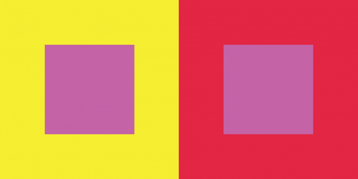
Free-Study – Paired Color Identities with Simultaneous Contrast
Step 1 – Color Research Process.
Jay
Shadin
Joyful
Creative
HelpFul
Quiet
Relax FINAL COLOR – Saturated Red
Out-Going
Creative
Friendly
Energetic
Loud FINAL COLOR – Yellow
Step 2 – Color Mockups
Step 2 Color Mockup
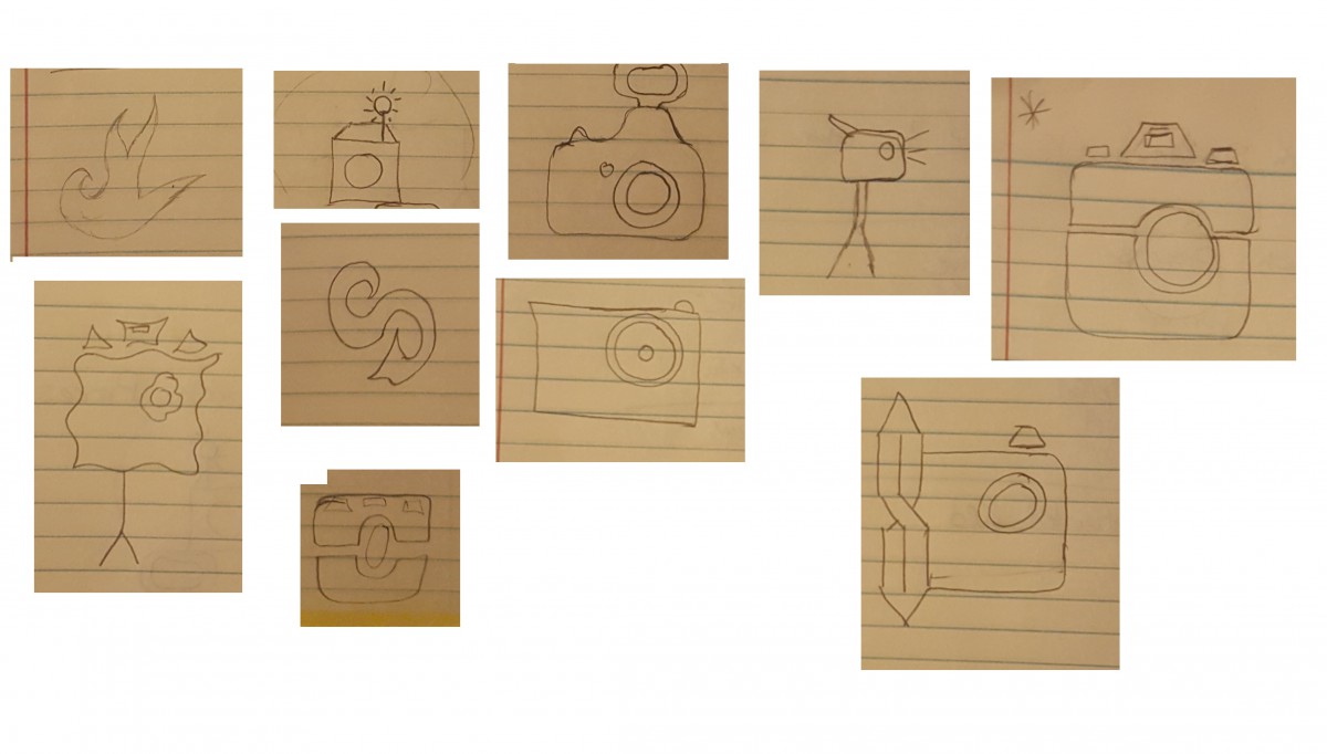
Step 3 – Icon Research Process
Step 3: ICON RESEARCH PROCESS
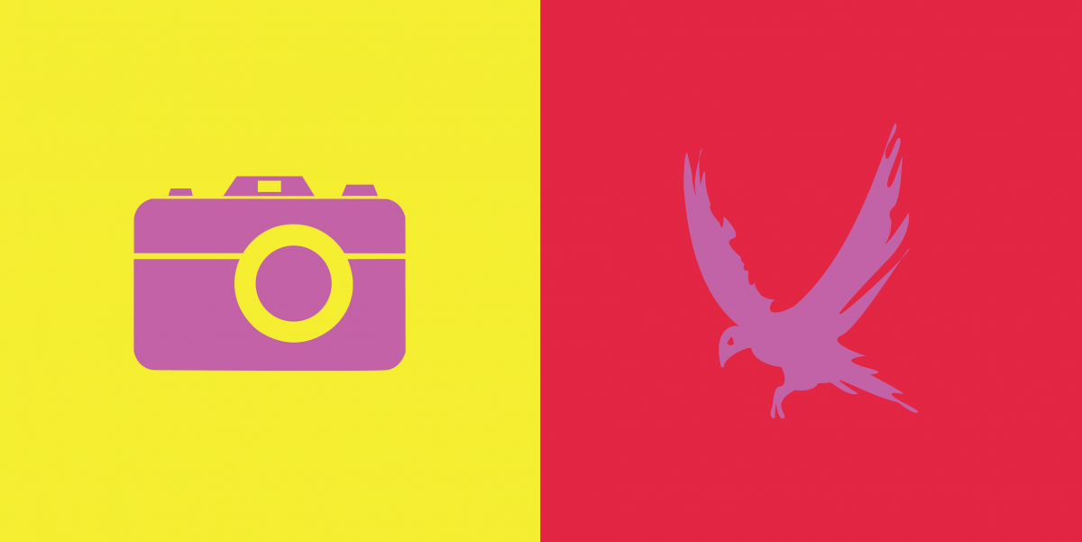
Step 4/5: Icon Mockup / Final Execution / Presentation
Step 5- FINAL EXECUTION
Thoughts This Part of this project was fun to create. We had to chose a color that represents our partners personalities and then create an icon that would represent them while also creating Simulated contrast.
This exhibit is presented by Jaichan Kirty, Jaichan Kirty was born and raised in Guyana, then moved to New York where he now lives and studies. Gathering inspiration from Tom Phillips’s altered text, A Humument, Kirty curate a project that integrates both words and visuals. A Humument is an altered book has unique combinations of literary and art, the author merged art with the connotation of specific words to exhibit two different genres into one. This book created by Tom Phillips, was released in 20th century. Like Phillips, Kirty found an inexpensive used book entitled Portrait of Ivan.The Portrait of Ivan is about a young boy coming of age while he is also discovering himself. Kirty transformed this book into new artistic creations both in appearance, by using ink, paint, pencil, cut outs, and folding.
Kirty also created a new title and theme for Portrait of Ivan.He had many ideas into the new title but finally decided on one, which is Portrait Van. The idea behind this new title came from the new juxtaposition theme for Portrait of Ivan, which is mysterious and creepy. This is a juxtaposition of Portrait of Ivan because a boy coming of age is supposed to be nice and pleasant. The opposite of that is mysterious and creepy. In order for Kirty to create these compositions and start changing Portrait of Ivan into Portrait Van. Kirty blocked out a huge amount of the pages and selected words and phrases to emphasize. He then created images using those words and phrases he wanted to emphasize in that page of the book.
The first piece of this exhibit is called, So that’s what it looks like. In English 1101, Kirty learned ahout over lapping New Yorks, which he incorporate in this pieces. Overlapping New Yorks include juxtapositions such as old and new, residential and commercial, historic and replaceable, natural and man-made, constructed and under-construction, well maintained and in disrepair, celebrated and forgotten, etc. Kirty has created a new window (a new view) into this book by using over lapping to create an illusion of a boy, who is Ivan, looking through a new page. He did this by cutting a square on the next page in the book. Kirty uses an X-Acto knife to carefully cut this square out of the page. Also, Kirty uses sharpie markers to cover up a huge amount of the pages leaving out a few words that create its own new story. These words creates a whole new meaning of this page. “So that’s what it looks like”.
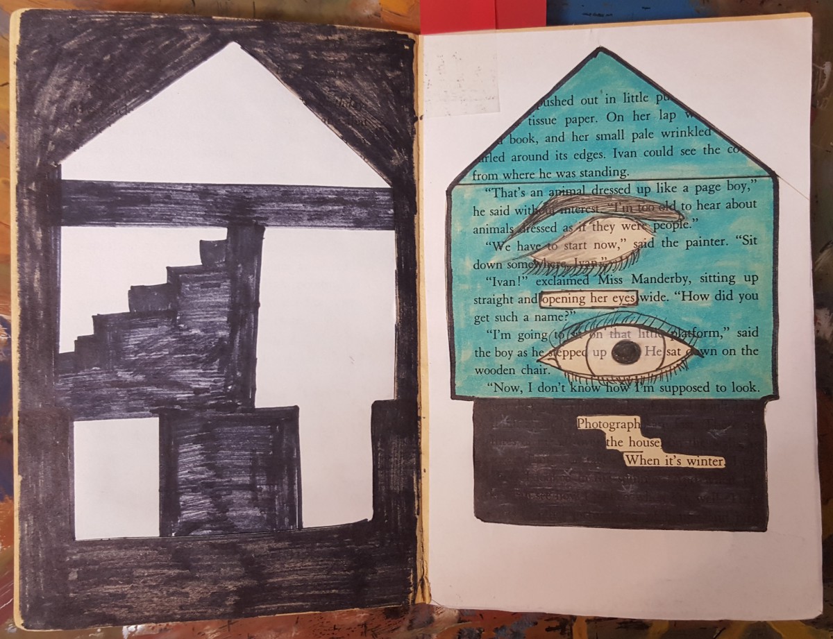
The second piece is called, Inside the House. In COMD 1100 Kirty learned about Shape (Organic, Geometric), Frame, Figure-Ground (Obvious, Ambiguous), Unity, Economy which he incorporate in this piece by blocking out a huge amount of the page and selected words and phrases to emphasize. “Opening her eyes” and “Photograph of the house when it’s winter”, which he used to create images. The first image is an eye-opening, which Kirty showed by drawing a closed eye and a second eye which is opened. This represents organic shapes. Then he uses white computer paper to cut out the shape of a house to emphasize the “Photography of the house when it’s winter”. Kirty chose white paper because snow is white and snow falls in the winter. Kirty then used the cut out of the house, which is the silhouette and glued it on the previous page. Also useing sharpie to create what it seems to be the inside of the house. This represented Geometric shapes.
The third and last piece of this exhibit is called, Blue Print. “Blueprint” was created when Kirty painted over a picture with saturated primary colors. Also, in COMD1100 Kirty learned about creating simple compositions demonstrating an accurate understanding of saturation, which includes Hue, Saturation, Prismatic Color, Muted Color, Chromatic Gray, Achromatic Gray, Luminosity, Primary Colors, Secondary Colors, Complementary Colors, Warm, Cool, CMY, RGB, RYB color models/systems. Kirty represted this concept by painting a blue box, and inside that box is a print of a foot-step, hence the title Blue Print. After painting over the picture, Kirty then closed the book allowing the paint to print over on the other page creating a paint splatter effect.
Panel #1
So that’s what it looks like
Jaichan Kirty
Born 1996 in Guyana
Lives and studies in New York
_________________________________________ Oh! So that’s what it looks like,2015
Sharpie on paper, 7.5″ x 5″
Kirty created this piece using an X-Acto knife to carefully cut this square out of the page, revealing the Portrait of Ivan that is on the previous page. Also, Kirty uses sharpie markers to cover up a huge amount of the pages leaving out a few words that create its own new story; Oh! So that’s what it looks like.
Panel #2
Inside the House
Jaichan Kirty
Born 1996 in Guyana
Lives and studies in New York
_________________________________________ “Inside the House” 2015
Sharpie on paper, White computer paper, Highlighter, 7.5” x 10”
Kirty blocked out a huge amount of the pages using a sharpie marker. While selecting words and phrases to emphasize, “Opening her eyes” and “Photograph of the house when it’s winter”. Which he used to create images. Kirty uses paper to cut out the shape of a house. The cut out of the house was glued on the previous page.
Panel #3
Blueprint
Jaichan Kirty
Born 1996 in Guyana
Lives and studies in New York _________________________________________
“Blueprint” 2015 Paint on paper, 7.5″ x 10″
“Blueprint” was created when Kirty painted over a picture with the saturated primary colors which includes blue, red and yellow. Kirty painted a blue box, and inside that box is a print of a foot-step. After painting over the picture, Kirty then closed the book allowing the paint to print over on the other page creating a paint splatter effect.
For our last class, we read Nora Ephron’s “The Boston Photographs” and examined the images her essay refers to. For our next class, we will consider the photographs published in Jet magazine that depict the brutalization of Emmett Till.
You might also look at this compilation of newspaper articles following Emmett Till’s murder. At the bottom of the page, you can download the FBI report, which includes materials from the time of the incident and more recent reporting.
Taking a step back, the Wikipedia page could be a good place to get started to understand the events that led up to and that followed Till’s murder.
Reply here with a comment about the choice to publish these photographs. You might write about what motivated the choice, or even what Ephron would say based on what she wrote in “The Boston Photographs,” or how these images matter today in relation to the #BlackLivesMatter movement. Are there other sources you consulted that were helpful for you? Please share them with us in your comment.
This poster is inspired by Swiss style posters and design aesthetics. Using Swissted’s nirvana poster, me and my colleague created a poster that was warm in color temperature. The original poster was black, red and light grey but for this project the use of all saturations were used (Muted, chromatic, and prismatic). The band name Bright Noise was thought of after me and my partner listed word associations for each of the 5 senses. Bright noise fit perfectly because the colors chosen, orange and yellow, are bright in luminosity. The term bright noise projects a powerful sense of sound and directs attention .
This exhibition is presented by the artist Shadin Risha. Shadin was born in a small country name Bangladesh but he was mostly raised in New York. Risha moved to New York at the age of twelve and he never looked back. He’s currently a student of New York City College of technology. parsuing his degree in arts and advertisement Design. Risha’s project ‘Thenderous Lifowao’ was inspire by Tom Phillips’ project which was known as “The Humument”. Risha came up with his project title Thenderous Lifowao by blocking out words from the main title of the book ‘The brief wondrous life of oscar wao’ by writen by Junot Diaz. Risha’s main goal was to change the theme of the book which originally was a story of a boy who’s constantly failing failures and disappoint and transform the character into a brave and mentally strong boy who takes all the negativity that’s thrown at him and turns it into the fuel to get what he wants.
The book’s original name was ‘the brief wondrous life of Oscar wao’. Instead of name the project with a title that’s easier to understand and could be found in the dictionary, Risha decided to come up with a completely new and different title. But since his project and the original book has a connection where both projects portrays the same characters but in a way, Risha chose to recreate the book’s new name from the original name. He keeps the word ‘The’ and adds ‘ndrous’ from ‘Wondrous’ to create a new word ‘Thendrous’. For the word ‘Lifowao’ he takes ‘Lif’ from the word ‘life’, the letter ‘O’ from ‘Of’ and adds them with the last word ‘Wao’.
The main book ‘The brief wondrous life of Oscar wao’ is a story about a boy who talks about his life and how the best part of life for him was when he was a eleven years old. Risha takes his sorrowful life story and decided to turn the half pathetic looser character into someone who’s bravely fighting for things he believes in and to survive during an apocalypse.
The project portrays a character from a Hispanic family who’s recently discovered himself and found out that he is attracted toward both women and men. But coming from a Hispanic family things turns out to be very hard for him. To make everything far worse a dangerous virus breaks out and the sick people starts to transform into a different types of creatures and starts to crave for human blood.
Risha goes on to tell his story by creating juxtaposition, perspective, positive and negative spaces and using values. There are pages where he fills up the whole page with black ink and leaves a little part of the book un-inked to create positive and negative space so when the audience glimpse at the page their eyes are naturally being drawn to the in-inked part which leads them into reading the left out portion of the story and conquer another piece if the puzzle that creates the whole story.
One of the page on the book creates two types image based on the angle the audience are looking at. First Risha colors over book page with black ink while leaving out some phrases and words that makes up a story. But then if the audience takes the time to look at the book horizontally they will see a silhouette of a boy sticking his head out of a door of a dark room with the sign of both bravery and fear that’s portrayed by his body language.
Risha decided to work on this particular book because he felt like it was something needed to be done. The story of Oscar Wao is not just a story a boy. There are people all around us that are living proof of that story. Risha wanted to create a fighter out of the character to influence and inspire the people that are beaten up to become a fighter themselves.
Tsang, Ka Yee (TK)
Born in Hong Kong
Lives and studies in New York
___________________________________________
“Flower”, 2015
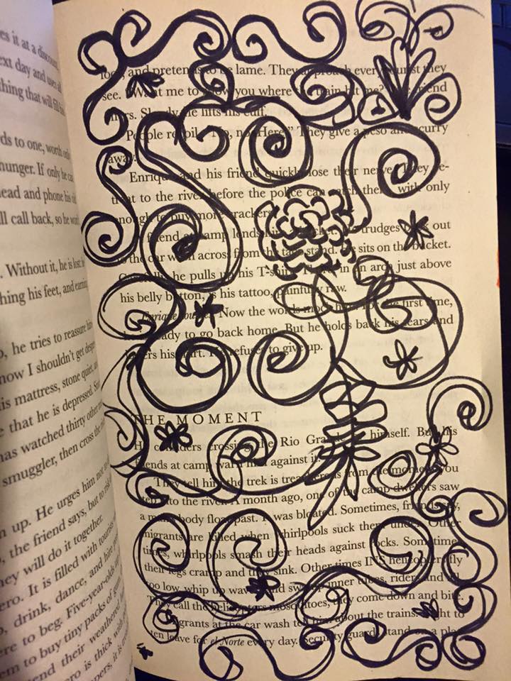
Sharpie on paper, Inking brush pens
In this work, TK wanna create a simple idea that represents the Flower pattern. Set up the pattern like the painting book called ” Secret Garden”. Using the black and white composition, and lay out the curvy figure, randomized draw though the page. Also, the author’s using a legato pattern to create the flower pattern.
Tsang, Ka Yee (TK)
Born in Hong Kong
Lives and studies in New York
___________________________________________
” Shackles”, 2015
Color markers, color pencils
Shackles was intended by the author to represent the idea of imagination. The author used the markers drew the sun in the middle, used the chain to connect the sun. Nothing can be closest to the Sun, whatever they are.
Tsang, Ka Yee (TK)
Born in Hong Kong
Lives and studies in New York
___________________________________________
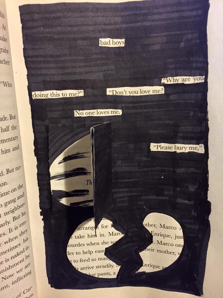
“Don’t You Love Me?”, 2015
Sharpie on paper, Inking brush pens, paste some page
Drawing this page, the concept is selected text to go though the main idea of this page. The author’s using the text, “Don’t you love me?” “No one love me” that represents the feeling from the page, then drew the broken heart on the bottom to mention the idea.