Color Interaction Parings: Phase 2

Achromatic gray studies

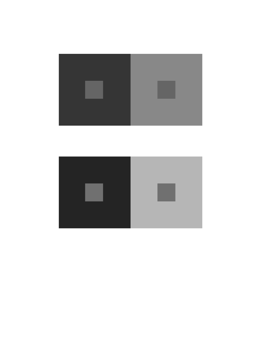
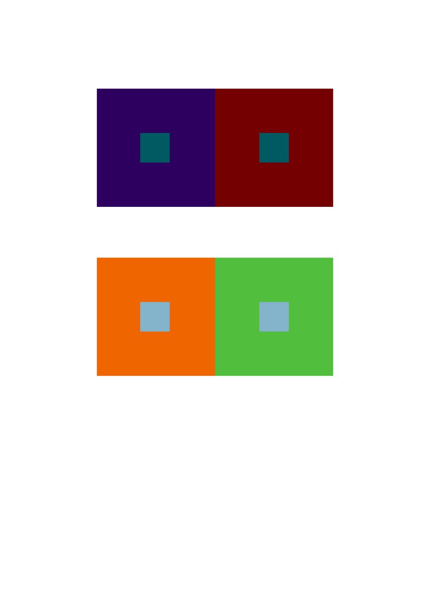
Group 1: For this study, I learned how to use different shades of grays to change the color of the middle square. The squares in the middle are the same color but the surrounding color makes it appear as though it’s a different color. It took 20 minutes to complete.

Shifting value with color

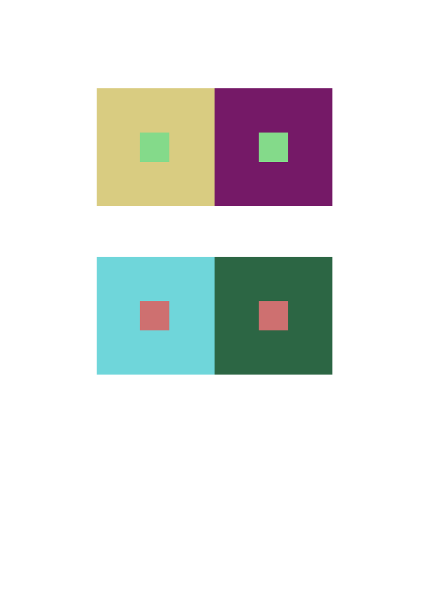
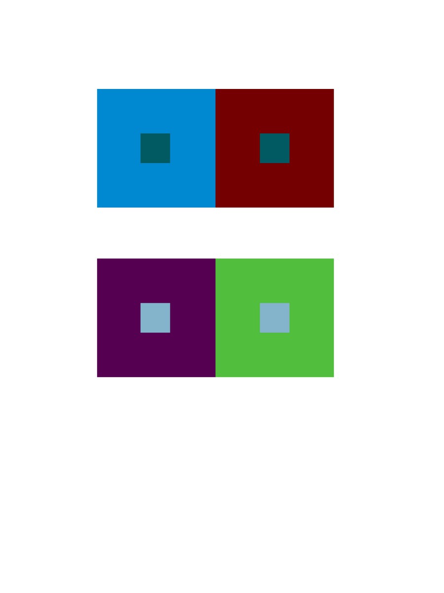
Group 2: For this study, I learned how to keep the color of the larger squares but change the value. The squares in the middle are the same color but with the change in value within the surrounding color it changes the appearance of the square in the middle. It took 20 minutes to complete.

Shifting hue, but not value

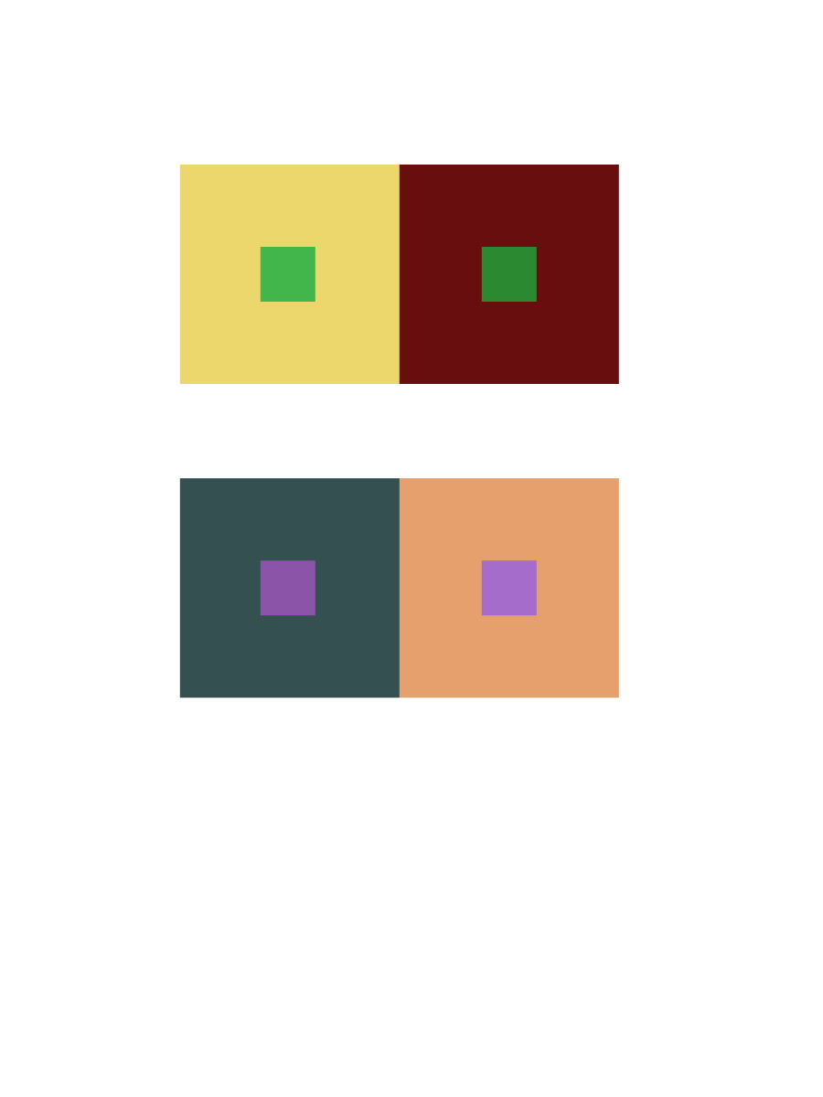
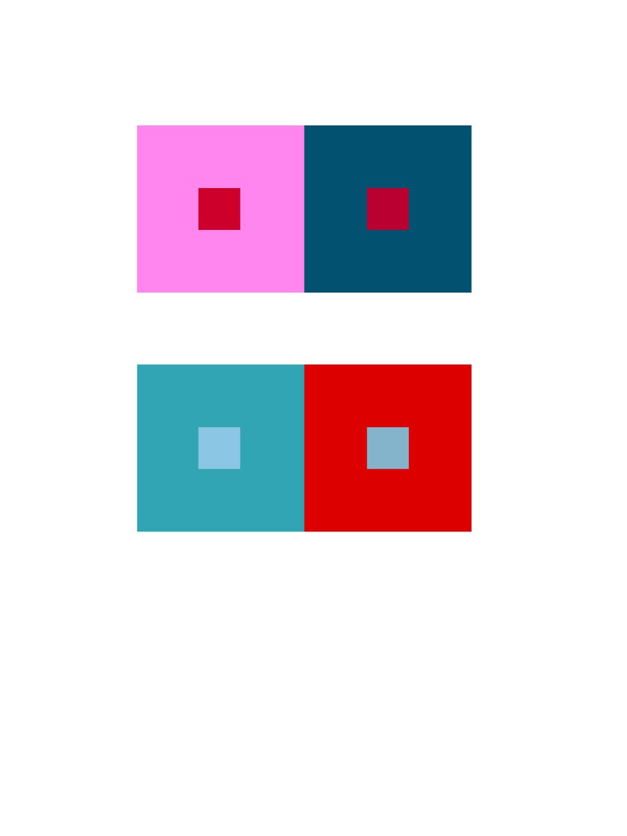
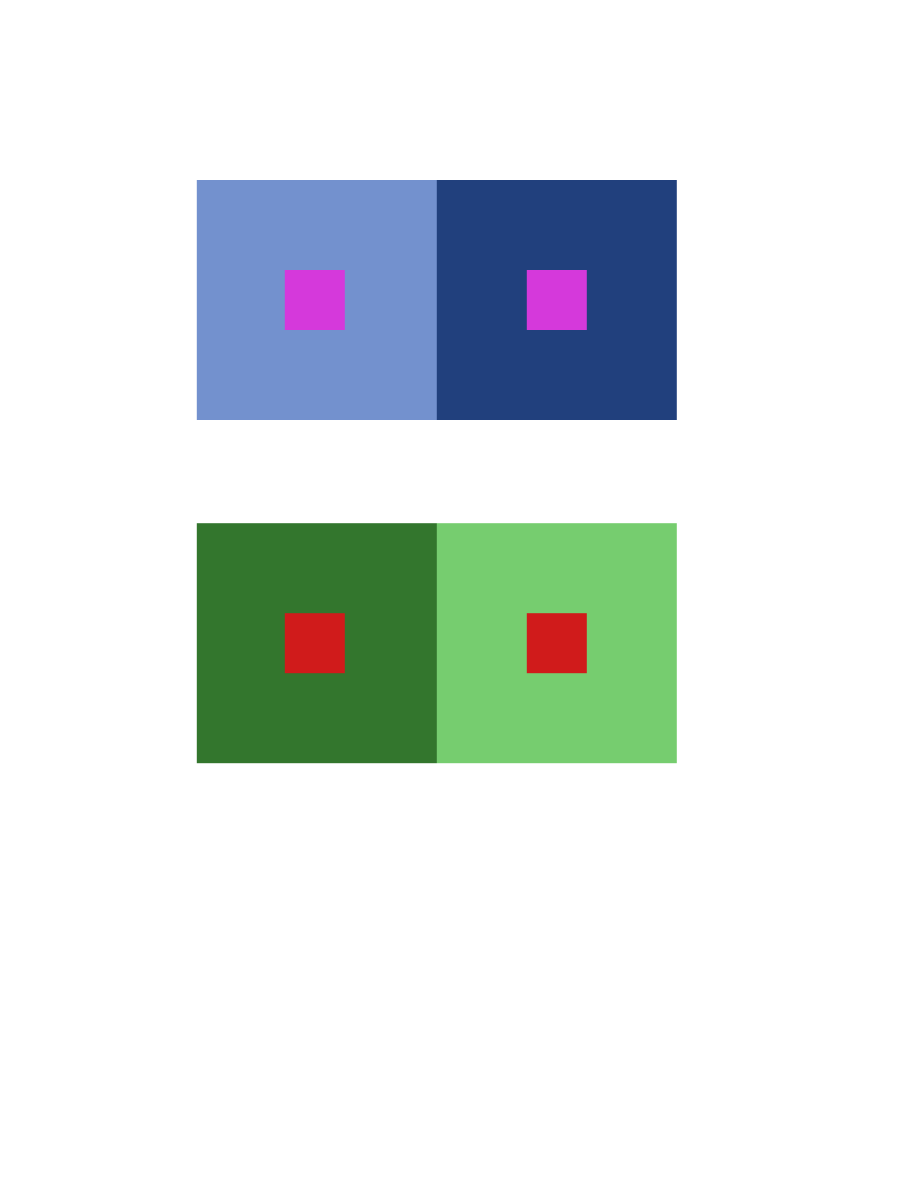
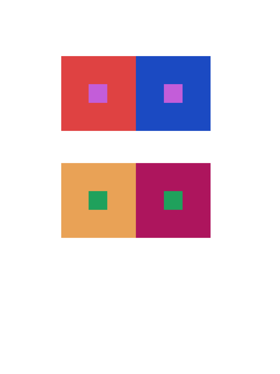
Group 3: For this study, I learned how to make different colors have the same value. The squares in the middle are the same color but the surrounding color make the little squares appear as if they have the same hue as the surrounding color. It took 35 minutes to complete.

Shifting hue and value

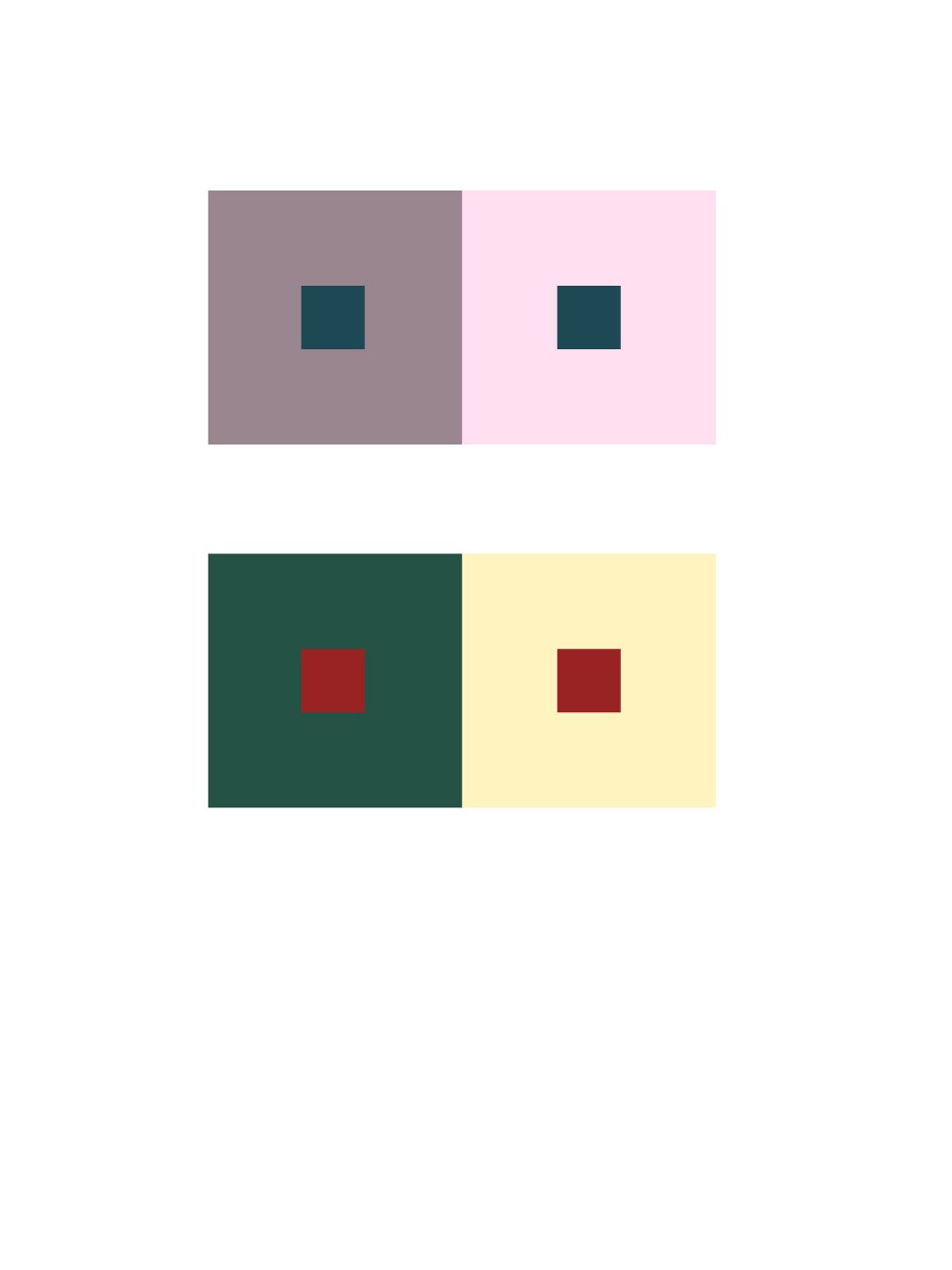
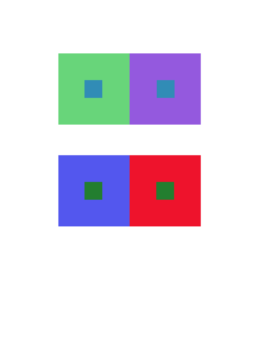
Group 4: For this study, I learned how to change the appearance of the middle squares with different hues and different values. It took 35 minutes to complete.


Project #5: Color Interaction Parings: Phase 2

Group 1 – Achromatic gray studies

colorinteractions_value(group 1)In group one, I think its the most easy part of this phase. All I’m doing is pick two different value colors to make center color look like they have different value, in fact, they have exactly same value.

Time took 10 minutes.

Group 2 – Shifting value (with color)

colorinteractions_value(group 2)

Group two is also kind of easy. I picked a color and change the value of the color to support the center color look different in value.

Time took 10 minutes.


Group 3 – Shifting hue, but not value

colorinteractions_huenotvalue(group 3)In group three, it did challenge me a little. I have to find two different color and make them have same value, and they have to support the center color look like they have different value.

Time took 20 minutes.

Group 4 – Shifting hue and value

colorinteractions_huenotvalue(group 4)

Group four is very similar to group three, the only different part is I can change the value of the two color.

Time took 10 minutes.


Group 5 – Extra Credit

colorinteractions_huenotvalue(gourp 5)Group five is similar to group four, however group four end up with center color looks like has different value, and group five is to change the value of center color to make them look like exactly same, in fact the value are different.

Time took 20 minutes.

Color Interaction Pairings: Phase 2

Group 1: Shifting Value
Group 2: Shifting Value in Color
Group 3: Shifting Hue, Not Value
Group 4: Shifting Hue and Value
Extra Credit: Making Two Different Colors Look Alike

According to this project, I learned different compositions will give us different visual effect. Warm back layer gives an effect of pumping out the composition that over it. Cool back layer opposites that, it gives an effect of inward zooming, like a 3D tunnel. Also when you put the same color on both cool and warm back layers, you will see two colors that exactly same will became two different colors, which called simultaneous contrast, an interesting effect tricks your eyes. I think the most painful part is when you are up on group 4 and extra credit part, because you have already stared on compositions with simultaneous contrast for long time, so the illusion may caused headache and eyes damage. It decreased my concentrations a lot, therefore this part is the best part to challenge yourself as a designer.

I spend around 5-10 minutes on each pairs

Silhouette

Noun

the dark shape and outline of someone or something visible against a lighter background, especially in dim light.

Source – Google Dictionary

I encountered this work while reading the guidelines for project #5 for COMD1100 “The personal icon should be a simple silhouette”

I now know a Silhouette is a black shape/figure outline of someone or something.

Silhouettes


[Glossary Entry 7]

Simultaneous Contrast

Noun

the tendency of a color to induce its opposite in hue, value and intensity upon an adjacent color and be mutually affected in return

Source – Merriam Dictionary

I encountered this word while reading the guide lines for project # 5 in COMD1100.

I now understand that Simultaneous Contrast means opposite in color and value.

[Glossary Entry 6]

Exhibit Catalogue Entry

This exhibit is presented by Jaichan Kirty. Jaichan Kirty was born and raised in Guyana, then moved to New York where he now lives and studies. Gathering inspiration from Tom Phillips’s altered text, A Humument, Kirty curate a project that integrates both words and visuals. Like Phillips, Kirty found an inexpensive used book entitled Portrait of Ivan. The Portrait of Ivan is about a young boy coming of age while he is also discovering himself. Kirty transformed this book into new artistic creations both in appearance, using ink, paint, pencil, cut-outs, and folding. Kirty also created a new title and theme for Portrait of Ivan. He had many ideas into the new title but finally decided on one, which is Portrait Van. The idea behind this new title came from the new juxtaposition theme for Portrait of Ivan, which is mysterious and creepy. This is a juxtaposition of Portrait of Ivan because a boy be coming of age is supposed to be nice and pleasant. The opposite of that is mysterious and creepy. In order for Kirty to create these compositions and start changing Portrait of Ivan into Portrait Van, Kirty blocked out a huge amount of the pages and selected words and phrases to emphasize. He then created images using those words and phrases he wanted to emphasize in that page of the book. The first piece of this exhibit is called “So that’s what it looks like”. Kirty has created a new window (a new view) into this book by using over-lapping to create an illusion of a boy, (Ivan) looking through a new page by cutting a square on the next page in the book. Kirty uses an X-Acto knife to carefully cut this square out of the page. Also Kirty uses sharpie markers to cover up a huge amount of the pages leaving out a few words that create its own new story. These words creates a whole new meaning of this page. “So that’s what it looks like”. The second piece is called “inside the house”. Kirty blocked out a huge amount of the page and selected words and phrases to emphasize. “Opening her eyes” and “Photograph of the house when it’s winter”, which he used to create images. The first image is an eye-opening and then he uses white computer paper to cut out the shape of a house to emphasize the “Photography of the house when it’s winter”. Kirty then used the cut out of the house and glued it on the previous page and used sharpie to create what it seems to be the inside of the house. The third and last piece of this exhibit is called “Blue Print”. “Blueprint” was created when Kirty painted over a picture with saturated primary colors. Kirty painted a blue box and inside that box is a print of a foot-step, hence the title Blue Print. After painting over the picture, Kirty then closed the book allowing the paint to print over on the other page creating a paint splatter effect. The resulting work merges image and text for each new project or concept in both courses he was taking COMD 1100 and English 1101.

Didactic Panels

Panel1

12047420_516917015133080_884622610_n

YingYang Zhang

Born in KaiPing, China

Route of Dreams

X-Acto knife, black bristol, and glue

To represent Of Mice and Men’s themes of dreams and loneliness, Yang used an X-Acto knife to cut out shapes of a dark cloud, lightning, and a bird from black bristol, then glued them on the page to create the obvious composition. The dark cloud and the lightning stand for the obstacles of our dreams, and the bird is used to represent loneliness.

Panel 2

IMG_1990

YingYang Zhang

Born in KaiPing, China

Broken

No. 6H pencil and black big brush

To represent Of Mice and Men’s theme of sacrifice, Yang used a No. 6H pencil and a black big brush to create the concept of pattern. Yang used the No.6H pencil to draw the shape of the pattern, then filled it with the black big brush.  The irregular lines staggered together makes it look like a broken mirror, represent the idea of sacrifice.

Panel 3

IMG_1989

YingYang Zhang

Born in KaiPing, China

Freedom

No. 6H pencil and black big brush

In Freedom, Yang used a No. 6H pencil and a black big brush to create the concept of overlap. Yang first used the No.6H pencil to draw the outline, then filled it with the black big brush. In this page, you only see part of the heart. And the heart is separating in birds shape. Presenting the idea of freedom.