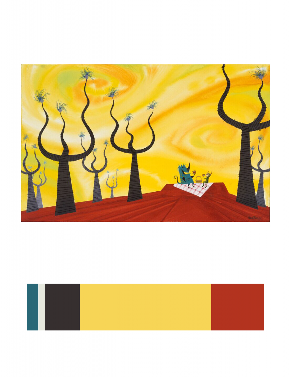
I choose this image (CONCEPT ART, SULLIVAN AND BOO, MONSTERS, INC., 2001) because the feeling this image gives to me is really close to my Humument book’s theme. The theme of the original book is about a resilience in the face of family tragedy, and the new theme is about imagery of fantasy. This image is fantasy because the scenery in the image seem does not exist in real world. Here is link to Cooper Hewitt Research: Here
Total time spend: 2 hour and 50 minutes


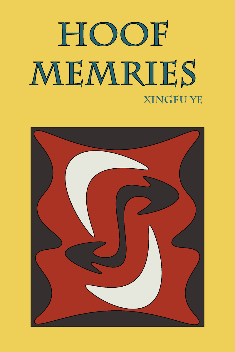
Nice work, I like how the color went well with your book cover. I am just curious is, your tile “Memries” intentionally have no “o”? Does your design at the front have any relation to the theme of your book? Over all, Nice work. In addition, you should mention what program you used.
There’s a nice sense of movement going on with all the curved shapes you used with each of your colors with your design, and there’s sufficient contrast that my eyes are drawn to the shape in the very middle. Overall, with regards to both the color inventory and the cover, I consider it a job well done.