I liked this project, I learned a lot of new skills on illustrator. The most fun was creating the Humument book cover. I use illustrator to demonstrate Color Harmony. I learned that Color Harmony is a palette of hues, shades, tints or tones (saturation) used to produce pleasing color relationships to engage the viewer and it creates a sense of order in the visual experience. There is nothing I think I would change about this project, I finished everything on time and handed in on time.
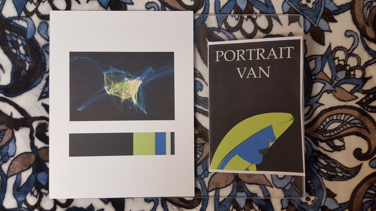


As discussed in class, your cover gives a different impression based on the position from where the viewer is looking at it, which is an interesting effect to consider when moving forward with future projects. The piece you chose for the Proportional Color Inventory is also an intriguing pick in my opinion, at least in part because it stands out among the rest of the class’s, most of which were posters.
I agree with Romie also, how people have different ways of seeing other things that you might no be able to see. I liked how we discussed in class and I mentioned in the class at the different angle, it looked like a banana and than it changed my view to see like a boxer. After you mentioned that he was wearing a hood. However, above all that I think your project went very well. Nice work!