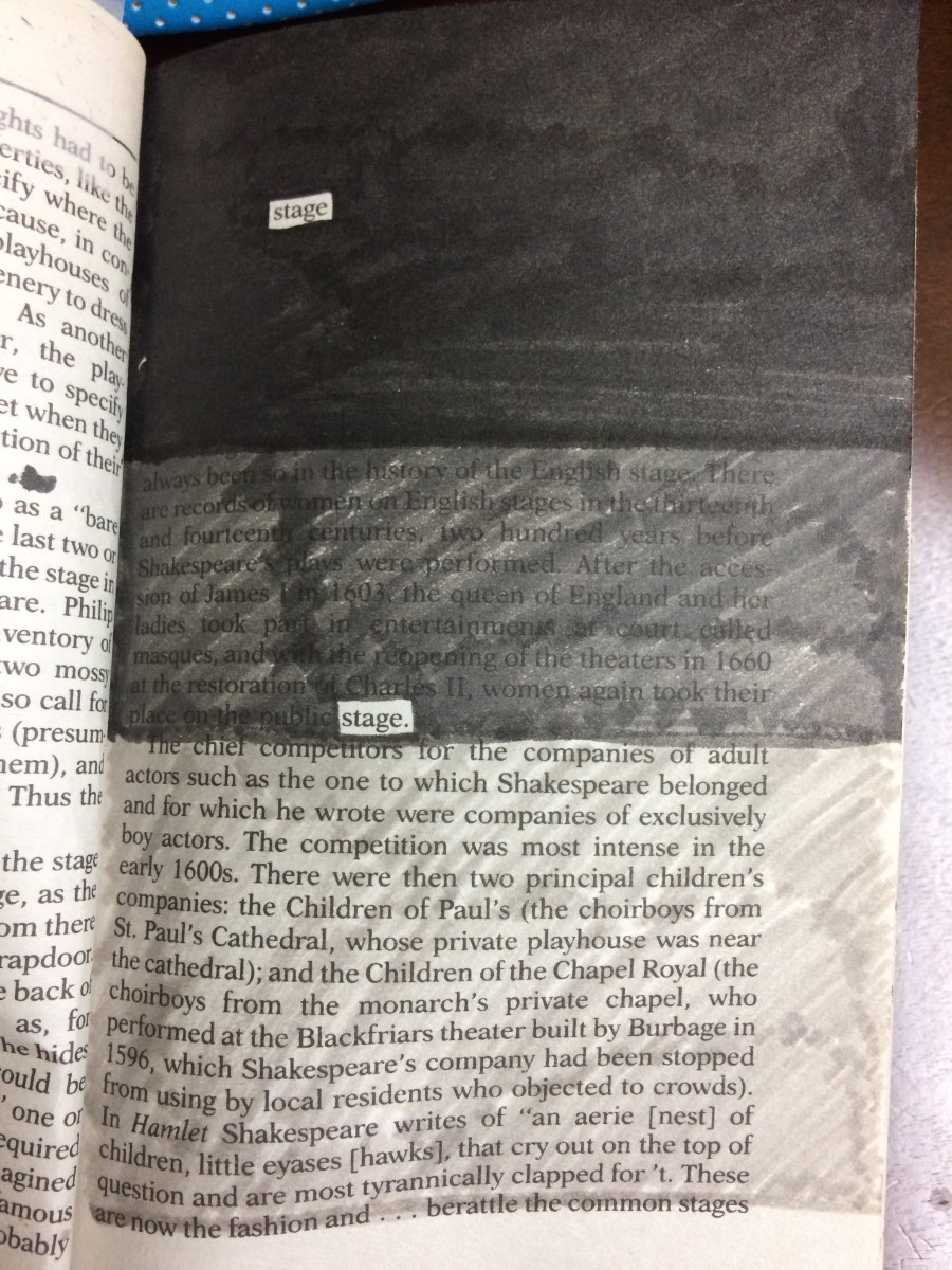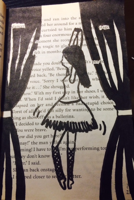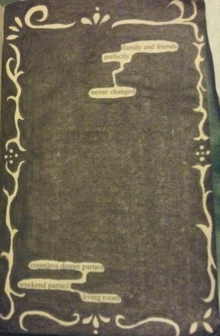
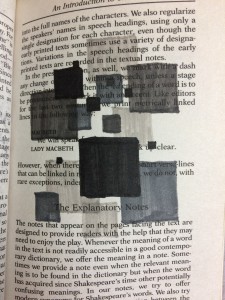
Jingyi Jiao
Title: “The Stage of Value”
Materials: Inking brush pens (black, dark gray, and light gray) and book pages from Shakespeare’s Macbeth.
For this project the artist chose to articulate value, which is the lightness and darkness of a color. Using inking brush pens to block out specific words, Jiao chose the word “stage” to incorporate the fact that Macbeth is a famous play itself. Using the skill of placement, the page shows value from the darkest blacks to no color at all.
———————————————————————————————-
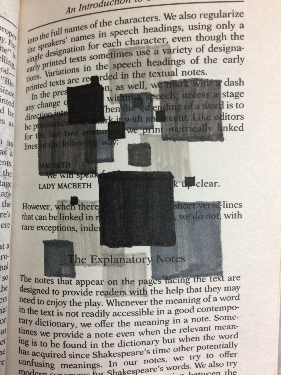
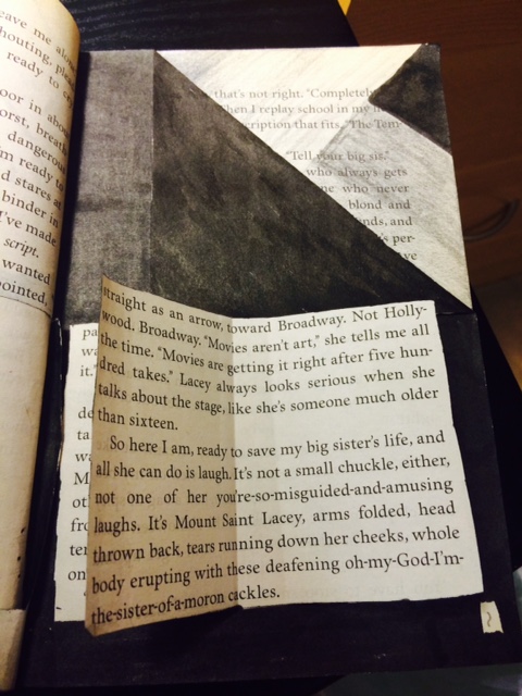
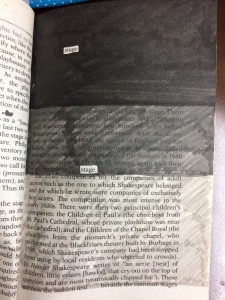
Jingyi Jiao
Title: “Box of dimension“
Materials: Inking brush pens (black, dark gray, and light gray) and book pages from Shakespeare’s Macbeth.
In Box of dimension, Jiao shows technique of overlap. Using inking brush pens to color boxes into different values, the transparent gray colors merged up, and becomes overlapped. By overlapping the boxes with different ranges of value together, it tricks your eyes and gives a 3D feeling.
———————————————————————————————-
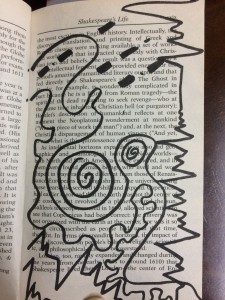
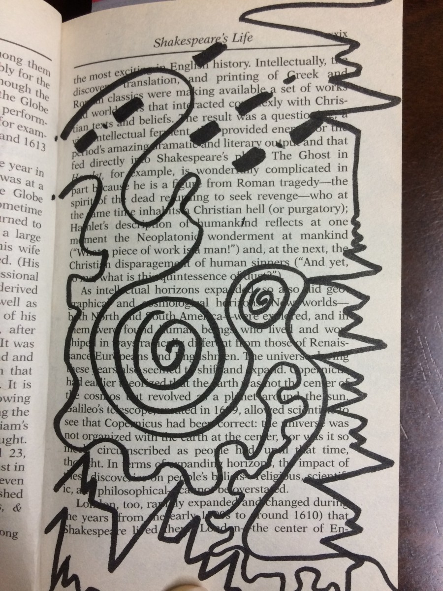
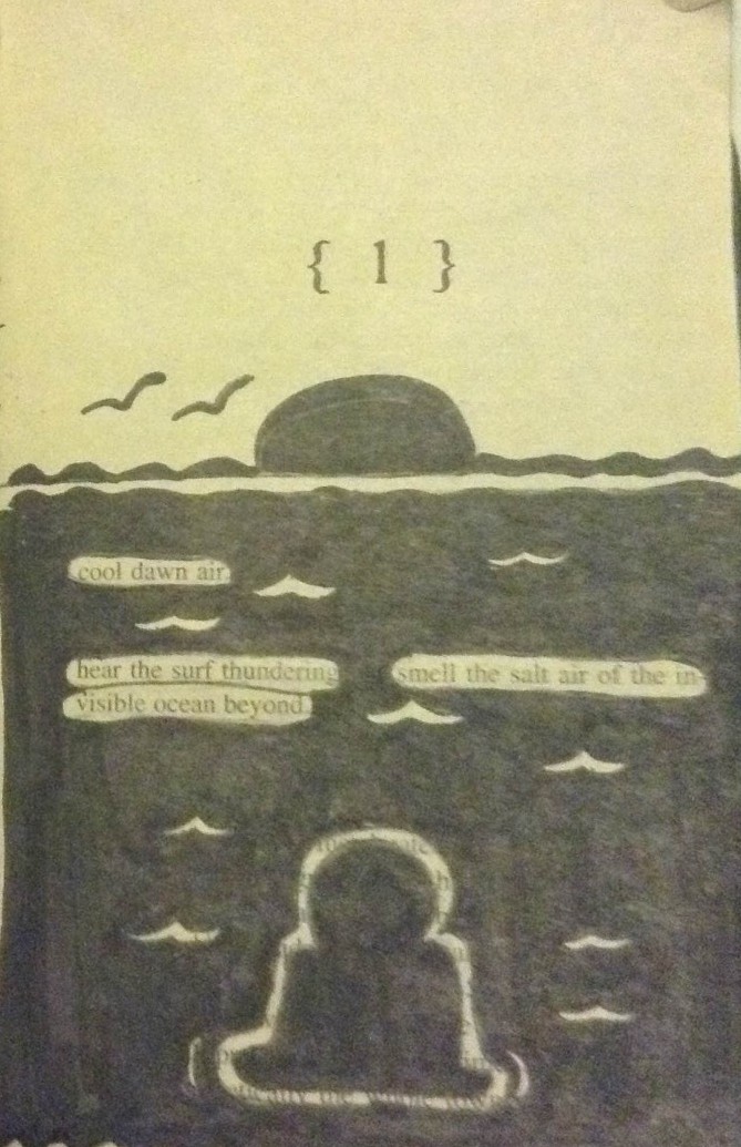
Jingyi Jiao
Title: “Music Party DO-RE-MI“
Materials: Inking brush pen (black) and book pages from Shakespeare’s Macbeth.
In Music Party Do-Re-Mi, it shows Jiao’s learning of rhythmic pattern that she connects with her interest in music. This composition shows the two different rhythms of staccato and legato. Staccato represents sharp patterns while legato represents round patterns. Jiao combines them up by using the creativity to turn music into art.