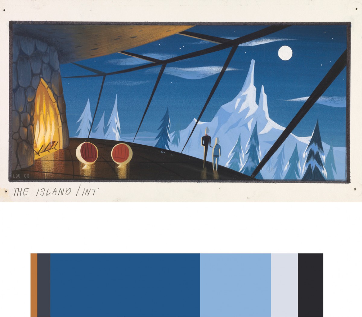
I chose this piece (CONCEPT ART, SYNDROME’S LAIR, THE INCREDIBLES, 2004) created by Lou Romano and Pixar Animation Studios because I thought the color scheme fit with the theme of my humument. The theme of my humument is calmness, lighthearted, and heartwarming. Overall it took about 30 minutes to do.
After drawing inspiration from Saul Bass’ Exodus, I then created my humument cover based on its color scheme. I also decided to do my own rendition of the “flames” due to fire being a running theme throughout the piece.
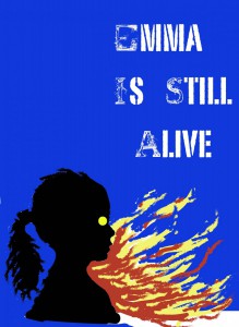
“Emma is Still Alive” is a piece created by aspiring artist Klever Javier Cobena. Drawing inspiration from Tom Phillips “A Humument”, the artist conveys a dark, mystifying, and gruesome atmosphere within his piece, using the contrasting original work of Jane Austen’s “Emma”. The concept behind both of these works is taking any medium of literature (i.e. a book) and turning it it into something completely new using different design aesthetics and artistic techniques. Originally a story of a young girl living in an upper class home in England, Cobena re-works that story with the the intention of driving it as far away from the original concept as possible. Using horror as a medium, Cobena decides to tell a tale of a a gruesome massacre, using only his design aesthetics and few highlighted words already within the pages of the book. Within the composition, a vast majority of the pieces are composed of either black ink, black paint, or black cut paper. Cobena, preferring black as a sort of “negative” color, utilizes materials such as Micron Ink Pens, Pigma Brushes, and Black Gouache Paints to re-work and block out certain words within the pages. With the given emphasis on certain select words that weren’t blocked out, Cobena re-tells the story through the artwork spread throughout the page. Certain examples within “Emma is Still Alive” include pages within like “Here Lies her Sins” and “Vision Of Shadow”, that use overlaps of two pages to create a single composition. Cobena uses nothing more than an exacto knife and a pen to create these overlaps, and express a single idea and theme with an overlap of two pages. Cobena also strongly integrates the concept of certain patterns of staccato nature, and legato nature. Using these concepts, Cobena creates certain moods and certain ideas using patterns differing between these two traits. On one page for example, one can view a sort of blood pattern running down on the words of a page, created using only a colored pencil and an HB sketch pencil. It has a a flowing, smooth pattern, and gives the viewer that feel and imagery of a bloody mess. On another page, there are images of sharp, jagged edges blacked out with a pigma brush, giving the viewer a sense of danger. Other design asthetics included with the piece also include ambigeouity, where Cobena utilizes the words on the page to create a layout that is very eye wandering and complex. There are also stable compositions, where he instead makes a focal point on the composition, drawing the viewers attention to a specific spot. Although most of these pages consists of mostly black color schemes, there are also works of color included within the piece. Cobena skillfully shifts certain traits of pure bright colors like prismatic blues and reds, to make them less saturated, decreasing their value, and keeping the visualities of darkness and negativity to stick to his theme. All while conveying their intense expressions and ideas they were intended to.
“Emma is Still Alive” is a piece created by aspiring artist Klever Javier Cobena. Drawing inspiration from Tom Phillips “A Humument”, the artist conveys a dark, mystifying, and gruesome atmosphere, using the contrasting original work of Jane Austen’s “Emma”. The concept behind both of these works is taking any medium of literature (i.e. a book) and turning it it into something completely new using different design aesthetics and artistic techniques. and Originally a story of a young girl living in an upper class home in England, Cobena re-works that story with the the intention of driving it as far away from the original concept as possible. Using horror as a medium, Cobena decides to tell a tale of a a gruesome massacre, using only his design aesthetics and few highlighted words already within the pages of the book. Within the composition, a vast majority of the pieces are composed of either black ink, black paint, or black cut paper. Cobena, preferring black as a sort of “negative” color, utilizes materials such as Micron Ink Pens, Pigma Brushes, and Black Gouache Paints to re-work and block out certain words within the pages. With the given emphasis on certain select words that weren’t blocked out, Cobena re-tells the story through the artwork spread throughout the page. Certain examples within “Emma is Still Alive” include pages within like “Here Lies her Sins” and “Vision Of Shadow”, that use overlaps of two pages to create a single composition. Cobena uses nothing more than an exacto knife and a pen to create these overlaps, and express a single idea and theme with an overlap of two pages. Cobena also strongly integrates the concept of certain patterns of staccato nature, and legato nature. Using these concepts, Cobena creates certain moods and certain ideas using patterns differing between these two traits. On one page for example, one can view a sort of blood pattern running down on the words of a page, created using only a colored pencil and an HB sketch pencil. It has a a flowing, smooth pattern, and gives the viewer that feel and imagery of a bloody mess. On another page, there are images of sharp, jagged edges blacked out with a pigma brush, giving the viewer a sense of danger. Other design asthetics included with the piece also include ambigeouity, where Cobena utilizes the words on the page to create a layout that is very eye wandering and complex. There are also stable compositions, where he instead makes a focal point on the composition, drawing the viewers attention to a specific spot.
This exhibit is presented by Jaichan Kirty, Jaichan Kirty was born and raised in Guyana, then moved to New York where he now lives and studies. Gathering inspiration from Tom Phillips’s altered text, A Humument, Kirty curate a project that integrates both words and visuals. A Humument is an altered book has unique combinations of literary and art, the author merged art with the connotation of specific words to exhibit two different genres into one. This book created by Tom Phillips, was released in 20th century. Like Phillips, Kirty found an inexpensive used book entitled Portrait of Ivan.The Portrait of Ivan is about a young boy coming of age while he is also discovering himself. Kirty transformed this book into new artistic creations both in appearance, by using ink, paint, pencil, cut outs, and folding.
Kirty also created a new title and theme for Portrait of Ivan.He had many ideas into the new title but finally decided on one, which is Portrait Van. The idea behind this new title came from the new juxtaposition theme for Portrait of Ivan, which is mysterious and creepy. This is a juxtaposition of Portrait of Ivan because a boy coming of age is supposed to be nice and pleasant. The opposite of that is mysterious and creepy. In order for Kirty to create these compositions and start changing Portrait of Ivan into Portrait Van. Kirty blocked out a huge amount of the pages and selected words and phrases to emphasize. He then created images using those words and phrases he wanted to emphasize in that page of the book.
The first piece of this exhibit is called, So that’s what it looks like. In English 1101, Kirty learned ahout over lapping New Yorks, which he incorporate in this pieces. Overlapping New Yorks include juxtapositions such as old and new, residential and commercial, historic and replaceable, natural and man-made, constructed and under-construction, well maintained and in disrepair, celebrated and forgotten, etc. Kirty has created a new window (a new view) into this book by using over lapping to create an illusion of a boy, who is Ivan, looking through a new page. He did this by cutting a square on the next page in the book. Kirty uses an X-Acto knife to carefully cut this square out of the page. Also, Kirty uses sharpie markers to cover up a huge amount of the pages leaving out a few words that create its own new story. These words creates a whole new meaning of this page. “So that’s what it looks like”.
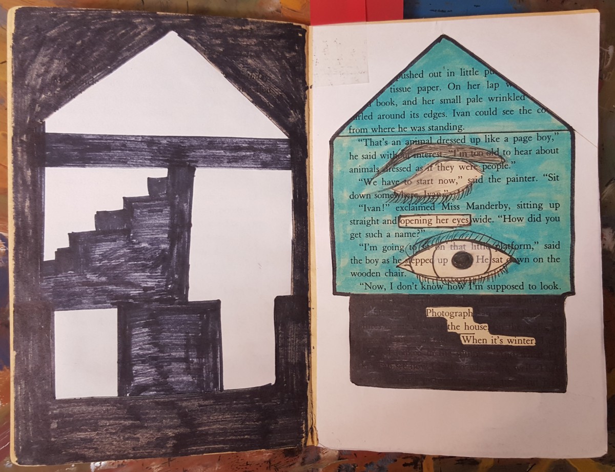
The second piece is called, Inside the House. In COMD 1100 Kirty learned about Shape (Organic, Geometric), Frame, Figure-Ground (Obvious, Ambiguous), Unity, Economy which he incorporate in this piece by blocking out a huge amount of the page and selected words and phrases to emphasize. “Opening her eyes” and “Photograph of the house when it’s winter”, which he used to create images. The first image is an eye-opening, which Kirty showed by drawing a closed eye and a second eye which is opened. This represents organic shapes. Then he uses white computer paper to cut out the shape of a house to emphasize the “Photography of the house when it’s winter”. Kirty chose white paper because snow is white and snow falls in the winter. Kirty then used the cut out of the house, which is the silhouette and glued it on the previous page. Also useing sharpie to create what it seems to be the inside of the house. This represented Geometric shapes.
The third and last piece of this exhibit is called, Blue Print. “Blueprint” was created when Kirty painted over a picture with saturated primary colors. Also, in COMD1100 Kirty learned about creating simple compositions demonstrating an accurate understanding of saturation, which includes Hue, Saturation, Prismatic Color, Muted Color, Chromatic Gray, Achromatic Gray, Luminosity, Primary Colors, Secondary Colors, Complementary Colors, Warm, Cool, CMY, RGB, RYB color models/systems. Kirty represted this concept by painting a blue box, and inside that box is a print of a foot-step, hence the title Blue Print. After painting over the picture, Kirty then closed the book allowing the paint to print over on the other page creating a paint splatter effect.
Panel #1
So that’s what it looks like
Jaichan Kirty
Born 1996 in Guyana
Lives and studies in New York
_________________________________________ Oh! So that’s what it looks like,2015
Sharpie on paper, 7.5″ x 5″
Kirty created this piece using an X-Acto knife to carefully cut this square out of the page, revealing the Portrait of Ivan that is on the previous page. Also, Kirty uses sharpie markers to cover up a huge amount of the pages leaving out a few words that create its own new story; Oh! So that’s what it looks like.
Panel #2
Inside the House
Jaichan Kirty
Born 1996 in Guyana
Lives and studies in New York
_________________________________________ “Inside the House” 2015
Sharpie on paper, White computer paper, Highlighter, 7.5” x 10”
Kirty blocked out a huge amount of the pages using a sharpie marker. While selecting words and phrases to emphasize, “Opening her eyes” and “Photograph of the house when it’s winter”. Which he used to create images. Kirty uses paper to cut out the shape of a house. The cut out of the house was glued on the previous page.
Panel #3
Blueprint
Jaichan Kirty
Born 1996 in Guyana
Lives and studies in New York _________________________________________
“Blueprint” 2015 Paint on paper, 7.5″ x 10″
“Blueprint” was created when Kirty painted over a picture with the saturated primary colors which includes blue, red and yellow. Kirty painted a blue box, and inside that box is a print of a foot-step. After painting over the picture, Kirty then closed the book allowing the paint to print over on the other page creating a paint splatter effect.
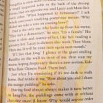
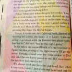
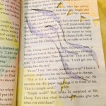
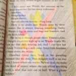
This exhibition is presented by the artist Tyler Santiago. Tyler Santiago was born and raised in Ozone Park, New York and still resides there and studies at New York City College of technology. Santiago got the inspiration from Tom Phillips re creation of a book called the Human Document but Phillips called it “The Humument”. Santiago’s title “essence come from part of the actual book he used which was a book written by Tillie Olsen called Silences. Santiago took the word Silences and jumbled up the words to create his title. Santiago made this book into his own creation based on what he learned in his classes Eng1101 and COMD1100. His concepts come from stuff like negative and positive space and juxtaposition the overlapping of something. Santiago used basic materials like rulers, black inking pens, and black inking brush. The first piece of work of Santiago’s book is called “silences” which shows negative and positive space and has a obvious focus point with the circled word silences. The second page that has all the word blacked out except the word “of” is called “isolation”. On the third page is called “Geometry” which shows negative and positive space and it shows geometric shape with a focus point where the word Literature is, and the first 3 pages are suppose to go together. The next page is called “The Beat” which represents a sound wave, which shows staccato. The next page titled “Flakes” which represents variety in size. The next page called “Swirls” represents a pattern of legato movement. On the next page is a piece call “Swoosh” are a bunch of line and in this piece it shows movement, And on the last page Santiago wanted to show what he learned in ENG1101 of Juxtaposition, this piece of work is call “New York”.
Jaichan Kirty
Born 1996 in Guyana
Lives and studies in New York
_________________________________________ Oh! So that’s what it looks like,2015
Sharpie on paper, 7.5″ x 5″
Kirty created this piece using an X-Acto knife to carefully cut this square out of the page, revealing the Portrait of Ivan that is on the previous page. Also, Kirty uses sharpie markers to cover up a huge amount of the pages leaving out a few words that create its own new story; Oh! So that’s what it looks like.
Panel #2
Inside the House
Jaichan Kirty
Born 1996 in Guyana
Lives and studies in New York
_________________________________________ “Inside the House” 2015
Sharpie on paper, White computer paper, Highlighter, 7.5” x 10”
Kirty blocked out a huge amount of the pages and selected words and phrases to emphasize, “Opening her eyes” and “Photograph of the house when it’s winter”. Which he used to create images. Kirty uses paper to cut out the shape of a house. The cut out of the house was glued on the previous page.
Panel #3
Blueprint
Jaichan Kirty
Born 1996 in Guyana
Lives and studies in New York _________________________________________
“Blueprint” 2015 Paint on paper, 7.5″ x 10″
“Blueprint” was created when Kirty painted over a picture with the saturated primary colors. Kirty painted a blue box, and inside that box is a print of a foot-step. After painting over the picture, Kirty then closed the book allowing the paint to print over on the other page creating a paint splatter effect.
Born in Japan, Tokyo
Lives and studies in New York City
——————————————————————————————-
Book of Wonder, 2015
Ink brush pen, and used paper bag book.
Understanding Tom Phillips’ concept behind his creative art work, Ayano Morishima combined different skills she learned from her Graphic design principle and English class to create a humument book. She changed the theme of the book, Wishes to a crazy wonderland concept to show completely different side of wonderland, where She used patterns to represent the chandelier and doors that connects to the theme.
Picture Perfect Family and Love Exists 2015
Pigma Micron Pens(0.2, 0.5 and Brush), Faber-Castell Brush Pen, scissors and various pencils(HB-6B).
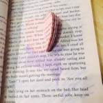
While combining concepts from graphic design and linguistic language, Brandy Ortiz made compositions with themes that juxtapose from the original theme from the novel “Brimestone” by Douglas Preston and Lincoln Child. The theme for the pages she constructed shows love while the theme for “Brimestone” is thriller. “The Picture Perfect Family” shows the message from the selected text by making a frame within the margins. The frame was first made by using the pens to make an outline. Then with the Faber-Castell Brush Pen she inked the page while leaving out the selected text to be revealed. The message explains a family that enjoys getting together and the frame makes the text appear to be the picture. “Love Exists” has the text appear from cutting out certain words from various pages to show all on one page. The idea behind the message was that love is a great feeling to have in the world we live in. Most of the page is shaded by pencil and represents low key. The heart shows that love will always be there even when surround by darkness.