Josef Müller-Brockmann was a celebrated twentieth century Swiss graphic designer and teacher. He studied design, architect and history of art. Moreover, he worked as a European design consultant. His works had been exhibited in Zurich, Hamburg and Bern.
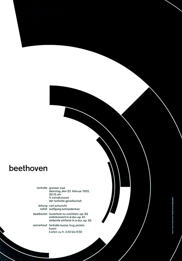
Born on May 9, 1914, Müller-Brockmann grew up in Rapperswil, Switzerland. He began his career as an apprentice to the designer and advertising consultant Walter Diggelman before, in 1936, establishing his own Zurich studio specialising in graphics, exhibition design and photography. By the 1950s he was established as the leading practitioner and theorist of Swiss Style, which sought a universal graphic expression through a grid-based design purged of extraneous illustration and subjective feeling. His ‘Musica viva’ poster series for the Zurich Tonhalle drew on the language of Constructivism to create a visual correlative to the structural harmonies of the music. Müller-Brockmann was founder and, from 1958 to 1965, co-editor of the trilingual journal Neue Grafik (New Graphic Design) which spread the principles of Swiss Design internationally. He was professor of graphic design at the Kunstgewerbeschule, Zurich from 1957 to 1960, and guest lecturer at the University of Osaka from 1961 and the Hochschule fur Gestaltung, Ulm from 1963. From 1967 he was European design consultant for IBM. He is the author of The Graphic Artist and his Design Problems (1961), History of Visual Communication (1971), History of the Poster (with Shizuko Müller-Yoshikawa, 1971) and Grid Systems in Graphic Design (1981). He has contributed to many symposiums and has held one-man exhibitions in Zurich, Bern, Hamburg, Munich, Stuttgart, Berlin, Paris, New York, Chicago, Tokyo, Osaka, Caracas and Zagreb. In 1987 he was awarded a gold medal for his cultural contribution by the State of Zurich.
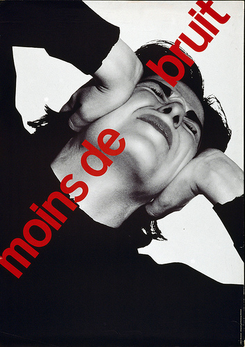
Beyond educating himself on the rules of typography, JMB focused on photography as his pictorial medium, the ultimate choice for objective imagery. With no “Photoshop” enhancement in that era, photography still had the power to bring a sense of clarity and honesty to the message, holding true to the objective intent of purity of information.
In 1953, JMB began sharing a studio with photographer Ernest A. Heiniger and began employing fellow photographer Serge Libiszewski as a design resource. Libiszewski was part of this new discipline in Germany known as “subjektive fotografie”. Also influenced by the “die neue typographie” philosophy of Jan Tschichold, Müller-Brockmann embraced the use of experimental photography of montage and photograms.
Eventually, JMB’s subjective expressive approach to photography changed toward the pragmatic objective. Still holding true to Tschichold’s philosophy of an “emphasis upon the clear and incorruptible characteristic of photography”, but now evolving toward a harmony and balance within the structural compositions. Integration of type, image, and form brought credibility to the image as a whole.
In an interview, Müller-Brockmann was asked about his inclination toward systematic order in designing given he advocated objective and radically minimalist geometric design and was the one who invented grid system for graphic design. In response, he explained that finding order in everything is rather a wishful thinking on his part. However, he always aspired to attain a distinct arrangement of typographic and pictorial elements. He claimed that the white reverse sides of his posters were his best work. He was once influenced by Carl Jung but later grew withdrawn. He was of the view that the unconscious is part of the support structure of his work. In his work he aspired to communicate information about an idea, event or product as vividly as possible. In fact, his work is not intended to make a timeless statement but rather to invite his audience to form their own opinion on the subject.
Josef Müller-Brockmann: Order was always wishful thinking for me. For 60 years I have produced disorder in files, correspondence and books. In my work, however, I have always aspired to a distinct arrangement of typographic and pictorial elements, the clear identification of priorities. The formal organisation of the surface by means of the grid, a knowledge of the rules that govern legibility (line length, word and letter spacing and so on) and the meaningful use of colour are among the tools a designer must master in order to complete his or her task in a rational and economic matter.
Josef Müller-Brockmann work is best known for its simple designs and clean use of typography. The shapes and colors he incorporated in his work still inspire the graphic designers of current generation. As with most graphic designers that can be classified as part of the Swiss International Style, Joseph Müller-Brockmann was influenced by the ideas of several different design and art movements including Constructivism, De Stijl, Suprematism and the Bauhaus. He is perhaps the most well-known Swiss designer and his name is probably the most easily recognized when talking about the period.
Swiss style Often referred to as the International Typographic Style or the International Style, the style of design that originated in Switzerland in the 1940s and 50s was the basis of much of the development of graphic design during the mid 20th century. Led by designers Josef Müller-Brockmann at the Zurich School of Arts and Krafts and Armin Hofmann at the Basel School of Design, the style favored simplicity, legibility and objectivity. Of the many contributions to develop from the two schools were the use of, sans-serif typography, grids and asymmetrical layouts. Also stressed was the combination of typography and photography as a means of visual communication. The primary influential works were developed as posters, which were seen to be the most effective means of communication.
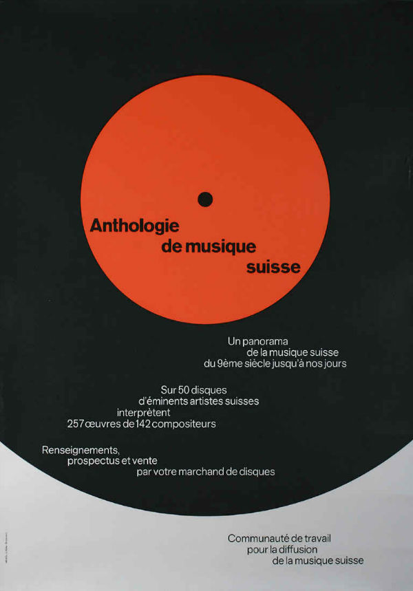
His design sense of the 1950s aimed to create posters that communicated with the masses. This was no small feat as the pieces had to communicate across a language barrier, with English, French, German and Italian speaking populations in Switzerland alone. It was the harmony and simplicity of these pieces that influenced a post-war world that had lost the sense of central nationalism and gained a lesson in the need for globalization. Müller-Brockmann was soon established as the leading practitioner and theorist of the Swiss Style, which sought a universal graphic expression through a grid-based design, purged of extraneous illustration and subjective feeling.
Perhaps his most decisive work was done for the Zurich Town Hall as poster advertisements for its theater productions. He published several books, including The Graphic Artist and His Problems and Grid Systems in Graphic Design. These books provide an in-depth analysis of his work practices and philosophies, and provide an excellent foundation for young graphic designers wishing to learn more about the profession. He spent most of his life working and teaching, even into the early 1990s when he toured the US and Canada speaking about his work. He died in Zurich in 1996.
Links:
http://www.famousgraphicdesigners.org/josef-muller-brockmann
http://www.designishistory.com/1940/joseph-mueller-brockmann/
http://www.eyemagazine.com/feature/article/reputations-josef-muller-brockmann
http://www.designishistory.com/home/swiss/