In 1960, Tom Monaghan and his brother, James, purchased DomiNick’s, a small pizza store in Ypsilanti, Michigan, near Eastern Michigan University. The deal was secured by a $500 down payment, and the brothers borrowed $900 to pay for the store.[8] The brothers planned to split the work hours evenly, but James didn’t want to quit his job as a full-time postman to keep up with the demands of the new business. Within eight months, James traded his half of the business to Tom for the Volkswagen Beetle they used for pizza deliveries. By 1965, Tom Monaghan had purchased two additional pizzerias; he now had a total of three locations in the same county. Monaghan wanted the stores to share the same branding, but the original owner forbade him from using the DomiNick’s name. One day an employee returned from a pizza delivery and suggested the name Domino’s. Monaghan immediately loved the idea and officially renamed the business Domino’s Pizza, Inc. in 1965.
One important factor that has helped Domino’s pizza over the years is the distinctive look of their logo. The bright and appealing colors stand out to people passing nearby and, with exposure to millions across the world; Dominos has become the place that many people think of first when they want to order a pizza. For anyone who seeks to create a branding empire of their own, it is important to consider the lessons and history of the Dominos brand.
The very first Dominos logo, which was created in the 1960’s, was created for two reasons. First it sought to attract more customers due to the bright and cheerful colors of the logo. The red, white and blue colors were meant to be highly noticeable so as to appeal to the largest amount of people possible. The three dots on the logo symbolize the three original Dominos locations that were open at the time. As the company planned to work hard on franchises, they planned to add a dot each time that a new location opened. Of course, with the incredible success of the Dominos brand, this plan was scrapped because the logo would otherwise need thousands of dots.
In 1987, the company decided to apply a minor change to their logo. First to be changed was the colors of the logo. While the general color scheme remained the same, the colors were made much more striking. This served to make the logo much more distinguishable to people on the roadside and people online. They also decided to flip the logo on its side. This had the effect of making the logo even easier for passerby to see, bringing in more customers.
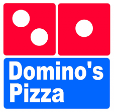
By 1996, the logo was altered to look like a diamond. The red domino became a bit darker, and the Domino’s Pizza text was altered again. This logo still appears in other countries and on most store signs or merchandise, but television ads have started using the new logo. In 2015, it was reused on television ads where Domino’s Pizza becomes Domino’s.
The current Dominos logo was created in early 2012. This logo kept the famous dominos icon, but removed the word pizza from the slogan, only showing the company name Dominos. This showed how powerful the Dominos brand has become. The logo is no longer includes the word “pizza”. Do they no longer want to be associated with pizza? Domino’s chief marketing officer Russell Weiner told AdAge, “So much of our menu is beyond pizza right now that we feel like we’re more than just a pizza place.” Things on Domino’s menu that are not pizza: Pasta, chicken wings, sandwiches, stuffed cheesy bread, bread bites, bread sticks, cinnamon bread sticks, and chocolate lava cake. So, many things that involve dough and/or sauce.
There can be no doubt that the Dominos logo is effective. Dominos has become a household name both in the United States and across the world bringing in billions of dollars every year. The success of the logo can probably be attributed to staying power. Dominos, unlike many other companies out there, has never really tried to reinvent their logo meaning that they have had many years to cultivate their customer base.
1960-1987
1987-1996
1996-2012
2012-present
Links:
https://www.logaster.com/blog/dominos-logo/
http://www.eater.com/2012/8/14/6555341/dominos-removes-pizza-from-its-new-logo
https://www.quora.com/What-does-Dominos-logo-mean
http://logos.wikia.com/wiki/Domino’s

