Color Interaction Parings: Phase 4

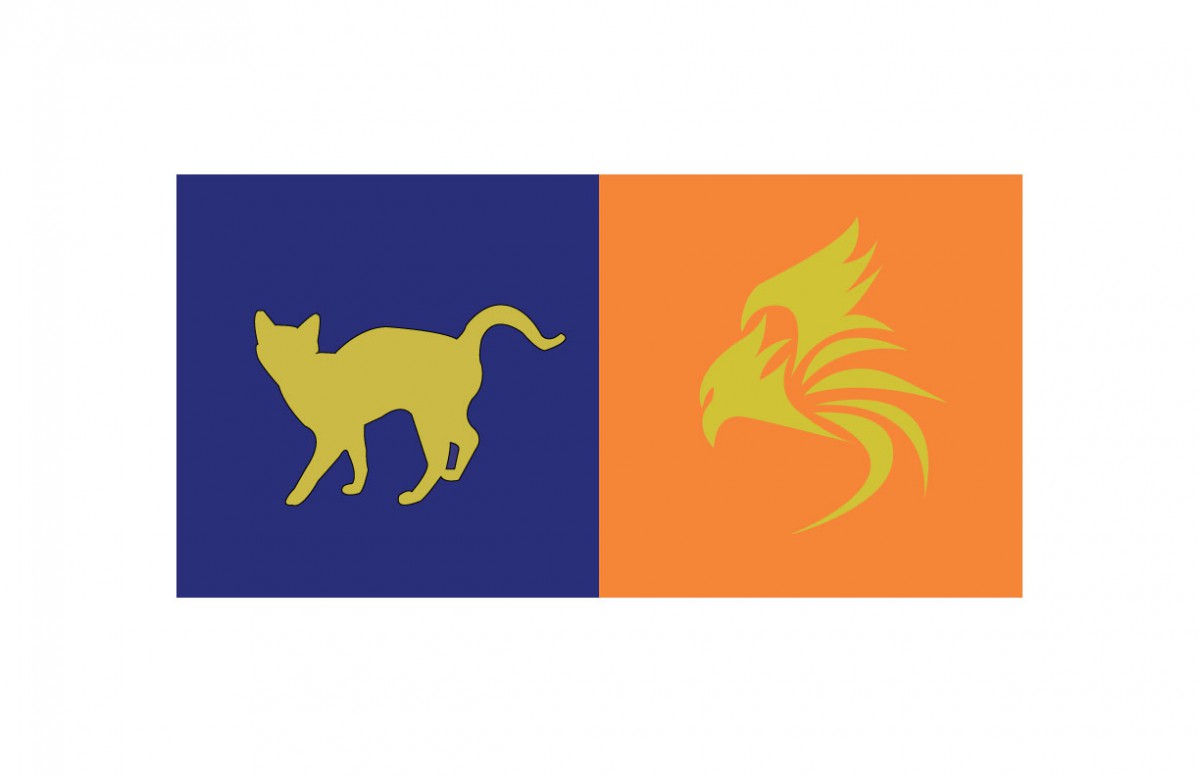
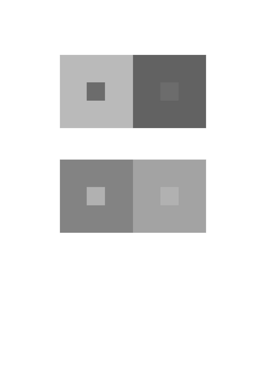
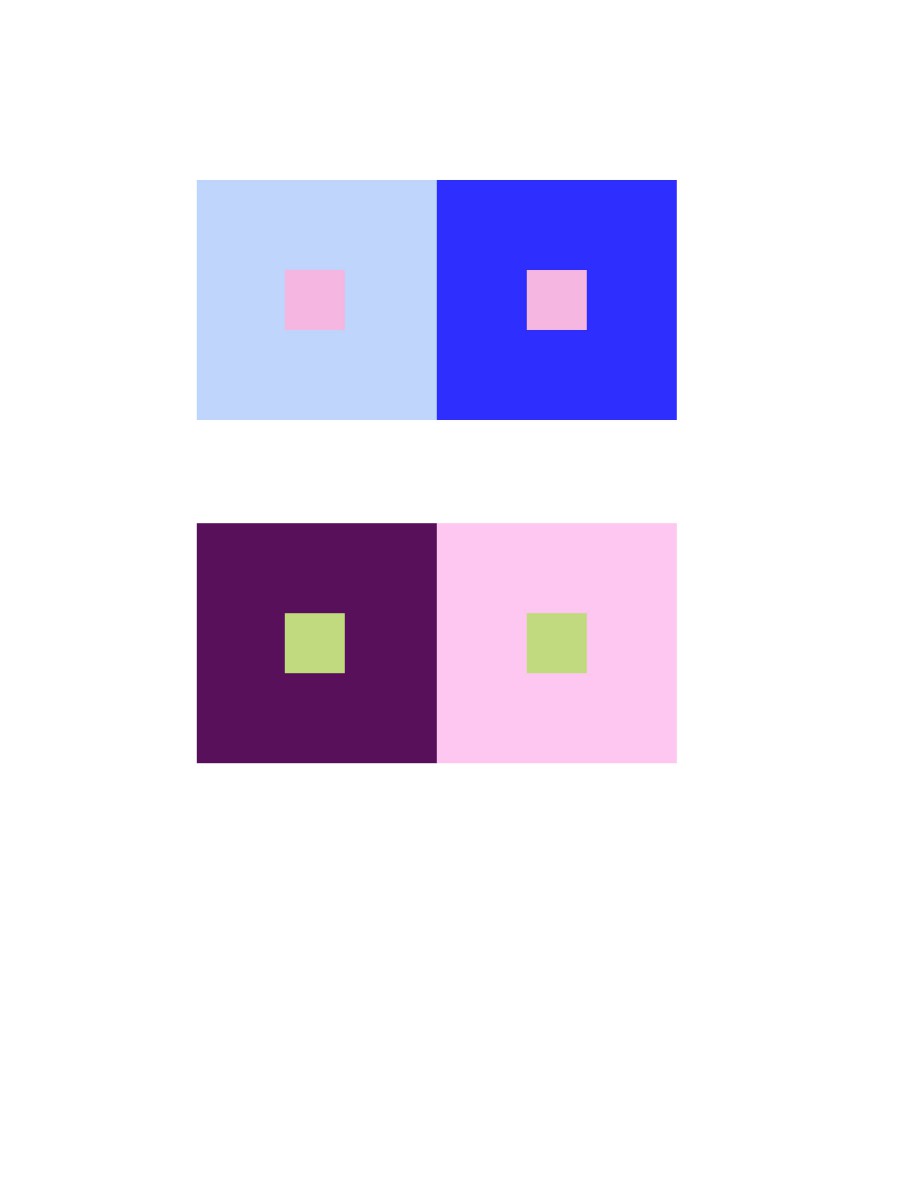
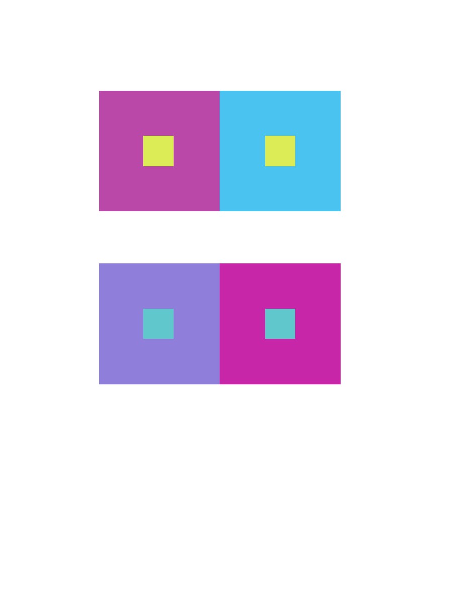
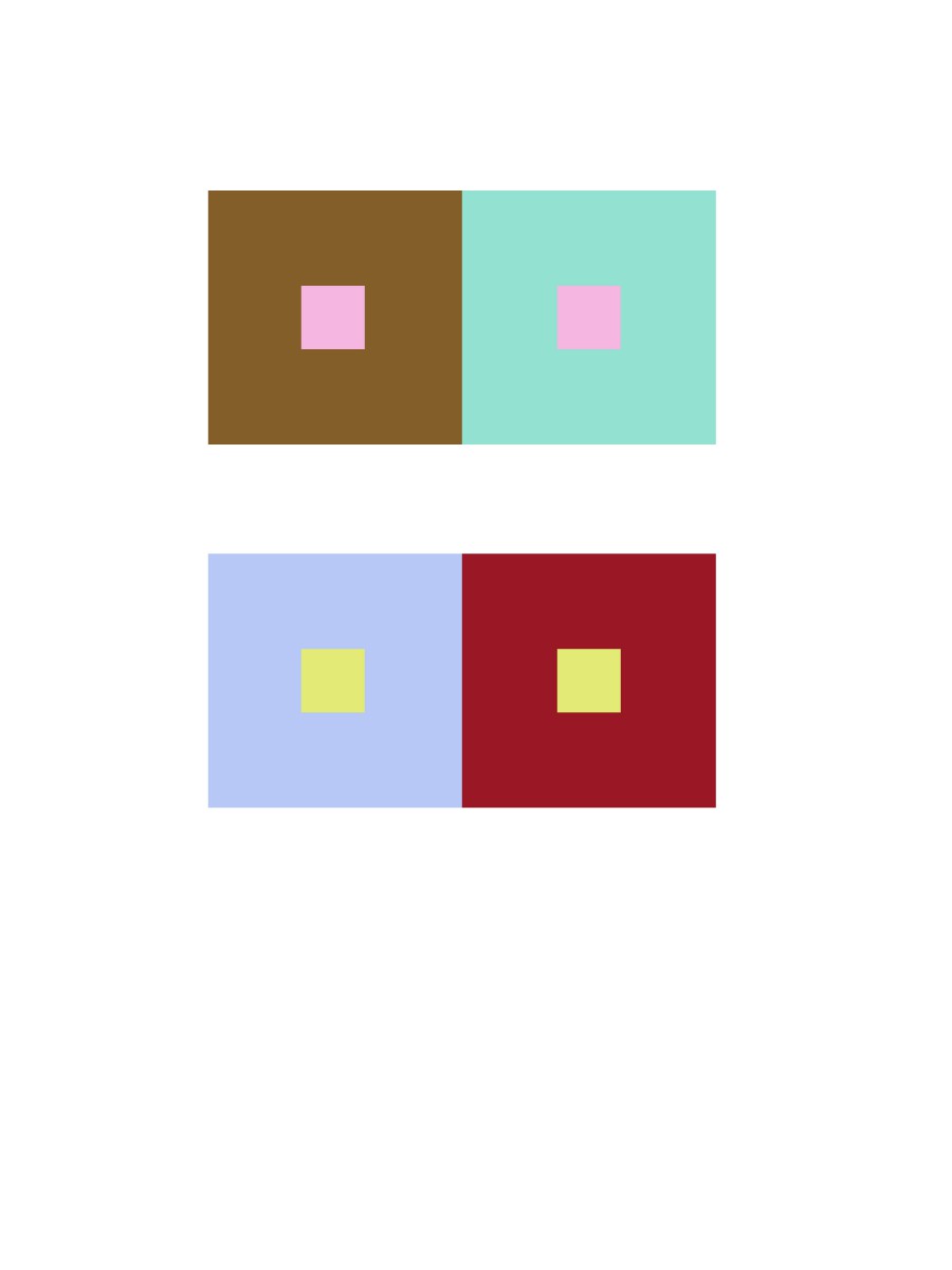
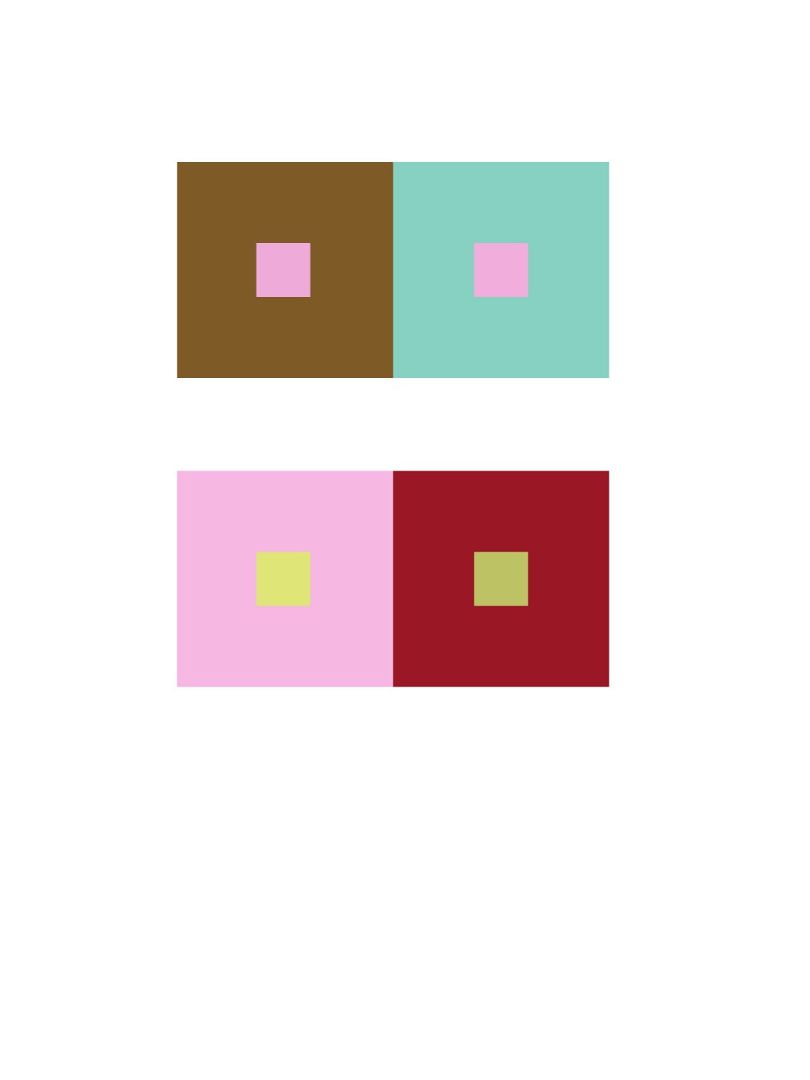
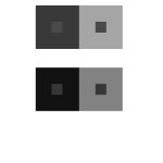
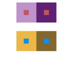
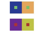
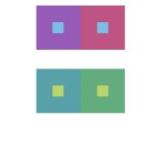
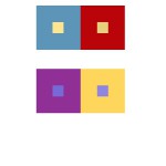
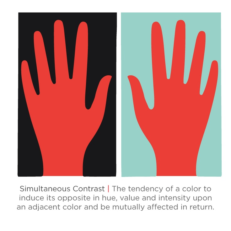
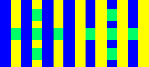
For this project, I learned the meaning of the color interaction such as simultaneous contrast, optical mixing, and complementary colors. The fun part of the project, we have to create total 8 pairs of color studies will explore interaction by shifting value, shifting value with color, shifting hue, but not value and shifting hue and value. It was really fun at the first time and tried to analyze the different between those color. The important part of this project I really liked is phase 3 (Paired Color Identities with Simultaneous Contrast), because we have to observe our partner, try to find the perfect color to represent his/her personality, that is really fun to research the meaning of the color. Since we used the illustrator to create the 8 pairs of color studies, the phase 3 part will be easy and effective to make it. I would not change anything of this project.

tkandklevercolorinteraction

Color Interaction Parings: Phase 3

tkandklevercolorinteraction

I thought this project was fun. For this project, Klever and me picked a color that represents us for the color and the logo. These logo and color have to represent our personality which is yellow at the logo, because we are positive, clarity, energy, optimist person.  Then Klever chose the blue color that represents my personality such as bubbly, reserved, shy, etc. I never think I’ll be a blue color person, that is the first time someone say it. In my observation, Klever is a talkative, positive, optimistic person, when I see the meaning of an orange color, the color is represent his personality very definitely. After that, we had to come up some idea for the logo, than I saw his necklace which was a bird from the movie (hungry game). I came up some idea like phoenix or bird that prominent his personality, because Klever has leadership at the class participation. When I used to draw the logo of the illustrator, it took me half hour to finish it. I know how to use the illustrator that is more helpful and save a lot of times to create it. I really liked this part of the project 5, and thank you to my partner Klever who understands and help me a lot of this project.

Color Interaction Parings: Phase 4

Color Interaction Parings
Color Interaction Parings (Right: Romie/Left: Ayano)

For this project, I had to use my knowledge of color interaction, where the color are the same but the background color tricks our eyes to see differently. Also, because of how one is more d saturated, and other are much more muted color. Making the logo stand pop out or sinks it in. The hardest thing to do for this project was where we have to come up with a logo. We had trouble at first, however we decided on using abstract piece. (Explained in Phase 3) Took me about four hours and forty minutes in total, with sketching and everything.

Color Interaction Parings: Phase 3

Color Interaction Parings

I really liked this part of the project, since we were able to work with a partner and use illustrator. For this project, me and my partner Romie picked a color that represents us both for the logo color and picked a relative personality color that represented us separately. We came up with idea for the logo should be a abstract. I think it was a great idea, since many people done a silhouette of an animal. I came up with this logo that combined with Romie ‘s hobbies. (*On the right) Including the curves that represents the creativeness and the pointy thorn looking curves indicates his smartness that goes straight to his point. Lastly, the little circle shows his personality that makes everything in put together. It took us about the whole class time to work on gathering ideas of personality wise, colors and hobbies. Including working on the illustrator and finishing it. It took me about hour and thirty minutes to place the logo on to the actual color paring. Ruffly it me about in total of four hours and thirty minutes.

Color Interaction Parings: Phase 2

Group 1 – Achromatic gray studies

group 1When I learned on this group, I thought this was easy to create studies, because it was gray color. I didn’t have to think a lot of the value or hue.

Took about 10 minutes.


Group 2 – Shifting value (with color)

group 2This group 2 was a little difficult than group 1 because of the value options. I had to try many times to make it perfectly.

Took about 15 minutes, because I had to double check the color.


Group 3 – Shifting hue, but not valuegroup3

Group 3 was easy to create. I learned how to using two color but had the same value, then saw a difference in the middle square, to create the misconception.

Took about 10 minutes


Group 4 – Shifting hue and value

group 4When I knew how to create the group 3, then group 4 will more easily. Just combine group 1-3 knowledge to create.

Took about 10 minutes.


Group 5 – Extra Credit

Extra CreditThis group was difficult because I had to make sure the color of the middle squares look the same one.

This took about 20 minutes

Color Interaction Parings: Phase 2

For this project, I had confidence on how to use hue and values to create this type of illusion. Each pair of small and big square/frame contains the difference in value or hue that made tricks on our sights. From our learning from the last project, I learned that our eyes does not capture a light spectrum that is emitted from the color that is actually there. With the help from value in Photoshop, I was able to create this interesting art. It took me about about ten minutes plus five minutes, because I wanted to check in with my professor if I was on a right track. With the knowledge of Photoshop from my Raster and Vector class, it made me easier to work on it and was able to help others with this project.

Simultaneous Contrast

Simultaneous Contrast 1 Simultaneous Contrast 2

(Click here for link to the first image. Click here for link to the second image.)

From what I’ve observed, these two images show interesting simultaneous contrast. In the first image, the lines are the same color but with the surrounding gray and yellow makes the lines appear as the colors are switched. The lines in the yellow box are gray while the lines in the gray box are yellow. In the second image, the surrounding colors are like in the first image( in a that they are different colors from one another). But the red hand in the black box appears to be lighter while the red hand in the blue box looks darker.


Simultaneous Contrast

Stripes

This website is called, Color Cube. It shows the example of simultaneous contrast where it has a variety of affects on our sights. When different backgrounds or patterns are framed by the identical colors, it appears to shift. The example follows this instructions, “The diagrams below feature two sets of identical green squares within a striping pattern. Do the colors on each side of the stripes appear different? In each case, the squares on the left side appear darker and the right side appears lighter. View the images from the side of your monitor to exaggerate this effect.”

Link: Here

Van Gogh: Night Café in Arles

Next website is called, Color Vision & Art. This website explains many famous paintings that shows examples of simultaneous contrast. “Two colors, side by side, interact with one another and change our perception accordingly.” This quote also explains very well about our perception of our sights. As we read further down, it explains each art that is posted online. Different art has different type of contrasts that the artist shows the viewer, which it explains how, “Simultaneous contrast is most intense when the two colors are complementary colors.”

Link: Here