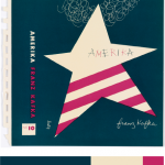
For this project, I picked dominant, sub-dominant, and accent colors from the design museum we went as a group. It was called, Cooper Hewitt. As I saw varieties of different designs, this book cover made me catch my eyes since it had all I need for this project. I picked it since it was simple to work with, and the choice of the color matched my theme itself. I used the eye dropper from the color inventory and used Photoshop over all to make the new book cover (at the right). I picked ballerina for my cover since I used a ballerina in one of my design it self. I used my theme for my style in the font also. I gotten the quote for the back and I done everything else at the back with the bar code and the numbers and the lines are all changed to the color I picked from my inventory. Over all for this project, other than the time we went to the museum, it took me about two hours to work on it. I also liked this project, since I was able to express freely about the theme of my book and how I was able to use technology to work on it.
The OpenLab at City Tech:A place to learn, work, and share
Support
Help | Contact Us | Privacy Policy | Terms of Use | CreditsAccessibility
Our goal is to make the OpenLab accessible for all users.
top


