Saturation Studies: Phase 2

Achromatic color saturation
Muted Saturation studies
Prismatic color studies

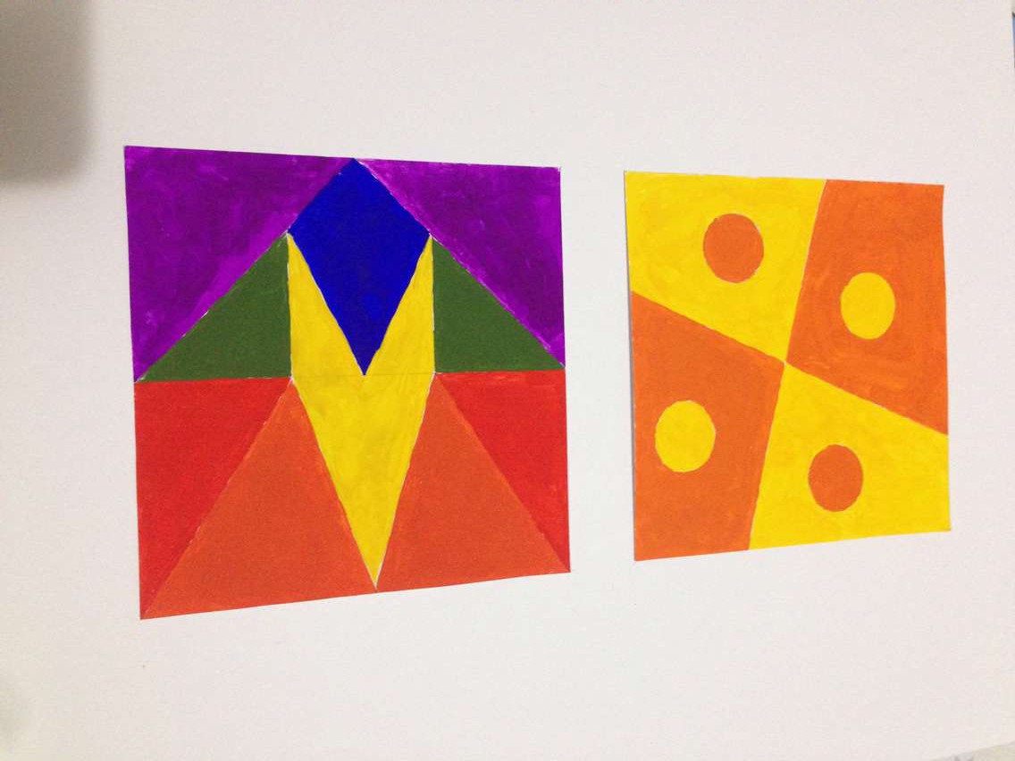
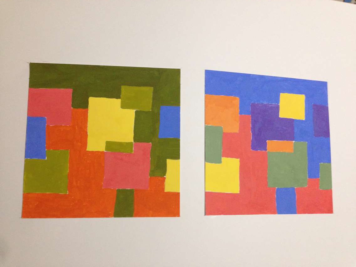
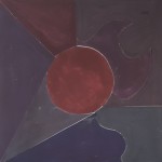
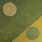
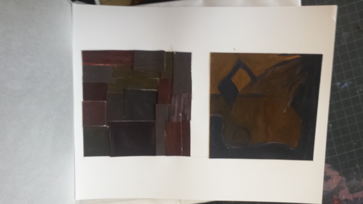
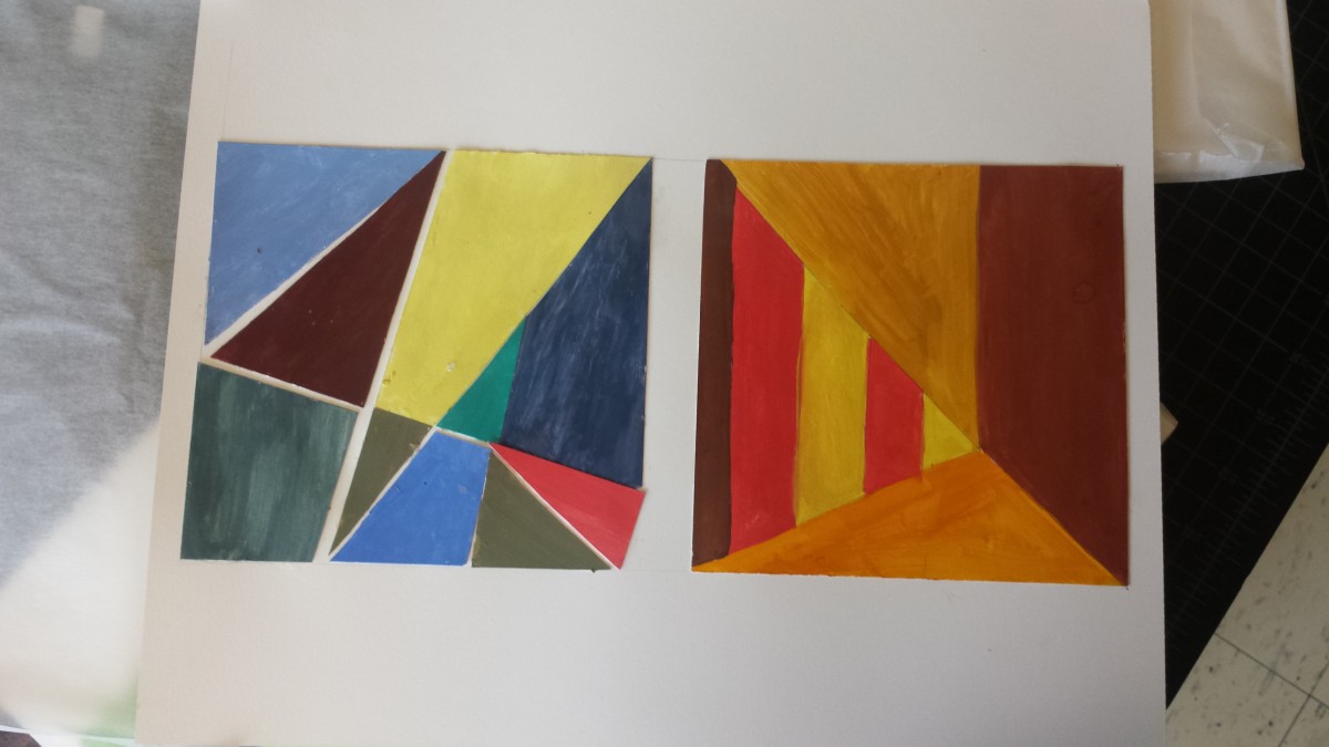
I learned that prismatic colors are the purest and chromatic colors are the least saturated. Muted colors lie in between. In order to obtain prismatic colors (pure R,O,Y,G,B,V) you use the primary colors (Red, yellow, blue). In order to make the other 3 prismatic colors (O,G,V) you mix red, yellow and blue accordingly. To create muted colors you can add either black, white, or it’s compliment. When adding black, you are shading and when adding white you are tinting. Using compliments can be tricky because using too much can lead to chromatic colors. Chromatic colors are essentially a muddy brown/grey and are created using a color and it’s compliment.

Saturation studies: Phase 3

Click here to see band poster: Brightnoise

This poster is inspired by Swiss style posters and design aesthetics. Using Swissted’s nirvana poster, me and my colleague created a poster that was warm in color temperature. The original poster was black, red and light grey but for this project the use of all saturations were used (Muted, chromatic, and prismatic). The band name Bright Noise was thought of after me and my partner listed word associations for each of the 5 senses. Bright noise fit perfectly because the colors chosen, orange and yellow, are bright in luminosity. The term bright noise projects a powerful sense of sound and directs attention .

saturation studies: Phase 4

This project has been my favorite so far. I enjoyed learning how to really percieve color. I gained alot from this project and my perspective on life has changed alot. I no longer see hues and shades. Now blue can be turquoise and turquoise can be prismatic, muted or chromatic. Being able to be as specific and narrow with colors is important especially in the visual communications field. For the paintings prismatic was easiest and I found chromatic to be hardest. The reason i say this is because prismatic colors are the purest meaning using color straight from a tube would be perfect. Chromatic colors on the other hand have a dark, muddy appearance with a slight touch of color. For example, there are browns that lean more on the orange side and anothers that lean toward a green undertone. Regaurdless, chromatic should be more challenging because colors are mixed unlike prismatic which are straight from a tube. For my three compositions, I selected pieces that felt related and balanced to one another. This project overall was very beneficial and the skill of seeing was learned.

saturation studies: Phase 1

Marcus Cerons color wheel

My color wheel was inspired by a series of events throughout my life. When younger, I had gone camping and fished. I loved the relaxation and nature all around me. Also, I love the ocean. It’s a whole other world that goes beyond our deepest imaginations. Two worlds side by side, ours and theirs.

Saturation Studies: Phase 4

Phase 1: Color Wheel

First time how to use the simple color (RED, BLUE, GREEN, YELLOW, VIOLET) to understanding of saturation.

0

Phase 2 : Three Saturation

Chromatic Gray Studies – Exercise #1 & 2:
Took around one and half hours.

12227656_1490642337905893_5404243689099950676_n

Muted Color Studies – Exercise #1 & 2:
Took around two hours to complete.

00

Prismatic Color Studies – Exercise #1 & 2:
Took around three hours.

01

 Phase 3: Swiss Style Band Poster

spicy pop

This project was fun for me, I worked with Brandy and Ashley, we had to make a poster of using the different saturation and values of the color red. At the beginning of the poster, we had to create a title that involves the senses of taste and sound. So we came up the “spicy” and “pop” for the title. Fortunately, we knew how to using the illustrator that we as fast as complete the poster .

Saturation Studies: Phase 3

spicy pop

For this saturation study, I worked with Brandy and TK. In this project, we had to create a band poster using a name that is a cross-sensory word or phrase. We were given three cards; a color card, a composition card, and a concept card. For, color card, we were given was warm color. For the composition card, we chose to do taste and sound. We came up with the name “Spicy Pop” by making a list that were taste and sound. We played around with the words until we came up with Spicy Pop and were satisfied with it. Since we were given warm color, we chose to do red. We used prismatic, chromatic, and muted. Overall it took about 3 hours to complete this project.


Saturation Studies: Phase 2

Chromatic Gray Studies – Exercise #1 & 2:

What I learned from this part of the project is how to create Chromatic Grays by mixing the color and its complementary.

Time Spent – An Hour and Half.

Muted Color Studies – Exercise #1 & 2:

What I learned from this part of the project is how to create Muted Colors by mixing the colors with white, or its complementary.

Time Spent – Two Hour and Half.

Prismatic Color Studies – Exercise #1 & 2:

This was created by just using the pure primary colors.

Time Spent – An Hour and Half.