Reflecting on this project, I seem to have some sort of understanding of all the concepts we were intended to learn, although i hope to grasp an even bigger understanding of them throughout more of my courses. With these color interaction studies, i was able to learn how colors are much more than what they seem. I was able to understand how intergrating concepts like saturation, value, hue, and tons can affect a color, and create something completely new.
Tag: Value
Color Interactions: Phase 3
With fellow classmate TK, we both researched on how color can be used to express certain personality traits. Not knowing too much about each other, we composed a list of how we saw each others personalities. Based on that list and our research, we created our Paired Color Identities Composition. 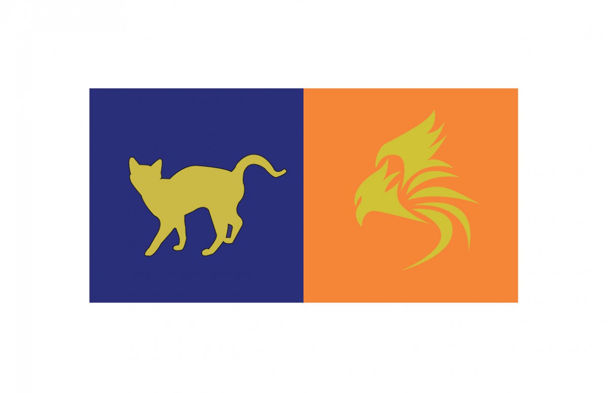
I decided to choose a more lower valued blue, with less saturation for her personality. I felt this color was suitable for her, as i saw her as a more cool, clam, and reserved kind of individual. She is also very shy, (hence why i chose to de-saturate the color). Blue is very commonly used to express these kind of traits in a person.
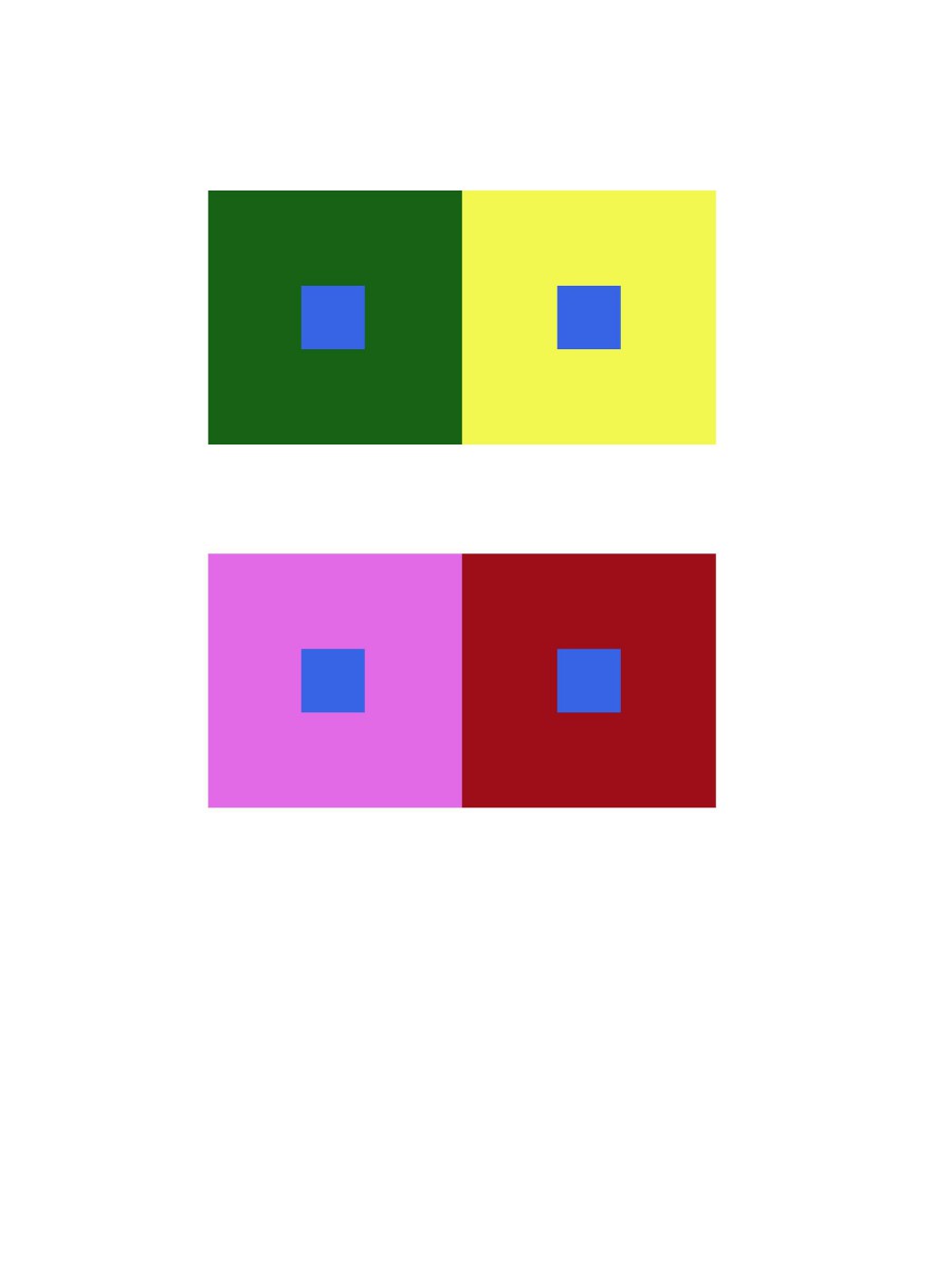
Color Interactions: Phase 2
The first color interaction observed is based off shifting hue, without touching the value, while the second shifts BOTH hue and value.
Hue Change, No Value
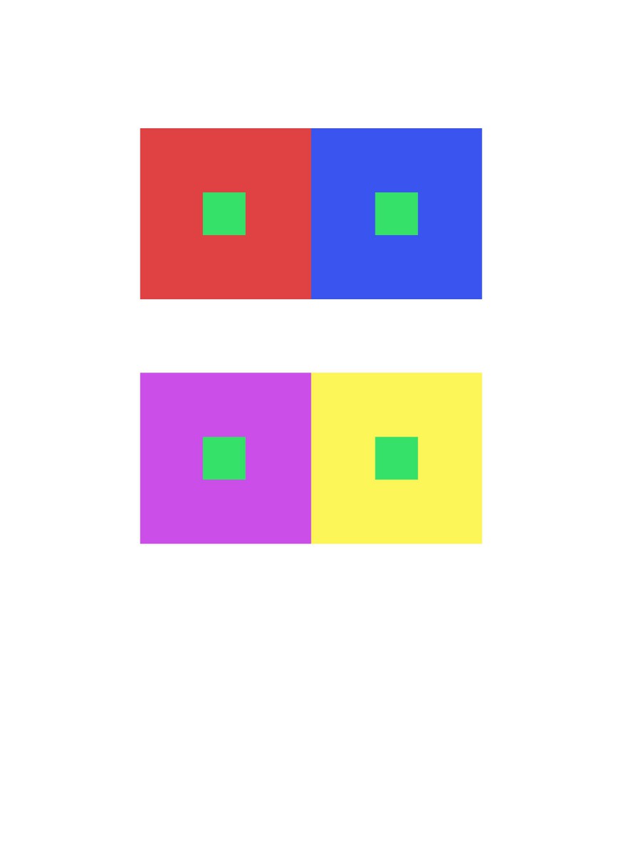
Shift in Both Hue and Value
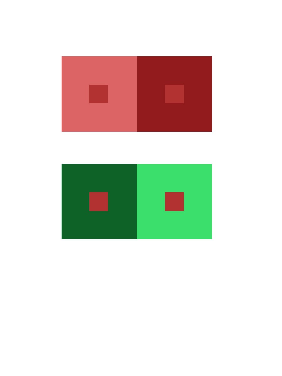
Color Interaction Pairings: Phase 1
These color interactions are based off of adjusting the hue, but without touching the value.
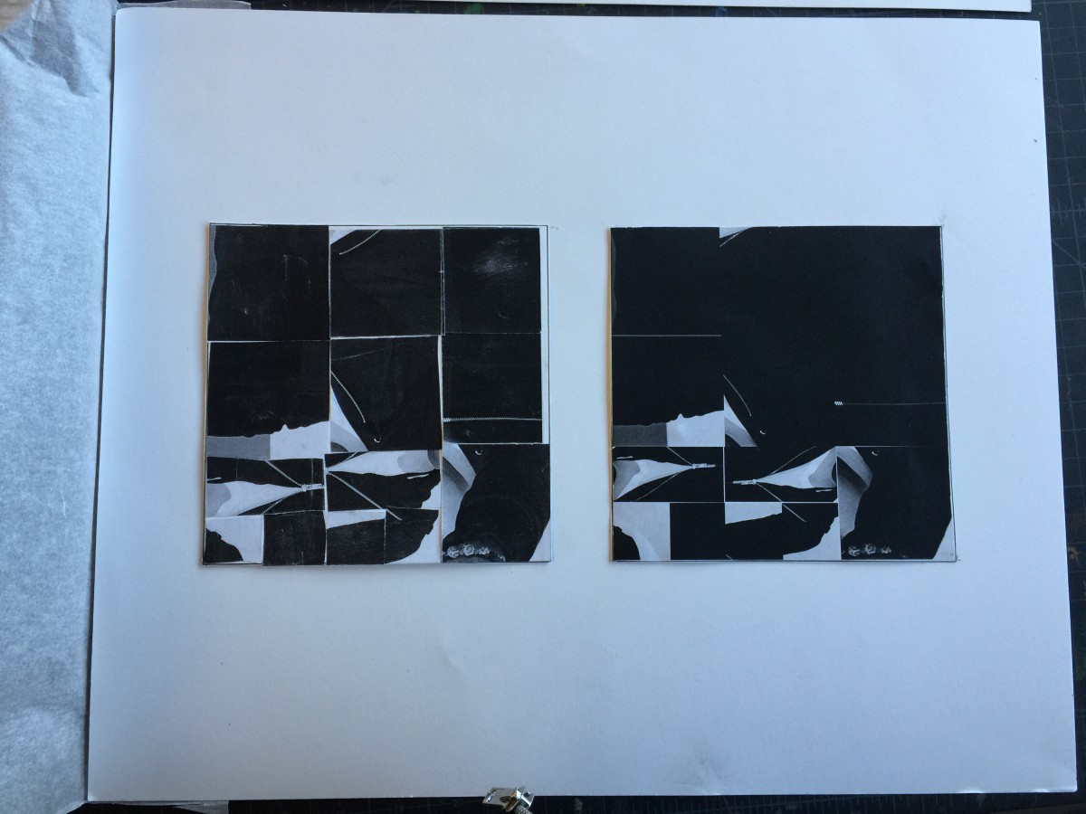
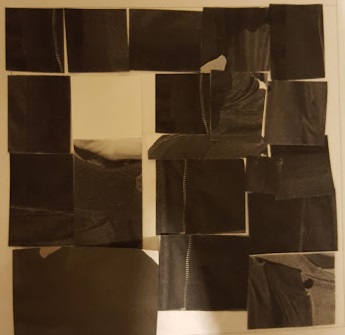
Shifting Value (Greyscale)
Shifting Value (Color)
Value Added Portraits: Phase 3
This is my final presentation of project #3. I spent approximately 5 hours of work time from the beginning of the project till the final phase. I feel my value range digital collage was more successful than the broad range painting, maybe due to my preference to using digita media. But overall I am pretty satisfied with the final product.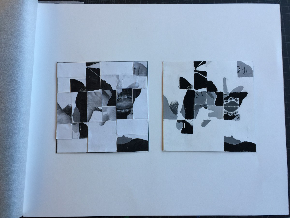
Value-Added Portraits: Phase 2

Time Spent – About an hour and a half.

