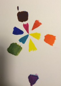
Color Harmony: Phase 1


Photo Link: 1st|2nd|3rd

I found these photos from google images and provided a link where it actually from. The first image is a sky with two colored progression. In which two colors are mixed in the middle and both sides takes two different colors that to show how it progressed to make the middle color. It also contains a little bit of chromatic gray shades in the middle since there are clouds. Secondly, I this image was posted in some kind of corner form, called Big Blue interactive which it said, “In honor of Flowers…” one of the post by Pete from Woodstock on 5/5/2015 11:21 am. There is different types of color that pansies produces as they flower. I picked this one instead of others since others had a relationship in using tint. I can see the progression of shades going on from outer petals toward the inside where it gets darker. Lastly, I picked a flower that had a tint of progression in pink. I was surprised that this is from someone who is using OpenLab and he/she went to a botanical garden and gathered this photos. It clearly shows the tint where the color progressed from the middle of the flower to the outer petals. Since we really different have time to go anywhere as a class, and since I gathered this information from the internet. It took me about five to ten minutes to gathered this images and inks, however it took me about twenty to twenty-five to write this post. About thirty-five minutes to finish this phase.

Simultaneous Contrast

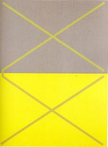
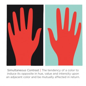
Simultaneous Contrast 1Β Simultaneous Contrast 2

(Click here for link to the first image. Click here for link to the second image.)

From what I’ve observed, these two images show interesting simultaneous contrast. In the first image, the lines are the same color but with the surrounding gray and yellow makes the lines appear as the colors are switched. The lines in the yellow box are gray while the lines in the gray box are yellow. In the second image, the surrounding colors are like in the first image( in a that they are different colors from one another). But the red hand in the black box appears to be lighter while the red hand in the blue box looks darker.


Simultaneous Contrast

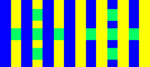
Stripes

This website is called, Color Cube. It shows the example of simultaneous contrast where it has a variety of affects on our sights. When different backgrounds or patterns are framed by the identical colors, it appears to shift. The example follows this instructions, β€œThe diagrams below feature two sets of identical green squares within a striping pattern. Do the colors on each side of the stripes appear different? In each case, the squares on the left side appear darker and the right side appears lighter. View the images from the side of your monitor to exaggerate this effect.”

Link: Here

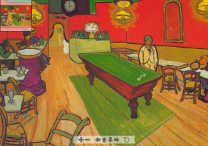
Van Gogh: Night CafΓ© in Arles

Next website is called, Color Vision & Art. This website explains many famous paintings that shows examples of simultaneous contrast. β€œTwo colors, side by side, interact with one another and change our perception accordingly.” This quote also explains very well about our perception of our sights. As we read further down, it explains each art that is posted online. Different art has different type of contrasts that the artist shows the viewer, which it explains how, β€œSimultaneous contrast is most intense when the two colors are complementary colors.”

Link: Here

Didactic Panel (Draft)

Ayano Morishima

Pattern
Pattern

Born in Japan, Tokyo
Lives and studies in New York City
β€”β€”β€”β€”β€”β€”β€”β€”β€”β€”β€”β€”β€”β€”β€”β€”β€”β€”β€”β€”β€”β€”β€”β€”β€”β€”β€”β€”β€”β€”-
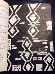
Gates of Wonder, 2015
Ink brush pen, and used paper bag book.

Understanding Tom Phillips’ concept behind his creative art work, Morishima combined different skills she learned from her Graphic design principle and English class to create a humument book. She changed the theme of the book, Wishes to a crazy wonderland concept to show completely different side of wonderland, where She used patterns to represent the chandelier and doors that connects to the theme.

Ayano Morishima

Didactic Panel #2
Didactic Panel #2

Born in Japan, Tokyo
Lives and studies in New York City
β€”β€”β€”β€”β€”β€”β€”β€”β€”β€”β€”β€”β€”β€”β€”β€”β€”β€”β€”β€”β€”β€”β€”β€”β€”β€”β€”β€”β€”β€”-
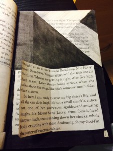
Book of Wonder, 2015
Exacto knife, Ink brush pen, folding, and used paper bag book.

Book of Wonder was created when Morishima used a Exacto knife to cut open a block of text at the bottom of the page and glued only in the middle. Creating a piece of story that continues from Gate to Wonder, which follows the theme of Wonderland. Falling into the rabbit hole, it leads the reader to go though the door to read a little book that Morishima created.

Ayano Morishima

Didactic Panel #3
Didactic Panel #3

Born in Japan, Tokyo
Lives and studies in New York City
β€”β€”β€”β€”β€”β€”β€”β€”β€”β€”β€”β€”β€”β€”β€”β€”β€”β€”β€”β€”β€”β€”β€”β€”β€”β€”β€”β€”β€”β€”-
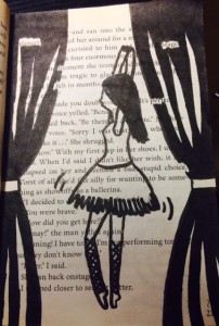
Dreams of Wonder, 2015
Ink brush pen, and used paper bag book.

Dreams of Wonder was created from the after math of Wonderland. The madness in wonderland was finally came to the end; still in the land, the ballerina indicates the beautiful dream that it stabilizes the wonder in the wonderland.

Project #3 (Locations)

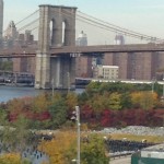
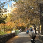
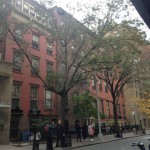
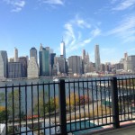
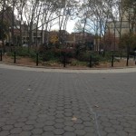
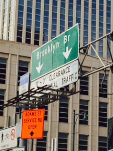
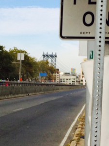
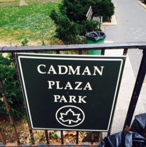
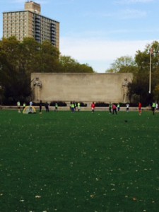
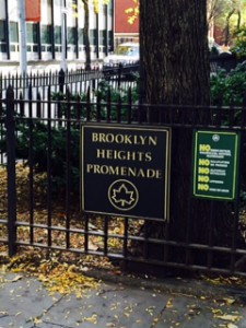
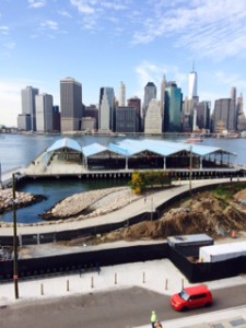
Throughout my walk, I’ve come across a few locations that gave me some beautiful sights that made my journey worth it. Most of these areas are along side the Brooklyn Bridge area and every sighting was new for me. This made my walk even more thrilling because I was surprised on how new everything was since I’m use to seeing just buildings on most of my walks. Don’t get me wrong the architectural design of some buildings are lovely to look at but I wanted a bit more natural aspects in my walk. I especially love that the season is autumn because the trees I’ve seen had some various shades of color which made me felt more alive when seeing them. All the sights I saw gave me a mollified but still sensational atmosphere. The first picture is the Brooklyn Bridge and at the bottom of the bridge is path that you can walk through trees with colors such as green, red, and yellow. The second picture is around where Harry Chapin Playground is. It’s a path with benches to rest and be surrounded by trees while glancing at the lower side of Manhattan. The third picture is of house from the Clark street area. I liked how the buildings looked and the area was very quiet when I strolled through it . The fourth picture is a view of the tip of Manhattan. While I was walking I saw The Freedom Tower and I took my route in that direction. I’ve come across this sight of the city, the East River and a bright blue sky while being surrounded by trees. The fifth picture is a flowery patch that I come across while exiting Cadman Plaza Park. I enjoyed taking in the vibrant sights that I encountered and taking that long walk was beneficial.


Project #3 (Location)

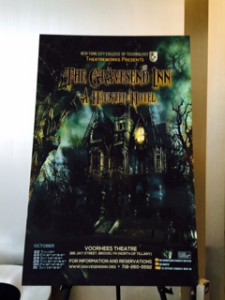
As you can see from the map, I picked very different locations where it took me about two to three hours in walking. I picked the first location, Voorhees Building because of an event that happened where drama department put this amazing Halloween Haunted Hotel. Next was the entrance of Brooklyn Bridge, I wanted to pick this location because of the mentioning in class. I went to the nearest park which was Cadman Plaza next to the court. The most farthest place I went was the at the end of Clark Street where I saw the river between Manhattan and Brooklyn. The view was very nice, where it showed me the different side views of from Brooklyn to Manhattan. Lastly, I picked Lawrence Street where I found many Asian cuisines restaurants.

Project #3Project #3

Project #3Project #3


Project #3Project #3Project #3

Project # 3 – Phase 1

Low Key
Low Key
High Key
High Key

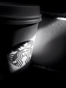
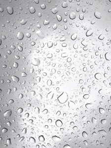
These are two pictures that I took , the Starbucks cup is low key and the raindrop is high key. The low key I used the filter to change the color become black&white, also putted the cup under the sunshine that shows the Starbucks logo. The high key is the raindrop when I take it at the car roof. Also, I change a little bit of the color become more white then make the picture prominent.

Value-Added Portrait: Phase 1

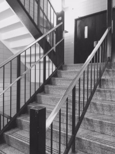
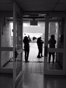
These are my two pictures that I took, where one on the left is High Key and the right is Low Key. The one on the left is High Key, because the more of the white and gray tone of the stair case stands out. On the other hand, the right side of the image contains more value in Low Key, which it contains more black shadings. Most of the figures of people or an objects turns out to be more of the Low Key.

High Key
High Key
Low Key
Low Key