Students from Fall 2015 can pickup their classwork from my office N1127 on the following dates. IMPORTANT: Please let me know if you plan to stop by. If you don’t confirm, I may not be in my office. Friday, March 4th, 11:30-12pm Thursday, March 10th, 12:45-1:45pm. Please contact me to CONFIRM. Hope you are having a wonderful semester! Print this page
Category: COMD1100
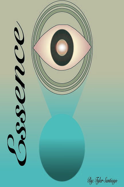
color harmony: phase 4
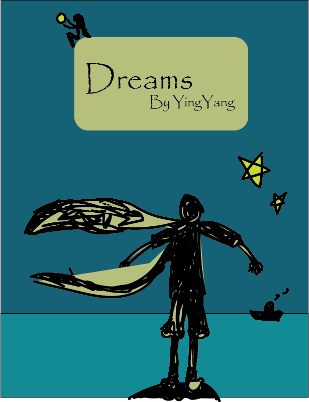
This was the final project for our course. Fusing together all the skills aquired and learned, we were to create book covers for our humument books. In refrence to a work of art located in the Cooper Hewitt museum, humument books used proportional color schemes to crate a holistic harmony between color and composition. The themes of my book are wonder and fantasy. Because of that i chose a work of art that uses various tints of blue. Emitting a feeling of peacefulness and dreams, this was the perfect inspiration for my book. I used question marks in my book cover design because wonder is often associated questions. Another reason is because when someone is aware of dreaming there is often a question between what’s real and whats not. This relates to my book which deals with various memories of fantasies and dreams. Because they are memories (remembrances) there can be a question of what truly did and did not happen. Overall, this project was learning to create balance using every skill in our tool box, even those of English. Its one thing to have the skills but another to apply them harmoniously.
Color Harmony: Phase 3
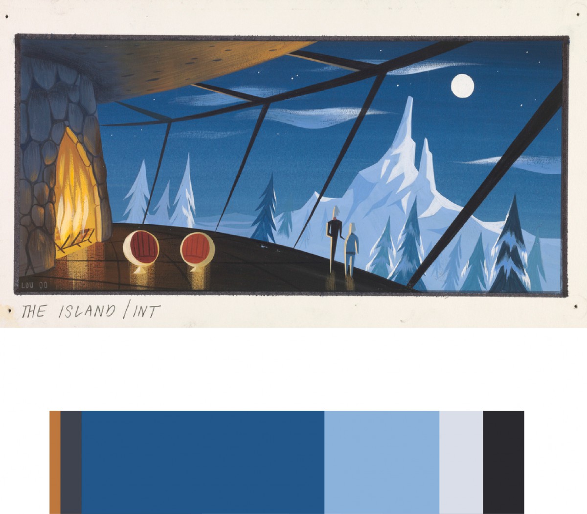
I chose this piece (CONCEPT ART, SYNDROME’S LAIR, THE INCREDIBLES, 2004) created by Lou Romano and Pixar Animation Studios because I thought the color scheme fit with the theme of my humument. The theme of my humument is calmness, lighthearted, and heartwarming. Overall it took about 30 minutes to do.
Color Harmony: Phase 4
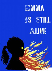
After drawing inspiration from Saul Bass’ Exodus, I then created my humument cover based on its color scheme. I also decided to do my own rendition of the “flames” due to fire being a running theme throughout the piece.
Color Harmony: Phase 3
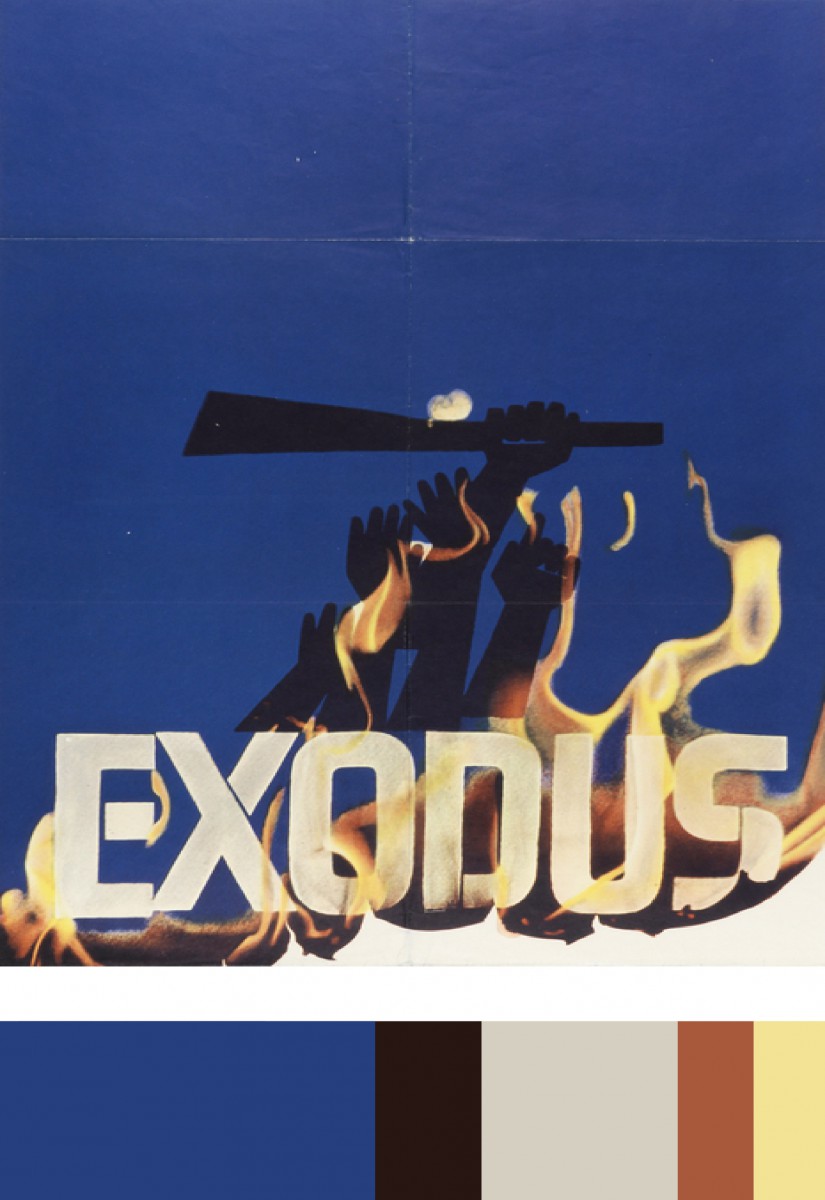
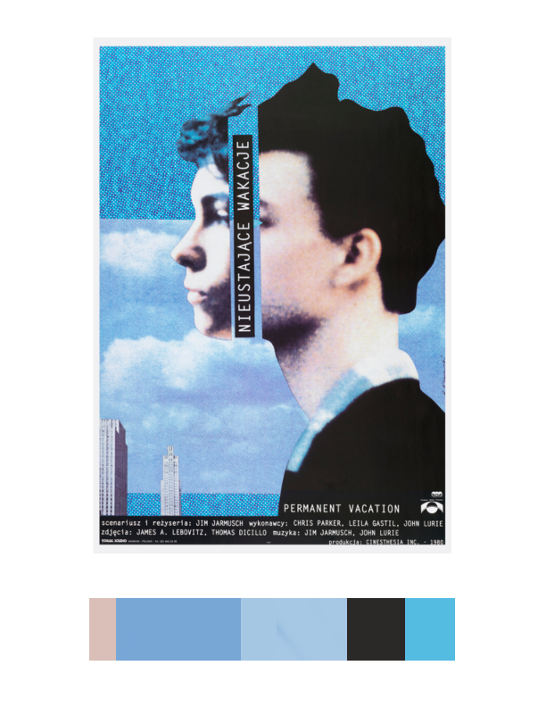
After our trip to Cooper Hewitt, I decided to choose a piece of art by Saul Bass called Exodus. This piece was created in 1961, and was poster designed for Otter Preminger’s film Exodus. I chose this particular piece because i thought it would be an excellent color scheme for my humument, and it also featured fire, which is already a pretty important part of my piece. I then created its color pallet, and used it as a base for my own cover art.
color harmony phase 3
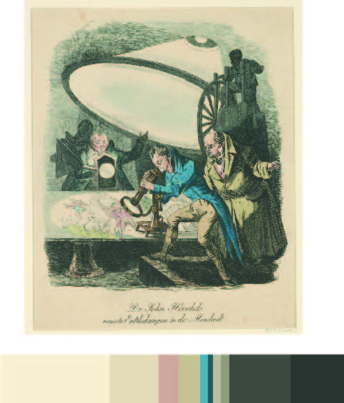
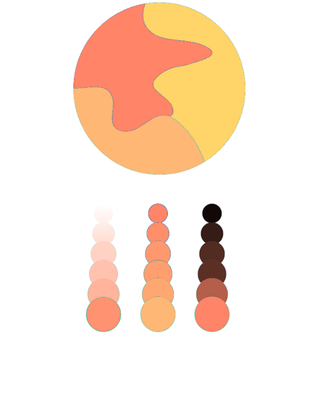
For this project i chose as piece called “THE GREAT MOON HOAX OF 1835” Posted on October 25, 2015. I chose this piece of work because it represents what my theme of my book is, the theme of my book is observation and the title “Essence” comes from the original title of the book which was “silences” by Tillie Olsen. I also liked the colors that were used in the work that i used and i think it goes great with the aspect i was trying to convey.
Color Harmony: Phase 3
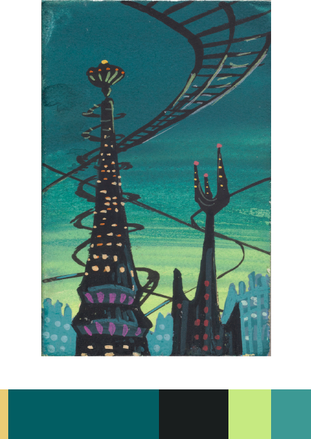
The reason I chose this image(CONCEPT ART, MONSTER CITY, MONSTERS, INC., 2001) from Cooper Hewitt is that I feel like it really match the themes of my humument work. The themes of my humument work are dreams and loneliness. The picture is basically bule and black. That gives me a stronge feelling of derams and loneliness.
Color harmony: Phase 3
For this phase of the project, we visit the Cooper Hewitt museum as a class trip. Here we explored many fields of art from graphics, sculptures, textiles, motion graphics, architecture, and so on. We were to use an inspiring piece of art found in the museum that also fit our selected theme for our humument books. My book in specific talks about a journey and I am juxtaposing that with the theme of memories. There is a relation but big difference between a journey and a memory. While on journey, a person’s experience is physical and fruitful. A memory on the other hand is a mental experience which we feel emotionally not physically. I also chose to articulate various memories of people from different walks of life to emphasize the differential between people. My book on the other hand shows how people can sometimes be all connected. I chose this as reference for my color inventory because when I first looked at it my mind suddenly became clear and peaceful. The peacefulness perceived from the blue allowed my mind to relax and reminisce. I’ve learned different shades, tints of blue can emit different emotions and this blue specifically gives a tranquil, relaxed state of mind. Although it’s peaceful the feeling of assurance is also provided. This part took me about 2 hours 20 mins.
Color harmony: Phase 2
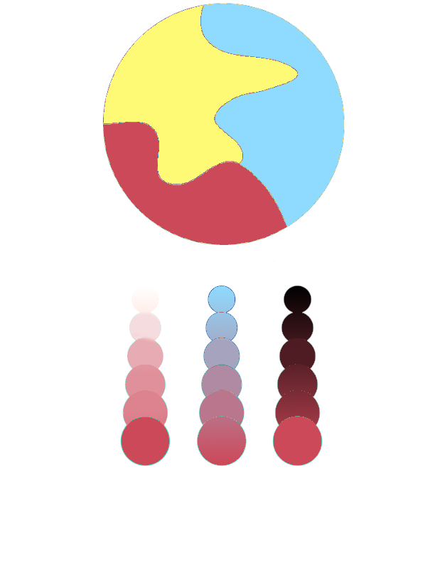
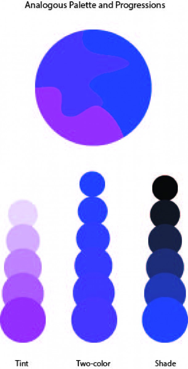
The Analagous color pallete on top displays Analagous colors. These are colors that lie adjent to one another on the color wheel. For example you want the color green. You’ll then chose one color after and before green which are green blue and yellow green. That leaves you with Green, green blue, and yellow green. Together those colors will work harmoniously and that is a strategy in choosing colors. For My analagous pallete I decided to stick with muted warm colors. To be more specific I have a muted red-orange, orange and yellow-orange mashup in my composition. Under my composition I show an example of tint on the left, a two color gradient in the middle and shade on the right.
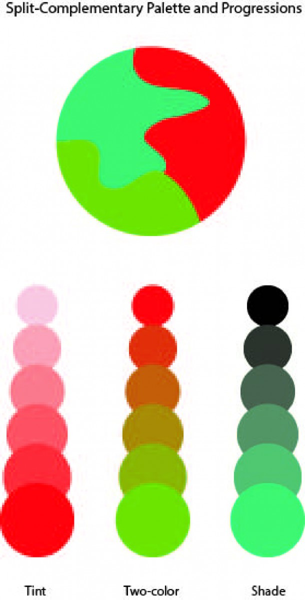
For split complementray colors you take one color and use the two colors adjacent to its compliment. An example is Violet, then find it’s compliment (yellow). The colors that come before and after yellow are orange and green. That means violet, orange, and green work harmoniously as a split complimentary color pallete. This composition contains muted colors aswell. Colors are muted with white leaving tinted red violet, blue and yellow. Below my composition, you see three examples, the left showing shade, the right showing tint and the middle showing a two color gradient. I did both compositions using Adobe Color CC Program. In total I spent around 2 hours.
Color Harmony: Phase 2
Using the Adobe Color CC program, I composed both an analogous pallet and split complementary pallet, using violet for the analogous, and red for the split complementary.