English Project #4 Final

This exhibit is presented by Jaichan Kirty, Jaichan Kirty was born and raised in Guyana, then moved to New York where he now lives and studies. Gathering inspiration from Tom Phillips’s altered text, A Humument, Kirty curate a project that integrates both words and visuals. A Humument is an altered book has unique combinations of literary and art, the author merged art with the connotation of specific words to exhibit two different genres into one. This book created by Tom Phillips, was released in 20th century. Like Phillips, Kirty found an inexpensive used book entitled Portrait of Ivan. The Portrait of Ivan is about a young boy coming of age while he is also discovering himself. Kirty transformed this book into new artistic creations both in appearance, by using ink, paint, pencil, cut outs, and folding.

Kirty also created a new title and theme for Portrait of Ivan. He had many ideas into the new title but finally decided on one, which is Portrait Van. The idea behind this new title came from the new juxtaposition theme for Portrait of Ivan, which is mysterious and creepy. This is a juxtaposition of Portrait of Ivan because a boy coming of age is supposed to be nice and pleasant. The opposite of that is mysterious and creepy. In order for Kirty to create these compositions and start changing Portrait of Ivan into Portrait Van. Kirty blocked out a huge amount of the pages and selected words and phrases to emphasize. He then created images using those words and phrases he wanted to emphasize in that page of the book.

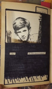
The first piece of this exhibit is called, So that’s what it looks like. In English 1101, Kirty learned ahout over lapping New Yorks, which he incorporate in this pieces. Overlapping New Yorks include juxtapositions such as old and new, residential and commercial, historic and replaceable, natural and man-made, constructed and under-construction, well maintained and in disrepair, celebrated and forgotten, etc. Kirty has created a new window (a new view) into this book by using over lapping to create an illusion of a boy, who is Ivan, looking through a new page. He did this by cutting a square on the next page in the book. Kirty uses an X-Acto knife to carefully cut this square out of the page. Also, Kirty uses sharpie markers to cover up a huge amount of the pages leaving out a few words that create its own new story. These words creates a whole new meaning of this page. “So that’s what it looks like”.

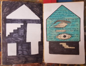
The second piece is called, Inside the House. In COMD 1100 Kirty learned about Shape (Organic, Geometric), Frame, Figure-Ground (Obvious, Ambiguous), Unity, Economy which he incorporate in this piece by blocking out a huge amount of the page and selected words and phrases to emphasize. “Opening her eyes” and “Photograph of the house when it’s winter”, which he used to create images. The first image is an eye-opening, which Kirty showed by drawing a closed eye and a second eye which is opened. This represents organic shapes. Then he uses white computer paper to cut out the shape of a house to emphasize the “Photography of the house when it’s winter”. Kirty chose white paper because snow is white and snow falls in the winter. Kirty then used the cut out of the house, which is the silhouette and glued it on the previous page. Also useing sharpie to create what it seems to be the inside of the house. This represented Geometric shapes.

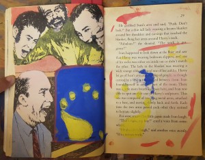
The third and last piece of this exhibit is called, Blue Print. “Blueprint” was created when Kirty painted over a picture with saturated primary colors. Also, in COMD1100 Kirty learned about creating simple compositions demonstrating an accurate understanding of saturation, which includes Hue, Saturation, Prismatic Color, Muted Color, Chromatic Gray, Achromatic Gray, Luminosity, Primary Colors, Secondary Colors, Complementary Colors, Warm, Cool, CMY, RGB, RYB color models/systems. Kirty represted this concept by painting a blue box, and inside that box is a print of a foot-step, hence the title Blue Print. After painting over the picture, Kirty then closed the book allowing the paint to print over on the other page creating a paint splatter effect.


Panel #1
So that's what it looks like
So that’s what it looks like

Jaichan Kirty
Born 1996 in Guyana
Lives and studies in New York
_________________________________________
Oh! So that’s what it looks like, 2015
Sharpie on paper, 7.5″ x 5″

Kirty created this piece using an X-Acto knife to carefully cut this square out of the page, revealing the Portrait of Ivan that is on the previous page. Also, Kirty uses sharpie markers to cover up a huge amount of the pages leaving out a few words that create its own new story; Oh! So that’s what it looks like.

Panel #2
Inside the House

Jaichan Kirty
Born 1996 in Guyana
Lives and studies in New York
_________________________________________
“Inside the House” 2015
Sharpie on paper, White computer paper, Highlighter, 7.5” x 10”

Kirty blocked out a huge amount of the pages using a sharpie marker. While selecting words and phrases to emphasize, “Opening her eyes” and “Photograph of the house when it’s winter”. Which he used to create images. Kirty uses paper to cut out the shape of a house. The cut out of the house was glued on the previous page.

Panel #3
Blueprint
Blueprint

Jaichan Kirty
Born 1996 in Guyana
Lives and studies in New York
_________________________________________
“Blueprint” 
2015
Paint on paper, 7.5″ x 10″

“Blueprint” was created when Kirty painted over a picture with the saturated primary colors which includes blue, red and yellow. Kirty painted a blue box, and inside that box is a print of a foot-step. After painting over the picture, Kirty then closed the book allowing the paint to print over on the other page creating a paint splatter effect.
Project 3 # Final

Everything has beauty, but not everyone sees it. If you take time to really look at simple things you will come to realize that they really are beautiful. The surrounding beautiful, natural scenery spreads out before our eyes. It makes our spirits are cheered up and refreshed. True happiness comes from nature, the peaceful and beautiful environment is indeed enjoyable. Take some time out of the working day to enjoy by walking through into the environment.

This route begins at the General Building, when you exit to the Johnson st and turn right side to the Cadman Plz E. Walk through the Tillary St, the Brooklyn War Memorial will appear in front of you. There have the memorial,that designed by the architectural firm of Eggers and Higgins. Building adorned by two large figures, one at either end of front facade. That depict a male warrior on the left and a female with a child to the right – symbols of victory and family. The other one of my location is Hillside Park, is one of the dog parks in New York City. This park can be the one of the green lungs of an urban area. A walk in the park can calm our strained nerves, which is very quaint, very clean, and quite beautiful.

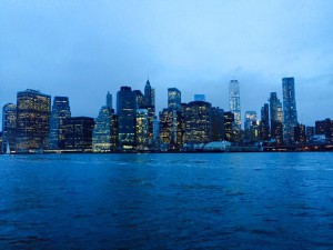
The other beauty in nature place is Brooklyn Bridge, is a park on the Brooklyn side of the East River in New York City. It’s a recreational, environmental and cultural destination enjoyed by visitors to New York City. There have a perfect view of the Manhattan, when you gaze afar into the Manhattan, the skyline at night from the those Building at Brooklyn Bridge Park. The panoramic view are marvelous. Also, the park have an alley when you walk through the alley, the surrounding view make you feel more comfortable and enjoyable into the nature environment. Looking at beauty in the alley, make me remind to the life is not always perfect. Like the alley, it has many bends, ups and down, but that’s its beauty and silent. “Nature is good for us launched scores of studies. Researchers reported stress reduction, improved attention, “mental restoration,” better health, increased longevity.” (Begley, Sharon Do We Really Need Nature?  August 12, 2015 Web. November 18, 2015). Everyone have to take sometime into nature, because we never noticed the beauty in nature that we were too busy trying to enjoy it. Look deep into nature, then you will understand everything better.

Keep walking to the end of the Brooklyn Bridge Park, you will see the boat ramp on the right side, have the other perfect view of the Manhattan. Then you can completely see the Pier 2 at Brooklyn Bridge Park in front of your face. It is dedicated to active recreation, contains over five acres of basketball, and over half an acre of artificial play turf, fitness equipment, and picnic tables available for walk-up use. A wide promenade wraps around the pier. It is one of the park have perfect promenade view includes the physical exercise fitness equipment and places. This is the different location of other places, is cross-over with physical exercise and beauty-in-nature. There is able to enjoy quietness and provide the area for visitors strengthen muscles & keep fit. It is kill two birds with one stone.

Where the beauty of nature and the freedom to breathe fresh air is all part of what is worth living for. Making the first change of your routine, you will really gains a different experience of your day, while it is the simple easy step. Every step can bring a lot of unpredictable things happen, but never ever stop to find the beauty in nature. Tale a moment to enjoy the beauty of nature, take a deep breath, relax…enjoy the rest of your day.

Project #3 (Final)

Beauty, the quality of being physically attractive is something that the user will encounter after they downloads this app. My co-workers and I, Ayano Morishima are making an route simulator known as “Road to Beauty” that takes the user to a journey that can lead them to a beautiful constructed location. Many people uses other apps to locate their shortest and fastest route, so that they could get to their location much faster. Taking a different walk from your usual course of route would open your view on beauty after downloading this app, which it contains features of short, fast and beautiful route.

Many apps from the apple store contains route simulator that pinpoints to the users location and calculate time to show them different option in best or shortest route to get there quickly as possible. However, is it time that the users want to save up to get to their destination? Sure, people want to get there quickly and do whatever they needed to do. But what if there is an app that can change the users surrounding views? Think about it, looking at the same route over and over is boring. The user might already know whats built there, even if they are blind! Our app focuses on people’s daily route and time, however what is different is users can use this app to encounter a beautiful constructed location just by taking a different route. Simple right? By changing just a little routine of using the same route to their destination; even if it takes just an extra few minutes, sure the surroundings of the users view will changes. Peter Terzian states that “The Heights wears its rich history on its sleeve, with the area a showcase of stately architectural styles, august churches and schools and literary landmarks.” Basically, the author is saying that there is a lot to see at the Brooklyn Heights. Such as churches, beautiful architecture, school, etc. Its beauty captivates people hearts and its amazing location with in Brooklyn heights conveys the inner beauty in Brooklyn.

One of the ongoing project route starts from the Voorhees building. This building is a center for engineering technology for students who does to NYC College of Technology. Once you left the building to make a right, you will see a big road. If you turn right again, you would encounter an entrance of Brooklyn Bridge. Brooklyn Bridges connects the two boroughs, Manhattan and Brooklyn crossing over the East River. As you go further straight, you will see a huge park called, Cadman Plaza Park. A huge park where you can play any sports. Walk to right and left again, where you will encounter location called, Brooklyn Heights Promenade. As you go in though this location, and keep walking straight, you will see a Brooklyn Bridge Park Pier 2. Place where it features in basketball, handball, etc. Each locations shows the beauty of each aspect in how it was constructed for. For example, since the Voorhees building was built unique, which it intrigues people who are interested in architecture or simply how different they are. Also, Brooklyn Bridge Park Pier 2’s building is constructed beautiful, because of the surrounded body of Hudson river and the view of the sky scrapers of Manhattan. Ronda Kaysen states that “As it is, many preservationists worry that Midtown could soon reach a tipping point in which the architectural mix of old and new is lost to a wash of sparkly glass.” Basically, the author is saying that not only in Manhattan, but other boroughs such as Brooklyn architecture are in need to keep an eye out. Soon or later it would be demolished without knowing.

These exampled location is a place where the users will encounter in the app. Such as the caption below will pop up to explain a little information that the user could do, when they arrive at certain locations. Many volunteers contributed to this route making, so that it shows the best time to go to the location, where it also shows the “best time” to go to the location at the top right corner. An example for the location above is, “the best time to go to the location” is between 2:30pm to 5:30pm. One of the volunteer commented, “It is a great place to go, especially since it is quite. You can see how each location are constructed differently comparing it to other locations. Going with friends or family would be a great way to explore a new route!” Thanks to our volunteers, this app does contain other features, such as little game that satisfies the users traveling, voice active system where you use it like Siri, time countdown where it countdowns time to get to the location. The article of The Adventure of a New Perspective: A Literary Walk in Brooklyn Heights states that, “Brooklyn Heights still retains a sense of dignity and quiet, the legacy of a residential neighborhood that was famous in the nineteenth century for its churches and for its elegant homes built by merchants and sea captains in the shipping trades.” Basically, the article is saying that Brooklyn Heights is the best place to go and explore about the legacy of a residential neighborhood and the beautiful scenery that smooths people heart.

Seeing different surroundings would motivate users to look though into new route to their destination, where they haven’t discovered yet. By using this app Road to Beauty, not only they gives the best option in shortest route, but to think about the user’s preference in showing beauty of how the location was constructed. Many people looks for quick way to get to the destination that they are seeking. However what if there is a route that is short and beautiful enough to make you use this app again? Why won’t you not give it a try?

Project #2 Final

“New York City”, what’s the first impression of that place? When you listen people tell you about New York City, what kind of the imagination come into your mind? Although there have many different juxtapositions & style of buildings, different cultural tradition of people, different landscape around us. New York City is not only hear or seeing, its about living the present and knowing the past. The past build up our beautiful and prosperous city; Bring the opportunity around the city in the present. You have to open all of your senses, perceptive of New York City by your feeling, seeing, hearing and touching. This idea come with the articles “City Limits” by Colson Whitehead, “Never listen to what people tell you about old New York, because if you don’t witness it, it is not a part of your New York.” The best example that starts to create our own perspective of New York, no matter what happens we have to accept the new and face forward our New York is changing..

The overlapping New York City I choose to go the Empire Fulton Ferry Park and Brooklyn Bridge Park, they juxtapose each other between the Brooklyn Bridge. I thought this is the best place for people to know it when you never ever seen the view of Manhattan. To get to this location you exit out of the Namm building and turn left to the Jay street, then go through the Jay street to the York street and turn left. Keep going to the Washington street and turn right to the Plymouth street, before you walk into the Plymouth street. Around those street have a fascinating place for people take a rest and most attractive shop. When you walked into the Plymouth street, the Manhattan Bridge is on your right side, there is the Empire Fulton Ferry Park. Keep walking to the left side, then will see the Jane’s Carousel and the Brooklyn Bridge in front of you, there is the Brooklyn Bridge Park.

Brooklyn Bridge Park is a park on the Brooklyn side of the East River in New York City. It’s a recreational, environmental and cultural destination enjoyed by visitors to New York City. There have a perfect view of the Manhattan, all juxtaposition of the buildings stand in the other side, have different style of the buildings between Manhattan and Brooklyn. As you know, Manhattan is the economic and cultural center of the United States. When you gaze afar into the Manhattan, the skyline at night from the those Building at Brooklyn Bridge Park. Shown are clear examples of Art Deco, Modern and Old architecture. Manhattan’s buildings have architecturally significant buildings in a wide range of styles spanning distinct historical and cultural periods.  “Our old buildings still stand because we saw them, moved in and out of their long shadows, were lucky enough to know them for a time. They are a part of the city we carry around. It is hard to imagine that something will take their place…” From the article “City Limits” by Colson Whitehead, those building recorded the memory of different periods, is an important part of the New York City. Even though, some buildings start to change when they are  torn down and a new are build in its place. But the point is to move forward because New York will continue to change with or without us.

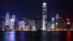
Why I’ll choose Brooklyn Bridge Park as the location because I always take the N train go through the Manhattan Bridge, I look at the Jane’s Carousel think that is a awesome place for people relaxing and comfortable. Sometimes I take the N train at the night time, the view of Manhattan have an attractiveness to catch my eyeballs. When the nightfall, Manhattan buildings nightscape look similar with my country – Hong Kong, which called the Pearl of the Orient. Both have the modern buildings and multiculturalism background,imposing buildings like the waterfront, but the difference between two places is the level of the buildings. In the New York City, most of the taller buildings are build in the Manhattan, because as you know there is the main economic center then the modern buildings will build at the center. However, it’s difficult to find out the smaller house or buildings in Hong Kong, because Hong Kong is an over-crowded city, have a large population in a small area. There only can build the taller buildings to improve the area problem.  Addition, the main reason of I choose because those two parks are the best and convenient place for people turn on the relaxed mood. The peaceful and beautiful environment is indeed enjoyable. Also, parks are often called the green lungs of an urban area, you can enjoy the surrounding view, such as the view of Manhattan at the Brooklyn Bridge Park.

Brooklyn Bridge Park and Empire Fulton Ferry Park are the green lungs of an urban area, is a awesome place see the landscape of the Manhattan. Many people of New York City was first seen by different reasons however, from there all start to create own perspective of New York. All of the different story, people, buildings are changing every moment, even though you stand on the park look at the Manhattan. No matter what happens we have to accept the new and face forward our New York is changing, using your sense of hearing, seeing, feeling the change. People have to living the present and knowing the past, then oneday you’ll say “you are a New Yorker when was there before is more real and solid than what is here now.”

0
View of the Manhattan at the Brooklyn Bridge Park

78503932
Nightscape of Hong Kong

Project #2 (Final)

     Have you ever been to any other borough other than Manhattan? Many of us are afraid to take a step forward to the unknown place that we have never set our foot on. What if there is an opportunity opened up before our eyes? Would you take a chance to discover something you haven’t encountered? People see unusual things such as an expensive store like Swarovski jewelry store next to an Off Price Fashion Outlet, which is a store you can get cheap clothes. Although, Manhattan consumers know areas to get specific cheap and expensive items, Brooklyn consumers get the overlap of the contrasting elements.

      Brooklyn is one of the five boughs that represents New York City. It combines with many mixed society that expresses equality toward the people and their culture. In Brooklyn, there are many stores that have different backgrounds which is nothing like what we see in other boroughs of New York, includes Manhattan, Queens, Bronx, or Staten Island. Stores in Brooklyn is where different boroughs are collided together, meaning stores from Manhattan can be found in Brooklyn next to stores from Bronx. It makes a whole new mixed borough that does not identify difference in people nor their social class and culture. Most of the stores are differentiated by cheap and expensive, the element of juxtaposition of the costs where stores contrasts each other. There are many stores on Fulton Street that has an example that shows the juxtaposition of cheap and expensive stores. The article, “City Limits” by Colson Whitehead, states that “You start building your own New York the first time you lay eyes on it” and it is indeed true. Colson explains how every person who lives or visits New York gets a different thoughts on the city. Since every person’s perspectives are different, it changes the point of view on the city; Noticing the overlaps around the different boroughs when they visit. One of the example is, there is a Off Price Fashion Outlet, where you can get cheap clothes next to an expensive Swarovski jewelry store. This weird combination of stores next to each other makes this borough unique. Another example of juxtaposition where time overlaps is; there was a T-mobile store in Fulton Street, however within a few days the store was already empty and the sign were gone. This kind of phenomenon happens where your memory thinks that “It was just there a few days ago” this is something that we don’t see everyday, other than Brooklyn.

      On the other hand, Manhattan is an interesting that is most known for the reputation of New York City. Times Square, which is in Manhattan is a very famous place that everyone knows about it, if you are currently living in New York City or if you hear the city’s name. This place intrigues people by the lights of the Broadway shows, TKTS known as ticket booth, Empire State Building, Central Park, the ball drop on New Years and it is called the place where beginning of fashion started. Instead of having stores mixed like in Brooklyn, Manhattan is divided into two parts that shows the example of juxtaposition. Manhattan is divided into West and East sides, they are different in which people believe that expensive stores are located in the east side and cheap stores are located in the west side where more people can afford. This statement may not be true, many people know when they reach to a certain areas that they come across are different. Example of juxtapositions between cheap and expensive stores in Manhattan is a lot similar in Brooklyn, however same stores in costs are located in the same areas.

      Comparing the borough between Brooklyn and Manhattan, it is shown that Brooklyn borough are more mixed in society. There is no difference in social class with the store management where everything have to be the same. Each store are different but in the same location. Because of these stores are arranged, it focuses on the client-tell feel more comfortable walking the place they are familiar. Brooklyn makes the people feel welcome and to show that there is no difference in their background stories. An example is Swarovski, an expensive jewelry store that is usually found in mid-town Manhattan. However, was found in Brooklyn where the store was next to an Off Price Fashion Outlet store, where you can get cheap clothes. This historic symbol of an swan and its name itself represents their example of elegance and beauty, it also makes the store to stands out what is around it. From the article “City Limits” by Colson Whitehead, states that “… started to wonder why some sidewalks sparkle at certain angles, and others don’t”, Colson clearly conveys how people do “wonder” about the difference of cheap and expensive stores in juxtaposition. These example shows the different juxtaposition of overlapping costs in cheap and expensive.

      When there is a opportunity opened up, take the chance where they show the different part of city that you have not seen before. Manhattan can be a place that is intriguing, because of the Broadway shows, TKTS known as ticket booth, Empire State Building, Central Park, the ball drop on New Years and it is called the place where beginning of fashion started. However, Brooklyn represent something more and unique that shows other people from the borough to understand their difference that are congenial to them. Places like Brooklyn, it makes you think that you just teleported to a different part of New York City, by only taking a few steps.

English Project #2: Final

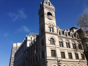
New York city has lots of landmarks, many of them are really famous. The U.S. Post Office on Adams street in Brooklyn is a historical main post office and Federal office building. The building its self appears particularly special in the area because of its Romanesque Revival style design.

The Post Office is just one block away from City Tech, Namm Hall. I didn’t notice it, until I took my sixteen minus of walk. To get to the U.S. Post Office with my path, first you need to walk left after get out of Namm hall, at the first block on your right hand side across the street, you can see a park, its a lively playground, many people who is local play sport, handout with friends and relaxing here. As you keep walking, at the same block on your left hand side, there is another building of City Tech. In front of that building cross the street, there is a church which is right next to the park. Keep walking about 5 minus, you can see the third building of City Tech. On the right hand side, you can see a little garden where you can take a break. Keep walking straight down to the next block until reach to the road turn right and look up, you can see a bridge that connects two building, that is for people who in the building could directly walk to other building on the other side of the street . Walking straight to the next block, you can see a parking lot and also, you can see the Brooklyn bridge is not far away from here. Now turn right so you are on the direction towards to the Post Office. This is Adams Street, as you can see on this block its all apartments, until you reach to the end of the block, you can see a restaurant called. Celeste Cafe & Grill. Now look diagonally across the street. There is the U.S. Post Office.

This U.S. Post Office is just one street away, behind the Namm Hall building. The building took over the whole block. The post office is not the only work site of the building, US Passport Agency, US Attorney’s Office, and US District Bankruptcy Court are also in there. The architecture feels like 19th centuries, because of its appearance. The whole building appears in white, it contains many features of the Romanesque Revival style. The building has seven stories tall.

FC79D3EDE9149112942A3EBAE194B8EB

I took this photo at a small park which is at the junction between Johnson St. and Cadman Plaza. In the photo, you can see the square corner tower rise above the roof line. Each level was distinguished with different belt courses around the building. You can also see an American flag is on the left side of the photo. In order to capture angle in the photo of the building, you must stand on the right hand side of the statue in the park I was talking about earlier.

I choose U.S. Post Office as the location because when I first arrive to that location, it attracts me with its bright white appearance, and the juxtaposition of the post office and the nearby building. The architecture feels like it was built in past few centuries , because of the special design of the building. What I thought about of the building is it must has some stories or it may be a very important building back in time, for some reason the origin purpose of the building is gone, however people don’t want take down the building and make a new architecture. They probably think this building is part of the history, its priceless, so they make the building to a post office. From what I learned about this building is this building was build for both a post office and courthouse, designed the building in the Romanesque Revival style of architecture in 1885. Its original purpose was build for post office, and courthouse. In 1999 the U.S. General Services Administration purchased the building and began the renovations included the new courtrooms and the restoration of historic courtrooms, original windows and numerous site features. Then the U.S. Bankruptcy Court, the U.S. Trustee, and the Offices of the U.S. Attorney added in to the building.

From the article “City Limits” by Colson Whitehead, it states that “Go back to your old haunts in your old neighborhoods and what do you find: they remain and have disappeared.” Even though, we didn’t have the opportunity to see the changes of the post office, however the history would like to tell us about what part of the building have change. The building was built in 1885, after the almost fifty years later, in 1930, as the population continued to grow, officials determined more space of the building was needed, the addition extended to the north. The article also mentioned “Our old buildings still stand because we saw them, moved in and out of their long shadows, were lucky enough to know them for a time.” the statement have shown that it was luck enough that people can still see those old buildings as they walking through their long and short shadows.

The U.S. Post office on  Adams street in Brooklyn is a very historical architecture, it’s also a very important building in New York. This is an example of juxtaposition in New York, buildings overlapping each other, make the city more diverse with different scene. Also to remind people that world changes so unpredictable, when they realize something was changed, its probably has changed months ago, because people became so careless about the stuffs they seem everyday in their life. So we should pay more attention to the stuffs surround us, before they change their original form.

project #2 – final

New York is an ever changing place with many places throughout the city tending to overlap with two different New York’s.  So I went around the surrounding area of City Tech to find one of these Overlapping New York’s, I finally did at Brooklyn Heights. First off I exited the Namm building and turning left down on Jay Street towards Tillary Street. From there I made a left on Tillary until I got to Clinton Street  you know that you’re going the right way because on your left is a small park dedicated to all the Korean war veterans.  I continued to follow Clinton Street until I hit Pierrepont Street. When i arrived at Pierrepont Street I followed it noticing all of the nice buildings and how many of them differ from each other and how much they differ from the buildings I’m used to in Times Square, until I finally arrived at Brooklyn Heights.

The overlapping New York in that area is that you can see the huge differences between the small building in Brooklyn Heights and the huge towering buildings of Manhattan. You can see the difference between them in that all the residential buildings in Brooklyn Heights are made of brick while the huge buildings of Manhattan are made of steel. Also from the side of Brooklyn Heights some people may have different views of both Manhattan and Brooklyn. For example some people from the side of Brooklyn Heights may see Manhattan as the place where they work while others like myself see Manhattan as home. On the other hand people on the side of Manhattan looking at Brooklyn will either see Brooklyn as home or either as a foreign place to those who may have never been too Brooklyn. While I was there I also saw a photograph of the old New York skyline with the twin towers tied to the fence. I thought that it offered a bit of insight into someone else’s New York. For example someone who might have lived in Brooklyn heights before 9/11will remember the skyline before the twin towers fell and therefore make that a part of their own New York while those that came after 9/11 only know what the skyline might look like without the twin towers or with the Freedom tower in the skyline. The best example of this that I can think of is in Colson Whitehead’s novel City Limits. In it Whitehead says “I still call it the Pan Am building, not out of affectation, but because that’s what it is.” This clearly shows that different people can have their own version of New York. Like I said those that had lived before 9/11 will always see the freedom tower as the place where the twin towers stood and those who lived after will see it as the new freedom tower. Another point that helps is when Whitehead says: “For that new transplant from Des Moines who is starting her first week of work at a Park avenue South insurance firm, that titan squatting over Grand Central is the Met life Building, and for her it always will be.” This quote further drives home the point the different New York’s between different people.   Regardless those are three different New York’s that may belong to anyone that lives in Brooklyn Heights.

Also in view at Brooklyn heights is the Brooklyn Bridge to everyone it represents a connection between both Manhattan and Brooklyn. This bridge is used to bridge two different people, even though they are the people in both Brooklyn and Manhattan are still all New Yorkers they are all entirely different people. So in that sense it is not only a bridge between Manhattan and Brooklyn but it is also a bridge between different New York’s

In the photo I took captures the juxtaposition between the small quaint buildings in Brooklyn heights compared to the huge towering buildings in Manhattan. You can easily see the differences between the buildings size and design. It also captures the differences between the different skylines of the different New York’s and how some people may have grown up with one thing while others grew up with another. These are all ways people may see New York through their eyes. That will never be the end either, as more new people come into this world at different times they too will experience completely different New York’s compared to the New York we have experienced in our life.

project #2 – final

There are always changes going on around us whether it be the people around us or the neighborhood we grew up in and that we know of. Change is definitely happening constantly in New York. Every corner you turn you see construction happening, they’re either building new houses, building complexes, fixing up roads, or even adding new businesses but there is always something being changed here in new york. I live I New York and I see a lot of changes going on by my neighborhood like they’re building a new mall by my house and fixing up the roads on the belt parkway/southern state. There are a lot of things that use to be here when I was younger and that are not here anymore. Another change people would notice are overlapping neighborhoods, like there could be a nice neighborhood then when you turn the corner the neighborhood could change in an instant and have run down houses and dirty streets, and even you can see a strip of stores and there could be a lot of little self owned businesses and then you see a nice big store that looks out of place that you wouldn’t expect would be there. Changes and improvements will always be apart of the New York lifestyle.


The place I chose for this project is a pretty good example of a store that looks out of place and shouldn’t or not expected to be in that spot. I chose a 99-cent store next to a jewelry store on the corner of Lawrence Street and Helen Keller Place. First you exit out the Namm building from the 300 Jay Street side and turn right. You keep going straight for 2 blocks until you reach Willoughby Street, once you get to Willoughby Street you turn left and cross the street and keep going straight until you reach a jewelry store called Giovanni’s Fine Jewelry and next to it is a 99 cent store called 99 cent City.


When I think of a jewelry store I think it would be next to nicer stores or more well known stores in a nicer neighborhood. This is because when people shop in more well known expensive stores those people shopping will be more attracted to the jewelry store. When you see the jewelry store next to this 99-cent store I think how does the jewelry store get business when both stores attract different types of customers. The 99-cent store attracts customers that look for cheap or inexpensive items to buy, and when I looked in the jewelry store the jewelry was nowhere near 99 cents. Unless the person is looking for a jewelry store to go to or looking for that jewelry store because its close to them then I don’t know why it would be next to a 99 cent store, and the neighbor hood didn’t look all that extraordinary where you think a jewelry store would be. This is where juxtaposition takes place. Juxtaposition is when two places or things are seen together and have contrasting qualities or traits.


When in all of these different places peoples senses come in to play, like what you may see, hear, smell, and even what you feel when you’re in these places. The thing about senses they work different with every person, for example one person may see something that use to be there and another person may just see what is there now. In the novel City Limits by Colson Whitehead he said “Thousands of people pass that storefront everyday, each one haunting the streets of his or her own New York, not one of them seeing the same thing.” Not one person sees the same New York as the next. When I was at the spot with the 99-cent store and the jewelry store my senses were going all over the place, when I looked around I saw a lot of people walking fast like they were rushing to get somewhere, but to put in consideration it was around 3 O’clock and people are getting out of school and work so people may have either been on there lunch break or rushing to get home because the trains are right there. My sense of smell was going on too because there are a lot of places to get to eat around that area and all of those different smells are rushing at you at once. When you stop and listen you hear all types of things like people talking on the phone, other peoples conversations the sound of traffic and its pretty loud because in this area it gets crowded with people that are coming from or going to work and coming from or going to school and it gets even louder because there is construction going on just around the corner from these two stores.


This is just a little example of juxtaposition in a huge city of different types of neighborhoods overlapping each other. Around every corner you’ll see all types of changes and people that live in that area may have different memories and stories of what they have been through in that area and another person may have a completely different story or memory of that area just because the different times they started either living or hanging around that neighborhood. Sometimes we may not want to see change in these neighborhood and we may thing things are fine the way they are but in actuality change is inevitable, there is always something that needs to get moved or replaced and everything has room for improvement, if you look at a picture of New York City from the 1960s to a picture of the city today they look completely different. This is what’s happening to our city and everywhere else other then New York we just have to except the change and just move on and hold on to our memories.

Project #1 Introduction: Final

My name is Ashley Fernandez, I’m 18 years old and live in Queens. I graduated from High School of Applied Communication which is located in Long Island City. I am now a freshman in City Tech taking Communication Design as a major. I’ve always had an interest in art especially during my school years. I’ve always loved drawing and I would be doing it all the time whether it was in my notebook or on the paint program on the computer. During my years, I really didn’t know what I wanted to major in college or what I wanted to do in life. At that time, I wasn’t really passionate to do a certain thing. But, during my junior year I had to take a graphic design class. I didn’t know what the class was or if I would actually have an interest in it. As I got to learn more about it and go to do some projects, I actually enjoyed it. That’s where my interest in Graphic Design started from. I am passionate about creating and drawing. If I’m creating something, I like to put my own style into that work. When I don’t really have anything to do, I like to draw most of the time. I’m more of a visual drawer. I like to draw the certain object if it’s in front of me. I’m not really sure what my design aesthetic is, but I’m figuring that out slowly as I’m learning more in my major. In five to ten years, I hope to see myself still having an interest in Graphic Design or having a job creating logos or album covers. I describe myself as quiet, shy, and an introvert. I am quiet most of the time and like to have my own little space for myself. I’m the shy type of person who’s not really comfortable to approach or talk to someone first. But once I know the person more, I am comfortable going up to them and talking to them first. I’m not sure what makes me so shy. I think it’s just the way I’ve always been since I was young. I also love to listen to music and it’s what I do most of my time. Some genres that I like to listen to is alternative, pop, Kpop, and sometimes hip-hop/rap. 

My avatar is the album cover and the new logo of one of my favorite band/group; EXO. I chose this avatar because I like the band but I also thought that their latest logo and album cover was creative and simple with color. When you first look at it, it looks confusing. At first you might see a hexagon but then you might also see a cube. But if you look really carefully, you can see the group’s name. I also liked that the album cover was simple with the colors. Using black as the background, it made the logo really stand out. Like the logo, I want to design something that is simple and looks confusing at first. But when you look at it more, you will see the obvious thing. But I also chose this logo because this band also made me like a new genre of music that I use to really dislike. I didn’t like it because I didn’t understand it and I also did not know why people liked that kind of genre. But as I listened more, I actually started to enjoy it. It made me realize that just because you don’t understand the language, that doesn’t mean you can’t enjoy it.

My avatar can be misleading to other people. When they look at it, they might be confused on what this image might exactly be. They might only see a hexagon or cube. They might not be able to see the band’s name. This might mislead people to think that I’m confusing, hard to figure out, or just like shapes.

ad07d020893725900d5711a51ef48b4a-bpfull


My profile will convey who I am and how I present myself in the work. It will also convey that I am simple and hardworking. It matters because I don’t really express who I am in person. But here, people would be able to see that more.

Project#1 Introduction (Final Draft)


  My name is Brandy I am a freshman here at Citytech. I graduated from Celia Cruz High School of Music, and while attending there I played percussion. I’m a pretty shy person at first, but eventually I open up the more familiar I get with the person. When I do open up I am a funny, bubbly, weird individual who is pretty open minded to new ideas. My passions lie in learning, creating, animation and imagination. I love learning not only new artistic techniques, but more about the world in general. There’s still so much I don’t know, and finding the answers to those unraveling questions is really satisfying. With creating, being able to bring out imagination to real life whether it’s from mine or someone else’s vision is fascinating, because a lot of interesting ideas dwells within people’s mind. I enjoy animation because this form of expression can be really effective when it comes to creating a great story. In animation I find there’s more life being put into the characters development, plotline and conflicts. Animation really engages me to want to know what will happen next and to make me feel what my favorite characters are feeling.

 With imagination I love wandering into my own world, taking a break from reality at times. Being able to come up with ideas that seem pretty unreal and having a feel for that fantasy is something that I can’t get bored from. I am still discovering my design aesthetic but I would say I really like to put my focus on color. Color brings about a reaction from people and depending on the color or shade I use, I can give out the most accurate atmosphere for my piece. To me the color blue is bold yet gentle, and by that statement I mean that it has balance in the way it shows itself which is why many people including myself enjoy it’s presence. In five to ten years I see myself enjoying whatever career I’m in, still exploring the world and having new experiences.

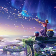
 I would say that my avatar portrays my carefree,adventurous personality. The way the petals carry off into the wind conveys being free to explore the world which is something I always look forward to in life.The petals also represent I’m a go with the flow type of person. The various sceneries depict the beauty I see in the vast world we live in. The different landscapes shows the adventures I wish to have in the future. This image really sets the way I like to imagine by the way the colors come together and make this image feel like a dream.

Some misinterpretations people could get from my avatar is that it is spiritual. This reason can be due to the fact it the woman seen in the picture looks like she is praying or practicing a ritual of some sort. People could interpret that she could be a farmer because of her possession of the petals, and pots that seem to resemble having wheat inside. Another interpretation someone might have when looking at my avatar is that the woman is killing the flowers by pulling them of their stems.

My profile conveys that I’m a laid back, adventurous person that is just fascinated by what the world has to offer. Also that I have a very whimsical vision when it comes to imagination. This matters to me because imagination is what makes me optimistic for the future, which is an necessity. It is necessity because I can see myself working in a field where it requires thinking outside the box. It can show that I am approachable and have various interests. And finally, my profile can represent on what I can offer the world.

ffcb801046eefb5dd27fc19202169cca-bpfull