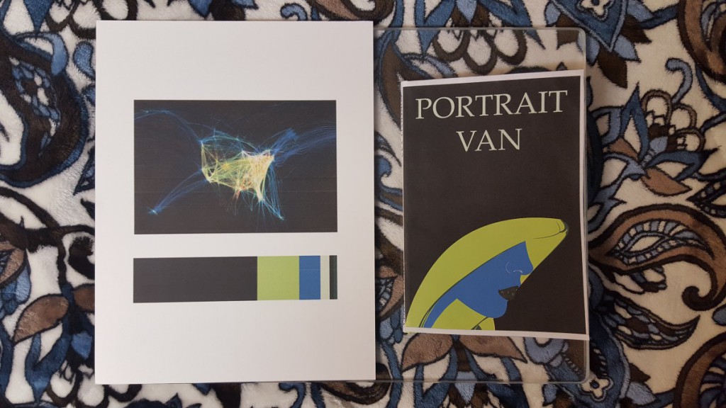
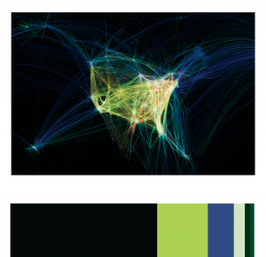
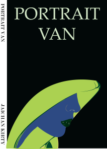
I liked this project, I learned a lot of new skills on illustrator. The most fun was creating the Humument book cover. I use illustrator to demonstrate Color Harmony. I learned that Color Harmony is a palette of hues, shades, tints or tones (saturation) used to produce pleasing color relationships to engage the viewer and it creates a sense of order in the visual experience. There is nothing I think I would change about this project, I finished everything on time and handed in on time.
Author: Jay
Color Harmony: Phase 3
I chose this image (DATA VISUALIZATION, FLIGHT PATTERNS, 2005–08) to reference in my Humument book cover because it is a juxtaposition of my books them. The original theme is about a boy becoming of age, and the new theme is mysterious. This image is mysterious because of all the negative space with the colorful spirals in the center.
Source Link
Time Spent – about 2 hours.
My Glossary Entries
Vocabulary:
Aesthetic
Juxtaposition
Monotony
Hierarchy
Conjecture
Simultaneous Contrast
Silhouette
Aloof
Solemn
Skylark
Unheralded
Disperse
Inventories
Orientate
Swatches
These glossary entries really helped a lot. By having to define the words and also explain the meaning of them helped me to get a better understanding of them more. If it wasn’t for these guidelines I would have just looked up the word and not think about it as much as I should have. Also by having my classmates post their entries benefited me a lot. When I go through the Ways Of Seeing site, I see the vocabulary my classmates post from readings. And when I go to read the readings, the words I don’t understand are already defined and explained thanks to my classmates.
Swatches
Noun
A small sample of fabric intended to demonstrate the look of a larger piece.
Source – Google Definitions
I encountered this word while reading the guidelines for project #6 for COMD1100. “The finished inventory should include an image of the color reference and a series of proportionally sized color swatches.”
Now I know what that sentence was saying, I need to include an image of the fabric that I will be inventorying as references for its color.
[Glossay Entry #15]
Orientate
Verb
To face or turn to the east
Source – Merriam-Webster
I encountered this word while reading the guidelines for project #6 for COMD1100. “Clearly orientate the viewer. Make sure the viewer understands how to navigate the cover”
Now I know what that sentence was saying, I have to make the cover so that viewers would want to look at it and clearly understand it.
[Glossay Entry #14]
Inventories
Noun
A complete list of items such as property, goods in stock, or the contents of a building
Source – Google Definitions
I encountered this word while reading the guidelines for project #6 for COMD1100. “Here are few examples of proportional inventories created from color references”
Now I know what that sentence was saying, it’s a list of properties from color references.
[Glossay Entry #13]
Disperse
Verb
Distribute or spread over a wide area
Source – Google Definitions
I encounter this word while watching TV. Now I understand that disperse means something is all over the place. It is scattered all around.
[Glossaty Entry #12]
Unheralded
Adjective
Not previously announced, expected, or recognized.
Source – Google Definitions
I encounter this word during the reading of Reading Lucy by Jennifer Egan
This word means not recognizing someone, or not expecting something to happen.
[Glossary Entry # 11]
Color Interaction Parings: Phase 4
This project was fun. I like working on the computer more rather than cut paper. I learned about Achromatic gray, what I learned on this group is, it was easy to see a difference because I was only working with grays. There wasn’t a lot of options to choose. Also Shifting value (with color), This group was a little tricky to create because of the value options. But with many tries, this is what I came up with. Also Shifting hue, but not value, This group was easy to create, I first chose a color and the chose another hue by sliding the hue bar up and down til I see a difference in the middle square. And Shifting hue and value, This group was also easy to create, I first chose a color and the chose another hue by sliding the hue bar up and down and then I changed the value until I see a difference in the middle square. Also we had to create a Free-Study – Paired Color Identities with Simultaneous Contrast. This Part of this project was fun to create. We had to chose a color that represents our partners personalities and then create an icon that would represent them while also creating Simulated contrast. I would not change anything about this project, I finished everything and handed them in on time.
Color Harmony: Phase 2
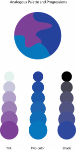
In order to create this Palette, I learned that a Analogous Palette colors that are adjacent to each other on the color wheel.
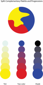
In order to create this Palette I learned that aSplit Complementary Palette is using one color plus two colors on either side of its complement.
