Free-Study – Paired Color Identities with Simultaneous Contrast
Step 1 – Color Research Process.
Jay
Shadin
Joyful
Creative
HelpFul
Quiet
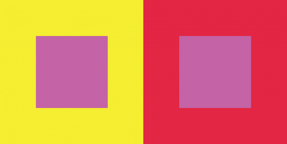
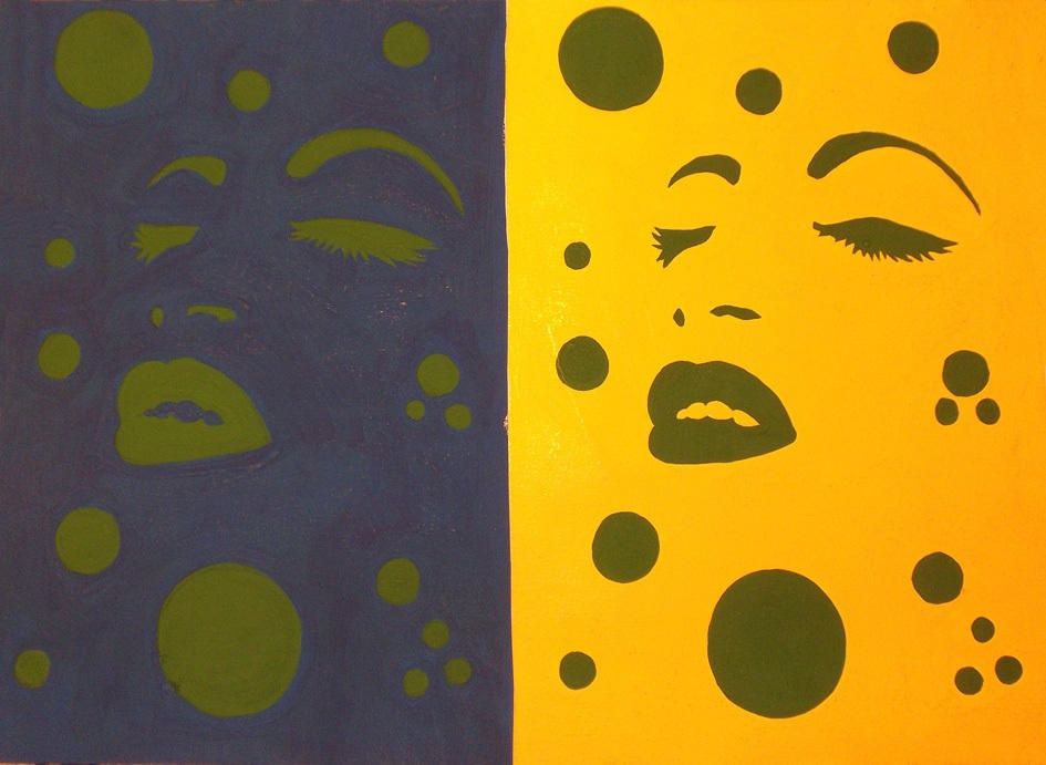
Relax FINAL COLOR – Saturated Red
Out-Going
Creative
Friendly
Energetic
Loud FINAL COLOR – Yellow
Step 2 – Color Mockups
Step 2 Color Mockup
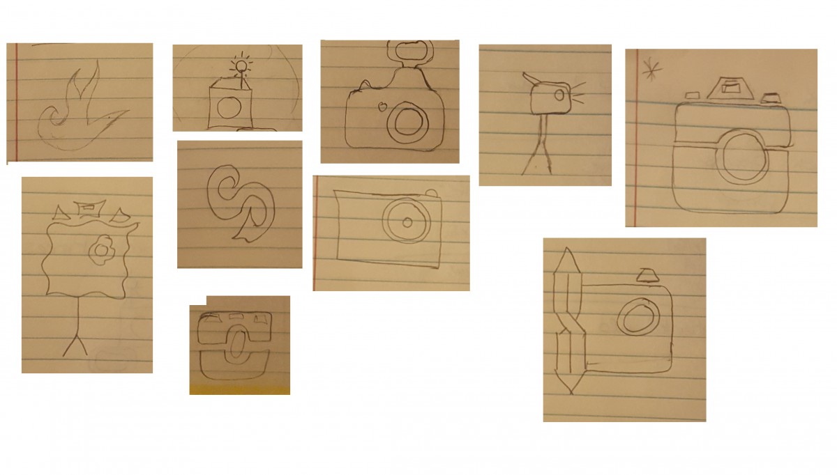
Step 3 – Icon Research Process
Step 3: ICON RESEARCH PROCESS
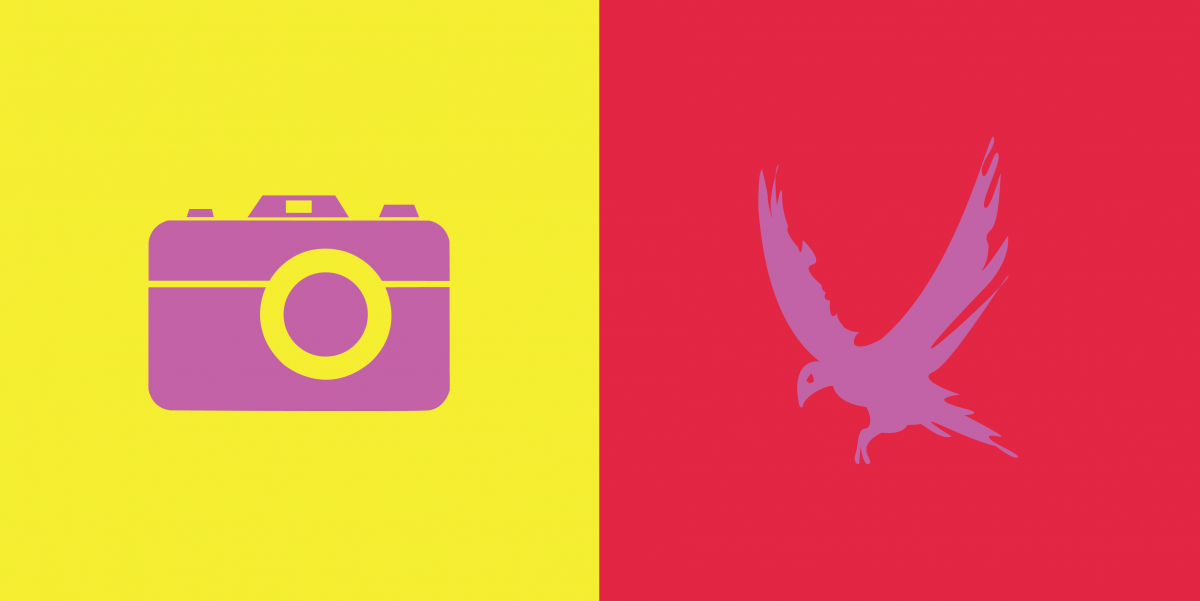
Step 4/5: Icon Mockup / Final Execution / Presentation
Step 5- FINAL EXECUTION
Thoughts This Part of this project was fun to create. We had to chose a color that represents our partners personalities and then create an icon that would represent them while also creating Simulated contrast.
This exhibit is presented by Jaichan Kirty, Jaichan Kirty was born and raised in Guyana, then moved to New York where he now lives and studies. Gathering inspiration from Tom Phillips’s altered text, A Humument, Kirty curate a project that integrates both words and visuals. A Humument is an altered book has unique combinations of literary and art, the author merged art with the connotation of specific words to exhibit two different genres into one. This book created by Tom Phillips, was released in 20th century. Like Phillips, Kirty found an inexpensive used book entitled Portrait of Ivan.The Portrait of Ivan is about a young boy coming of age while he is also discovering himself. Kirty transformed this book into new artistic creations both in appearance, by using ink, paint, pencil, cut outs, and folding.
Kirty also created a new title and theme for Portrait of Ivan.He had many ideas into the new title but finally decided on one, which is Portrait Van. The idea behind this new title came from the new juxtaposition theme for Portrait of Ivan, which is mysterious and creepy. This is a juxtaposition of Portrait of Ivan because a boy coming of age is supposed to be nice and pleasant. The opposite of that is mysterious and creepy. In order for Kirty to create these compositions and start changing Portrait of Ivan into Portrait Van. Kirty blocked out a huge amount of the pages and selected words and phrases to emphasize. He then created images using those words and phrases he wanted to emphasize in that page of the book.
The first piece of this exhibit is called, So that’s what it looks like. In English 1101, Kirty learned ahout over lapping New Yorks, which he incorporate in this pieces. Overlapping New Yorks include juxtapositions such as old and new, residential and commercial, historic and replaceable, natural and man-made, constructed and under-construction, well maintained and in disrepair, celebrated and forgotten, etc. Kirty has created a new window (a new view) into this book by using over lapping to create an illusion of a boy, who is Ivan, looking through a new page. He did this by cutting a square on the next page in the book. Kirty uses an X-Acto knife to carefully cut this square out of the page. Also, Kirty uses sharpie markers to cover up a huge amount of the pages leaving out a few words that create its own new story. These words creates a whole new meaning of this page. “So that’s what it looks like”.
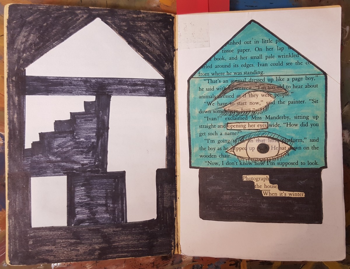
The second piece is called, Inside the House. In COMD 1100 Kirty learned about Shape (Organic, Geometric), Frame, Figure-Ground (Obvious, Ambiguous), Unity, Economy which he incorporate in this piece by blocking out a huge amount of the page and selected words and phrases to emphasize. “Opening her eyes” and “Photograph of the house when it’s winter”, which he used to create images. The first image is an eye-opening, which Kirty showed by drawing a closed eye and a second eye which is opened. This represents organic shapes. Then he uses white computer paper to cut out the shape of a house to emphasize the “Photography of the house when it’s winter”. Kirty chose white paper because snow is white and snow falls in the winter. Kirty then used the cut out of the house, which is the silhouette and glued it on the previous page. Also useing sharpie to create what it seems to be the inside of the house. This represented Geometric shapes.
The third and last piece of this exhibit is called, Blue Print. “Blueprint” was created when Kirty painted over a picture with saturated primary colors. Also, in COMD1100 Kirty learned about creating simple compositions demonstrating an accurate understanding of saturation, which includes Hue, Saturation, Prismatic Color, Muted Color, Chromatic Gray, Achromatic Gray, Luminosity, Primary Colors, Secondary Colors, Complementary Colors, Warm, Cool, CMY, RGB, RYB color models/systems. Kirty represted this concept by painting a blue box, and inside that box is a print of a foot-step, hence the title Blue Print. After painting over the picture, Kirty then closed the book allowing the paint to print over on the other page creating a paint splatter effect.
Panel #1
So that’s what it looks like
Jaichan Kirty
Born 1996 in Guyana
Lives and studies in New York
_________________________________________ Oh! So that’s what it looks like,2015
Sharpie on paper, 7.5″ x 5″
Kirty created this piece using an X-Acto knife to carefully cut this square out of the page, revealing the Portrait of Ivan that is on the previous page. Also, Kirty uses sharpie markers to cover up a huge amount of the pages leaving out a few words that create its own new story; Oh! So that’s what it looks like.
Panel #2
Inside the House
Jaichan Kirty
Born 1996 in Guyana
Lives and studies in New York
_________________________________________ “Inside the House” 2015
Sharpie on paper, White computer paper, Highlighter, 7.5” x 10”
Kirty blocked out a huge amount of the pages using a sharpie marker. While selecting words and phrases to emphasize, “Opening her eyes” and “Photograph of the house when it’s winter”. Which he used to create images. Kirty uses paper to cut out the shape of a house. The cut out of the house was glued on the previous page.
Panel #3
Blueprint
Jaichan Kirty
Born 1996 in Guyana
Lives and studies in New York _________________________________________
“Blueprint” 2015 Paint on paper, 7.5″ x 10″
“Blueprint” was created when Kirty painted over a picture with the saturated primary colors which includes blue, red and yellow. Kirty painted a blue box, and inside that box is a print of a foot-step. After painting over the picture, Kirty then closed the book allowing the paint to print over on the other page creating a paint splatter effect.
This exhibit is presented by Jaichan Kirty. Jaichan Kirty was born and raised in Guyana, then moved to New York where he now lives and studies. Gathering inspiration from Tom Phillips’s altered text, A Humument, Kirty curate a project that integrates both words and visuals. Like Phillips, Kirty found an inexpensive used book entitled Portrait of Ivan. The Portrait of Ivan is about a young boy coming of age while he is also discovering himself. Kirty transformed this book into new artistic creations both in appearance, using ink, paint, pencil, cut-outs, and folding. Kirty also created a new title and theme for Portrait of Ivan. He had many ideas into the new title but finally decided on one, which is Portrait Van. The idea behind this new title came from the new juxtaposition theme for Portrait of Ivan, which is mysterious and creepy. This is a juxtaposition of Portrait of Ivan because a boy be coming of age is supposed to be nice and pleasant. The opposite of that is mysterious and creepy. In order for Kirty to create these compositions and start changing Portrait of Ivan into Portrait Van, Kirty blocked out a huge amount of the pages and selected words and phrases to emphasize. He then created images using those words and phrases he wanted to emphasize in that page of the book. The first piece of this exhibit is called “So that’s what it looks like”. Kirty has created a new window (a new view) into this book by using over-lapping to create an illusion of a boy, (Ivan) looking through a new page by cutting a square on the next page in the book. Kirty uses an X-Acto knife to carefully cut this square out of the page. Also Kirty uses sharpie markers to cover up a huge amount of the pages leaving out a few words that create its own new story. These words creates a whole new meaning of this page. “So that’s what it looks like”. The second piece is called “inside the house”. Kirty blocked out a huge amount of the page and selected words and phrases to emphasize. “Opening her eyes” and “Photograph of the house when it’s winter”, which he used to create images. The first image is an eye-opening and then he uses white computer paper to cut out the shape of a house to emphasize the “Photography of the house when it’s winter”. Kirty then used the cut out of the house and glued it on the previous page and used sharpie to create what it seems to be the inside of the house. The third and last piece of this exhibit is called “Blue Print”. “Blueprint” was created when Kirty painted over a picture with saturated primary colors. Kirty painted a blue box and inside that box is a print of a foot-step, hence the title Blue Print. After painting over the picture, Kirty then closed the book allowing the paint to print over on the other page creating a paint splatter effect. The resulting work merges image and text for each new project or concept in both courses he was taking COMD 1100 and English 1101.
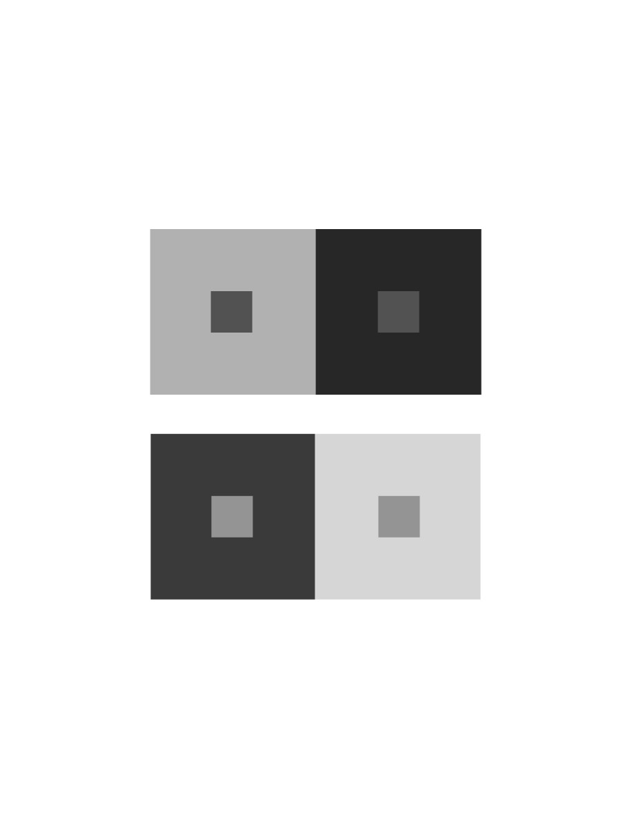
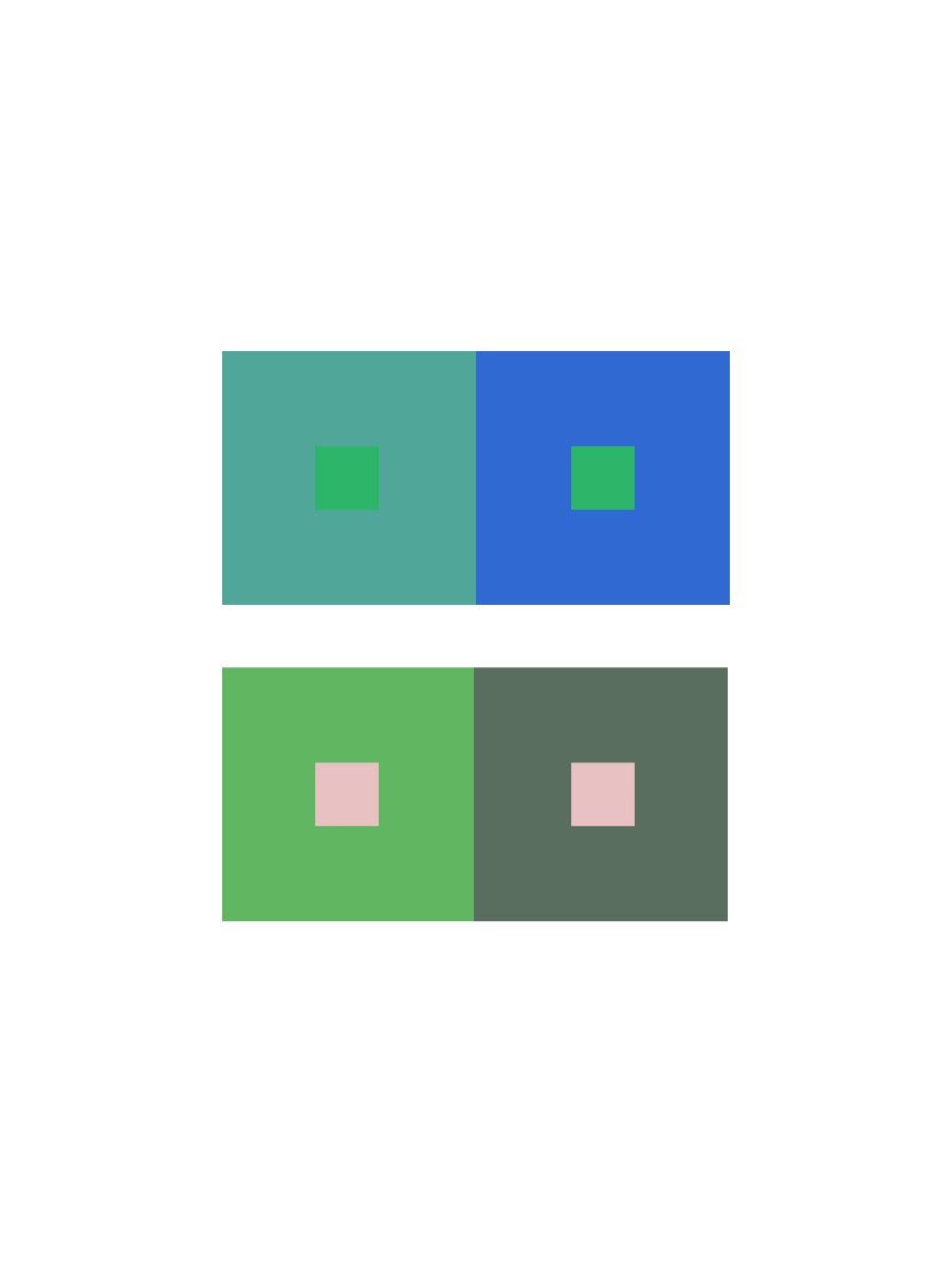
In the first picture, the red dots are being contrast. on the right, the red looks saturated because of the surrounding grays. On the left the dots look really bright and pure. However both red are exactly the same. In the second image the triangles are fading away on the right side while you can clearly see it on the right side. The green triangles are being simultaneous Contrasted.
What I learned on this group is, it was easy to see a difference because I was only working with grays. There wasn’t a lot of options to choose.
Took about 10 minutes.
Group 2 – Shifting value (with color)
This group was a little tricky to create because of the value options. But with many tries, this is what I came up with.
Took about 25 minutes, because I had to experiment a lot to get what i was looking for.
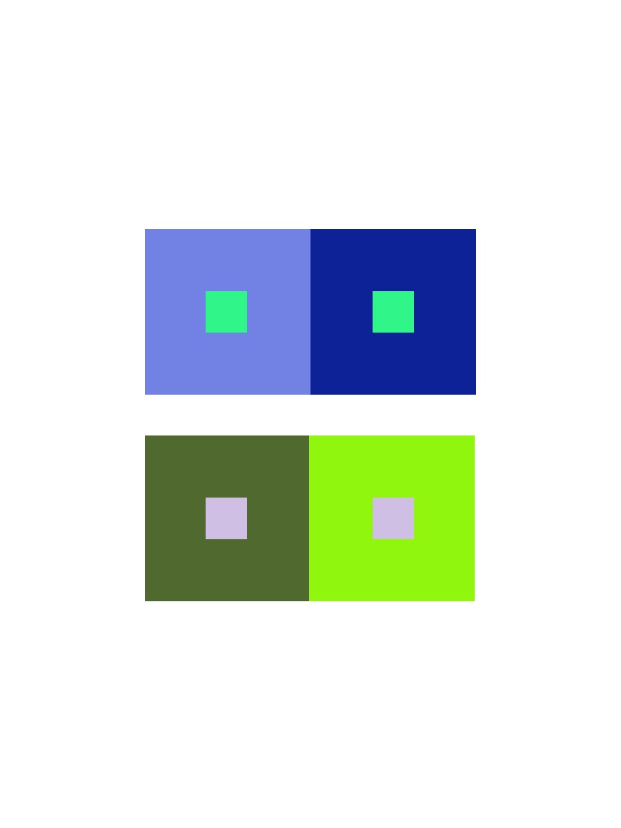
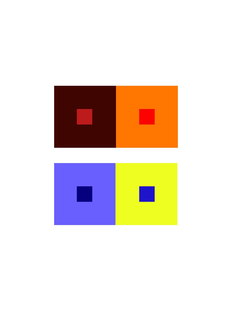
Group 3 – Shifting hue, but not value
This group was easy to create, I first chose a color and the chose another another hue by sliding the hue bar up and down util I see a difference in the middle square.
Took about 10 minutes
Group 4 – Shifting hue and value
This group was also easy to create, I first chose a color and the chose another hue by sliding the hue bar up and down and then I changed the value until I see a difference in the middle square.
Took about 10 minutes.
Group 5 – Extra Credit
This group was very difficult because I had to keep changing the colors so that I could make the middle squares look alike.


