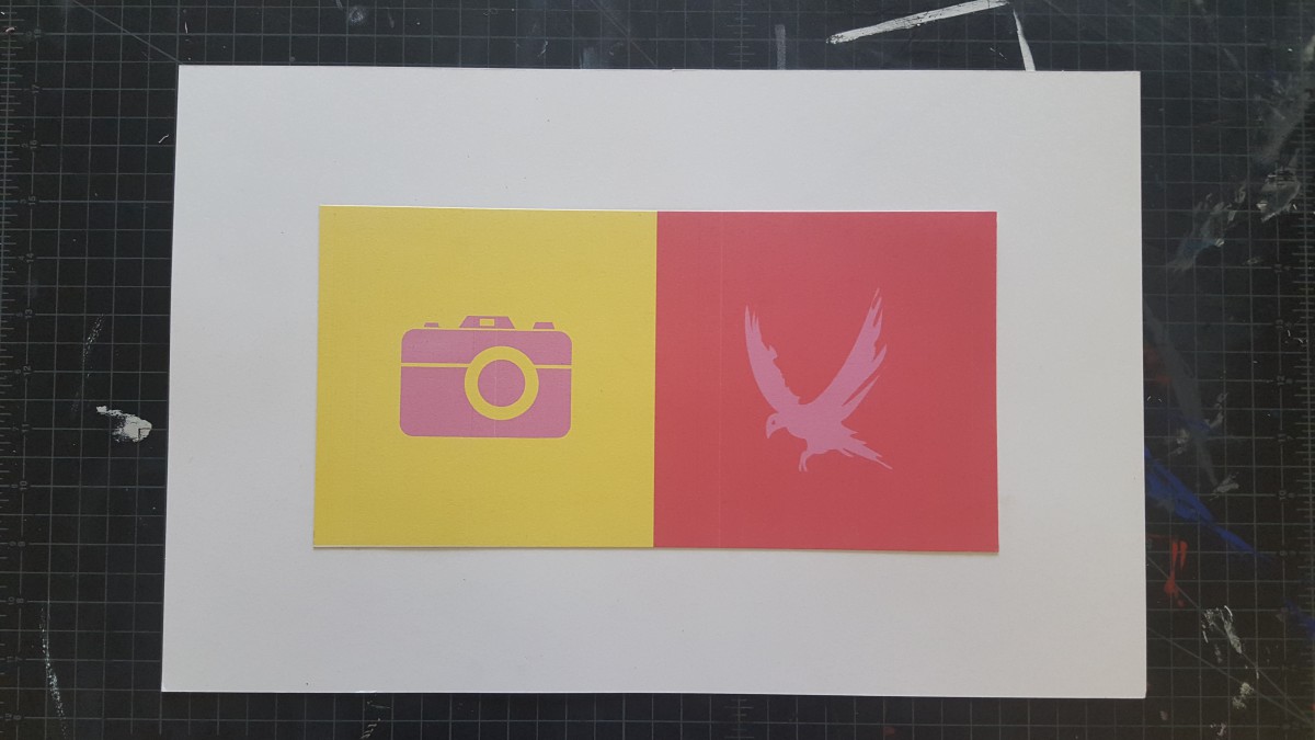
This project was fun. I like working on the computer more rather than cut paper. I learned about Achromatic gray, what I learned on this group is, it was easy to see a difference because I was only working with grays. There wasn’t a lot of options to choose. Also Shifting value (with color), This group was a little tricky to create because of the value options. But with many tries, this is what I came up with. Also Shifting hue, but not value, This group was easy to create, I first chose a color and the chose another hue by sliding the hue bar up and down til I see a difference in the middle square. And Shifting hue and value, This group was also easy to create, I first chose a color and the chose another hue by sliding the hue bar up and down and then I changed the value until I see a difference in the middle square. Also we had to create a Free-Study – Paired Color Identities with Simultaneous Contrast. This Part of this project was fun to create. We had to chose a color that represents our partners personalities and then create an icon that would represent them while also creating Simulated contrast. I would not change anything about this project, I finished everything and handed them in on time.


Nicely done, I preferred much more high quality photo, so that who ever seeing the project should be able to see the color interaction. Since that is our main goal. Also, do not forget to add how many hours you took to create this project. Many people tend to forget that.