Color Harmony: Phase 4

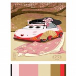
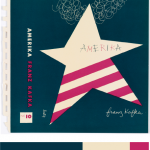
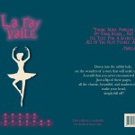
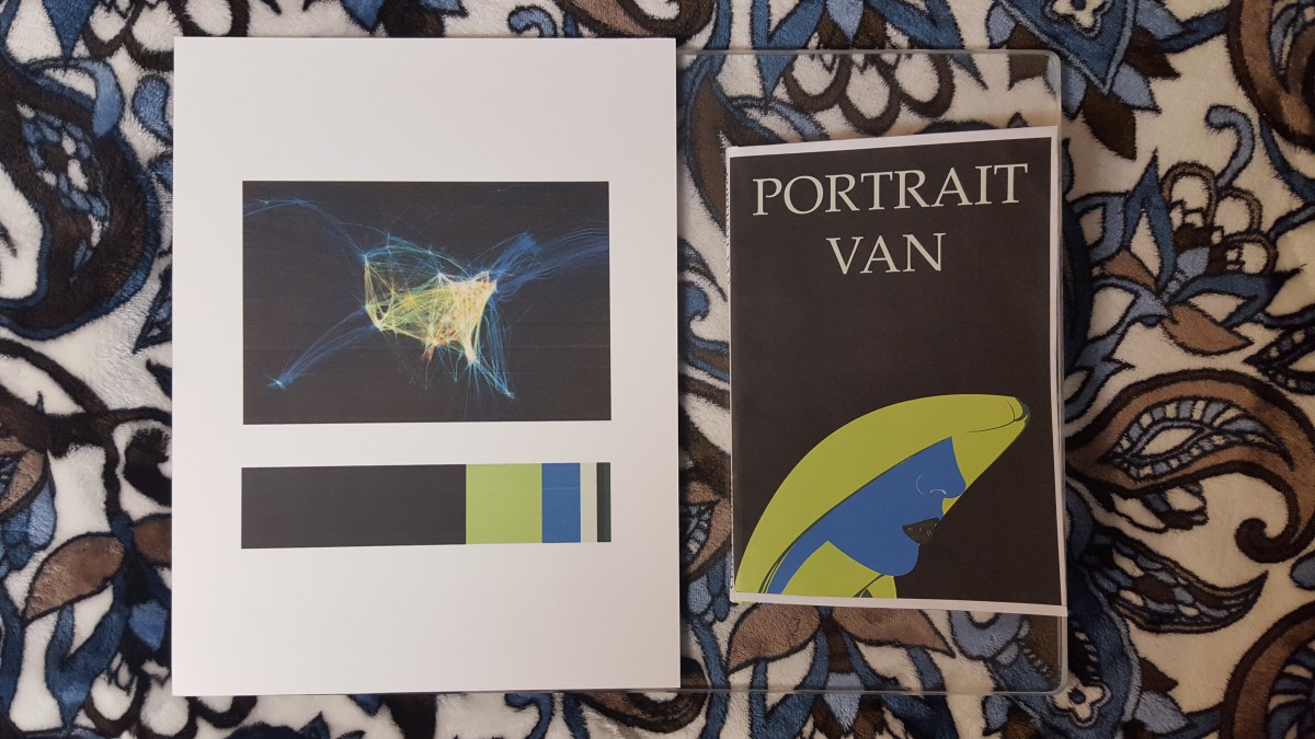
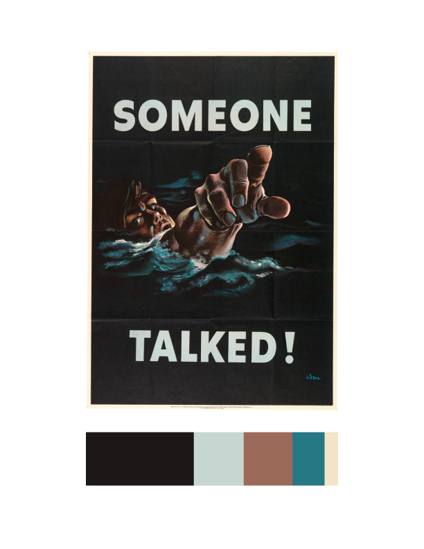
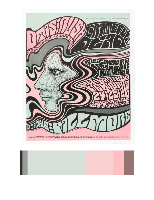
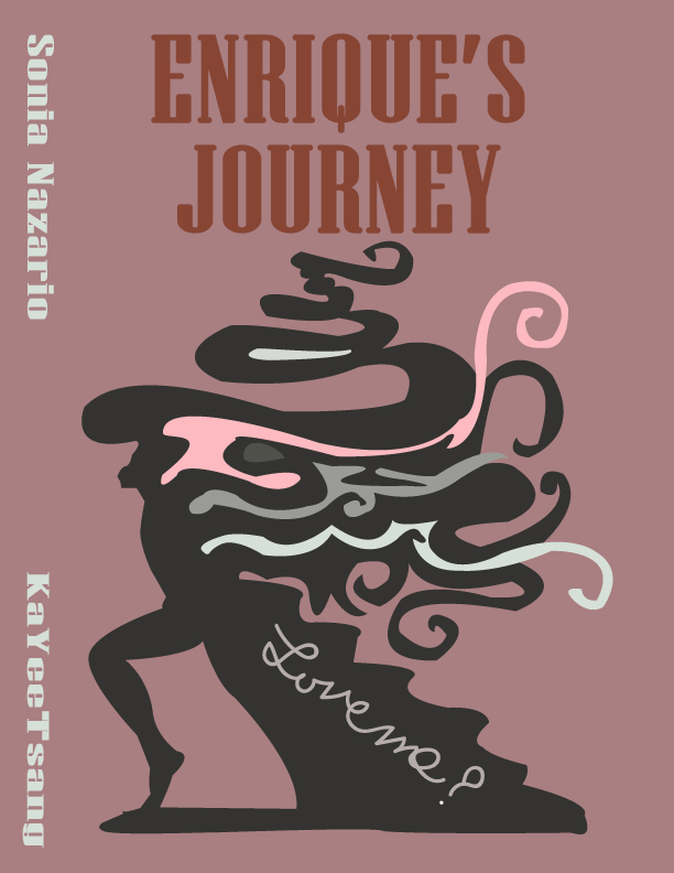
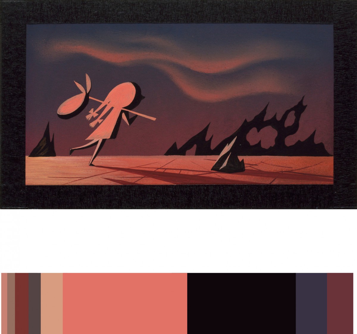
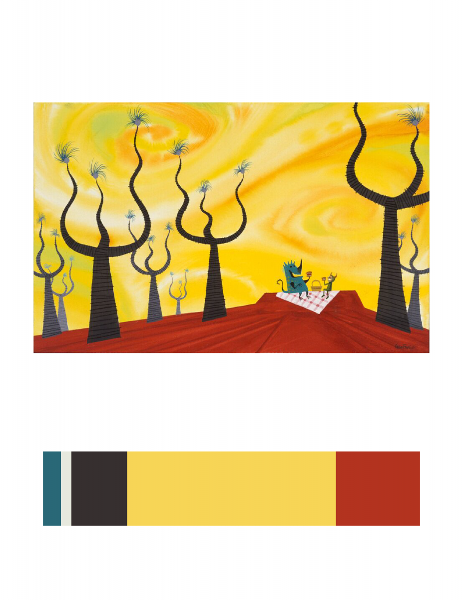
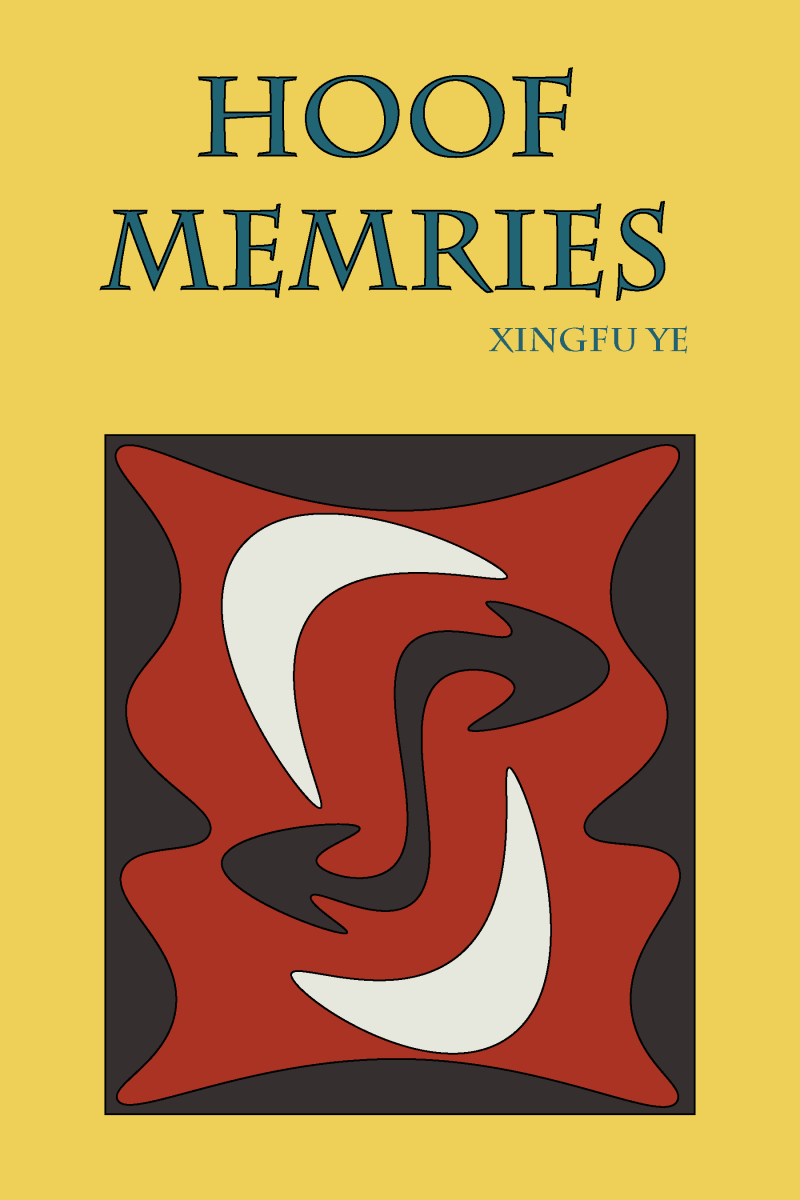
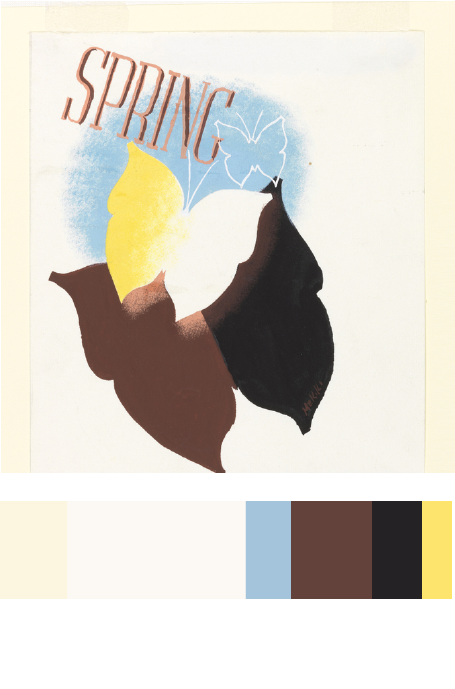
This project was the final one for this course and shortest one that I had to complete. Overall for this project I learned about color harmony which was making colors together. I had to create a split-complementary palette and an analogous palette which were two types of color relationships. Then my class went on a trip to the Cooper Hewitt Museum where we had to find references for our book covers that we had to make for our humument books. The hardest part of this project was finding the right poster to use for the Color Proportion Inventory, which was another assignment we had to complete. The poster had to have a dominant color, sub-dominant color, accent, and a tint or shade. The poster also had to relate to the theme of our humuments. There was a lot of experimentation done with color and I had fun seeing different types of combinations.


Color Harmony: Phase 4

For this project, I picked dominant, sub-dominant, and accent colors from the design museum we went as a group. It was called, Cooper Hewitt. As I saw varieties of different designs, this book cover made me catch my eyes since it had all I need for this project. I picked it since it was simple to work with, and the choice of the color matched my theme itself. I used the eye dropper from the color inventory and used Photoshop over all to make the new book cover (at the right). I picked ballerina for my cover since I used a ballerina in one of my design it self. I used my theme for my style in the font also. I gotten the quote for the back and I done everything else at the back with the bar code and the numbers and the lines are all changed to the color I picked from my inventory. Over all for this project, other than the time we went to the museum, it took me about two hours to work on it. I also liked this project, since I was able to express freely about the theme of my book and how I was able to use technology to work on it.

color harmony: phase 4

This was the final project for our course. Fusing together all the skills aquired and learned, we were to create book covers for our humument books. In refrence to a work of art located in the Cooper Hewitt museum, humument books used proportional color schemes to crate a holistic harmony between color and composition. The themes of my book are wonder and fantasy. Because of that i chose a work of art that uses various tints of blue. Emitting a feeling of peacefulness and dreams, this was the perfect inspiration for my book. I used question marks in my book cover design because wonder is often associated questions. Another reason is because when someone is aware of dreaming there is often a question between what’s real and whats not. This relates to my book which deals with various memories of fantasies and dreams. Because they are memories (remembrances) there can be a question of what truly did and did not happen. Overall, this project was learning to create balance using every skill in our tool box, even those of English. Its one thing to have the skills but another to apply them harmoniously.

Color Harmony: Phase 4

I liked this project, I learned a lot of new skills on illustrator. The most fun was creating the Humument book cover. I use illustrator to demonstrate Color Harmony. I learned that Color Harmony is a palette of hues, shades, tints or tones (saturation) used to produce pleasing color relationships to engage the viewer and it creates a sense of order in the visual experience. There is nothing I think I would change about this project, I finished everything on time and handed in on time.

20151220_135549

Color Harmony: Phase 3

After going on our Cooper Hewitt museum trip, I chose this digital painting( Kabuki Theater Poster) by Ellen Mon Lee because I love the color palette, the Japanese influence and being underneath a cherry blossom is soothing. I thought this would be a good inspiration behind Glass Child because the theme of this book is tranquil and slice of life. The total time to complete this process was 6 hours.(Source)


Color Harmony: Phase 3

TKcolorinventory
Color Inventory
project6finalcolorinventory02
Humument Book Cover


The reason I chose this image (Poster, Otis Rush 1967) to reference in my Humument book cover because the main idea of this image is psychedelic. The original theme is about a boy go to find his mother in America, and the new theme is mind-altering. Base on my humument design of the third page, I used to describe his feeling, which is the select the text the show out his feeling. This image is using the deformed bubble text, sinuous lines and pale colors produce an optical surge, suggesting the effects of hallucinatory on the mind.

Source Link

Color Harmony: Phase 3

Cover side-01
Humument Book Cover(side)
Humument Book Cover (Front)
Color Inventory
Color Inventory


I choose this image (CONCEPT ART, SULLIVAN AND BOO, MONSTERS, INC., 2001) because the feeling this image gives to me is really close to my Humument book’s theme. The theme of the original book is about a resilience in the face of family tragedy, and the new theme is about imagery of fantasy. This image is fantasy because the scenery in the image seem does not exist in real world. Here is link to Cooper Hewitt Research: Here

Total time spend: 2 hour and 50 minutes

Color Harmony: Phase 3

book cover chriswarecolorinventory.ai

I chose this piece ( Spring in the Country, 1935) posted by Edward McKnight Kauffer, acquired it in 1963. I chose this piece to reference in my Humument book cover because most color contains in this piece are warm colors, like yellow, chromatic red (brown), and muted yellow. The theme I chose for my humument is relax, warm color can better to represent my theme, it gives a feeling of warmness and relaxable.

source link