Color Harmony: Phase 3

book cover chriswarecolorinventory.ai

I chose this piece ( Spring in the Country, 1935) posted by Edward McKnight Kauffer, acquired it in 1963. I chose this piece to reference in my Humument book cover because most color contains in this piece are warm colors, like yellow, chromatic red (brown), and muted yellow. The theme I chose for my humument is relax, warm color can better to represent my theme, it gives a feeling of warmness and relaxable.

source link 

Glossary Write-Up

propeller

inextricably

Filthy

coherent

genre

Chiaroscuro

Beguiles

Sentiment

secluded

illuminati

vehement

cliché

midair

riveting

The glossary assignment helped me a lot in building vocabulary. I learned from my own glossary, at the same time learned from the glossaries posted by others. I born and raised up in China, that caused I didn’t have much chance to contact with the English. So when I came to NY, English becomes one big problem to me in conversation. The glossary is a good assignment for the students study for English. When we don’t understand any words, we could searched up to see the definition and make it as a glossary, not only to help myself, also helped other students who never seen this word to encounter it.

riveting

adjective

  • very exciting or interesting

http://www.merriam-webster.com/dictionary/riveting

I saw this word from the reading excerpt: ” The Boston Photographs”. On the line says ” When I talked to editors.. they used words like ‘interesting’ and ‘riveting’ and ‘gripping’ to describe them.”

midair

noun

  •  a region in the air not close to the ground

source: http://www.merriam-webster.com/dictionary/midair

I saw this word from the reading excerpt: ” The Boston Photographs”. On the line says when the child almost fallen down from the building. At that time he was in midair.


Exhibit Catalogue (final)

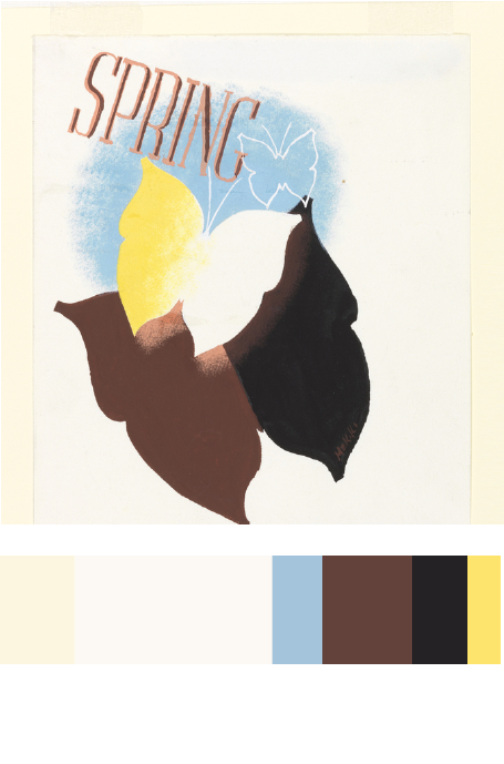
Jiao, inspired by Tom Phillips’ A Humument, exhibits her works and at the same time, tells a short-story plot about Macbeth, she also adds a new feeling to it other than the tragedy; a positive feeling of relaxation and warmness for readers. Tom Phillips created Humument by using a collage, placement, color value, and other skills as reference to that. Jiao created her own humument art known as The Stage of Value, Box of dimension and Music Party DO-RE-MI. Jiao conveys a lot messages in her humument arts, and also gives an effect of Macbeth itself. She chose Macbeth by William Shakespeare to be the paper layer for her humument, by using the same skills as Tom Phillips, she chose to use the three skills which are the collage-making, placement, and overlapping. Each skill used in a different piece of work.


The Stage of Value is her best piece of work. It may look easy and simple but, the meaning behind, is significant. For The Stage of Value the artist chose to articulate value, which is the lightness and darkness of a color, she used materials of inking brush pens (black, dark gray, and light gray). Using inking brush pens to block out specific words, Jiao chose the word “stage” to incorporate the fact that Macbeth is a famous play itself. Using the skill of placement, the page shows value from the darkest blacks to no color at all. The black and grays color choices refers to the evilness, hopeless, and the o a lot of negative messages conveyed from Macbeth. More than half of the areas were low-key, with only a small part left as white, because there remain little positive messages left in Macbeth, which are former king’s kindness and soldiers’ loyalty.


Her second work is The Box of Dimension, in this piece, Jiao shows technique of overlap. Using inking brush pens to color boxes into different values, the transparent gray colors merged up and becomes overlapped. By overlapping the boxes with different ranges of value together, it tricks the audience’s eyes and gives a 3D-feeling. The design makes it look like a time tunnel, the boxes represent tunnel entrances that connect with different time dimensions. They can transfer you to the another world, the era that had Macbeth’s existence is included in one box of dimensions; viewers could take a guess of which box is the entrance to the world of Macbeth. This page can be a little game for you, after you chose a box, flip to the next page to see if there is a word that says “Macbeth” behind the box you chose, if there is, it means you were right.


The last one is Music Party DO-RE-MI, it shows Jiao’s learning of rhythmic pattern that she connects with her interest in music. This composition shows the two different rhythms of staccato and legato. Staccato represents sharp patterns while legato represents round patterns, Jiao combines them up and turned music into art. Macbeth is also a famous stage opera show, the actors sing out their lines while following the background music. In her last humument art, Jiao gives the message that Macbeth is not just a book, it is also an opera. By covering the patterns over the lines, she conveys these lines that could be sung out as a beautiful song. So when people read Macbeth, at the same time they can get a feeling of listening to music, feel relaxed, get a different feeling such as Macbeth’s tragedy. Same concept for Box of Dimension, interesting 3D-feeling that brings you out of a sad tragedy and makes you feel joyful.

Color Interaction Parings: Phase 3

color interaction paring

Colors indicate different things, such as emotion, feeling, and personality. From this project, I learn to discribe a person by using colors instead of using literature words. I chose dark blue as a representation for my partner. His first impression to me was he is a calm person who good at observing people. And after comprehend more about him from the conversation, I convinced I was right. Considered he took phycology in high school, enjoy in reading books  more than entertainment with others, and likely isolated himself from people, I determine he is an introvert with sensitive feeling, intelligent but mostly used it for himself only, don’t easily show expression or feelings because of too calm.  According to these observations I chose for him dark blue, a color mixed of blue and black. The logo I chose for him is an eyeball, eyeball represents mystery, he’s  fully surrounding by it, another reason is because he can’t stop  observing people so I believe the eyeball is the best logo to indicate him. We spend about a half hour to finish everything. It’s a interesting project, and I learned new knowledge of colors.

Exhibit Catalogue

A Humument is an altered book has unique combinations of literary and art, the author merged art with the connotation of specific words to exhibit two different genres into one. This book created by Tom Phillips, released in 20th century. Now in 21th century’s today, an artist whose name is Jingyi Jiao, she inspired by A Humument, as reference to that she created her own humument and named as “The Stage of Value”, “Box of dimension”, and “Music Party DO-RE-MI”. Jiao born and raised in Tianjin, China. She now lives in New York as a college student, majors in Communication Design and continuing her art design studies. Jiao chose Macbeth to be her humument, by using the techniques learned from her english and graphic design classes helped to create art works on Macbeth, such as collage, placement, overlap, etc. “The Stage of Value” is her best piece of work. It looks easy and simple, but the meaning behind is significant. For “The Stage of Value” the artist chose to articulate value, which is the lightness and darkness of a color, used materials of Inking brush pens (black, dark gray, and light gray). Using inking brush pens to block out specific words, Jiao chose the word “stage” to incorporate the fact that Macbeth is a famous play itself. Using the skill of placement, the page shows value from the darkest blacks to no color at all. The black and grays color choices refers to  the evilness, hopeless, and the bunch of negative messages convey from Macbeth. More than half areas were low-key, only a small part left as white, because there still a little positive messages left in Macbeth, which are former King’s kindness and soldiers’ loyalty. Her second work is the “Box of dimension”. In Box of dimension, Jiao shows technique of overlap. Using inking brush pens to color boxes into different values, the transparent gray colors merged up, and becomes overlapped. By overlapping the boxes with different ranges of value together, it tricks your eyes and gives a 3D feeling. The last one is the “Music Party DO-RE-MI”. In Music Party Do-Re-Mi, it shows Jiao’s learning of rhythmic pattern that she connects with her interest in music. This composition shows the two different rhythms of staccato and legato. Staccato represents sharp patterns while legato represents round patterns. Jiao combines them up by using the creativity to turn music into art. So when people read this Macbeth, they can get a feeling of happy and relax, an opposite feeling as Macbeth’s tragedy. Jiao conveys a lot messages in her humument arts, and it also gives an effect to Macbeth. She exhibits her works at same time tells a short story plot about Macbeth, and also add a new feeling to it, other than the tragedy it brings a new kind of fresh mood for readers.

cliché

noun

a phrase or expression that has been used so often that it is no longer original or interesting

something that is so commonly used in books, stories, etc., that it is no longer effective

Source: Merriam-Webster 

In Eng1101, I learned this word from a reading called ” The Boston Photographs”. On line says: ” Learn to use clichĂ©s with devil-may-care abandon.” There is a interesting symbol on top of the letter “e”, I curious what is that meaning for, is anyone knows that?

Color Interaction Pairings: Phase 2

Group 1: Shifting Value
Group 2: Shifting Value in Color
Group 3: Shifting Hue, Not Value
Group 4: Shifting Hue and Value
Extra Credit: Making Two Different Colors Look Alike

According to this project, I learned different compositions will give us different visual effect. Warm back layer gives an effect of pumping out the composition that over it. Cool back layer opposites that, it gives an effect of inward zooming, like a 3D tunnel. Also when you put the same color on both cool and warm back layers, you will see two colors that exactly same will became two different colors, which called simultaneous contrast, an interesting effect tricks your eyes. I think the most painful part is when you are up on group 4 and extra credit part, because you have already stared on compositions with simultaneous contrast for long time, so the illusion may caused headache and eyes damage. It decreased my concentrations a lot, therefore this part is the best part to challenge yourself as a designer.

I spend around 5-10 minutes on each pairs