Reflecting on this project, I seem to have some sort of understanding of all the concepts we were intended to learn, although i hope to grasp an even bigger understanding of them throughout more of my courses. With these color interaction studies, i was able to learn how colors are much more than what they seem. I was able to understand how intergrating concepts like saturation, value, hue, and tons can affect a color, and create something completely new.
Category: COMD1100 Project #5
Color Interactions: Phase 3
With fellow classmate TK, we both researched on how color can be used to express certain personality traits. Not knowing too much about each other, we composed a list of how we saw each others personalities. Based on that list and our research, we created our Paired Color Identities Composition. 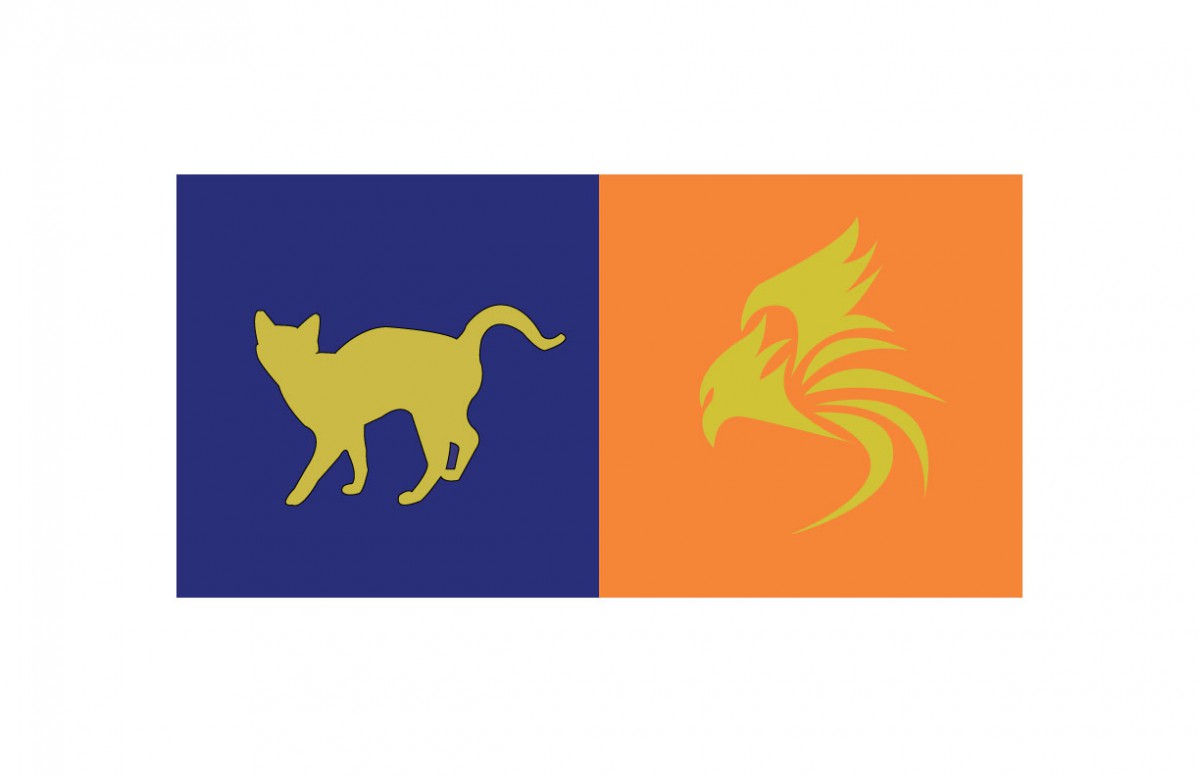
I decided to choose a more lower valued blue, with less saturation for her personality. I felt this color was suitable for her, as i saw her as a more cool, clam, and reserved kind of individual. She is also very shy, (hence why i chose to de-saturate the color). Blue is very commonly used to express these kind of traits in a person.
Color Interactions: Phase 2
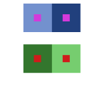
The first color interaction observed is based off shifting hue, without touching the value, while the second shifts BOTH hue and value.
Hue Change, No Value
Shift in Both Hue and Value
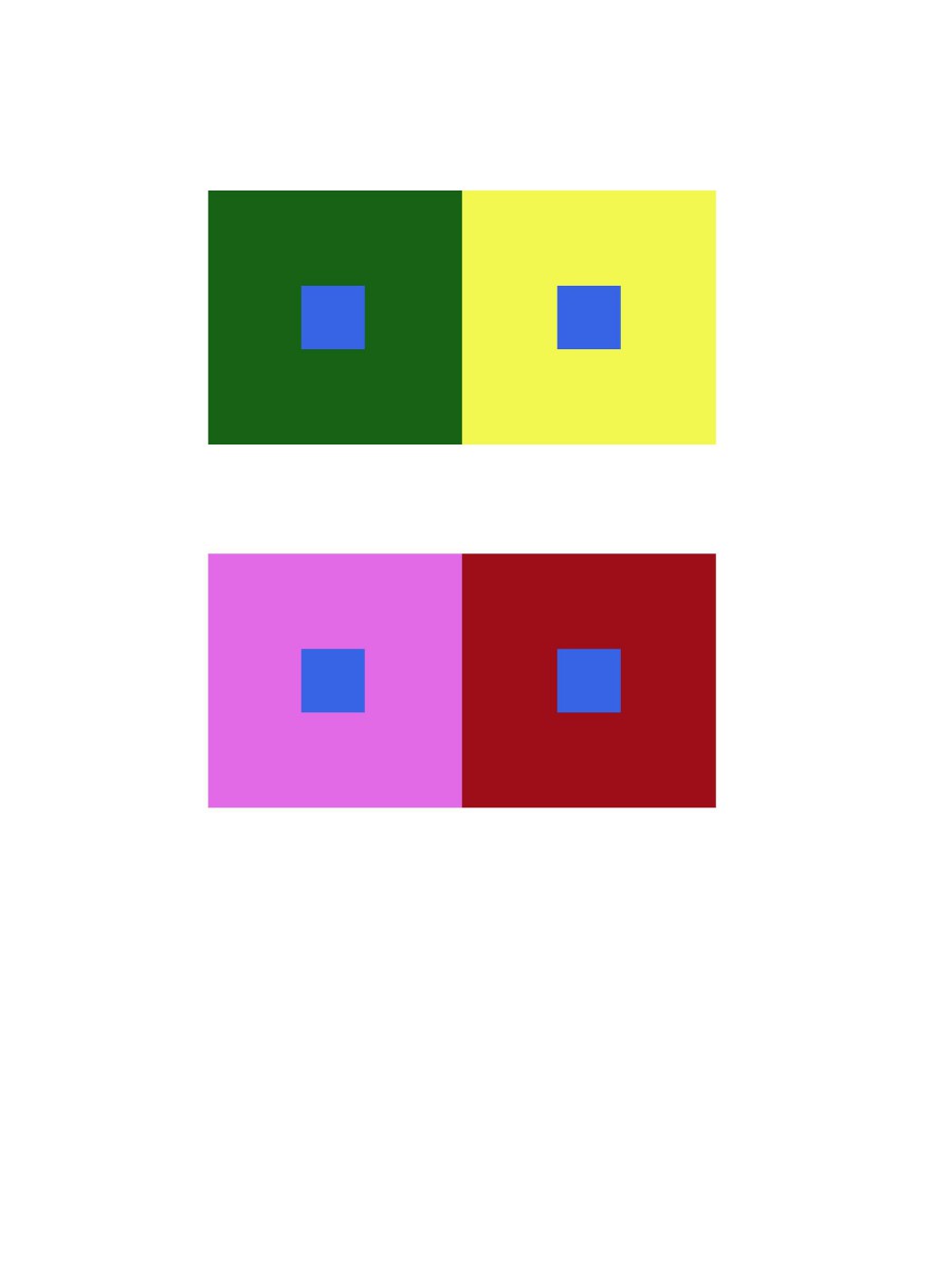
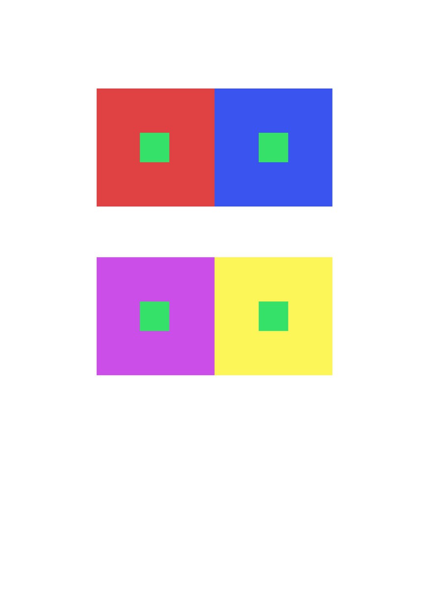
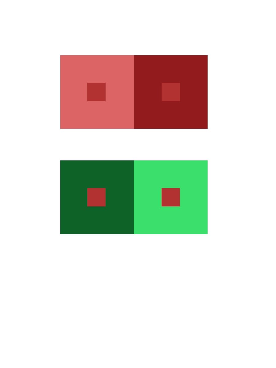
Color Interaction Pairings: Phase 1
These color interactions are based off of adjusting the hue, but without touching the value.
Shifting Value (Greyscale)
Shifting Value (Color)
color interaction pairing
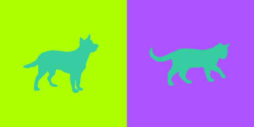
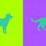
doing this project was actually pretty fun and was a nice experience. i got to know my partner better and see what we have in common and what is different about us. i also got a better understanding of color interaction and the way my eyes would see color. i chose a mixed color of pink and blue and that is the color you see on the right because of my partner Brandy Ortiz’s personality. her personality consist of being serious, giggly, passionate, and outgoing. i chose a cat as her icon because thats what she reminds me of because she can be giggly and happy at one point and switch it up real quick and be a very serious and straight forward person.
Color Interaction Parings: Phase 4
For this project, I learned about simultaneous contrast. Simultaneous contrast is when you have to colors next to each other one of the colors change due to the contrast between the colors. In class we had to go through four studies (shifting value, shifting value with color, shifting hue but not value and shifting hue and value) of changing colors with simultaneous contrast. This was really fun to me because of the way the the middle color that was being surrounded looked like a completely different color. It was like an optical illusion and my eyes felt like they were zooming in on the color which was pretty cool. After getting through this phase the next step was to partner up with someone and create simultaneous contrast with colors that best represents our personalities. As a bonus, we also had to create logos for each other that represents our personalities but at the same time both logos had to be similar in a way. Not only was it fun getting to know my partner but the research in finding colors that represents different traits was fun as well. The challenging part for me was coming up with cohesive logos. I believe it was hard because there was a lot of different traits deal with so it’s was hard finding that one thing that represents everything. For the next project, if it deals with logos what I’ll probably do is do more research on how to create logos so I can have an easier time with that part.


Color Interaction Pairings: Phase 3
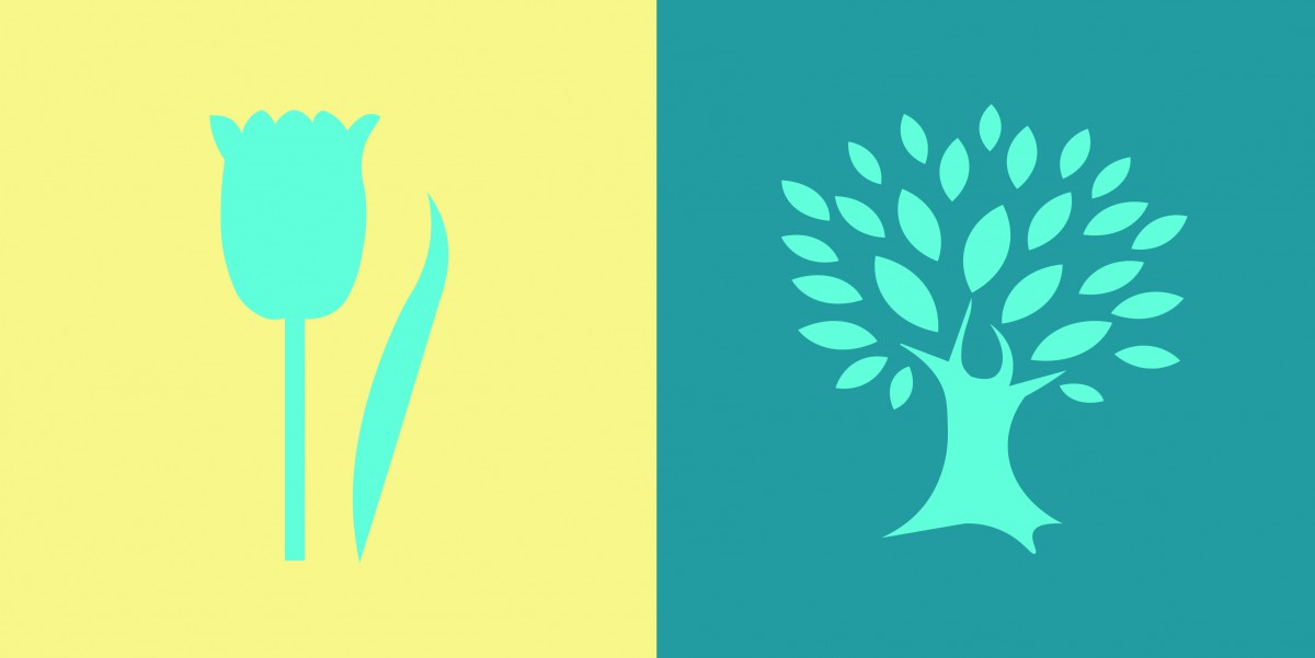
I found this project really fun to do. For project #5, the class had to pair up with someone and think of a color that represents their personality. For my partner, I chose a teal color. I chose this because it has a mix of blue and green. For blue, my partner is calm and creative. For green, it’s for his liking in nature. After we chose the colors, we had to choose a shared color that matched both our personalities. The color that we both agreed on was turquoise because we are both calm. We also had to make a logo that represented our partner. I chose a tree because of my partner’s liking in nature. This project took around 3 to 4 hours to complete.
Color Interaction Parings: Phase 4
For this project, I learned the meaning of the color interaction such as simultaneous contrast, optical mixing, and complementary colors. The fun part of the project, we have to create total 8 pairs of color studies will explore interaction by shifting value, shifting value with color, shifting hue, but not value and shifting hue and value. It was really fun at the first time and tried to analyze the different between those color. The important part of this project I really liked is phase 3 (Paired Color Identities with Simultaneous Contrast), because we have to observe our partner, try to find the perfect color to represent his/her personality, that is really fun to research the meaning of the color. Since we used the illustrator to create the 8 pairs of color studies, the phase 3 part will be easy and effective to make it. I would not change anything of this project.
Color Interaction Parings: Phase 3
I thought this project was fun. For this project, Klever and me picked a color that represents us for the color and the logo. These logo and color have to represent our personality which is yellow at the logo, because we are positive, clarity, energy, optimist person. Then Klever chose the blue color that represents my personality such as bubbly, reserved, shy, etc. I never think I’ll be a blue color person, that is the first time someone say it. In my observation, Klever is a talkative, positive, optimistic person, when I see the meaning of an orange color, the color is represent his personality very definitely. After that, we had to come up some idea for the logo, than I saw his necklace which was a bird from the movie (hungry game). I came up some idea like phoenix or bird that prominent his personality, because Klever has leadership at the class participation. When I used to draw the logo of the illustrator, it took me half hour to finish it. I know how to use the illustrator that is more helpful and save a lot of times to create it. I really liked this part of the project 5, and thank you to my partner Klever who understands and help me a lot of this project.
Color Interaction Parings: Phase 4

For this project, I had to use my knowledge of color interaction, where the color are the same but the background color tricks our eyes to see differently. Also, because of how one is more d saturated, and other are much more muted color. Making the logo stand pop out or sinks it in. The hardest thing to do for this project was where we have to come up with a logo. We had trouble at first, however we decided on using abstract piece. (Explained in Phase 3) Took me about four hours and forty minutes in total, with sketching and everything.

