Color Interaction Pairings: Phase 3

color interaction

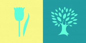
I found this project really fun to do. For project #5, the class had to pair up with someone and think of a color that represents their personality. For my partner, I chose a teal color. I chose this because it has a mix of blue and green. For blue, my partner is calm and creative. For green, it’s for his liking in nature. After we chose the colors, we had to choose a shared color that matched both our personalities. The color that we both agreed on was turquoise because we are both calm. We also had to make a logo that represented our partner. I chose a tree because of my partner’s liking in nature. This project took around 3 to 4 hours to complete.
 

Color Interaction Parings: Phase 3

colorinteractionfreestudy_

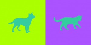
This project I found to be really fun and interesting. Not only was everyone able to work with a partner but we had the chance to get to know our partners in this activity. So with my partner Tyler, we had to pick a color for each other that best represents the other person’s personality. Then we had to pick a color that matches both of our personality traits. Next we had to come up with logos that represented each other but in a way that they are similar. With all of these elements we had to make sure our work showed simultaneous contrast. I chose yellow-green for Tyler because he’s mainly funny and outgoing(that represents the yellow) but at the same time he’s relaxed(that represents the green). Tyler chose to do a pink-blue color for me because although I’m cheerful and giggly(that represents the pink) I’m also intellectual, trustworthy and relaxed(that represents the blue). Our shared color is a blue-green to represent our relaxed traits. Tyler chose a cat logo for me since I’m cuddly but clever like a cat. I chose a dog for Tyler because dogs are outgoing and he really loves dogs. This part took about 4 hours and 30 minutes to complete.


Color Interaction Parings: Phase 3

Free-Study – Paired Color Identities with Simultaneous Contrast

Step 1 – Color Research Process.

Jay  Shadin
Joyful
Creative
HelpFul
Quiet
Relax
FINAL COLOR – Saturated Red
Out-Going
Creative
Friendly
Energetic
Loud
FINAL COLOR – Yellow

Step 2 – Color Mockups 

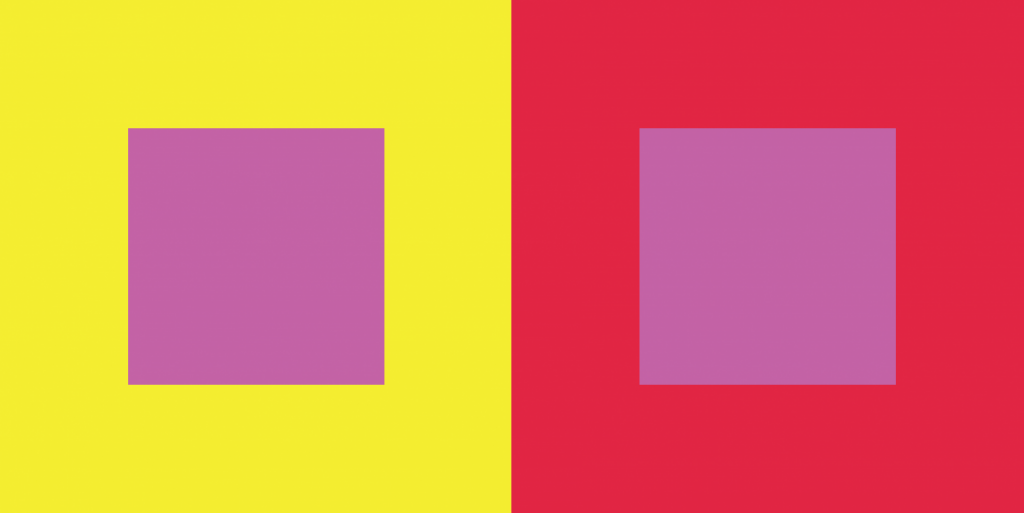
Step 2 Color Mockup
Step 2 Color Mockup


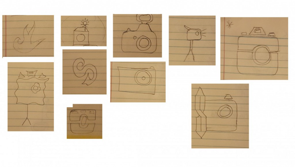
Step 3 –  Icon Research Process

Step 3: ICON RESEARCH PROCESS

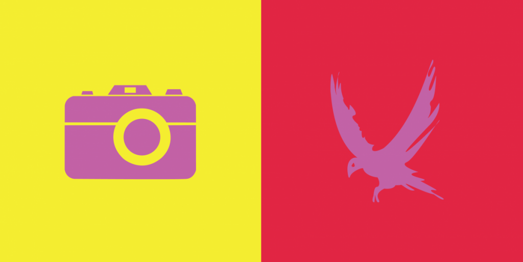
Step 4/5: Icon Mockup / Final Execution / Presentation

Step 5- FINAL EXECUTION

Thoughts
This Part of this project was fun to create. We had to chose a color that represents our partners personalities and then create an icon that would represent them while also creating Simulated contrast.

Time – This took about 4 hours.