Color Interaction Parings: Phase 4

Project 5 lightning and sun png

From doing project 5, I learned a color could look different compare to the original color when it is surround by another color. When the color is surrounded by low value color, the color will appears more brighter, when its surrounded by high value color, it will appears more darker. I also learn some techniques of illustrator. I think what I can done better in the project is I want to make the color illusion look more effective. I wish I could use what I have learned about illustrator for the last project. Total time took 4 hours to finish .

Color Interaction Parings: Phase 4

colorinteractionfreestudy

In this project, I did a research of the meanings of different color. Then I picked a color that I think it represents my partner’s personality the most. The color I chose is cream yellow. Because I feel like she is a friendly and quiet person. Next we chose a shared color that contrasts both of our color choices. I also learned how to use less-saturated hue or variation in value to create good contrast. Finally, we picked a icon for each other. By making the icon, I learned  some Illustrator techniques. I learned how to use pen tool to create a simple silhouette. I filled it with the shared color and place it within the background. Overall, I really enjoyed this project.

Color Interaction Parings: Phase 3

Step 1: COLOR RESEARCH PROCESS

Marcus’s personality: Creative, positive, responsibility, playful, and secretive.

Color: Purple

Step 2: COLOR MOCKUP

lightningsun
Step 2: color mock up

Step 3: ICON RESEARCH PROCESS

92026A76668D7D653F57B876BA387C25

Step 4: ICON MOCKUP


Project 5 lightning and sun png

This is the Paired Color Identities with Simultaneous Contrast I worked on with Marcus. Total time took 3 hours.

Color Interaction Parings: Phase 4

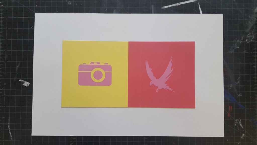
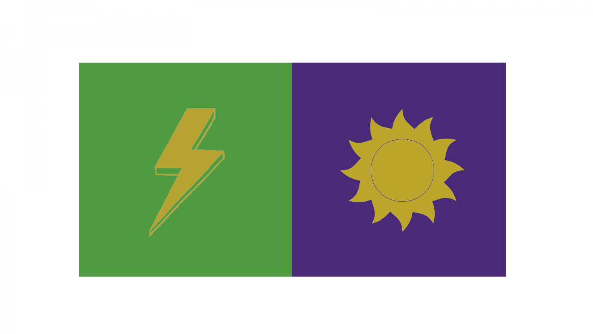
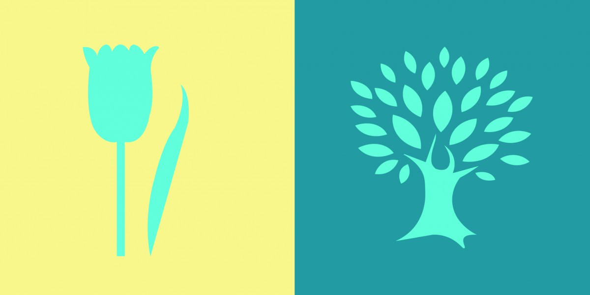
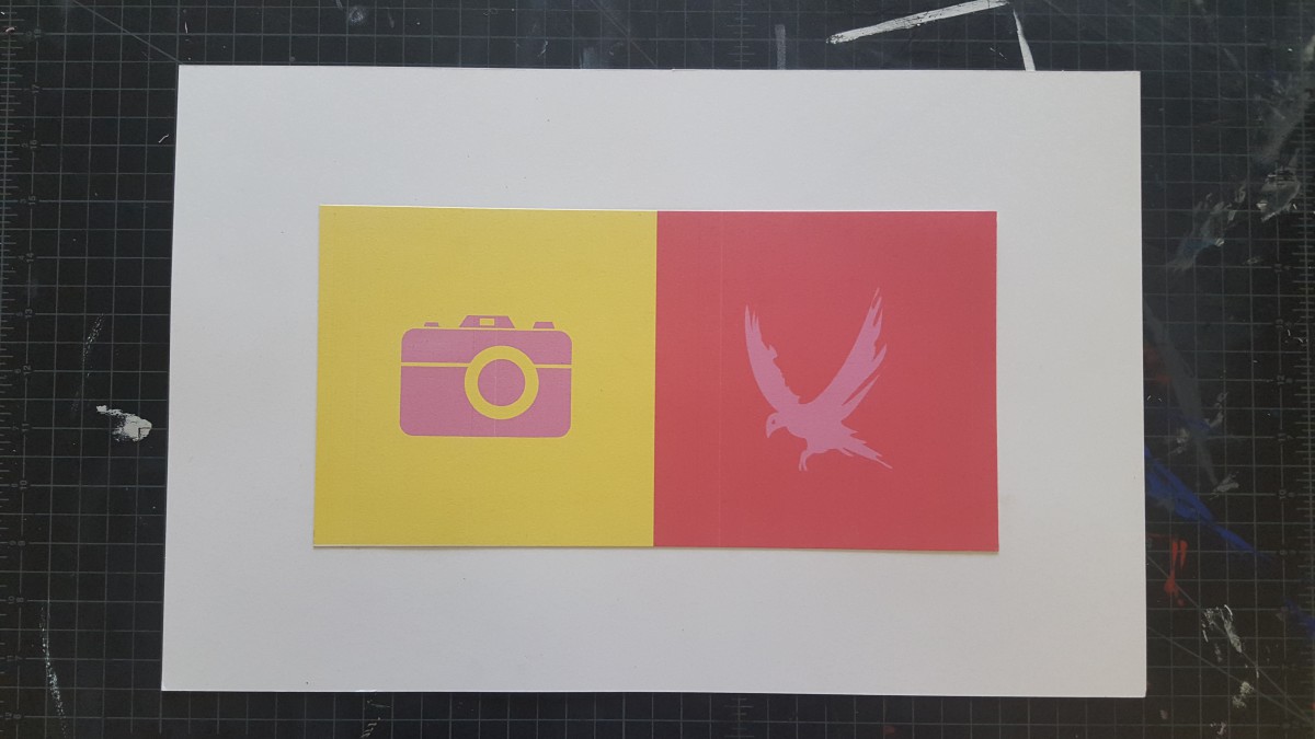
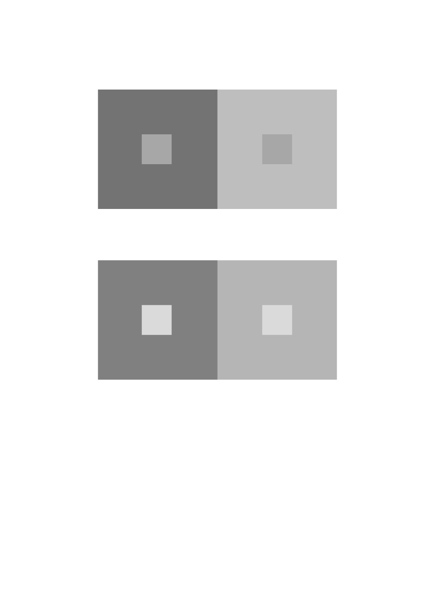
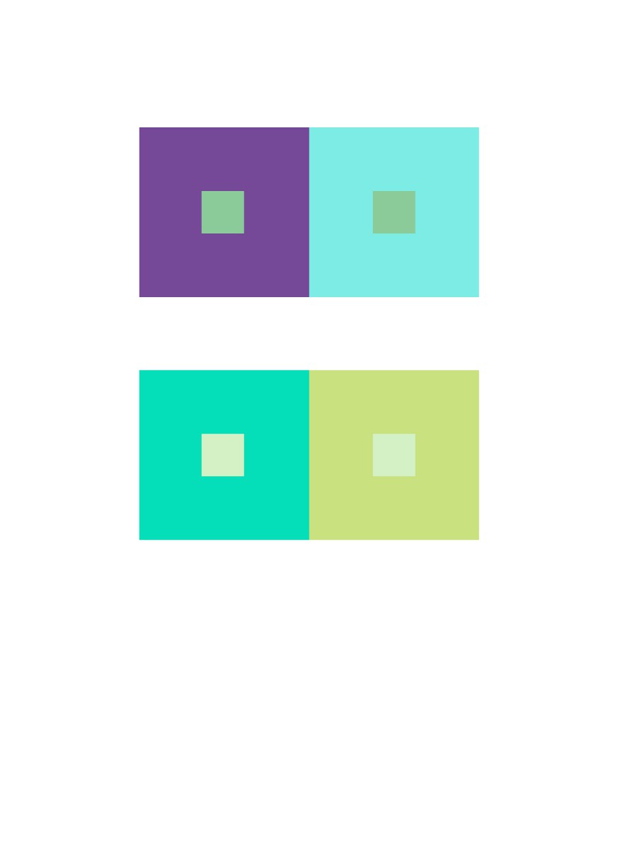
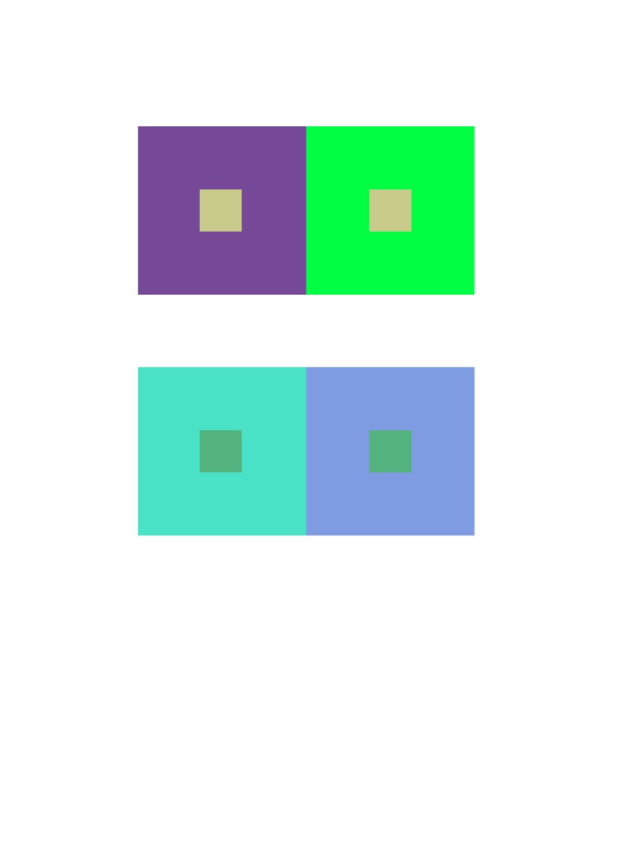
This project was fun. I like working on the computer more rather than cut paper. I learned about Achromatic gray, what I learned on this group is, it was easy to see a difference because I was only working with grays. There wasn’t a lot of options to choose. Also  Shifting value (with color), This group was a little tricky to create because of the value options. But with many tries, this is what I came up with. Also Shifting hue, but not value, This group was easy to create, I first chose a color and the chose another hue by sliding the hue bar up and down til I see a difference in the middle square. And Shifting hue and value, This group was also easy to create, I first chose a color and the chose another hue by sliding the hue bar up and down and then I changed the value until I see a difference in the middle square. Also we had to create a Free-Study – Paired Color Identities with Simultaneous Contrast. This Part of this project was fun to create. We had to chose a color that represents our partners personalities and then create an icon that would represent them while also creating Simulated contrast. I would not change anything about this project, I finished everything and handed them in on time.

Free-Study – Paired Color Identities with Simultaneous Contrast

Color interactions: phase 4

For this project, color and how its perceived was the main idea. I’ve learned that one color can appear differently according to its surrounding color because surrounding color subtracts itself from the influenced color. There can be differences in hue, saturation, value or all depending on color combinations. For this project, four color interactions were observed. An achromatic interaction with difference in hue and 3 color interactions with changes in hue, value and both. The change in value can be made by selecting three colors with different values. One hue light in value, one dark and another in between. As designers, colors are consistently used as a means to communicate to viewers so learning to manipulate the eye is significant.

color interactions: phase 3

Click on the link to view the color interaction pair-ups: lightningsun

Me and my colleague did not know nothing about each other. As an experiment we gave each other a color according to how we felt through our energy. My partner guessed violet and I green. Deeper research was then carried out to learn about color and psychology. Colors can often specify specific personalities, sounds, emotions, smells, and so on. That shows how the human mind links color to all the five senses and the power of color. We then learned different shades and tints of hues had more specific meanings which is how we chose the colors we did. Using knowledge we had on each other we chose the right shades for another and we used similar qualities for our influenced color. We’ve conjured the color yellow as our shared color. For our icons i chose a lightning bolt and he a sun. This  is because he loves electronics, nature and is a very straight forward person. Me because I love the summer, photography and traveling. Both icons relate because they both are found in nature and emit light. Time taken was around 90 minutes