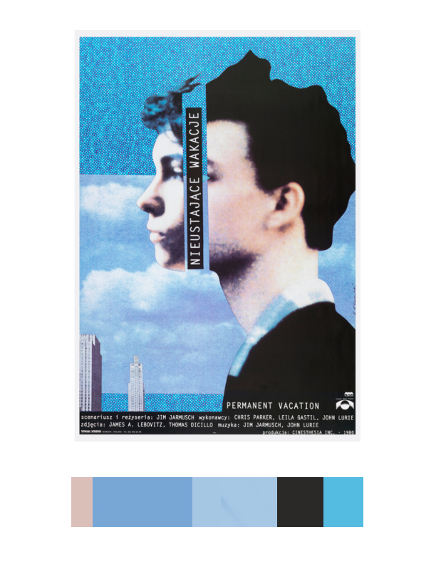
This was the final project for our course. Fusing together all the skills aquired and learned, we were to create book covers for our humument books. In refrence to a work of art located in the Cooper Hewitt museum, humument books used proportional color schemes to crate a holistic harmony between color and composition. The themes of my book are wonder and fantasy. Because of that i chose a work of art that uses various tints of blue. Emitting a feeling of peacefulness and dreams, this was the perfect inspiration for my book. I used question marks in my book cover design because wonder is often associated questions. Another reason is because when someone is aware of dreaming there is often a question between what’s real and whats not. This relates to my book which deals with various memories of fantasies and dreams. Because they are memories (remembrances) there can be a question of what truly did and did not happen. Overall, this project was learning to create balance using every skill in our tool box, even those of English. Its one thing to have the skills but another to apply them harmoniously.
Category: Student Posts
persistent
Persistent /pərˈsist(ə)nt/ – to be consistently strong despite difficulties; to not give up
Ex. Although Stanley procrastinated a bit this semester, he is persistent to complete all his work.
I remember hearing of this word back in september when we spoke about ourselves. I honestly heard it before but had no clue what so ever as to what it actually meant
contiguous
Contiguous /kənˈtiɡyo͞oəs/ – to be close in distance, side by side; to touch borders.
Ex. New jersey and Pennsylvania are considered contiguous states because their borders touch.
In my illustrator class, my teacher used this term when explaining selection methods. The word has a weird sound and could have meant anything so i decided to search it up and add it to our class glossary.
perilous
Perilous /ˈperələs/ – to be filled with danger. Not safe.
Ex. After 9/11, New York city became perilous causing there to be an upgrade in security
A professor in my class used the term. I’m familiar with it because of the Star spangled banner but never truly understood it.
lenient
Lenient /ˈlēnēənt/ – to be forgiving or permissive.
Ex. “Sam became lenient after I apologized for breaking her book. She smiled and gave me a hug.”
I’ve come across this term countless times throughout my time being. I’ve had a sense of the word but didnt really know what it actually meant. Turns out to be the oppisite of what I thought it was.
Color harmony: Phase 3
For this phase of the project, we visit the Cooper Hewitt museum as a class trip. Here we explored many fields of art from graphics, sculptures, textiles, motion graphics, architecture, and so on. We were to use an inspiring piece of art found in the museum that also fit our selected theme for our humument books. My book in specific talks about a journey and I am juxtaposing that with the theme of memories. There is a relation but big difference between a journey and a memory. While on journey, a person’s experience is physical and fruitful. A memory on the other hand is a mental experience which we feel emotionally not physically. I also chose to articulate various memories of people from different walks of life to emphasize the differential between people. My book on the other hand shows how people can sometimes be all connected. I chose this as reference for my color inventory because when I first looked at it my mind suddenly became clear and peaceful. The peacefulness perceived from the blue allowed my mind to relax and reminisce. I’ve learned different shades, tints of blue can emit different emotions and this blue specifically gives a tranquil, relaxed state of mind. Although it’s peaceful the feeling of assurance is also provided. This part took me about 2 hours 20 mins.
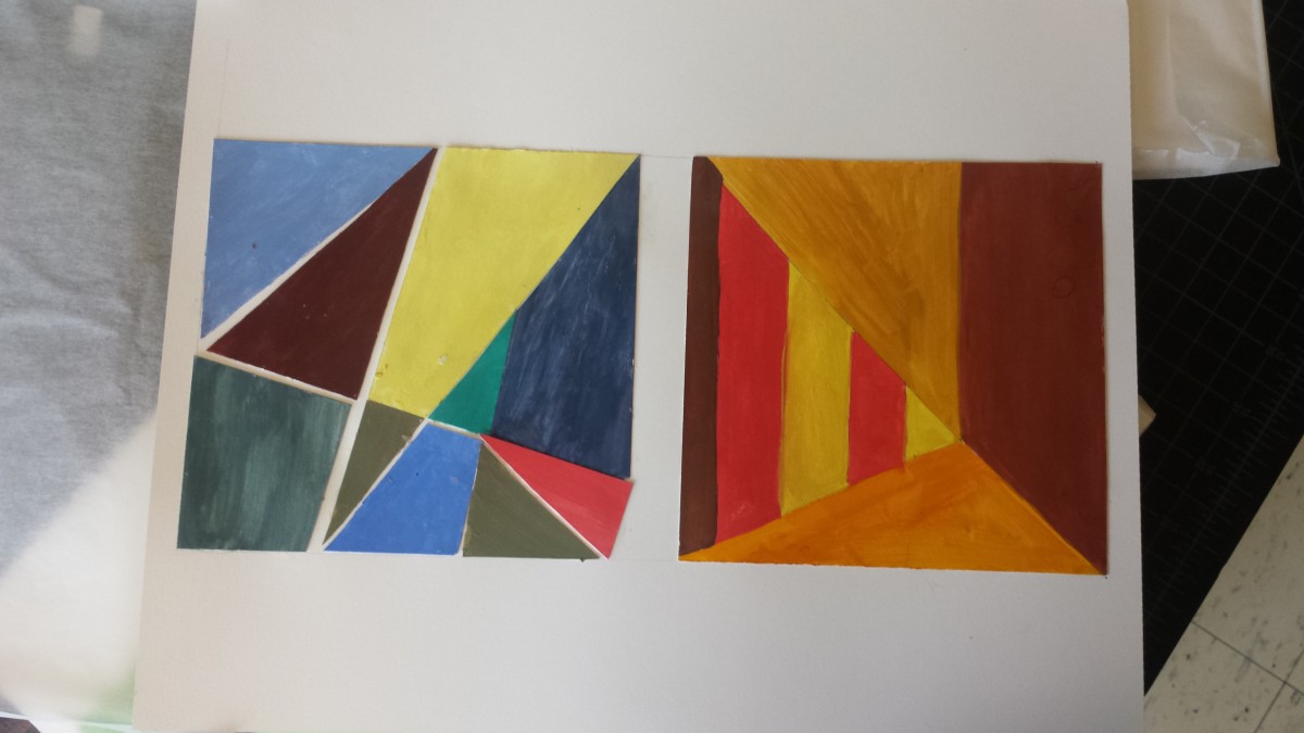
Color harmony: Phase 2
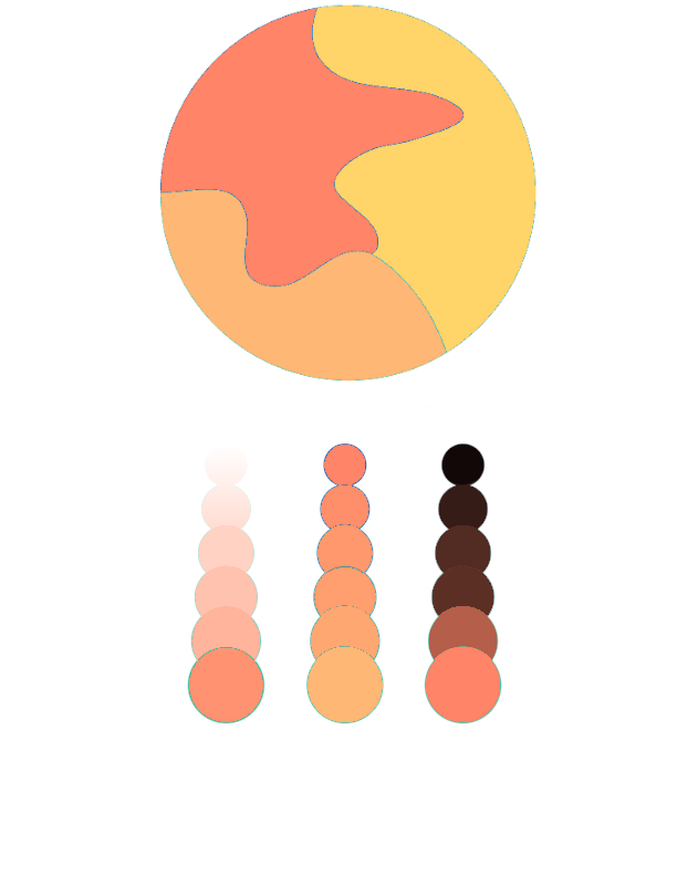
The Analagous color pallete on top displays Analagous colors. These are colors that lie adjent to one another on the color wheel. For example you want the color green. You’ll then chose one color after and before green which are green blue and yellow green. That leaves you with Green, green blue, and yellow green. Together those colors will work harmoniously and that is a strategy in choosing colors. For My analagous pallete I decided to stick with muted warm colors. To be more specific I have a muted red-orange, orange and yellow-orange mashup in my composition. Under my composition I show an example of tint on the left, a two color gradient in the middle and shade on the right.
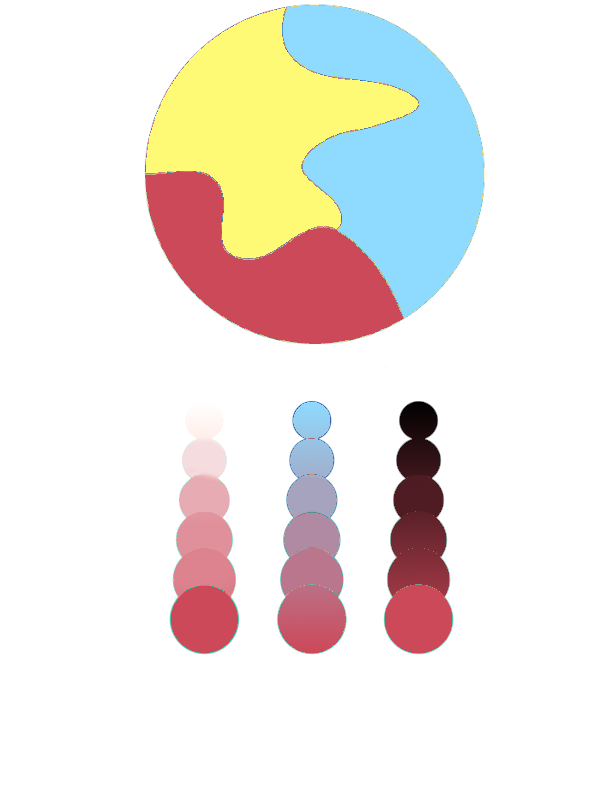
For split complementray colors you take one color and use the two colors adjacent to its compliment. An example is Violet, then find it’s compliment (yellow). The colors that come before and after yellow are orange and green. That means violet, orange, and green work harmoniously as a split complimentary color pallete. This composition contains muted colors aswell. Colors are muted with white leaving tinted red violet, blue and yellow. Below my composition, you see three examples, the left showing shade, the right showing tint and the middle showing a two color gradient. I did both compositions using Adobe Color CC Program. In total I spent around 2 hours.
Color interactions: phase 4
For this project, color and how its perceived was the main idea. I’ve learned that one color can appear differently according to its surrounding color because surrounding color subtracts itself from the influenced color. There can be differences in hue, saturation, value or all depending on color combinations. For this project, four color interactions were observed. An achromatic interaction with difference in hue and 3 color interactions with changes in hue, value and both. The change in value can be made by selecting three colors with different values. One hue light in value, one dark and another in between. As designers, colors are consistently used as a means to communicate to viewers so learning to manipulate the eye is significant.
color interactions: phase 3
Click on the link to view the color interaction pair-ups: lightningsun
Me and my colleague did not know nothing about each other. As an experiment we gave each other a color according to how we felt through our energy. My partner guessed violet and I green. Deeper research was then carried out to learn about color and psychology. Colors can often specify specific personalities, sounds, emotions, smells, and so on. That shows how the human mind links color to all the five senses and the power of color. We then learned different shades and tints of hues had more specific meanings which is how we chose the colors we did. Using knowledge we had on each other we chose the right shades for another and we used similar qualities for our influenced color. We’ve conjured the color yellow as our shared color. For our icons i chose a lightning bolt and he a sun. This is because he loves electronics, nature and is a very straight forward person. Me because I love the summer, photography and traveling. Both icons relate because they both are found in nature and emit light. Time taken was around 90 minutes
Saturation Studies: Phase 2

I learned that prismatic colors are the purest and chromatic colors are the least saturated. Muted colors lie in between. In order to obtain prismatic colors (pure R,O,Y,G,B,V) you use the primary colors (Red, yellow, blue). In order to make the other 3 prismatic colors (O,G,V) you mix red, yellow and blue accordingly. To create muted colors you can add either black, white, or it’s compliment. When adding black, you are shading and when adding white you are tinting. Using compliments can be tricky because using too much can lead to chromatic colors. Chromatic colors are essentially a muddy brown/grey and are created using a color and it’s compliment.

