Welcome to Ways of Seeing. This First Year Learning Community for COMD students taking COMD 1100 & ENG 1101 will include field trips, hands-on projects, and cross-sensory experiences to help you discover and express your creative vision.
Classwork Pickup
Students from Fall 2015 can pickup their classwork from my office N1127 on the following dates. IMPORTANT: Please let me know if you plan to stop by. If you don’t confirm, I may not be in my office. Friday, March 4th, 11:30-12pm Thursday, March 10th, 12:45-1:45pm. Please contact me to CONFIRM. Hope you are having a wonderful semester! Print this page
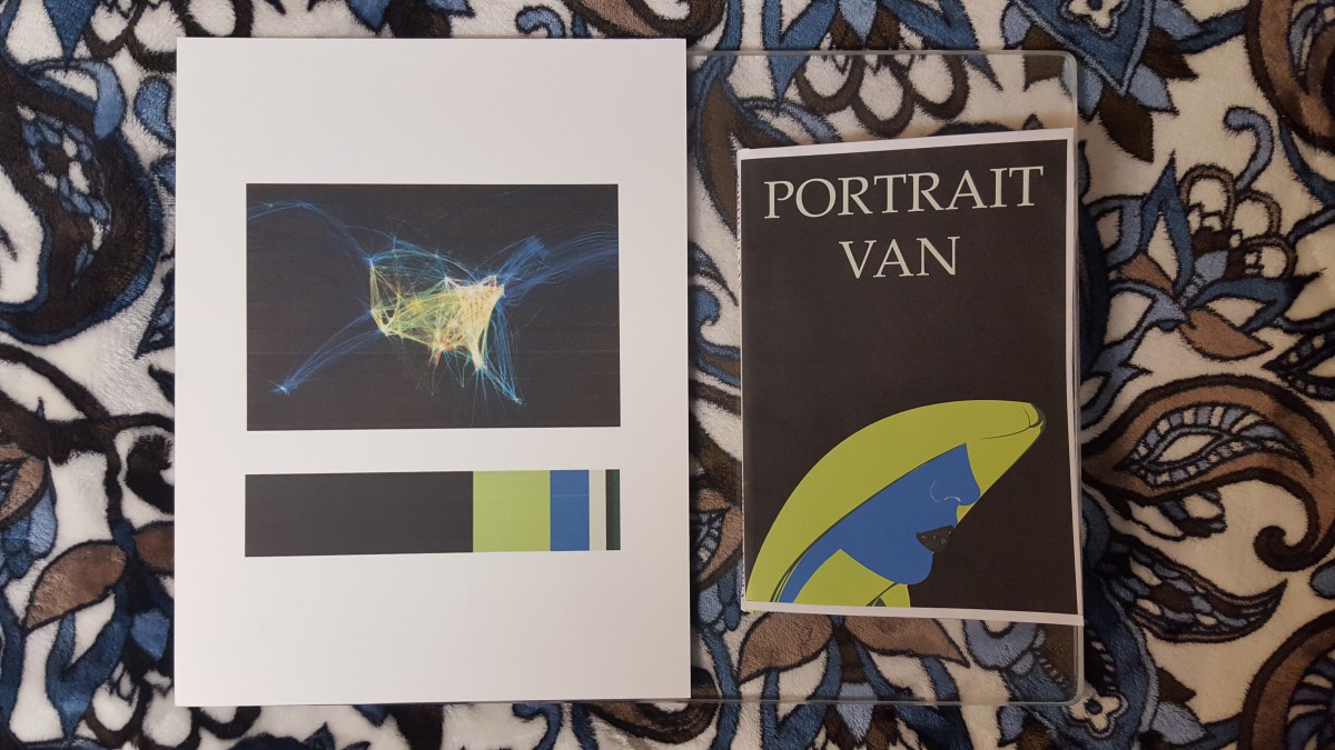
Color Harmony: Phase 4
This project was the final one for this course and shortest one that I had to complete. Overall for this project I learned about color harmony which was making colors together. I had to create a split-complementary palette and an analogous palette which were two types of color relationships. Then my class went on a trip to the Cooper Hewitt Museum where we had to find references for our book covers that we had to make for our humument books. The hardest part of this project was finding the right poster to use for the Color Proportion Inventory, which was another assignment we had to complete. The poster had to have a dominant color, sub-dominant color, accent, and a tint or shade. The poster also had to relate to the theme of our humuments. There was a lot of experimentation done with color and I had fun seeing different types of combinations.
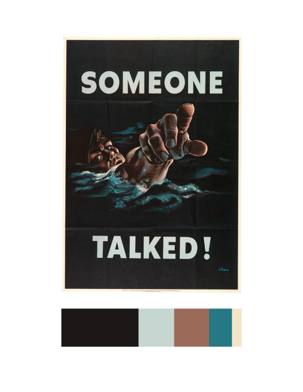
Color Harmony: Phase 4
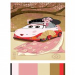
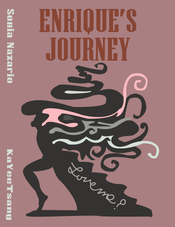
For this project, I picked dominant, sub-dominant, and accent colors from the design museum we went as a group. It was called, Cooper Hewitt. As I saw varieties of different designs, this book cover made me catch my eyes since it had all I need for this project. I picked it since it was simple to work with, and the choice of the color matched my theme itself. I used the eye dropper from the color inventory and used Photoshop over all to make the new book cover (at the right). I picked ballerina for my cover since I used a ballerina in one of my design it self. I used my theme for my style in the font also. I gotten the quote for the back and I done everything else at the back with the bar code and the numbers and the lines are all changed to the color I picked from my inventory. Over all for this project, other than the time we went to the museum, it took me about two hours to work on it. I also liked this project, since I was able to express freely about the theme of my book and how I was able to use technology to work on it.
Project #3
People are different in many ways some like to take long walks while other just want to get from point A to point B in the fastest time. When people go for a walk there are different things people would like to see or do on that walk. Everyone is different some people like to see different things on their walks like things that they may deem beautiful to them. Others might not want or care to see anything beautiful on their walks; some might just want to get from one place to the next in the fastest time while others want to go somewhere peaceful and beautiful. For me I love to take nice long walks, I don’t even need to be going anywhere in particular as long as I am not busy. But for me the ideal place to walk through, that is by the water.
On the walk I choose to take I walked from Citytech over the Brooklyn Bridge too City Hall. I choose this mainly because I love to be by the water so when I went over the Brooklyn Bridge it was refreshing to see the river instead of the usual tall buildings of the city. “No mere river crossing, this span is an elegant reminder of New York’s history of architectural innovation. When it opened in 1883, the Brooklyn Bridge was a feat of engineering: It was the first structure to cross the East River.” It was also really nice to feel the wind blowing in my face and being able to see Brooklyn and Manhattan from a different view. In a way it helps give us a different perspective on the way we see Manhattan and Brooklyn. For this walk I started from City tech and walked to Tillary st. where the entrance of the Brooklyn Bridge is. As I was walking I watched as the buildings stopped and I began to see the river. Even though it may have been noisy due to the passing cars on the bridge it still was very peaceful for me because seeing the river and both skylines of Manhattan and Brooklyn are pretty breathtaking. I continued on my way until I made it to City Hall Now if you would like to enhance your walk I would say that crossing the Brooklyn Bridge at night is your best bet, the view of the city is enhanced due to the light emitted from the city. Even other people agree that the Brooklyn Bridge is the best spot to get the most beautiful views. On different websites you can see that people have a lot to say about how beautiful the view can be from the bridge. “Everyone should walk the Brooklyn Bridge, I have been to New York quite a few times and have never walked the Brooklyn Bridge. It is such an amazing view and worth it to do this especially as the sun is setting, its perfect!” another person said “it has a Magnificent view, excellent experience, refreshing from the building infested city, either for a romantic walk, or for a friendly catch up with a view or a family trip.”
Another walk you could take that also delivers on the breathtaking view of the Manhattan skyline is the Brooklyn Heights Promenade. This location is another one that I enjoyed walking through mainly due to the fact that it is also by the water. The Brooklyn Heights Promenade is one third of a mile long, here it gives you a beautiful view of the Brooklyn Bridge connecting two people, people from Manhattan and people from Brooklyn.
“The Brooklyn Heights Promenade will take your breath away. Made famous by cameo appearances in movies like Annie Hall and Moonstruck, it is one of the most romantic spots in New York City, and has been the destination for thousands of first dates, wedding proposals and anniversary celebrations.”
I would also like to reiterate what I said before in that this locations view is enhanced when it is night time. For this walk I also went up Tillary st. but instead of going onto the Brooklyn Bridge I continued straight noticing the nice architecture of the post office as I went along until I got to Cadman plaza W. from there I made a left until I got to Pierrepont st. noticing the Columbus park as I passed. From there I followed Pierrepont st. until the end. On that street you can see some very beautiful architecture from the nice houses there so take your time when walking.
All in all I want to impart these locations so that others can experience the same beautiful sights I have because in its own way you have to be there yourself to truly experience the sights. No picture can truly give you the same emotion as being there for yourself.
Works cited page
Terzian, Peter. “must-see Brooklyn Heights March” 03, 2014. Web. November 16, 2015.
“Brooklyn Heights Promenade” New York Harbor Parks. November 16, 2015.
Freudenheim, Ellen. “How to Walk the Brooklyn Bridge—Manhattan to Brooklyn, Brooklyn to Manhattan” November 16, 2015.
color harmony: phase 4
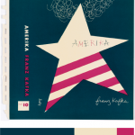
This was the final project for our course. Fusing together all the skills aquired and learned, we were to create book covers for our humument books. In refrence to a work of art located in the Cooper Hewitt museum, humument books used proportional color schemes to crate a holistic harmony between color and composition. The themes of my book are wonder and fantasy. Because of that i chose a work of art that uses various tints of blue. Emitting a feeling of peacefulness and dreams, this was the perfect inspiration for my book. I used question marks in my book cover design because wonder is often associated questions. Another reason is because when someone is aware of dreaming there is often a question between what’s real and whats not. This relates to my book which deals with various memories of fantasies and dreams. Because they are memories (remembrances) there can be a question of what truly did and did not happen. Overall, this project was learning to create balance using every skill in our tool box, even those of English. Its one thing to have the skills but another to apply them harmoniously.
Color Harmony: Phase 4
I liked this project, I learned a lot of new skills on illustrator. The most fun was creating the Humument book cover. I use illustrator to demonstrate Color Harmony. I learned that Color Harmony is a palette of hues, shades, tints or tones (saturation) used to produce pleasing color relationships to engage the viewer and it creates a sense of order in the visual experience. There is nothing I think I would change about this project, I finished everything on time and handed in on time.
Color Harmony -Phase 3

took me about 2 1/2 to finish. really enjoyed playing around with the colors. had agreat time during this semester!
Color Harmony: Phase 3
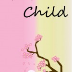
After going on our Cooper Hewitt museum trip, I chose this digital painting( Kabuki Theater Poster) by Ellen Mon Lee because I love the color palette, the Japanese influence and being underneath a cherry blossom is soothing. I thought this would be a good inspiration behind Glass Child because the theme of this book is tranquil and slice of life. The total time to complete this process was 6 hours.(Source)
Color Harmony: Phase 3
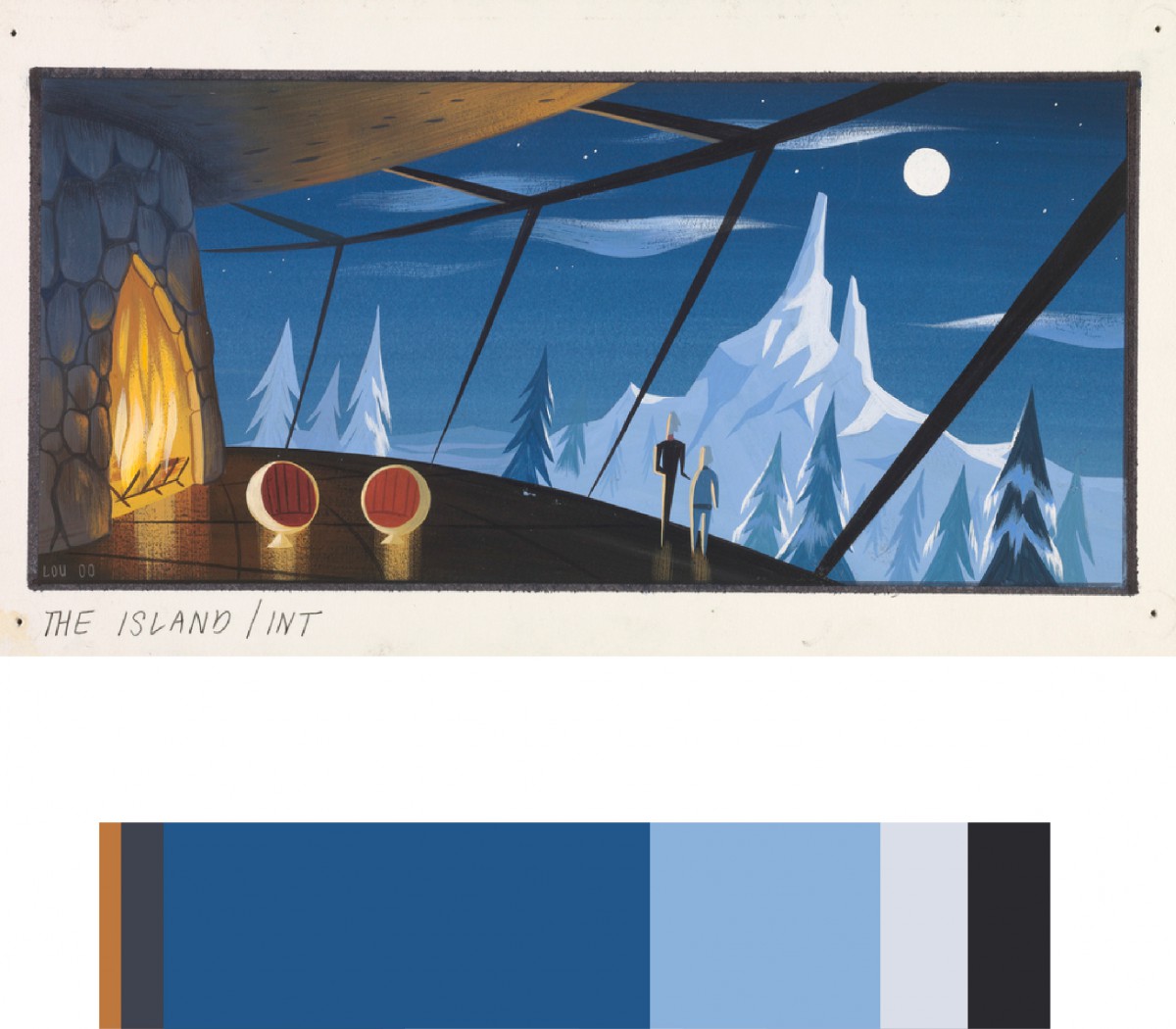
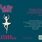
I chose this piece (CONCEPT ART, SYNDROME’S LAIR, THE INCREDIBLES, 2004) created by Lou Romano and Pixar Animation Studios because I thought the color scheme fit with the theme of my humument. The theme of my humument is calmness, lighthearted, and heartwarming. Overall it took about 30 minutes to do.
Color Harmony: Phase 3
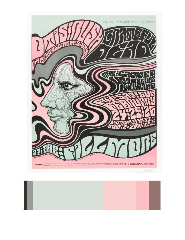
The reason I chose this image (Poster, Otis Rush 1967) to reference in my Humument book cover because the main idea of this image is psychedelic. The original theme is about a boy go to find his mother in America, and the new theme is mind-altering. Base on my humument design of the third page, I used to describe his feeling, which is the select the text the show out his feeling. This image is using the deformed bubble text, sinuous lines and pale colors produce an optical surge, suggesting the effects of hallucinatory on the mind.

