Color Harmony: Phase 4

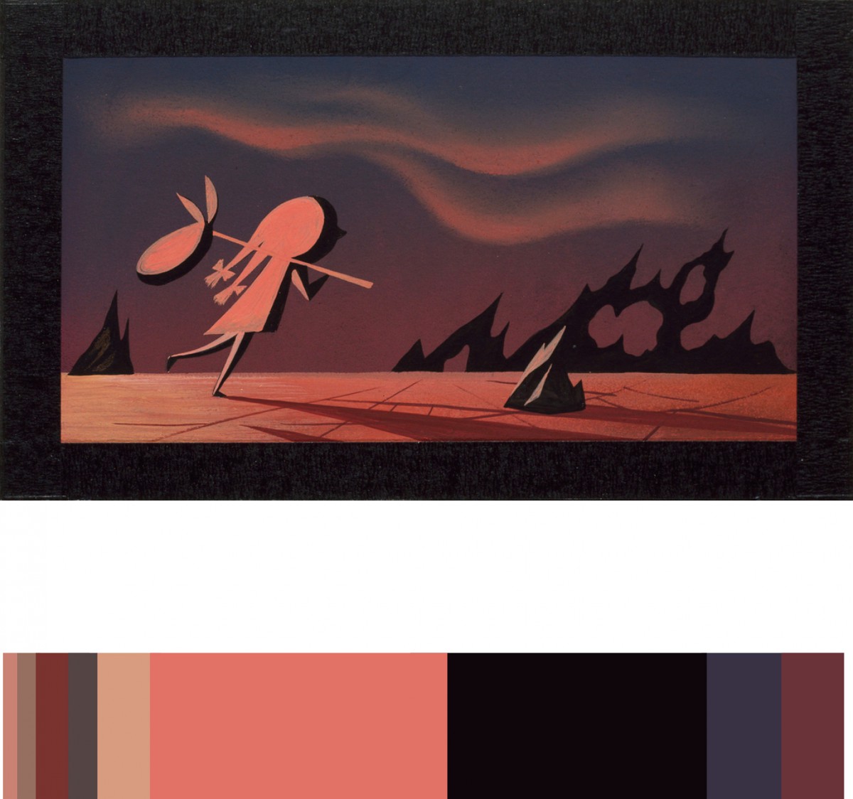
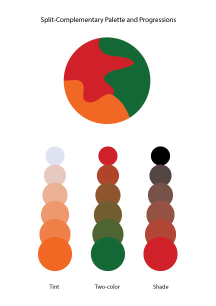
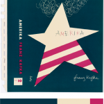
For this project, I picked dominant, sub-dominant, and accent colors from the design museum we went as a group. It was called, Cooper Hewitt. As I saw varieties of different designs, this book cover made me catch my eyes since it had all I need for this project. I picked it since it was simple to work with, and the choice of the color matched my theme itself. I used the eye dropper from the color inventory and used Photoshop over all to make the new book cover (at the right). I picked ballerina for my cover since I used a ballerina in one of my design it self. I used my theme for my style in the font also. I gotten the quote for the back and I done everything else at the back with the bar code and the numbers and the lines are all changed to the color I picked from my inventory. Over all for this project, other than the time we went to the museum, it took me about two hours to work on it. I also liked this project, since I was able to express freely about the theme of my book and how I was able to use technology to work on it.

Color Harmony: Phase 3

I picked this from the design gallery at the Cooper Hewitt, Smithsonian Design Museum; Book cover, Amerika, 1947 design by Alvin Lustig. The explanation of why Lustig made this cover is said from the the didactic from the web site that states, “…employ abstracted iconography and simple typography and lettering to create emotionally compelling representations of a book’s themes.” I picked this cover, because it was simple. As in, it had simple colors compared to others. Others tend to have multiple colors that it didn’t identify it, for my connection in the theme. Since my dominant color is dark blue, the use of shade in the ballerina drop shadow was difficult. However, if you see it closely it is actually a more dark shade of blue. I also used tint in the title of my book and also a shade for my name at the bottom. For over all phase 3, I spend about two hours. I didn’t use any tin or shade at the back cover, since I wanted the reader to actually see the text. I used Photoshop to complete this phase. Link to Cooper Hewitt Research: Here

Color Harmony: Phase 2

analogouspalettesplit-complementarypalette

For the those two images, which is analogous palette and split complementary palette. It was the time to understand more about the color harmony. By picking three colors from the color wheel, and looking from the example, is easier to create the new one. Since I know the concept of the shades, tint, tone, gradient, gray scale, and compliments. It took 15 mins to complete at the class.

Color Harmony: Phase 1


Photo Link: 1st|2nd|3rd

I found these photos from google images and provided a link where it actually from. The first image is a sky with two colored progression. In which two colors are mixed in the middle and both sides takes two different colors that to show how it progressed to make the middle color. It also contains a little bit of chromatic gray shades in the middle since there are clouds. Secondly, I this image was posted in some kind of corner form, called Big Blue interactive which it said, “In honor of Flowers…” one of the post by Pete from Woodstock on 5/5/2015 11:21 am. There is different types of color that pansies produces as they flower. I picked this one instead of others since others had a relationship in using tint. I can see the progression of shades going on from outer petals toward the inside where it gets darker. Lastly, I picked a flower that had a tint of progression in pink. I was surprised that this is from someone who is using OpenLab and he/she went to a botanical garden and gathered this photos. It clearly shows the tint where the color progressed from the middle of the flower to the outer petals. Since we really different have time to go anywhere as a class, and since I gathered this information from the internet. It took me about five to ten minutes to gathered this images and inks, however it took me about twenty to twenty-five to write this post. About thirty-five minutes to finish this phase.

Color Harmony: Phase 2

From our lesson, I learned the color harmony. There is different kinds of harmony such as use of gray scale, shades, tint, tone, compliments, and gradient. There is color relationships that I learned also, Analogous, Near-Compliments, and Split-Compliments. For our phase 2 of the project #6, I downloaded a template that my professor provided for us to understand and take practice in using tone, two-color, and shades. By picking three colors from the color wheel and using the Analogous and Split-Compliments. This part of the project was pretty easy and understandable, since we learned so much about color, and the way that how each relationships of the color works from our learning today. It took me the whole class to complete phase 2, so about three hours.