 LOGO: LEGO
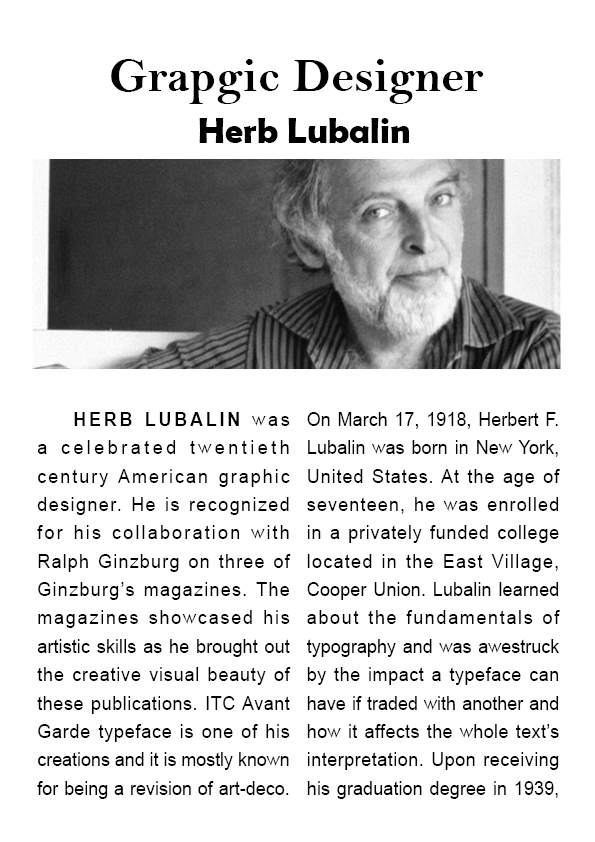
The popular children’s toys Legos have a rich and storied history. These once-wooden blocks were made in the workshop of toymaker Ole Kirk Christiansen in 1932. He is a joiner and carpenter from Denmark establishes The LEGO Group. His innovative business would later on develop into a global enterprise, largely known as one of the world’s most respected toy companies. In 1934, his company was renamed “LEGO” originates from two Danish words: “Leg” (meaning “play”) and “Godt” (meaning “well”). Since then, this once-tiny company has expanded at incredible pace, making board games and even famous console games, but always staying true to the original plastic Lego.
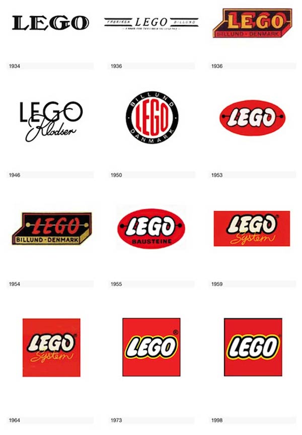
The Lego logo is one of the most popular and instantly recognizable logos in the toy industry. The distinctiveness of their logo: the bright red, yellow and white colors of the logo leap out at consumers and can easily catch the eye. It has undergone six significant overhauls since its inception in 1935.
in 1934, the first logo was created by the LEGO Group. It was used on correspondence, shipping labels and other printed materials, but not on toys. Starting in 1936 an ink stamp “LEGO Fabriken Billund” was used on the wooden toys. The first logo was a simple and modest affair. This logo was dark, with very warm and wooden looking colors. As the Legos, at this time at least, were exclusively wooden, the logo was meant to resemble a woodcut. In 1950, the logo was introduced with the first plastic toys. In 1954, the first of the oval logos. This appeared on Lego Mursten catalogs The company had still not standardized on color. Examples exist in several colors. In 1960, the first of the square logos. In 1973, when Lego began production in the United States, they decided to update their logo for a more modern appearance. The Lego Company was trying to standardize their logo for the global market, and they settled on the well-known red, yellow and white logo that is still easily recognized today. In 1998, the Lego company redesign its current logo.
After leaving Lego’s logo history, I know how the company choose the color, typeface and shape to represent their meaning of the company. Every step of change will alter the fate of the company. Even though just a little bit changing of the banner or logo, that will affect people’s attention. If used the black and white color for the logo, that will not attract customers look at it. Color is the best way of catch people’s eyes balls of looking at the logo.
The important thing of create the logo, is how to successful choice the color more than shape and typeface. At the draw of the Lego logo is in its boldness. The bright colors are sure to attract the eye of young customers who will in turn draw their parent’s eyes to it. The brick-shape of the logo says that all that anyone needs to know about the toys and this simplicity has no doubt helped the Lego Company in its rise to the top.