Color Harmony: Phase 4

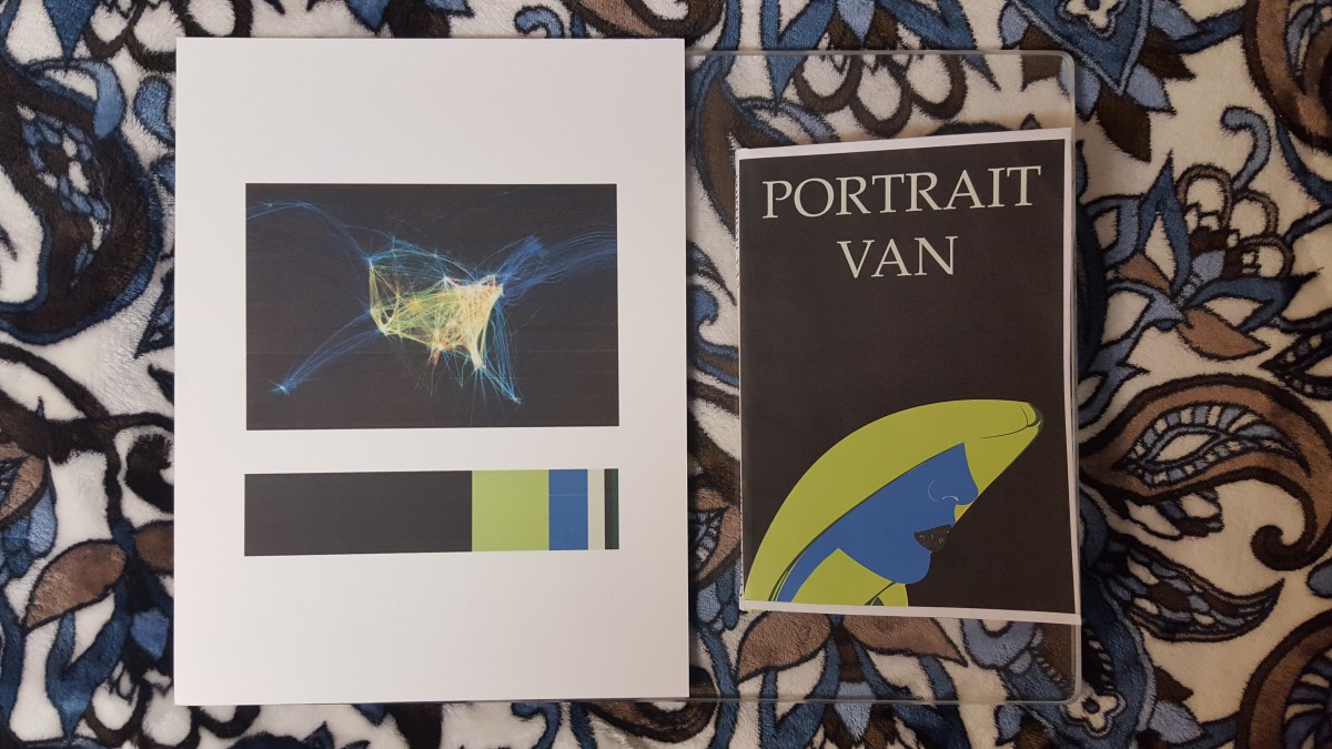
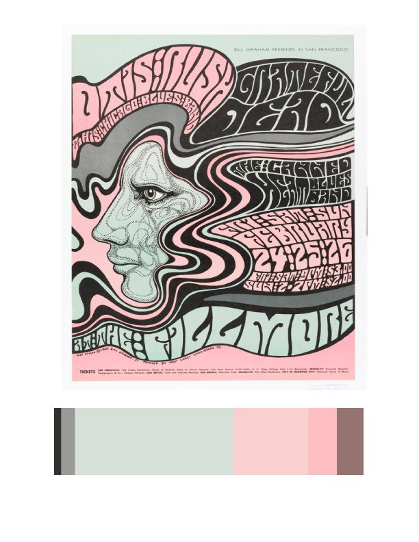
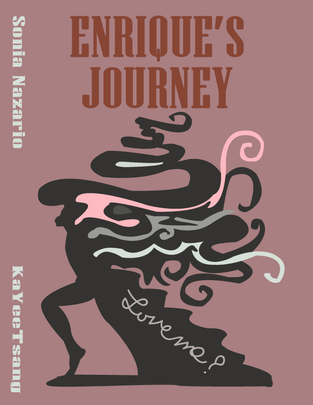
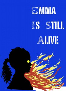
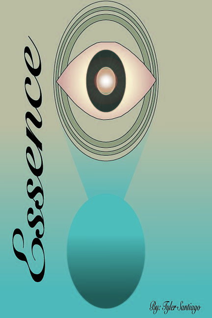
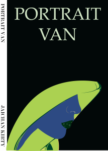
I liked this project, I learned a lot of new skills on illustrator. The most fun was creating the Humument book cover. I use illustrator to demonstrate Color Harmony. I learned that Color Harmony is a palette of hues, shades, tints or tones (saturation) used to produce pleasing color relationships to engage the viewer and it creates a sense of order in the visual experience. There is nothing I think I would change about this project, I finished everything on time and handed in on time.

20151220_135549

Color Harmony: Phase 3

TKcolorinventory
Color Inventory
project6finalcolorinventory02
Humument Book Cover


The reason I chose this image (Poster, Otis Rush 1967) to reference in my Humument book cover because the main idea of this image is psychedelic. The original theme is about a boy go to find his mother in America, and the new theme is mind-altering. Base on my humument design of the third page, I used to describe his feeling, which is the select the text the show out his feeling. This image is using the deformed bubble text, sinuous lines and pale colors produce an optical surge, suggesting the effects of hallucinatory on the mind.

Source Link

Color Harmony: Phase 3

After our trip to Cooper Hewitt, I decided to choose a piece of art by Saul Bass called Exodus. This piece was created in 1961, and was poster designed for Otter Preminger’s film Exodus. I chose this particular piece because i thought it would be an excellent color scheme for my humument, and it also featured fire, which is already a pretty important part of my piece. I then created its color pallet, and used it as a base for my own cover art.

colorpallete


color harmony phase 3

observation_phase3bookspine bookcover


For this project i chose as piece called “THE GREAT MOON HOAX OF 1835” Posted on October 25, 2015. I chose this piece of work because it represents what my theme of my book is, the theme of my book is observation and the title “Essence” comes from the original title of the book which was “silences” by Tillie Olsen. I also liked the colors that were used in the work that i used and i think it goes great with the aspect i was trying to convey. 

Reference Link


Color Harmony: Phase 3

I chose this image (DATA VISUALIZATION, FLIGHT PATTERNS, 2005–08) to reference in my Humument book cover because it is a juxtaposition of my books them. The original theme is about a boy becoming of age, and the new theme is mysterious. This image is mysterious because of all the negative space with the colorful spirals in the center.
Source Link

Time Spent – about 2 hours.