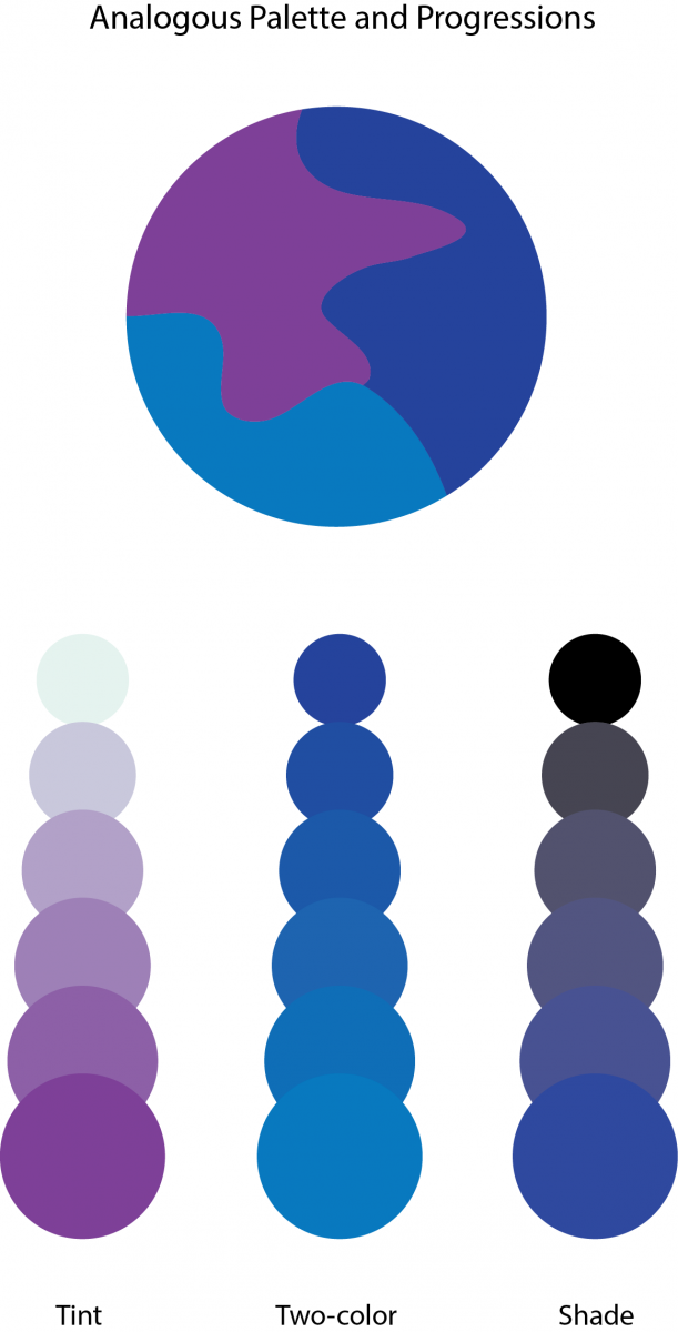
In order to create this Palette, I learned that a Analogous Palette colors that are adjacent to each other on the color wheel.
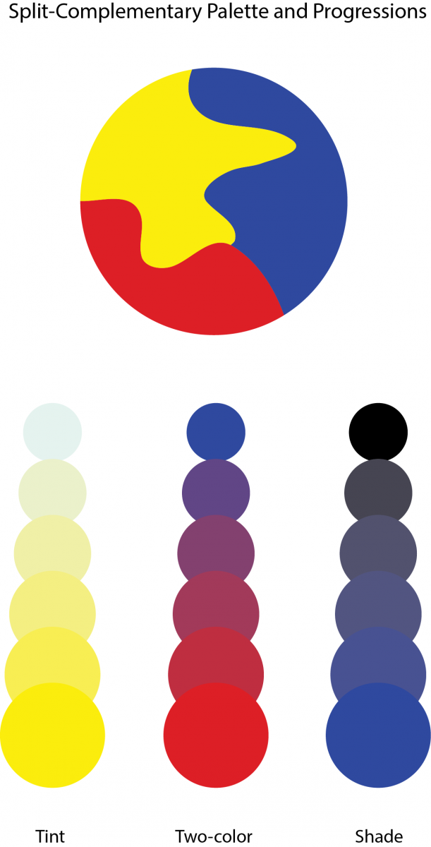
In order to create this Palette I learned that aSplit Complementary Palette is using one color plus two colors on either side of its complement.


I think that the two-color interaction between red and blue are the most interesting feature in your Split Complementary Palette. I think if you swapped the violet and the blue for tint and shade in your Analogous Palette Progressions, it might look more dynamic.