Color Interaction Pairings: Phase 3

color interaction

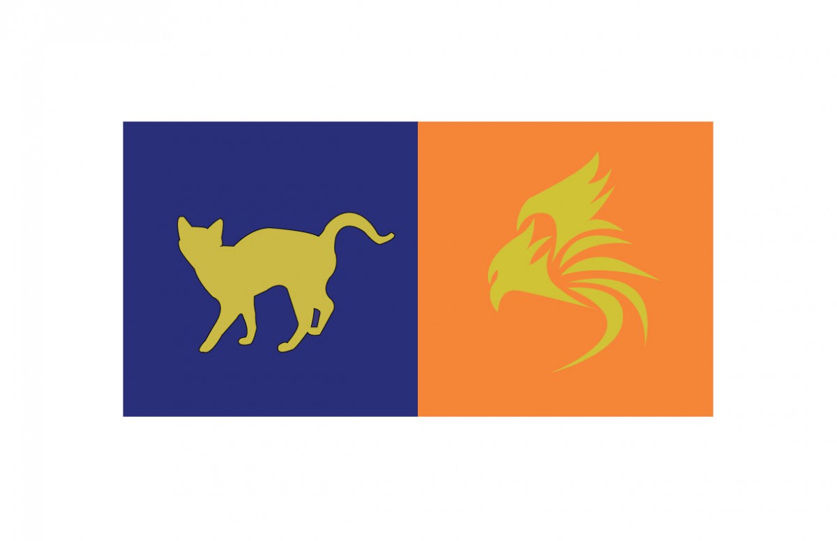
I found this project really fun to do. For project #5, the class had to pair up with someone and think of a color that represents their personality. For my partner, I chose a teal color. I chose this because it has a mix of blue and green. For blue, my partner is calm and creative. For green, it’s for his liking in nature. After we chose the colors, we had to choose a shared color that matched both our personalities. The color that we both agreed on was turquoise because we are both calm. We also had to make a logo that represented our partner. I chose a tree because of my partner’s liking in nature. This project took around 3 to 4 hours to complete.


Color Harmony: Phase 2

analogouspalette project                      split-complementarypalette project

In our lesson we learned all about Color harmony. We also learned about the difference between Analogous Palettes and Split Complementary Palettes. In phase 2 of project 6 i downloaded the template for what you can see above and basically had to experiment with any three colors on the color wheel until we came up with two different palettes that have a good sense of harmony between the colors.


Bellicose

Adjective
demonstrating aggression and willingness to fight.
inclined or eager to fight; aggressively hostile; belligerent; pugnacious.
I encounter this word during the reading of The New York Times – Has Europe Reached the Breaking Point? . When I looked at the sentence “Western superpower without the bellicosity or the laissez-faire hardheartedness of the United States.”

Comprehensive

Adjective
comprehending or thoroughly understanding with one’s mind; having an extensive mental range or grasp, as of a particular subject or many subjects.
Noun
The detailed layout of an advertisement, showing placement of photographs, illustrations, copy, etc., as for presentation to a client.
Often, comprehensives. Also called comprehensive examination.
I encountered this word, from The New York Times Documenting Rape in India, the sentence ” a problem that could be alleviated with a comprehensive program……”

Color Interaction Parings: Phase 4

For this project, I learned the meaning of the color interaction such as simultaneous contrast, optical mixing, and complementary colors. The fun part of the project, we have to create total 8 pairs of color studies will explore interaction by shifting value, shifting value with color, shifting hue, but not value and shifting hue and value. It was really fun at the first time and tried to analyze the different between those color. The important part of this project I really liked is phase 3 (Paired Color Identities with Simultaneous Contrast), because we have to observe our partner, try to find the perfect color to represent his/her personality, that is really fun to research the meaning of the color. Since we used the illustrator to create the 8 pairs of color studies, the phase 3 part will be easy and effective to make it. I would not change anything of this project.

tkandklevercolorinteraction

Color Harmony: Phase 2

analogouspalettesplit-complementarypalette

For the those two images, which is analogous palette and split complementary palette. It was the time to understand more about the color harmony. By picking three colors from the color wheel, and looking from the example, is easier to create the new one. Since I know the concept of the shades, tint, tone, gradient, gray scale, and compliments. It took 15 mins to complete at the class.

Eloquent

adjective

fluent or persuasive in speaking or writing.

Source: Google Definition 

This word was encounter while I was reading the article Lecture Me. Really. where it says “Note-taking should be just as eloquent as speaking.” I think this means taking notes should be like fluent speaking. And now I understand Eloquent means fast and fluent writing or speaking.

Color Interaction Parings: Phase 3

tkandklevercolorinteraction

I thought this project was fun. For this project, Klever and me picked a color that represents us for the color and the logo. These logo and color have to represent our personality which is yellow at the logo, because we are positive, clarity, energy, optimist person.  Then Klever chose the blue color that represents my personality such as bubbly, reserved, shy, etc. I never think I’ll be a blue color person, that is the first time someone say it. In my observation, Klever is a talkative, positive, optimistic person, when I see the meaning of an orange color, the color is represent his personality very definitely. After that, we had to come up some idea for the logo, than I saw his necklace which was a bird from the movie (hungry game). I came up some idea like phoenix or bird that prominent his personality, because Klever has leadership at the class participation. When I used to draw the logo of the illustrator, it took me half hour to finish it. I know how to use the illustrator that is more helpful and save a lot of times to create it. I really liked this part of the project 5, and thank you to my partner Klever who understands and help me a lot of this project.