Didactic Panel

12308398_1495736224063171_9189550163241015207_nTsang, Ka Yee (TK)
Born in Hong Kong
Lives and studies in New York
___________________________________________
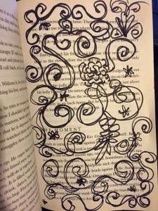
“Flower”, 2015
Sharpie on paper, Inking brush pens

In this work, TK wanna create a simple idea that represents the Flower pattern. Set up the pattern like the painting book called ” Secret Garden”. Using the black and white composition, and lay out the curvy figure, randomized draw though the page. Also, the author’s using a legato pattern to create the flower pattern.
12346359_1495736444063149_7380081770727574868_nTsang, Ka Yee (TK)
Born in Hong Kong
Lives and studies in New York
___________________________________________
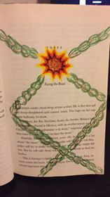
” Shackles”, 2015
Color markers, color pencils

Shackles was intended by the author to represent the idea of imagination. The author used the markers drew the sun in the middle, used the chain to connect the sun. Nothing can be closest to the Sun, whatever they are.


Tsang, Ka Yee (TK)12341209_1495736250729835_8995960213660294801_n
Born in Hong Kong
Lives and studies in New York
___________________________________________
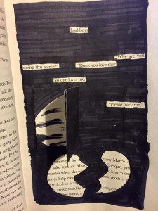
“Don’t You Love Me?”, 2015
Sharpie on paper, Inking brush pens, paste some page

Drawing this page, the concept is selected text to go though the main idea of this page. The author’s using the text, “Don’t you love me?” “No one love me” that represents the feeling from the page, then drew the broken heart on the bottom to mention the idea.
Exhibit Catalogue

A Humument is an altered book has unique combinations of literary and art, the author merged art with the connotation of specific words to exhibit two different genres into one. This book created by Tom Phillips, released in 20th century. Now in 21th century’s today, an artist whose name is Jingyi Jiao, she inspired by A Humument, as reference to that she created her own humument and named as “The Stage of Value”, “Box of dimension”, and “Music Party DO-RE-MI”. Jiao born and raised in Tianjin, China. She now lives in New York as a college student, majors in Communication Design and continuing her art design studies. Jiao chose Macbeth to be her humument, by using the techniques learned from her english and graphic design classes helped to create art works on Macbeth, such as collage, placement, overlap, etc. “The Stage of Value” is her best piece of work. It looks easy and simple, but the meaning behind is significant. For “The Stage of Value” the artist chose to articulate value, which is the lightness and darkness of a color, used materials of Inking brush pens (black, dark gray, and light gray). Using inking brush pens to block out specific words, Jiao chose the word “stage” to incorporate the fact that Macbeth is a famous play itself. Using the skill of placement, the page shows value from the darkest blacks to no color at all. The black and grays color choices refers to  the evilness, hopeless, and the bunch of negative messages convey from Macbeth. More than half areas were low-key, only a small part left as white, because there still a little positive messages left in Macbeth, which are former King’s kindness and soldiers’ loyalty. Her second work is the “Box of dimension”. In Box of dimension, Jiao shows technique of overlap. Using inking brush pens to color boxes into different values, the transparent gray colors merged up, and becomes overlapped. By overlapping the boxes with different ranges of value together, it tricks your eyes and gives a 3D feeling. The last one is the “Music Party DO-RE-MI”. In Music Party Do-Re-Mi, it shows Jiao’s learning of rhythmic pattern that she connects with her interest in music. This composition shows the two different rhythms of staccato and legato. Staccato represents sharp patterns while legato represents round patterns. Jiao combines them up by using the creativity to turn music into art. So when people read this Macbeth, they can get a feeling of happy and relax, an opposite feeling as Macbeth’s tragedy. Jiao conveys a lot messages in her humument arts, and it also gives an effect to Macbeth. She exhibits her works at same time tells a short story plot about Macbeth, and also add a new feeling to it, other than the tragedy it brings a new kind of fresh mood for readers.

exhibit catalog

This exhibition is presented by the artist Tyler Santiago. Tyler Santiago was born and raised in Ozone Park, New York and still resides there and studies at New York City College of technology. Santiago got the inspiration from Tom Phillips re creation of a book called the Human Document but Phillips called it “The Humument”. Santiago’s title “essence come from part of the actual book he used which was a book written by Tillie Olsen called Silences. Santiago took the word Silences and jumbled up the words to create his title. Santiago made this book into his own creation based on what he learned in his classes Eng1101 and COMD1100. His concepts come from stuff like negative and positive space and juxtaposition the overlapping of something. Santiago used basic materials like rulers, black inking pens, and black inking brush. The first piece of work of Santiago’s book is called “silences” which shows negative and positive space and has a obvious focus point with the circled word silences. The second page that has all the word blacked out except the word “of” is called “isolation”. On the third page is called “Geometry” which shows negative and positive space and it shows geometric shape with a focus point where the word Literature is, and the first 3 pages are suppose to go together. The next page is called “The Beat” which represents a sound wave, which shows staccato. The next page titled “Flakes” which represents variety in size. The next page called “Swirls” represents a pattern of legato movement. On the next page is a piece call “Swoosh” are a bunch of line and in this piece it shows movement, And on the last page Santiago wanted to show what he learned in ENG1101 of Juxtaposition, this piece of work is call “New York”.

saturation studies: Phase 4

This project has been my favorite so far. I enjoyed learning how to really percieve color. I gained alot from this project and my perspective on life has changed alot. I no longer see hues and shades. Now blue can be turquoise and turquoise can be prismatic, muted or chromatic. Being able to be as specific and narrow with colors is important especially in the visual communications field. For the paintings prismatic was easiest and I found chromatic to be hardest. The reason i say this is because prismatic colors are the purest meaning using color straight from a tube would be perfect. Chromatic colors on the other hand have a dark, muddy appearance with a slight touch of color. For example, there are browns that lean more on the orange side and anothers that lean toward a green undertone. Regaurdless, chromatic should be more challenging because colors are mixed unlike prismatic which are straight from a tube. For my three compositions, I selected pieces that felt related and balanced to one another. This project overall was very beneficial and the skill of seeing was learned.

Value added: phase 2


Left: Broad range collage Right: Narrow high-key collage
Left: Broad range collage
Right: Narrow high-key collage

The collages were a challenge for me but I managed to complete both broad and narrow range pieces. For my broad collage I decided to surely include cutouts of my shirt. Plaid, already being a design itself, often gives a spectrum of gray when in grey scale. The reason being is that plaid contains many hues, shades and tints holistically. For the focal point I used a cutout that was high in value to draw attention. In the narrow range collage, I decided to stick with high key because the focal point for this piece would be very low in value. The contrast between the low key focal point and high key design makes it easy in drawing in viewers. The background was kept simple but uses a shadow of my headset to create movement and flow. In all I wanted both pieces to be an inverse of one another. The collage on the left has a broad range with a high key focal point and the right collage contains a high key design with a low key focal point.  Overall time taken was about 2 hours 20 minutes.

Aloof

Adjective

not friendly or forthcoming; cool and distant.

Source – Google Dictionary

I encountered this word while watching a video on colors and people personalities in COMD1101.

I now understand that Aloof means someone who is not friendly, they are distant from others.

[Glossary Entry # 8]