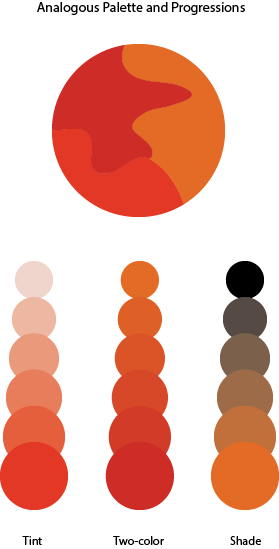
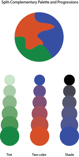
In our lesson we learned all about Color harmony. We also learned about the difference between Analogous Palettes and Split Complementary Palettes. In phase 2 of project 6 i downloaded the template for what you can see above and basically had to experiment with any three colors on the color wheel until we came up with two different palettes that have a good sense of harmony between the colors.


You did a good job with the Analogous Palette and its progressions, but in the Split-Complementary Palette, assuming your first color is green, you should replace the blue with something like red-violet, since that color lies on the other side of red, since you already chose red-orange.