Free-Study – Paired Color Identities with Simultaneous Contrast
Step 1 – Color Research Process.
| Jay | Shadin |
| Joyful Creative HelpFul Quiet Relax FINAL COLOR – Saturated Red |
Out-Going Creative Friendly Energetic Loud FINAL COLOR – Yellow |
Step 2 – Color Mockups

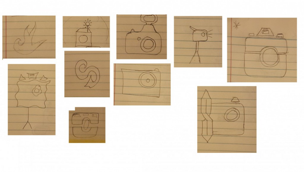
Step 3 – Icon Research Process

Step 4/5: Icon Mockup / Final Execution / Presentation

Thoughts
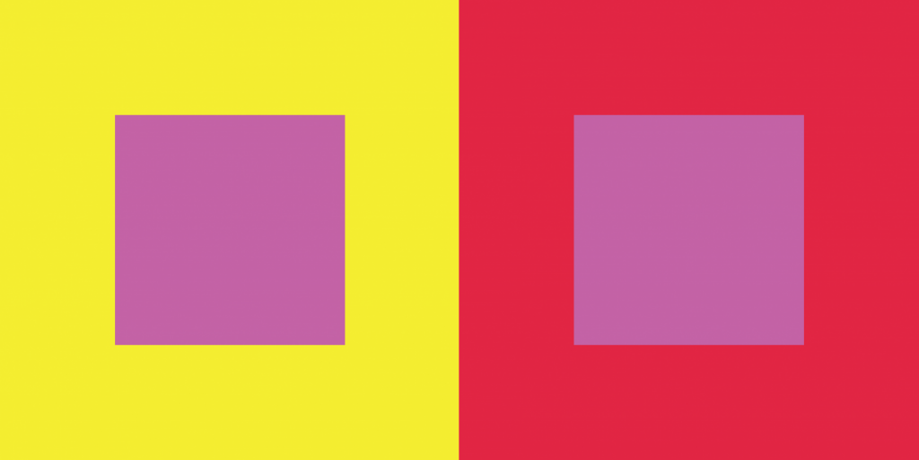
This Part of this project was fun to create. We had to chose a color that represents our partners personalities and then create an icon that would represent them while also creating Simulated contrast.
Time – This took about 4 hours.


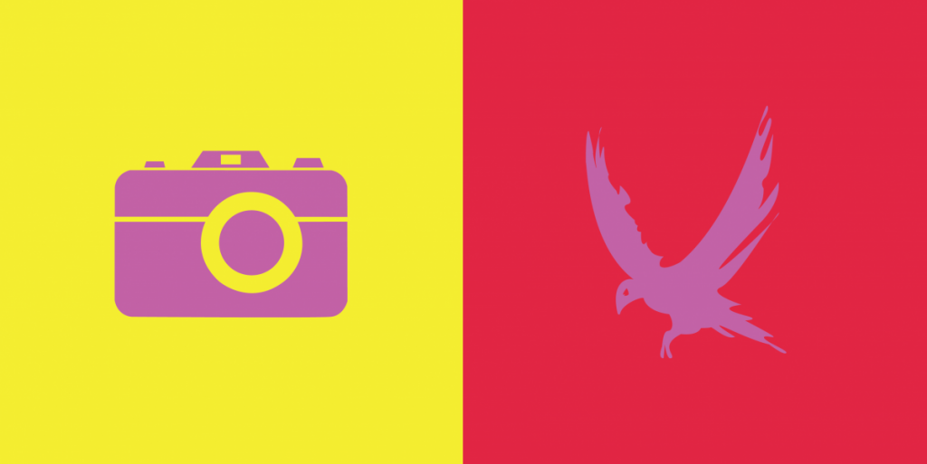
Not much to say in terms of criticism, as both logos came out quite nicely, and the simultaneous contrast is easy to see. The camera logo appears darker in contrast to the yellow box, while the bird logo appears lighter in contrast to the red box.
I think it great that you made the post like this, however you should spend more time explaining what you have done and learned from this project.
I like the way you broke down every part of phase 3 in a sort of concise way but showing all the work you’e both had done. I do agree with Ayano on giving more words behind what you learned. Besides that, great logo designs and execution in simultaneous contrast.