Saturation Studies: Phase 4

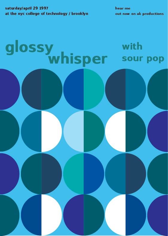
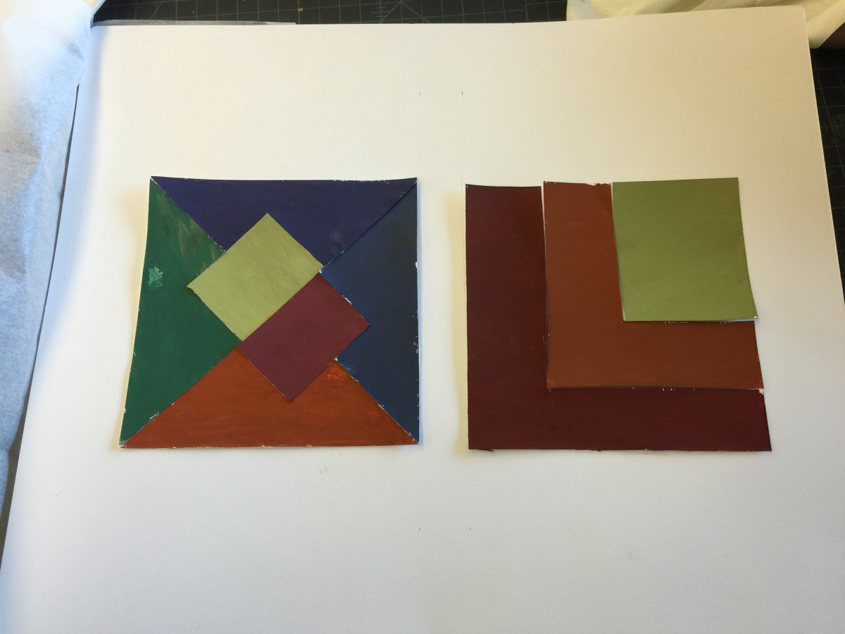
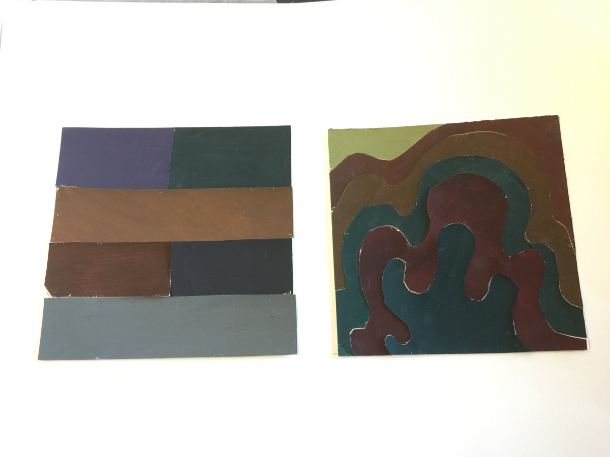
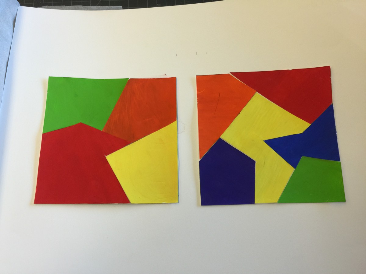
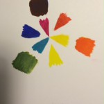
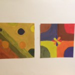
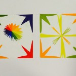
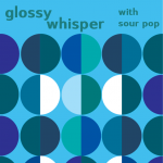
This project was pretty interesting, because I did not use paint ever since elementary school. I remember when I was mixing color back than, however comparing it to now it is very different. I had to learn new vocabulary such as saturation, value, temperature, lamination, etc to help me do the project 4. At first, I had trouble with the paintings, however from our critique I learned many things that I should have done instead to make it a very successful piece of art. I really liked phase 3 instead of phase 1 or 2 since we used Illustrator to help us create our band poster. It seems that I am very fit in using technologized material instead of working with paints.

Saturation Studies: Phase 3

My partner was Klever Cobena, we worked on phase three where we followed the three cars that was already provided for us. The color (Cool), composition (cross-sensory) and style (Iggy Pop). We chose the colors between blue and green, however I added one violet color which I add in more blue to make it cool color. Some may notice that there is a white part of my phase three. It was intentionally, because I used the example from Van Gough-Cafe, where we talked about in class.

image

Saturation Studies: Phase 2

For the chromatic studies, I learned that we have to add a large amount of the complimentary colors which is a opposite color that shows in the color wheel (ex. yellow and violet). Muted Studies, I learned that you must add a little complimentary colors and add in white. However, putting so much color would lead into pastel which we do not wanted. Finally, I learned that in prismatic studies, you do not need add anything to change.

It was pretty hard making chromatic colors and muted broad and high key. I had to redo them which I will take picture and update after I get the project back. I redone the muted high key and for prismatic high key. What I also learned was I thought that I must add white to make high key, however we do not need to use white. It took me about three to four hours for each studies. Over all, I learned many things, such as chromatic, muted, prismatic, saturation, value, etc. In addition, I think I was able to learn a new skills in painting where I never would have, if I did not take this course.

Didactic panel for poster

Brandy Ortiz

Born 1997 in Bronx,NY
Lives and studies in New York

Picture Perfect Family 2015
Pigma Micron Pens(0.2, 0.5 and Brush) and Faber-Castell Brush Pen

Drawing inspiration from Phillips’s Humument project, Ortiz transformed Brimstone and its thriller theme into one with a theme of family gathering. The concept behind this composition is that through the selected text,  the artist depicts a family that enjoys getting together.By outlining the frame with micron pens followed by inking the rest of the page with the brush pen, the frame within the margin area transforms the text to make it look like a family portrait.