Third Phase of our Saturation Studies. I was partnered with fellow classmate Ayano Morishima. With her well developed knowledge of Adobe Illustrator, and our mutual taste and design aesthetic, she created the Swiss Style Poster below for our band, Glossy Whisper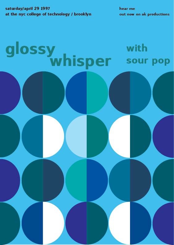
The OpenLab at City Tech:A place to learn, work, and share
The OpenLab is an open-source, digital platform designed to support teaching and learning at City Tech (New York City College of Technology), and to promote student and faculty engagement in the intellectual and social life of the college community.


top
I like the two basic colors your group chose to use, green and blue are both good examples of cool colors. The only suggestion I have for this poster is the color contrast of the figure-ground and the band name color. They are both like chromatic to me, plus the values are kind of same as well. I believe it will having a better contrast after you changed the value.