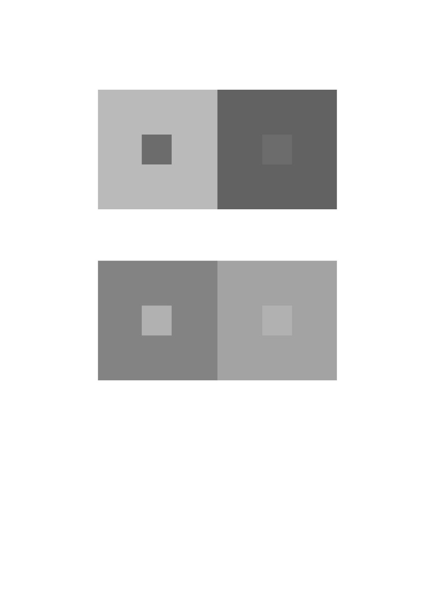
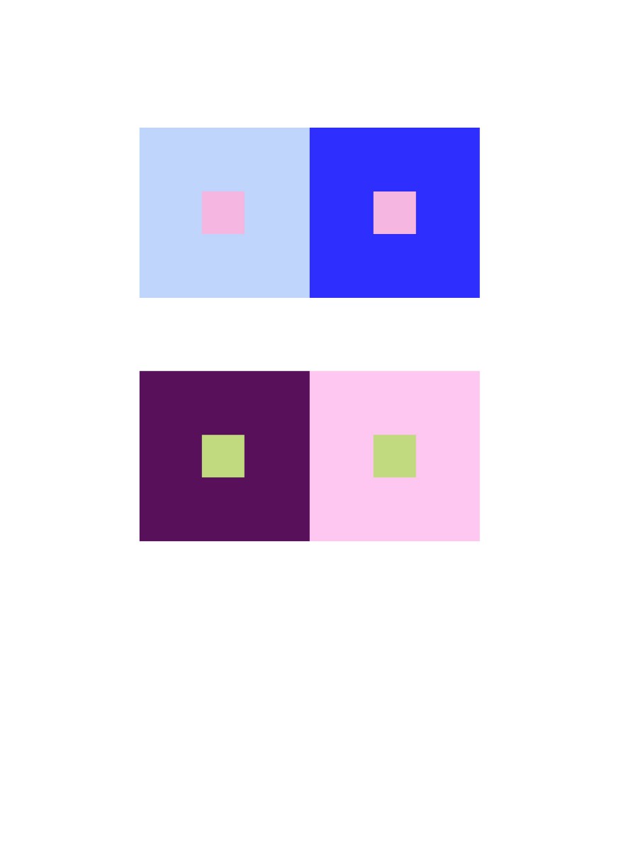
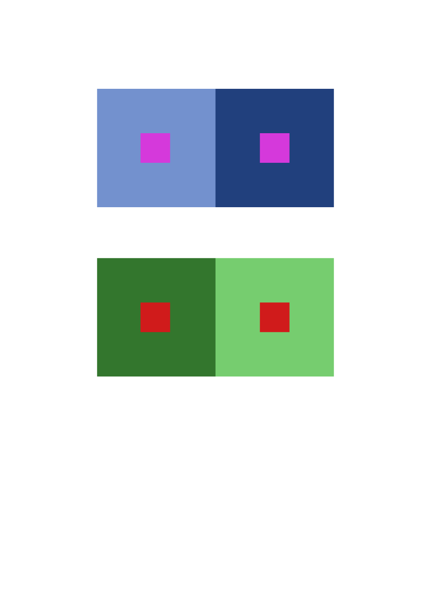
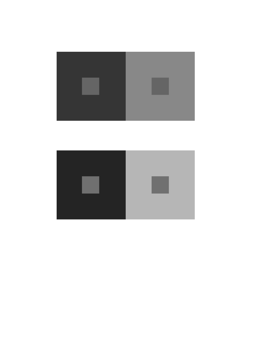
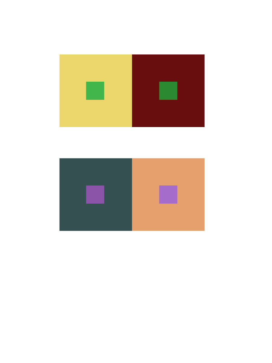
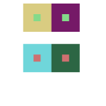
Group 1 – Achromatic gray studies
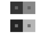 In group one, I think its the most easy part of this phase. All I’m doing is pick two different value colors to make center color look like they have different value, in fact, they have exactly same value.
Time took 10 minutes.
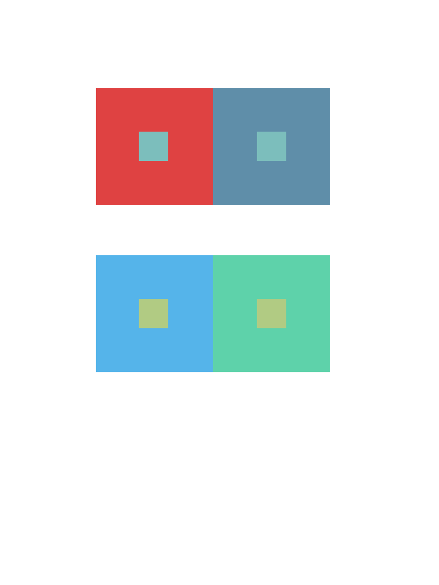
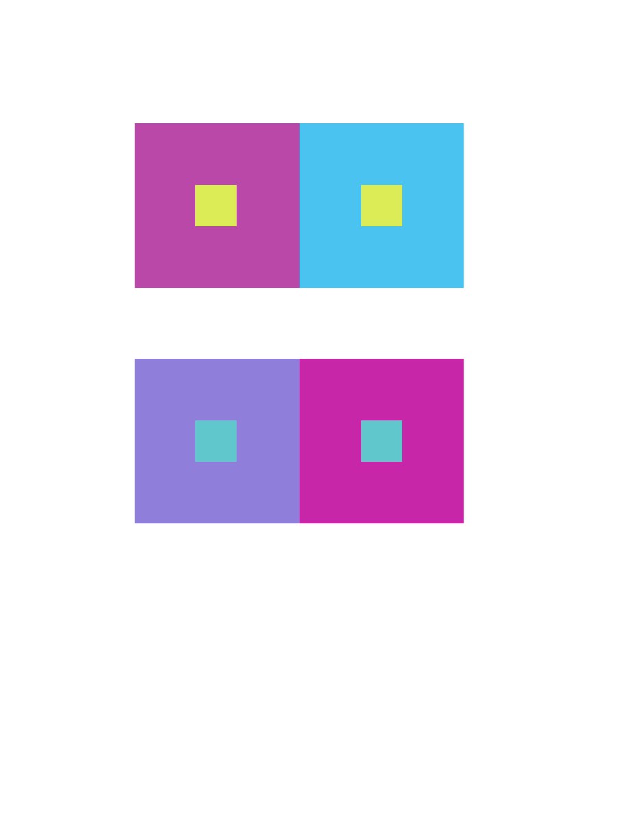
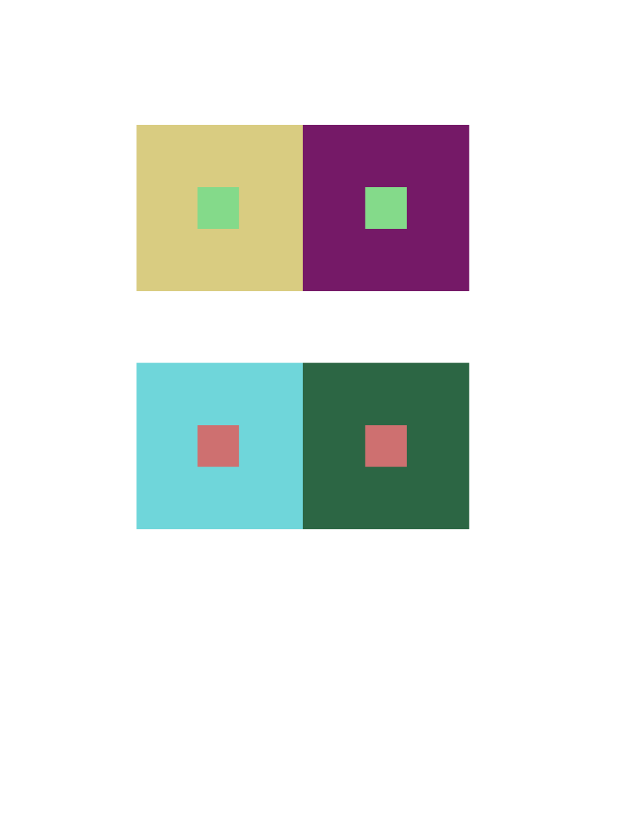
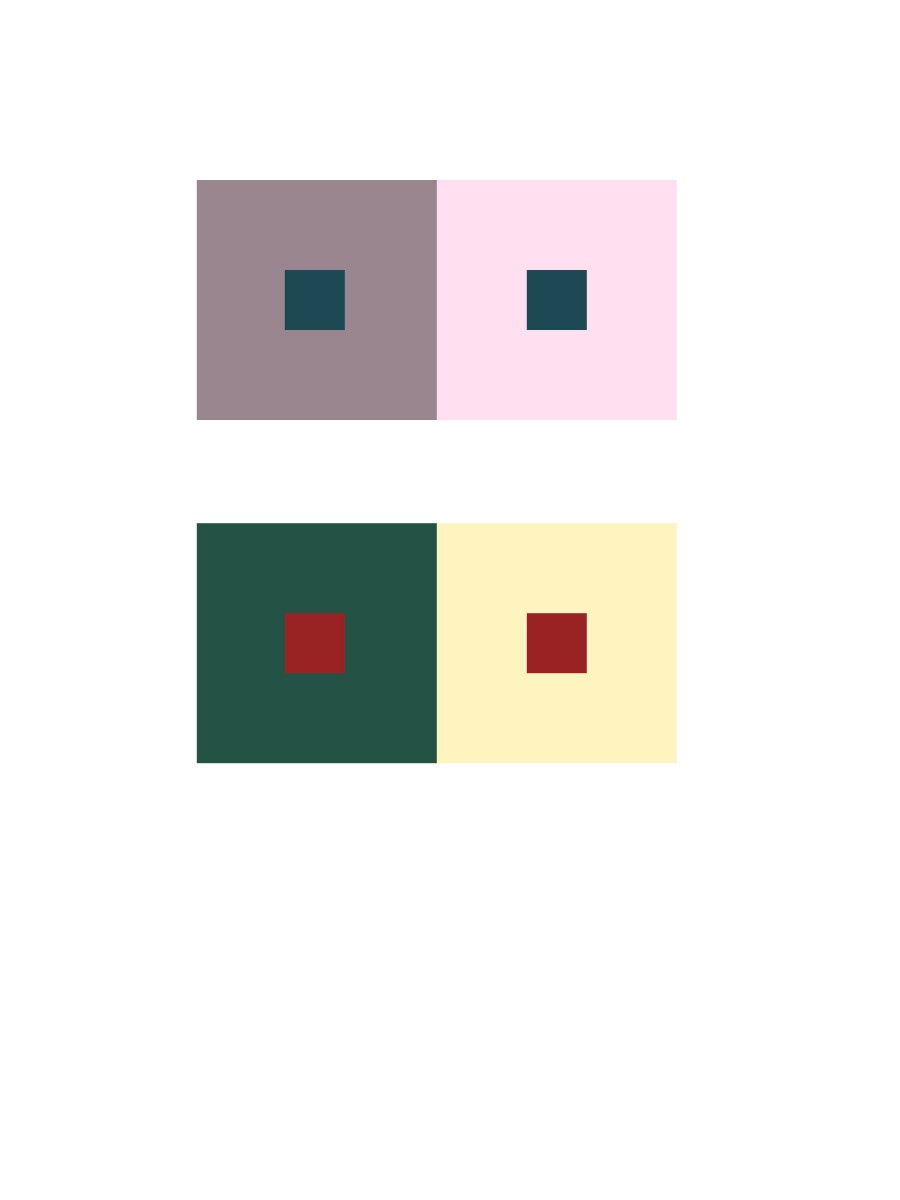
Group 2 – Shifting value (with color)
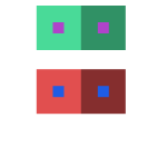
Group two is also kind of easy. I picked a color and change the value of the color to support the center color look different in value.
Time took 10 minutes.
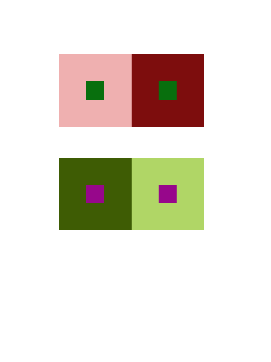
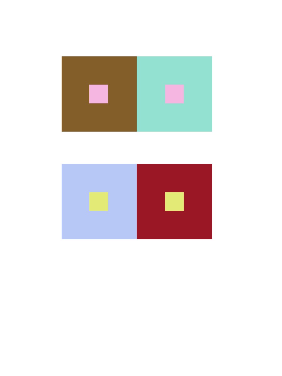
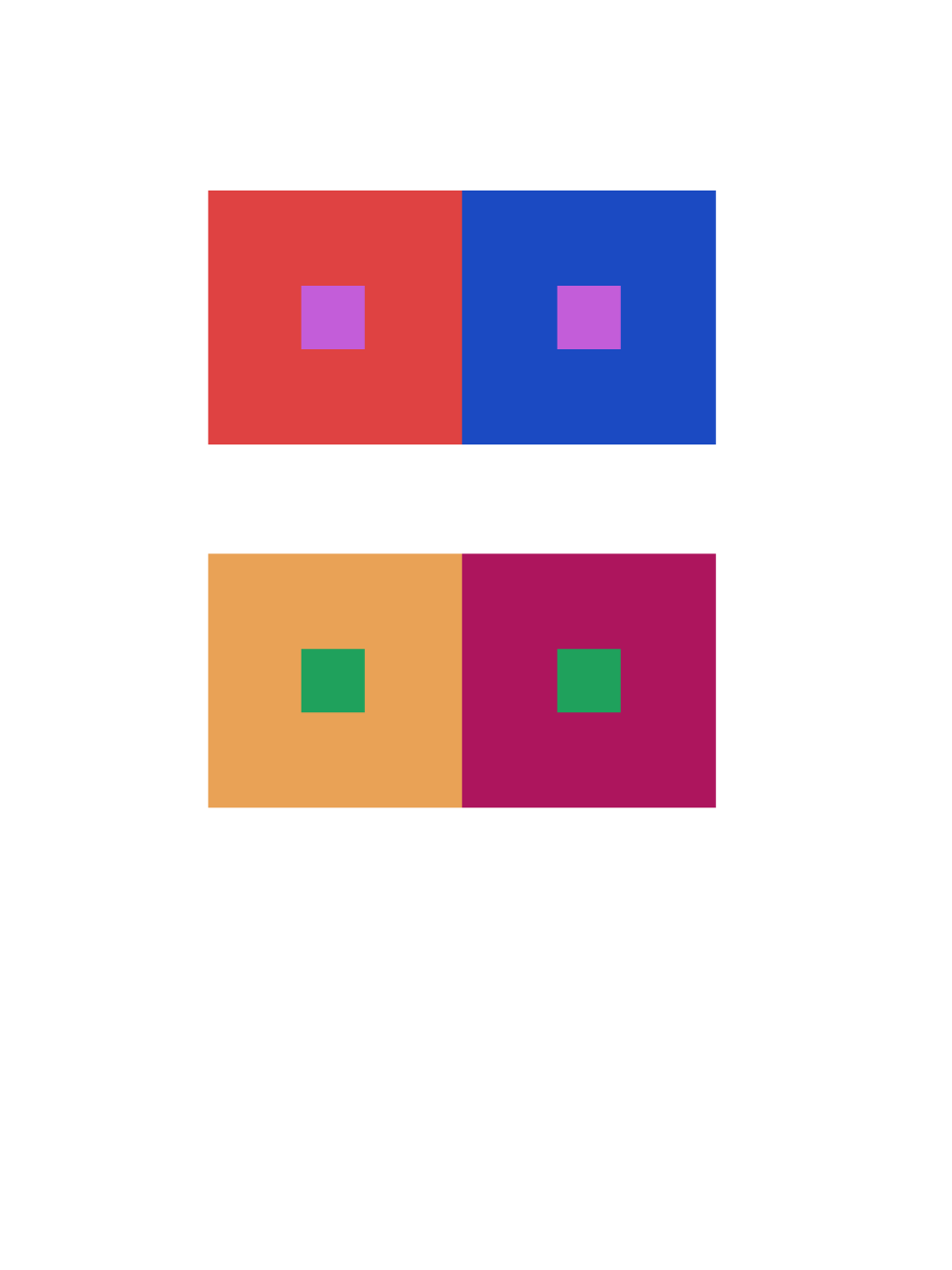
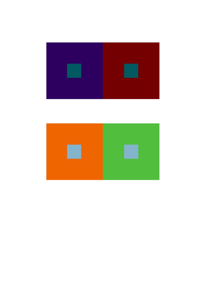
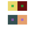
Group 3 – Shifting hue, but not value
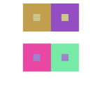 In group three, it did challenge me a little. I have to find two different color and make them have same value, and they have to support the center color look like they have different value.
Time took 20 minutes.
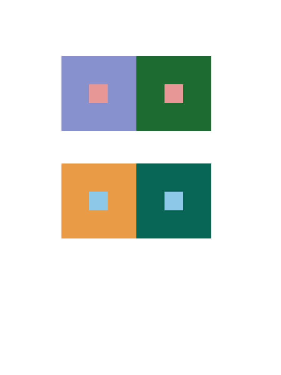
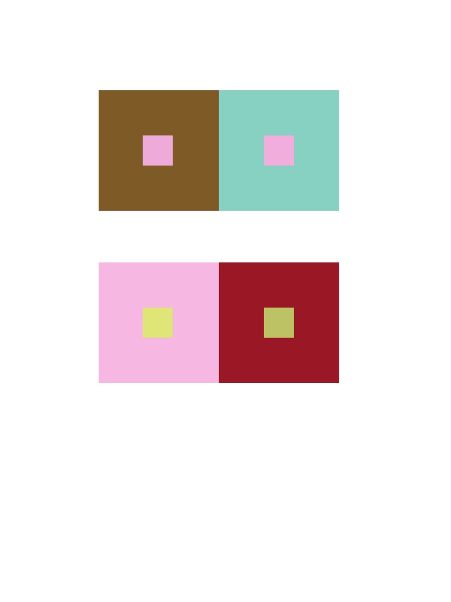
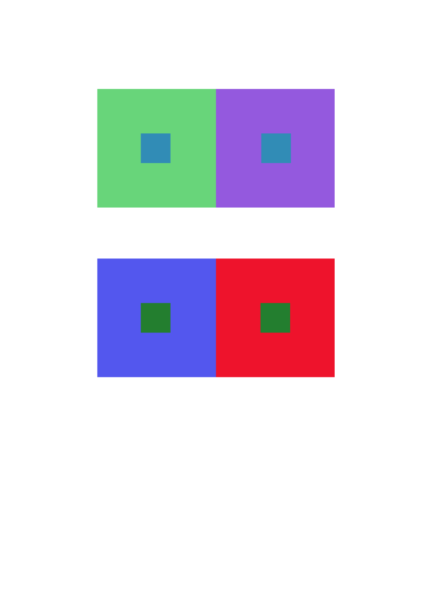
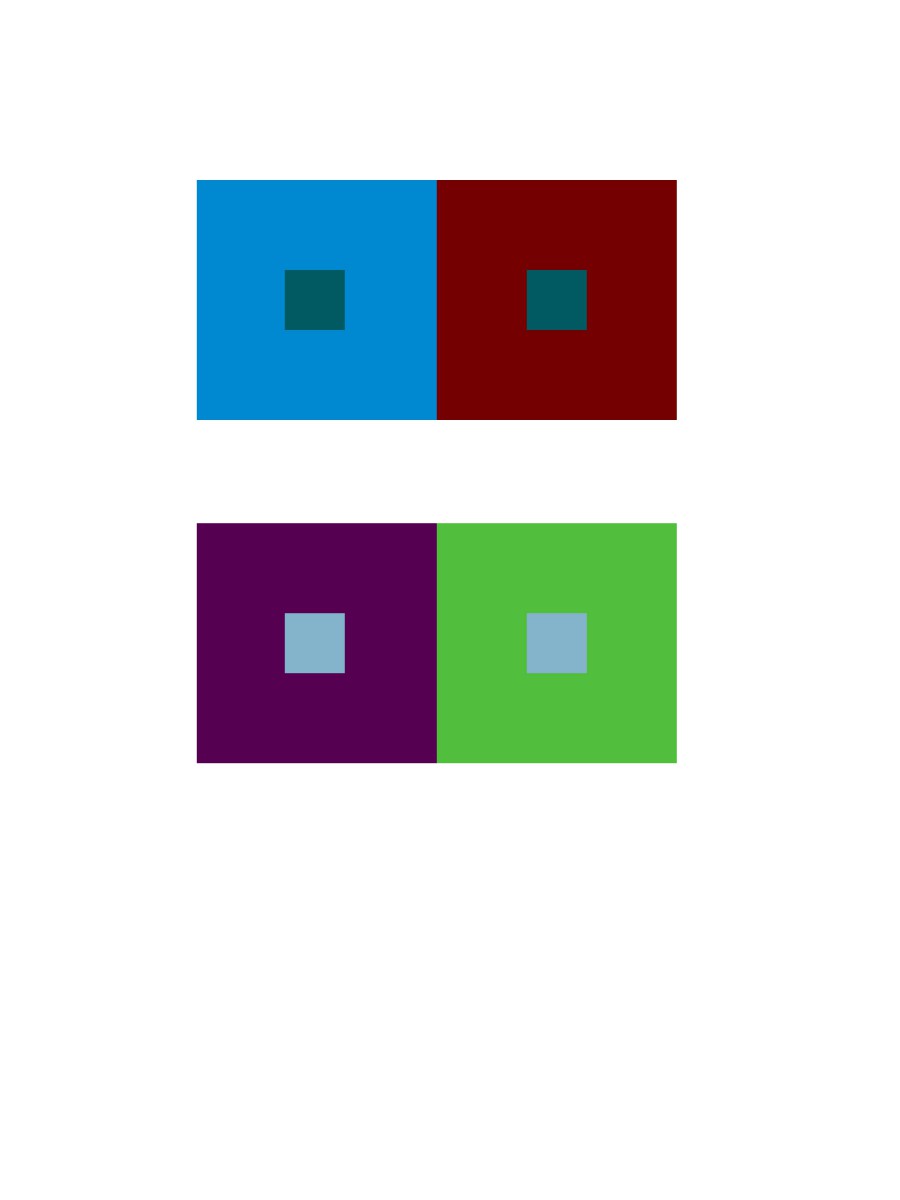
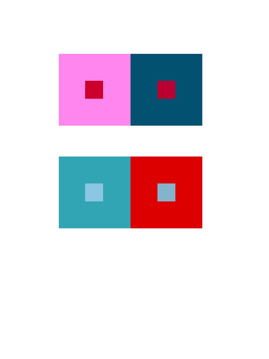
Group 4 – Shifting hue and value
Group four is very similar to group three, the only different part is I can change the value of the two color.
Time took 10 minutes.
Group 5 – Extra Credit
 Group five is similar to group four, however group four end up with center color looks like has different value, and group five is to change the value of center color to make them look like exactly same, in fact the value are different.
Time took 20 minutes.
![}H06ZU(HRI]A34T7H[]4353](https://openlab.citytech.cuny.edu/rosenspevackfylcf15/files/2015/12/H06ZUHRIA34T7H4353-300x233.jpg)