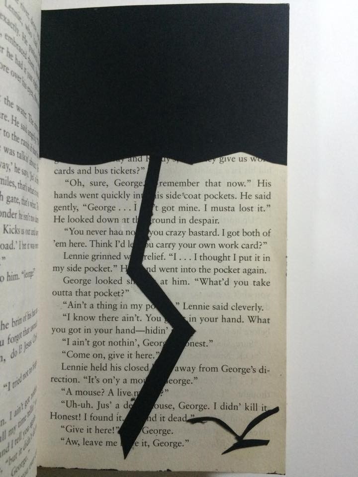
Panel1
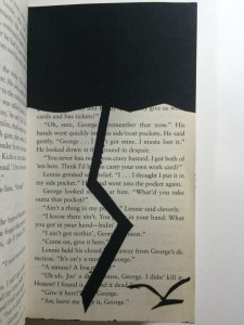
YingYang Zhang
Born in KaiPing, China
Route of Dreams
X-Acto knife, black bristol, and glue
To represent Of Mice and Men’s themes of dreams and loneliness, Yang used an X-Acto knife to cut out shapes of a dark cloud, lightning, and a bird from black bristol, then glued them on the page to create the obvious composition. The dark cloud and the lightning stand for the obstacles of our dreams, and the bird is used to represent loneliness.
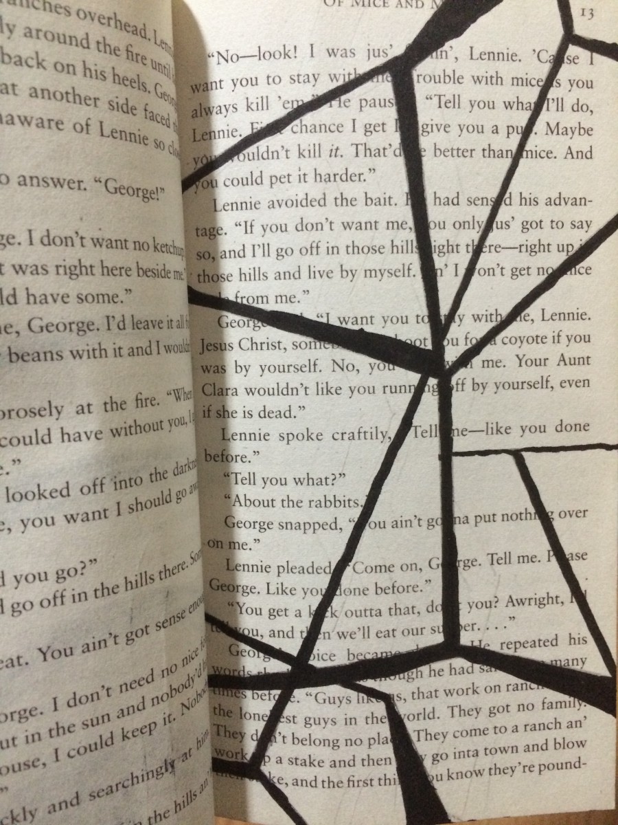
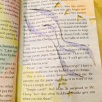
Panel 2
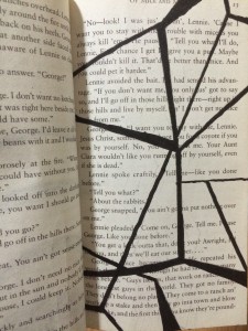
YingYang Zhang
Born in KaiPing, China
Broken
No. 6H pencil and black big brush
To represent Of Mice and Men’s theme of sacrifice, Yang used a No. 6H pencil and a black big brush to create the concept of pattern. Yang used the No.6H pencil to draw the shape of the pattern, then filled it with the black big brush. The irregular lines staggered together makes it look like a broken mirror, represent the idea of sacrifice.
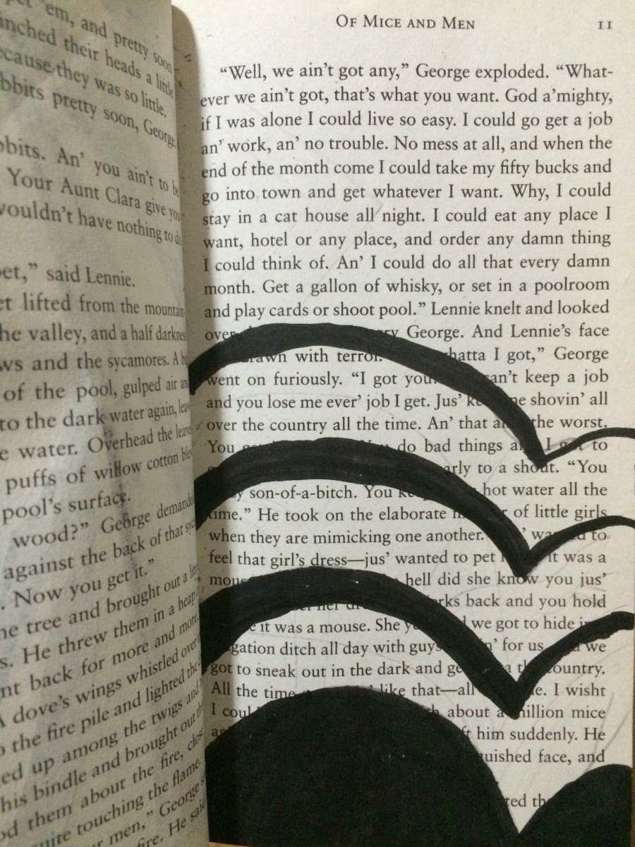
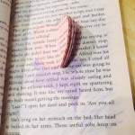
Panel 3

YingYang Zhang
Born in KaiPing, China
Freedom
No. 6H pencil and black big brush
In Freedom, Yang used a No. 6H pencil and a black big brush to create the concept of overlap. Yang first used the No.6H pencil to draw the outline, then filled it with the black big brush. In this page, you only see part of the heart. And the heart is separating in birds shape. Presenting the idea of freedom.