Project 3 # Final

Everything has beauty, but not everyone sees it. If you take time to really look at simple things you will come to realize that they really are beautiful. The surrounding beautiful, natural scenery spreads out before our eyes. It makes our spirits are cheered up and refreshed. True happiness comes from nature, the peaceful and beautiful environment is indeed enjoyable. Take some time out of the working day to enjoy by walking through into the environment.

This route begins at the General Building, when you exit to the Johnson st and turn right side to the Cadman Plz E. Walk through the Tillary St, the Brooklyn War Memorial will appear in front of you. There have the memorial,that designed by the architectural firm of Eggers and Higgins. Building adorned by two large figures, one at either end of front facade. That depict a male warrior on the left and a female with a child to the right – symbols of victory and family. The other one of my location is Hillside Park, is one of the dog parks in New York City. This park can be the one of the green lungs of an urban area. A walk in the park can calm our strained nerves, which is very quaint, very clean, and quite beautiful.

The other beauty in nature place is Brooklyn Bridge, is a park on the Brooklyn side of the East River in New York City. It’s a recreational, environmental and cultural destination enjoyed by visitors to New York City. There have a perfect view of the Manhattan, when you gaze afar into the Manhattan, the skyline at night from the those Building at Brooklyn Bridge Park. The panoramic view are marvelous. Also, the park have an alley when you walk through the alley, the surrounding view make you feel more comfortable and enjoyable into the nature environment. Looking at beauty in the alley, make me remind to the life is not always perfect. Like the alley, it has many bends, ups and down, but that’s its beauty and silent. “Nature is good for us launched scores of studies. Researchers reported stress reduction, improved attention, “mental restoration,” better health, increased longevity.” (Begley, Sharon Do We Really Need Nature?  August 12, 2015 Web. November 18, 2015). Everyone have to take sometime into nature, because we never noticed the beauty in nature that we were too busy trying to enjoy it. Look deep into nature, then you will understand everything better.

Keep walking to the end of the Brooklyn Bridge Park, you will see the boat ramp on the right side, have the other perfect view of the Manhattan. Then you can completely see the Pier 2 at Brooklyn Bridge Park in front of your face. It is dedicated to active recreation, contains over five acres of basketball, and over half an acre of artificial play turf, fitness equipment, and picnic tables available for walk-up use. A wide promenade wraps around the pier. It is one of the park have perfect promenade view includes the physical exercise fitness equipment and places. This is the different location of other places, is cross-over with physical exercise and beauty-in-nature. There is able to enjoy quietness and provide the area for visitors strengthen muscles & keep fit. It is kill two birds with one stone.

Where the beauty of nature and the freedom to breathe fresh air is all part of what is worth living for. Making the first change of your routine, you will really gains a different experience of your day, while it is the simple easy step. Every step can bring a lot of unpredictable things happen, but never ever stop to find the beauty in nature. Tale a moment to enjoy the beauty of nature, take a deep breath, relax…enjoy the rest of your day.
Saturation Studies: Phase 4

Phase 1: Color Wheel

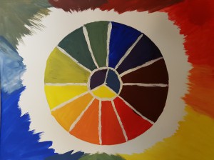
First time how to use the simple color (RED, BLUE, GREEN, YELLOW, VIOLET) to understanding of saturation.

0

Phase 2 : Three Saturation

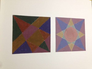
Chromatic Gray Studies – Exercise #1 & 2:
Took around one and half hours.

12227656_1490642337905893_5404243689099950676_n

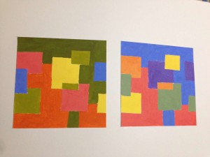
Muted Color Studies – Exercise #1 & 2:
Took around two hours to complete.

00

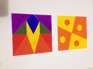
Prismatic Color Studies – Exercise #1 & 2:
Took around three hours.

01

 Phase 3: Swiss Style Band Poster

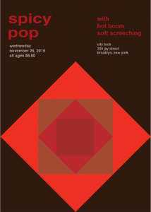
spicy pop

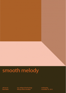
This project was fun for me, I worked with Brandy and Ashley, we had to make a poster of using the different saturation and values of the color red. At the beginning of the poster, we had to create a title that involves the senses of taste and sound. So we came up the “spicy” and “pop” for the title. Fortunately, we knew how to using the illustrator that we as fast as complete the poster .

Saturation Studies: Phase 3

spicy pop

For this saturation study, I worked with Brandy and TK. In this project, we had to create a band poster using a name that is a cross-sensory word or phrase. We were given three cards; a color card, a composition card, and a concept card. For, color card, we were given was warm color. For the composition card, we chose to do taste and sound. We came up with the name “Spicy Pop” by making a list that were taste and sound. We played around with the words until we came up with Spicy Pop and were satisfied with it. Since we were given warm color, we chose to do red. We used prismatic, chromatic, and muted. Overall it took about 3 hours to complete this project.


Saturation Studies: Phase 2

Chromatic Gray Studies – Exercise #1 & 2:

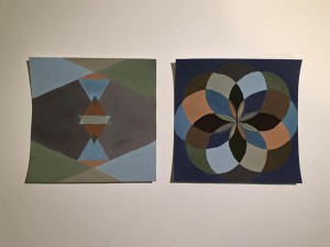
What I learned from this part of the project is how to create Chromatic Grays by mixing the color and its complementary.

Time Spent – An Hour and Half.

Muted Color Studies – Exercise #1 & 2:

What I learned from this part of the project is how to create Muted Colors by mixing the colors with white, or its complementary.

Time Spent – Two Hour and Half.

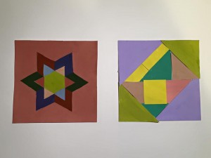
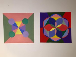
Prismatic Color Studies – Exercise #1 & 2:

This was created by just using the pure primary colors.

Time Spent – An Hour and Half.

Saturation Studies: Phase 3

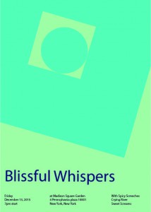
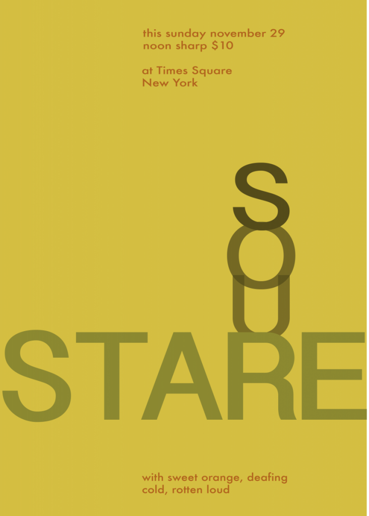
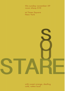
This part of this project was fun, I like creating stuff right on the computer, Hence Graphic Designer. It was fun to create this poster because I learned what the old times Band posters looked like. Creating this poster was harder than I thought because I am new to illustrator so it was very frustration. We came up with the name Sour Stare because our colors where warm colors, therefore, we also use different saturations and values of the color orange.

Sour Stare
Sour Stare

Saturation Studies: Phase 4

My thought on this project was, It was actually fun. We finally got to work with color! It was interesting how mixing the primary colors creates new colors.

Phase 1: Color Wheel

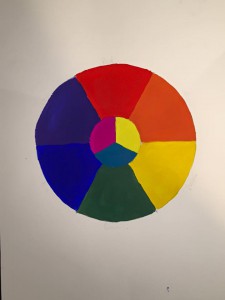
In order to create this color wheel I had to use only the 3 Primary colors, (RED, YELLOW, and BLUE). To create the rest of the colors, I then had to mix these colors together to create the secondary colors (ORANGE, GREEN, and VIOLET). And so on.

Color Wheel
Color Wheel

Phase 2: Saturation Studies

I have learned allot from this project, for example how to create Chromatic Gray by mixing the a color and it’s complementary. And I learned how to create Muted Colors by mixing the colors with white, or its complementary.

Phase 3 – Swiss Style Band Poster

This part of this project was fun, I like creating stuff right on the computer, Hence Graphic Designer. It was fun to create this poster because I learned what the old times Band posters looked like. Creating this poster was harder than I thought because I am new to illustrator so it was very frustration. We came up with the name Sour Stare because our colors where warm colors, therefore, we also use different saturations and values of the color orange.

Sour Stare
Sour Stare

Saturation Studies: Phase 2


Fixed Prismatic Studies
Muted Studies
Muted Studies
Chromatic Studies
Chromatic Studies

Total time took 6 hours to finish. By doing chromatic studies, I learn when mixing two opposite color on color wheel with same amount. The color will become darker. When doing muted studies, I learned when adding different amount color can change the volume of the color. Fixed prismatic studies are the easiest part of the project, its only using six pure color to paint.