Saturation Studies: Phase 4

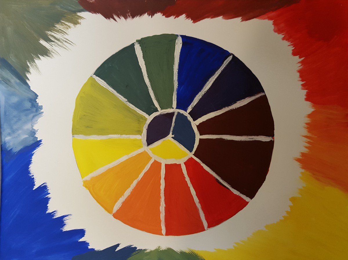
My thought on this project was, It was actually fun. We finally got to work with color! It was interesting how mixing the primary colors creates new colors.

Phase 1: Color Wheel

In order to create this color wheel I had to use only the 3 Primary colors, (RED, YELLOW, and BLUE). To create the rest of the colors, I then had to mix these colors together to create the secondary colors (ORANGE, GREEN, and VIOLET). And so on.

Color Wheel
Color Wheel

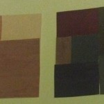
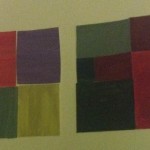
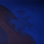
Phase 2: Saturation Studies

I have learned allot from this project, for example how to create Chromatic Gray by mixing the a color and it’s complementary. And I learned how to create Muted Colors by mixing the colors with white, or its complementary.

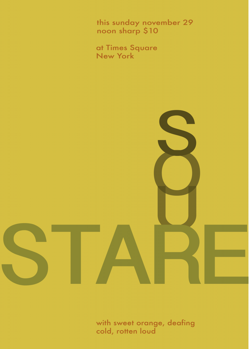
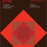
Phase 3 – Swiss Style Band Poster

This part of this project was fun, I like creating stuff right on the computer, Hence Graphic Designer. It was fun to create this poster because I learned what the old times Band posters looked like. Creating this poster was harder than I thought because I am new to illustrator so it was very frustration. We came up with the name Sour Stare because our colors where warm colors, therefore, we also use different saturations and values of the color orange.

Sour Stare
Sour Stare

Saturation Studies: Phase 4

For this project, in the beginning I learned about the different triads of colors which are CYM (Cyan, Yellow, Magenta), RGB (Red, Green, Blue) and RYB (Red, Yellow, Blue). Also I learned about the different levels of saturation for color which are chromatic, muted and prismatic. Mainly the tasks were to make broad and narrow range collages using each level of saturation. At first getting the colors down was pretty difficult because you had to be careful with how much of the complement color you add in to change the saturation. I was very scared of the paint running out in this project. Another fear was making the exact shade of color when I ran out of it. I thought using paint in this project would be a bit easier because in the previous project we used paint. As a matter of fact it was harder because of mixing all the different colors. I find for this project I really need to improve my craftsmanship because the paint didn’t come out as smooth as I wanted it to. The next task was to make a swiss style poster which I found to be pretty simple because at that point I got a better grasp behind the concepts of the saturation levels. The next project I don’t really know what to expect which is pretty exciting because I’ll be learning something new. Hopefully I can use what I learned from this project and previous projects for the next one.