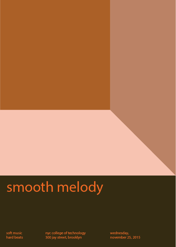
I created this piece of composition with my partner Ruky. We followed the theme provided, they are color (warm), composition, and style (touch, and sound). We chose orange to be our basic color, means every chromatic, muted and prismatic colors in this composition are orange with changes of value and saturation. It took us about a hour to finish this during the course time, after that, I brought it home and spend 5 minutes to make a final revising.


I love how it feels like you are in a room. Your poster reminds me of somethng that would be in a cafe Also the shades of colors that are in the box feels smooth and relaxed as your title says smooth melody. You mentioned about there being prismatic in your poster but I don’t really see it here. But overall I like your poster and continue the good work!
Brandy makes a good point about how the poster seems to recede into the distance with the large square, which is the most saturated of all three color shapes, giving it the feel of a room by adding that sense of depth. Your poster title looks like it acts as the prismatic color, at least to me anyway. Ultimately, it seems to be a successful enough poster.