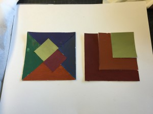
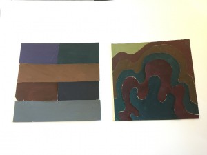
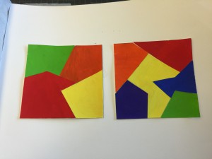
The second phase of our Saturation Studies. Each composition individually consisted of approximately 2 hours and 30 minutes work time each.
The OpenLab at City Tech:A place to learn, work, and share
Support
Help | Contact Us | Privacy Policy | Terms of Use | CreditsAccessibility
Our goal is to make the OpenLab accessible for all users.
top


I like how, all the colors came out. Also, I noticed that you used more geometric shape than the organic. However, I least you made one that is organic. You have to add in caption, because I do not know which one is which. I can guess at least and are you sure it is in the right order? Nice work!
Thank you for reminding me actually, and thank you for your feedback it’s definitely something I could’ve improved on. I agree 100%
I like your prismatic, nice color choices, and the shapes of it are like a puzzle, this interests me a lot. For your first two pieces, I’m confusing about which two in those four compositions are broads. From the top two pieces, I believe one piece should be muted, but for now I don’t see it, because muted composition has a higher value, and more saturation. You need some changes on your color for muted.
I agree with Ayano on adding captions because the only one to me that’s really distinguishable is the prismatic collages. I also agree with Jingyi on not being able to tell which is broad and narrow range (even with the prismatic collages).
These are very good, I can clearly tell which is prismatic and muted, but the chromatic is kind of hard to see, they don’t really look like chromatic grays to me. And I also agree with the other students, you should add a caption under each composition.