
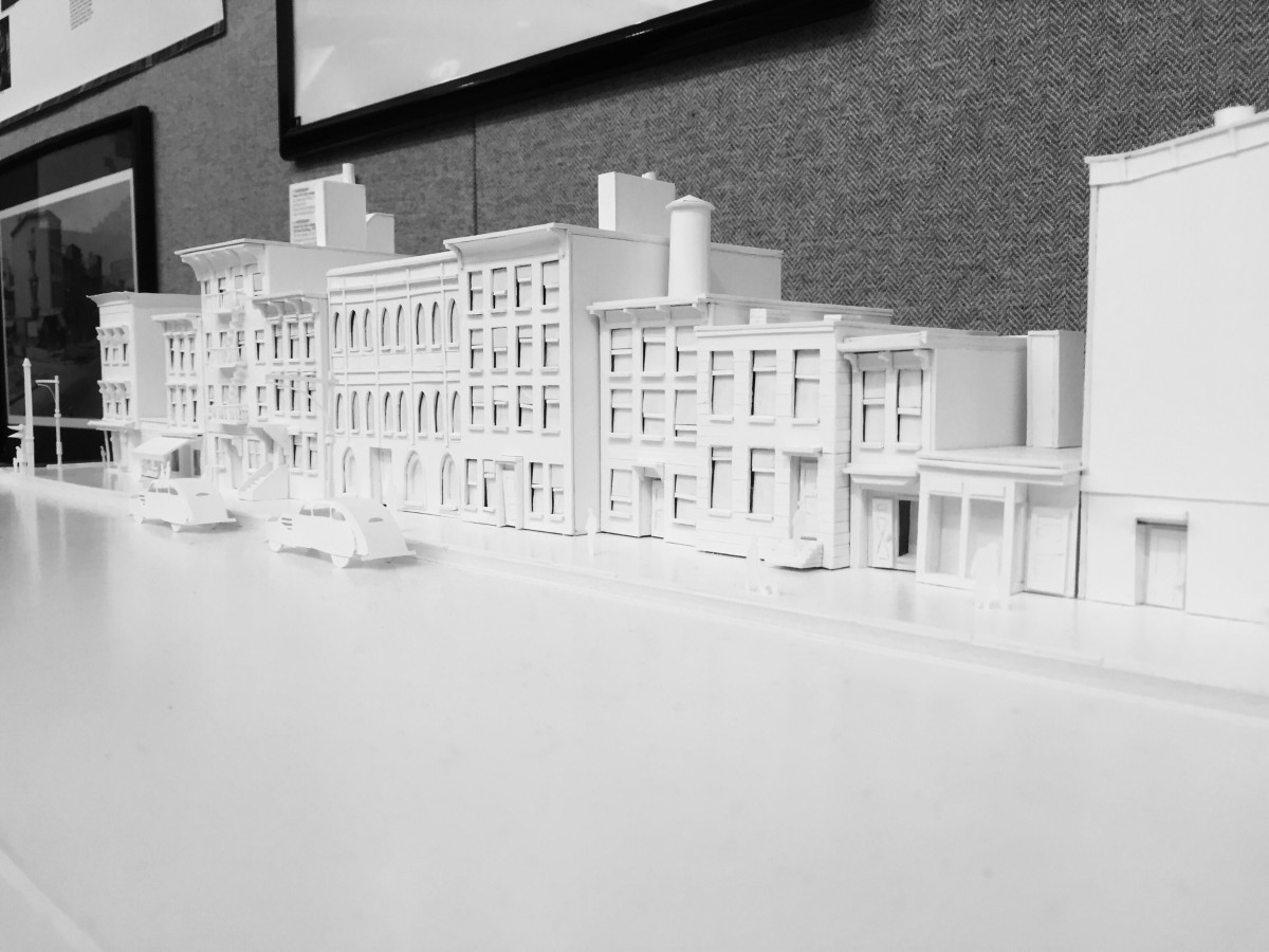
The first image is low key and second image is low key. The difference between these two image is that the low key image has dark color the most and the high key image has light color the most.
The first image is low key and second image is low key. The difference between these two image is that the low key image has dark color the most and the high key image has light color the most.
New York city has lots of landmarks, many of them are really famous. The U.S. Post Office on Adams street in Brooklyn is a historical main post office and Federal office building. The building its self appears particularly special in the area because of its Romanesque Revival style design.
The Post Office is just one block away from City Tech, Namm Hall. I didn’t notice it, until I took my sixteen minus of walk. To get to the U.S. Post Office with my path, first you need to walk left after get out of Namm hall, at the first block on your right hand side across the street, you can see a park, its a lively playground, many people who is local play sport, handout with friends and relaxing here. As you keep walking, at the same block on your left hand side, there is another building of City Tech. In front of that building cross the street, there is a church which is right next to the park. Keep walking about 5 minus, you can see the third building of City Tech. On the right hand side, you can see a little garden where you can take a break. Keep walking straight down to the next block until reach to the road turn right and look up, you can see a bridge that connects two building, that is for people who in the building could directly walk to other building on the other side of the street . Walking straight to the next block, you can see a parking lot and also, you can see the Brooklyn bridge is not far away from here. Now turn right so you are on the direction towards to the Post Office. This is Adams Street, as you can see on this block its all apartments, until you reach to the end of the block, you can see a restaurant called. Celeste Cafe & Grill. Now look diagonally across the street. There is the U.S. Post Office.
This U.S. Post Office is just one street away, behind the Namm Hall building. The building took over the whole block. The post office is not the only work site of the building, US Passport Agency, US Attorney’s Office, and US District Bankruptcy Court are also in there. The architecture feels like 19th centuries, because of its appearance. The whole building appears in white, it contains many features of the Romanesque Revival style. The building has seven stories tall.
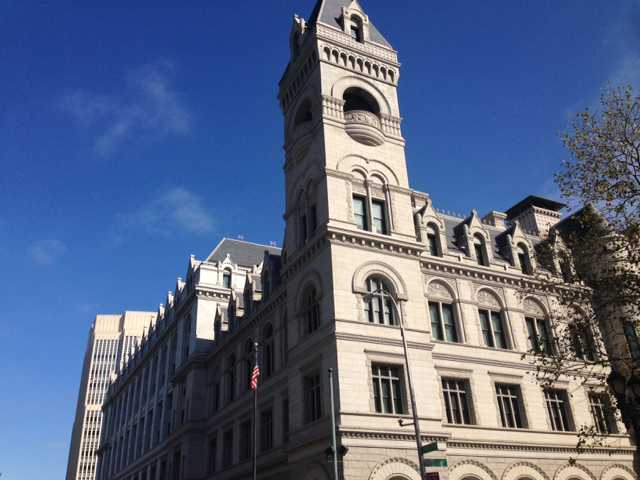
I took this photo at a small park which is at the junction between Johnson St. and Cadman Plaza. In the photo, you can see the square corner tower rise above the roof line. Each level was distinguished with different belt courses around the building. You can also see an American flag is on the left side of the photo. In order to capture angle in the photo of the building, you must stand on the right hand side of the statue in the park I was talking about earlier.
I choose U.S. Post Office as the location because when I first arrive to that location, it attracts me with its bright white appearance, and the juxtaposition of the post office and the nearby building. The architecture feels like it was built in past few centuries , because of the special design of the building. What I thought about of the building is it must has some stories or it may be a very important building back in time, for some reason the origin purpose of the building is gone, however people don’t want take down the building and make a new architecture. They probably think this building is part of the history, its priceless, so they make the building to a post office. From what I learned about this building is this building was build for both a post office and courthouse, designed the building in the Romanesque Revival style of architecture in 1885. Its original purpose was build for post office, and courthouse. In 1999 the U.S. General Services Administration purchased the building and began the renovations included the new courtrooms and the restoration of historic courtrooms, original windows and numerous site features. Then the U.S. Bankruptcy Court, the U.S. Trustee, and the Offices of the U.S. Attorney added in to the building.
From the article “City Limits” by Colson Whitehead, it states that “Go back to your old haunts in your old neighborhoods and what do you find: they remain and have disappeared.” Even though, we didn’t have the opportunity to see the changes of the post office, however the history would like to tell us about what part of the building have change. The building was built in 1885, after the almost fifty years later, in 1930, as the population continued to grow, officials determined more space of the building was needed, the addition extended to the north. The article also mentioned “Our old buildings still stand because we saw them, moved in and out of their long shadows, were lucky enough to know them for a time.” the statement have shown that it was luck enough that people can still see those old buildings as they walking through their long and short shadows.
The U.S. Post office on Adams street in Brooklyn is a very historical architecture, it’s also a very important building in New York. This is an example of juxtaposition in New York, buildings overlapping each other, make the city more diverse with different scene. Also to remind people that world changes so unpredictable, when they realize something was changed, its probably has changed months ago, because people became so careless about the stuffs they seem everyday in their life. So we should pay more attention to the stuffs surround us, before they change their original form.
New York is an ever changing place with many places throughout the city tending to overlap with two different New York’s. So I went around the surrounding area of City Tech to find one of these Overlapping New York’s, I finally did at Brooklyn Heights. First off I exited the Namm building and turning left down on Jay Street towards Tillary Street. From there I made a left on Tillary until I got to Clinton Street you know that you’re going the right way because on your left is a small park dedicated to all the Korean war veterans. I continued to follow Clinton Street until I hit Pierrepont Street. When i arrived at Pierrepont Street I followed it noticing all of the nice buildings and how many of them differ from each other and how much they differ from the buildings I’m used to in Times Square, until I finally arrived at Brooklyn Heights.
The overlapping New York in that area is that you can see the huge differences between the small building in Brooklyn Heights and the huge towering buildings of Manhattan. You can see the difference between them in that all the residential buildings in Brooklyn Heights are made of brick while the huge buildings of Manhattan are made of steel. Also from the side of Brooklyn Heights some people may have different views of both Manhattan and Brooklyn. For example some people from the side of Brooklyn Heights may see Manhattan as the place where they work while others like myself see Manhattan as home. On the other hand people on the side of Manhattan looking at Brooklyn will either see Brooklyn as home or either as a foreign place to those who may have never been too Brooklyn. While I was there I also saw a photograph of the old New York skyline with the twin towers tied to the fence. I thought that it offered a bit of insight into someone else’s New York. For example someone who might have lived in Brooklyn heights before 9/11will remember the skyline before the twin towers fell and therefore make that a part of their own New York while those that came after 9/11 only know what the skyline might look like without the twin towers or with the Freedom tower in the skyline. The best example of this that I can think of is in Colson Whitehead’s novel City Limits. In it Whitehead says “I still call it the Pan Am building, not out of affectation, but because that’s what it is.” This clearly shows that different people can have their own version of New York. Like I said those that had lived before 9/11 will always see the freedom tower as the place where the twin towers stood and those who lived after will see it as the new freedom tower. Another point that helps is when Whitehead says: “For that new transplant from Des Moines who is starting her first week of work at a Park avenue South insurance firm, that titan squatting over Grand Central is the Met life Building, and for her it always will be.” This quote further drives home the point the different New York’s between different people. Regardless those are three different New York’s that may belong to anyone that lives in Brooklyn Heights.
Also in view at Brooklyn heights is the Brooklyn Bridge to everyone it represents a connection between both Manhattan and Brooklyn. This bridge is used to bridge two different people, even though they are the people in both Brooklyn and Manhattan are still all New Yorkers they are all entirely different people. So in that sense it is not only a bridge between Manhattan and Brooklyn but it is also a bridge between different New York’s
In the photo I took captures the juxtaposition between the small quaint buildings in Brooklyn heights compared to the huge towering buildings in Manhattan. You can easily see the differences between the buildings size and design. It also captures the differences between the different skylines of the different New York’s and how some people may have grown up with one thing while others grew up with another. These are all ways people may see New York through their eyes. That will never be the end either, as more new people come into this world at different times they too will experience completely different New York’s compared to the New York we have experienced in our life.
There are many juxtapositions near City Tech (The New York City College of Technology). The two locations I choose to juxtapose are Macy and H&M, both are located in Brooklyn, on Fulton Street, near City Tech. Although Macy’s and H&M are both stores that sell clothes, very similar decorations of the interior, but you still could find out the difference by juxtaposing them.
Fulton Street is a long street in northern Brooklyn. There are many chain stores build on it, include Macy’s and H&M. Clienteles prefer to have a clothes shopping in either of these two stores, the stores’ popularity and unique fashion style has attacked majority clienteles who interests on clothes shopping. Otherwise, these two clothing stores are controlling New Yorkers’ fashion storm the most. The six main elements to juxtapose are logo, size, item selling, building appearance, interior appearance, and demographics. The first five elements identify the rate of demographics, and the clientele type they have. The clientele has no age limit, can be teenagers and seniors as well.
Logo is the symbol of brand, represents a company, contains the management conceptions of a company. Macy’s logo design is horizontally and contains a red star on the left side of the letter “macy’s”. Instead of using apostrophe between y and s, they add a small black star replace on it for better visualization. H&M has a sloppy logo. It seems to be more like a handwritten letter, the letters are tilted to the right, and if you look at it clearly you will notice this logo can be written down by using marker, the endpoint of each composition has a little waving trace that can be done with a marker only. Macy’s and H&M are using different fonts for their logo, Macy’s logo is very similar to Avant Garde Gothic Extra Light, H&M’s logo is similar to Dom Diagonal. The logo shapes reflect their style. Macy’s tendency trends plain, cozy, generality, and stable. H&M trends stylish, and diversity. But they also have a common in color using which is red. “Interesting things happen when the creative impulse is cultivated with curiosity, freedom and intensity.”, by Rob Marsh. Red is color with strong intensity, “the color red is the color of energy, passion and action”, bright warmness color red can easily catch up clienteles’ attention to their logo, this is why many other companies are also putting red in their logo such as Youtube, Coca-Cola, etc.
The size of building implies how many classifications they do have. The larger the store is, the bigger the chance of clientele to get a view inside the store, unless a small store is famous. Macy’s size is larger and higher than H&M, plus underground floor it contains 7 floors, 5floors more than H&M, so it is possible for Macy to sell more different kind of items in their store, and after my observation, I find out they really do sell other stuffs. Other than clothes, they sell furnitures, fragrances, watches, and daily necessities on the underground floor and the floors over the 3rd floor. People go to stores for shopping items they demand for. Since Macy has more categories of item selling, the rate of the clientele are defiantly greater than H&M, because H&M sells clothes only. Another thing helps clienteles’ rate raises is the location. Macy and H&M are both located on Fulton Street, where many chain stores build on. Macy is getting a favorable place than others. A bus stop of B25, B26, B38, B52 is on front of Macy’s store, there are always many people sitting and standing at the bus stop waiting for the buses. The more buses stop at the bus stop, the more people will be there for waiting. The more people are there, the better chance for them to walk in the Macy’s store even they don’t demand for anything, maybe after they visit inside the store they will find out what they need to purchase. H&M has an inferior location stand, but in my own opinion, I like their building appearance more than Macy’s. Macy’s building appearance is laconically plain, appear light brown color. They have two large glass doors on the ground floor, and a few showcases beside entrances. Macy’s building has no windows, this appearance gives me a feel of less oxygen, depression, and gloomy. H&M build a glassy wall, support with Iron shelf, that means people can clearly see inside through the glasses, for better understanding what type of fashion they have sell, this way is much more efficient than looking at the showcase. In addition, this building appearance appears bright, clean, and fresh, unique building design attracts clienteles’ attention a lot. “Architecture is a visual art, and the buildings speak for themselves.” by Julia Morgan.
I have been to Macy’s and H&M twice for observing. The results of my investigation shows Macy’s clienteles more inclined to adult, clienteles for H&M are inclined to teenagers and who born after 90’s. I prefer H&M as a teenager, their logo looks contemporary creative, fashion styles are classified properly, not like Macy’s mix fashion, example when I looked for preppy style clothes I couldn’t find them as a group presents in a precise area, but in H&M I could. This is just my own opinion, not meaning as general. Everyone interests in different type of fashion styles, and this preference lead to the juxtaposition of Macy’s and H&M. “Fashion is about dressing according to what’s fashionable. Style is more about being yourself.” by Oscar de la Renta.
World changes with the passage of time. No one knows when things around would be change to unfamiliar, maybe a year, a month, or probably tomorrow. Many changes have led to most of the people become careless to the things around. But if you just paid a little attention to it, you will realize there are many small phenomenon you could realize in much detail ways. Since you juxtaposition, realize the advantages and disadvantages, you will always compare what you see to the others, and most time the equivalence will not be the same. Such as the Macy and H&M locate on Fulton Street. “Cities are about juxtaposition.”, by Richard Rogers.
![]()
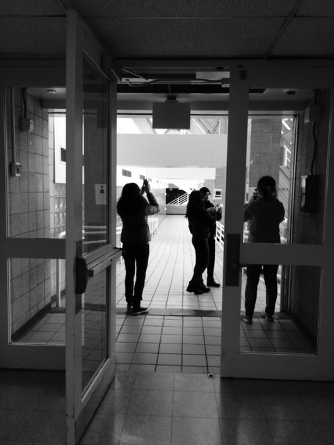
These are my two pictures that I took, where one on the left is High Key and the right is Low Key. The one on the left is High Key, because the more of the white and gray tone of the stair case stands out. On the other hand, the right side of the image contains more value in Low Key, which it contains more black shadings. Most of the figures of people or an objects turns out to be more of the Low Key.


high key

low key
The first image is high key and the second one is low key. You can see the differences between the light. High key has a brighter figure and low key has a darker figure.
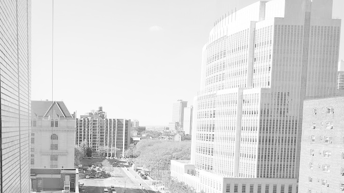
This first image is a High Key image of Jay Street. You can tell it is a High Key image because of how bright it is. you can clearly see how the sun is shining bright on the edges of the building. You can tell the sun is on the left by looking at the huge shadow the building created on the street. By making this image gray scale, it made the street looks sad and depressing. You can only see a few cars drawing by which people can take as this part of town is really dull and boring.
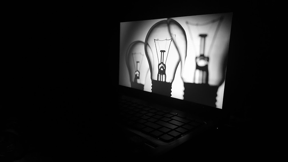
This second image is a Low Key image of a computer with the screen on in a dark room. You can tell this is a Low Key image by all the negative space. There is no shadow in this picture only a little highlight on the keyboard caused by the brightness on the screen. Part of the keyboard is light and the rest faded into the darkness. This picture can represent there will always be light in the darkness.
There are always changes going on around us whether it be the people around us or the neighborhood we grew up in and that we know of. Change is definitely happening constantly in New York. Every corner you turn you see construction happening, they’re either building new houses, building complexes, fixing up roads, or even adding new businesses but there is always something being changed here in new york. I live I New York and I see a lot of changes going on by my neighborhood like they’re building a new mall by my house and fixing up the roads on the belt parkway/southern state. There are a lot of things that use to be here when I was younger and that are not here anymore. Another change people would notice are overlapping neighborhoods, like there could be a nice neighborhood then when you turn the corner the neighborhood could change in an instant and have run down houses and dirty streets, and even you can see a strip of stores and there could be a lot of little self owned businesses and then you see a nice big store that looks out of place that you wouldn’t expect would be there. Changes and improvements will always be apart of the New York lifestyle.
The place I chose for this project is a pretty good example of a store that looks out of place and shouldn’t or not expected to be in that spot. I chose a 99-cent store next to a jewelry store on the corner of Lawrence Street and Helen Keller Place. First you exit out the Namm building from the 300 Jay Street side and turn right. You keep going straight for 2 blocks until you reach Willoughby Street, once you get to Willoughby Street you turn left and cross the street and keep going straight until you reach a jewelry store called Giovanni’s Fine Jewelry and next to it is a 99 cent store called 99 cent City.
When I think of a jewelry store I think it would be next to nicer stores or more well known stores in a nicer neighborhood. This is because when people shop in more well known expensive stores those people shopping will be more attracted to the jewelry store. When you see the jewelry store next to this 99-cent store I think how does the jewelry store get business when both stores attract different types of customers. The 99-cent store attracts customers that look for cheap or inexpensive items to buy, and when I looked in the jewelry store the jewelry was nowhere near 99 cents. Unless the person is looking for a jewelry store to go to or looking for that jewelry store because its close to them then I don’t know why it would be next to a 99 cent store, and the neighbor hood didn’t look all that extraordinary where you think a jewelry store would be. This is where juxtaposition takes place. Juxtaposition is when two places or things are seen together and have contrasting qualities or traits.
When in all of these different places peoples senses come in to play, like what you may see, hear, smell, and even what you feel when you’re in these places. The thing about senses they work different with every person, for example one person may see something that use to be there and another person may just see what is there now. In the novel City Limits by Colson Whitehead he said “Thousands of people pass that storefront everyday, each one haunting the streets of his or her own New York, not one of them seeing the same thing.” Not one person sees the same New York as the next. When I was at the spot with the 99-cent store and the jewelry store my senses were going all over the place, when I looked around I saw a lot of people walking fast like they were rushing to get somewhere, but to put in consideration it was around 3 O’clock and people are getting out of school and work so people may have either been on there lunch break or rushing to get home because the trains are right there. My sense of smell was going on too because there are a lot of places to get to eat around that area and all of those different smells are rushing at you at once. When you stop and listen you hear all types of things like people talking on the phone, other peoples conversations the sound of traffic and its pretty loud because in this area it gets crowded with people that are coming from or going to work and coming from or going to school and it gets even louder because there is construction going on just around the corner from these two stores.
This is just a little example of juxtaposition in a huge city of different types of neighborhoods overlapping each other. Around every corner you’ll see all types of changes and people that live in that area may have different memories and stories of what they have been through in that area and another person may have a completely different story or memory of that area just because the different times they started either living or hanging around that neighborhood. Sometimes we may not want to see change in these neighborhood and we may thing things are fine the way they are but in actuality change is inevitable, there is always something that needs to get moved or replaced and everything has room for improvement, if you look at a picture of New York City from the 1960s to a picture of the city today they look completely different. This is what’s happening to our city and everywhere else other then New York we just have to except the change and just move on and hold on to our memories.
October 21, 2015 What’s DUE? VALUE RANGE RESEARCH: Post your paragraphs and 2 images (high key and low key) to the class blog (see Project #3: Phase 1 Guidelines.) Don’t forget to comment on at least 3 other students posts. Bring in the completed value scale exercise we started in class. HUMUMENT Work: Post an image or image gallery […]
The OpenLab is an open-source, digital platform designed to support teaching and learning at City Tech (New York City College of Technology), and to promote student and faculty engagement in the intellectual and social life of the college community.

