 Tsang, Ka Yee (TK)
Born in Hong Kong
Lives and studies in New York
___________________________________________
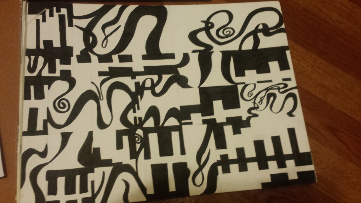
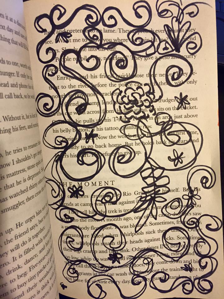
“Flower”, 2015
Sharpie on paper, Inking brush pens
In this work, TK wanna create a simple idea that represents the Flower pattern. Set up the pattern like the painting book called ” Secret Garden”. Using the black and white composition, and lay out the curvy figure, randomized draw though the page. Also, the author’s using a legato pattern to create the flower pattern.
 Tsang, Ka Yee (TK)
Born in Hong Kong
Lives and studies in New York
___________________________________________
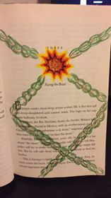
” Shackles”, 2015
Color markers, color pencils
Shackles was intended by the author to represent the idea of imagination. The author used the markers drew the sun in the middle, used the chain to connect the sun. Nothing can be closest to the Sun, whatever they are.
Tsang, Ka Yee (TK)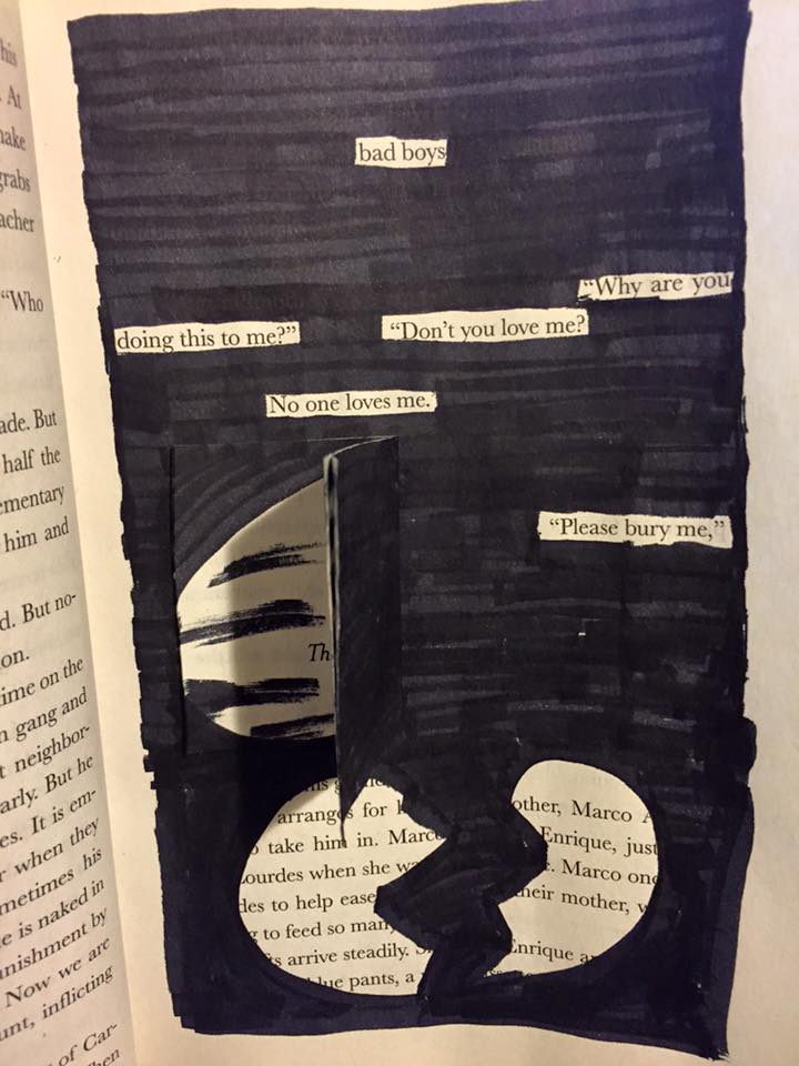
Born in Hong Kong
Lives and studies in New York
___________________________________________
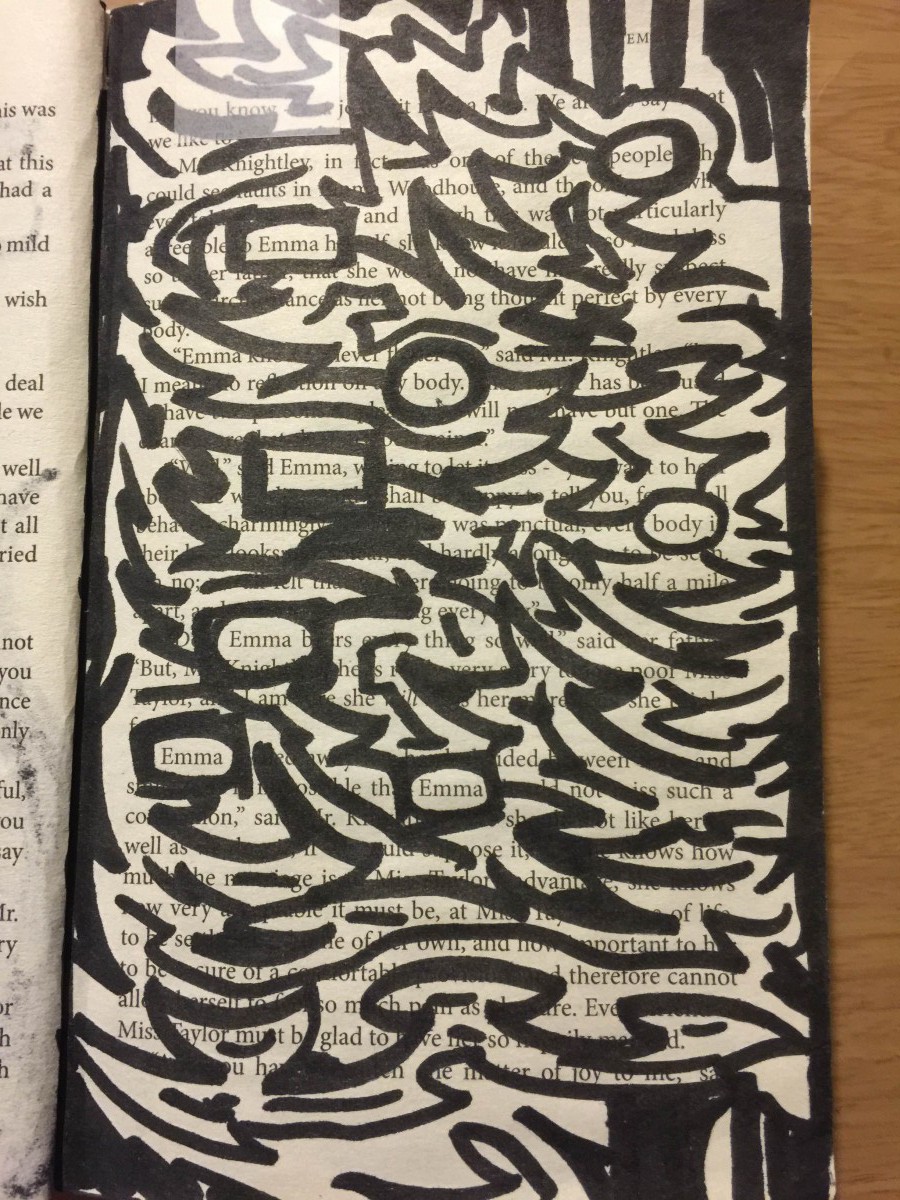
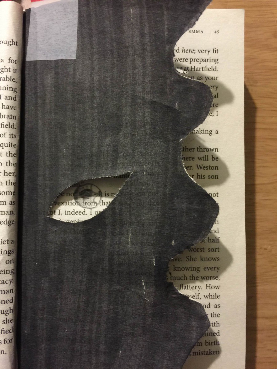
“Don’t You Love Me?”, 2015
Sharpie on paper, Inking brush pens, paste some page
Drawing this page, the concept is selected text to go though the main idea of this page. The author’s using the text, “Don’t you love me?” “No one love me” that represents the feeling from the page, then drew the broken heart on the bottom to mention the idea.