In this project I worked with Yang and we decided on the name. We were told to work with a warm color so we made a list with colors that are warm and picked out red. Then we came up with the name that stood out and sounded like something busy so it fits with the worm color.
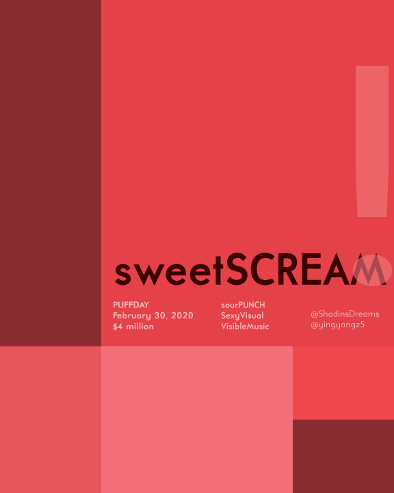


Nice, work but you should definitely change the title for this project. Its called Project 4: Phase 3. I quite not understand why you added your name and your partner’s at the right side where it says @……. What is that suppose to be? I like the different shade of red you used for this project. It kind of bothers me that M is still can be seen though that “!” mark. I would make that “!” bigger or make the M fit so that the color of M can be faded out. Above all, nice work
Wow! this poster is so cool, I like the colors you guys used. I can clearly see the chromatic and muted, but I’m not sure if the prismatic red is pure, because it seems… just little a bit, little a bit muted to me, but I don’t think its a big deal. Nice work guys!!