ENG. PROJECT 2 (FINAL)

There are many juxtapositions near City Tech (The New York City College of Technology). The two locations I choose to juxtapose are Macy and H&M, both are located in Brooklyn, on Fulton Street, near City Tech. Although Macy’s and H&M are both stores that sell clothes, very similar decorations of the interior, but you still could find out the difference by juxtaposing them.

Fulton Street is a long street in northern Brooklyn. There are many chain stores build on it, include Macy’s and H&M. Clienteles prefer to have a clothes shopping in either of these two stores, the stores’ popularity and unique fashion style has attacked majority clienteles who interests on clothes shopping. Otherwise, these two clothing stores are controlling New Yorkers’ fashion storm the most. The six main elements to juxtapose are logo, size, item selling, building appearance, interior appearance, and demographics. The first five elements identify the rate of demographics, and the clientele type they have. The clientele has no age limit, can be teenagers and seniors as well.

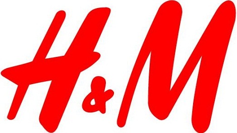
Logo is the symbol of brand, represents a company, contains the management conceptions of a company. Macy’s logo design is  horizontally and contains a red star on the left side of the letter “macy’s”. Instead of using apostrophe between y and s, they add a small black star replace on it for better visualization. H&M has a sloppy logo. It seems to be more like a handwritten letter, the letters are tilted to the right, and if you look at it clearly you will notice this logo can be written down by using marker, the endpoint of each composition has a little waving trace that can be done with a marker only. Macy’s and H&M are using different fonts for their logo, Macy’s logo is very similar to Avant Garde Gothic Extra Light, H&M’s logo is similar to Dom Diagonal. The logo shapes reflect their style. Macy’s tendency trends plain, cozy, generality, and stable. H&M trends stylish, and diversity. But they also have a common in color using which is red. “Interesting things happen when the creative impulse is cultivated with curiosity, freedom and intensity.”, by Rob Marsh. Red is color with strong intensity, “the color red is the color of energy, passion and action”, bright warmness color red can easily catch up clienteles’ attention to their logo, this is why many other companies are also putting red in their logo such as Youtube, Coca-Cola, etc.

The size of building implies how many classifications they do have. The larger the store is, the bigger the chance of clientele to get a view inside the store, unless a small store is famous. Macy’s size is larger and higher than H&M, plus underground floor it contains 7 floors, 5floors more than H&M, so it is possible for Macy to sell more different kind of items in their store, and after my observation, I find out they really do sell other stuffs. Other than clothes, they sell furnitures, fragrances, watches, and daily necessities on the underground floor and the floors over the 3rd floor. People go to stores for shopping items they demand for. Since Macy has more categories of item selling, the rate of the clientele are defiantly greater than H&M, because H&M sells clothes only. Another thing helps clienteles’ rate raises is the location. Macy and H&M are both located on Fulton Street, where many chain stores build on. Macy is getting a favorable place than others. A bus stop of B25, B26, B38, B52 is on front of Macy’s store, there are always many people sitting and standing at the bus stop waiting for the buses. The more buses stop at the bus stop, the more people will be there for waiting. The more people are there, the better chance for them to walk in the Macy’s store even they don’t demand for anything, maybe after they visit inside the store they will find out what they need to purchase. H&M has an inferior location stand, but in my own opinion, I like their building appearance more than Macy’s. Macy’s building appearance is laconically plain, appear light brown color. They have two large glass doors on the ground floor, and a few showcases beside entrances. Macy’s building has no windows, this appearance gives me a feel of less oxygen, depression, and gloomy. H&M build a glassy wall, support with Iron shelf, that means people can clearly see inside through the glasses, for better understanding what type of fashion they have sell, this way is much more efficient than looking at the showcase. In addition, this building appearance appears bright, clean, and fresh, unique building design attracts clienteles’ attention a lot. “Architecture is a visual art, and the buildings speak for themselves.” by Julia Morgan.

I have been to Macy’s and H&M twice for observing. The results of my investigation shows Macy’s clienteles more inclined to adult, clienteles for H&M are inclined to teenagers and who born after 90’s. I prefer H&M as a teenager, their logo looks contemporary creative, fashion styles are classified properly, not like Macy’s mix fashion, example when I looked for preppy style clothes I couldn’t find them as a group presents in a precise area, but in H&M I could. This is just my own opinion, not meaning as general. Everyone interests in different type of fashion styles, and this preference lead to the juxtaposition of Macy’s and H&M. “Fashion is about dressing according to what’s fashionable. Style is more about being yourself.” by Oscar de la Renta.

World changes with the passage of time. No one knows when  things around would be change to unfamiliar, maybe a year, a month, or probably tomorrow. Many changes have led to most of the people become careless to the things around. But if you just paid a little attention to it, you will realize there are many small phenomenon you could realize in much detail ways. Since you juxtaposition, realize the advantages and disadvantages, you will always compare what you see to the others, and most time the equivalence will not be the same. Such as the Macy and H&M locate on Fulton Street. “Cities are about juxtaposition.”, by Richard Rogers.


1440128789-17-HM_Playa_del_Carmen Macys_Logo_R_redblack(1)

Value-Added Portrait: Phase 1

These are my two pictures that I took, where one on the left is High Key and the right is Low Key. The one on the left is High Key, because the more of the white and gray tone of the stair case stands out. On the other hand, the right side of the image contains more value in Low Key, which it contains more black shadings. Most of the figures of people or an objects turns out to be more of the Low Key.

High Key
High Key
Low Key
Low Key

Project #3 Phase 1 – Discover

High Key
High Key

This first image is a High Key image of Jay Street. You can tell it is a High Key image because of how bright it is. you can clearly see how the sun is shining bright on the edges of the building. You can tell the sun is on the left by looking at the huge shadow the building created on the street. By making this image gray scale, it made the street looks sad and depressing. You can only see a few cars drawing by which people can take as this part of town is really dull and boring.

Low Key
Low Key

This second image is a Low Key image of a computer with the screen on in a dark room. You can tell this is a Low Key image by all the negative space. There is no shadow in this picture only a little highlight on the keyboard caused by the brightness on the screen. Part of the keyboard is light and the rest faded into the darkness. This picture can represent there will always be light in the darkness.

project #2 – final

There are always changes going on around us whether it be the people around us or the neighborhood we grew up in and that we know of. Change is definitely happening constantly in New York. Every corner you turn you see construction happening, they’re either building new houses, building complexes, fixing up roads, or even adding new businesses but there is always something being changed here in new york. I live I New York and I see a lot of changes going on by my neighborhood like they’re building a new mall by my house and fixing up the roads on the belt parkway/southern state. There are a lot of things that use to be here when I was younger and that are not here anymore. Another change people would notice are overlapping neighborhoods, like there could be a nice neighborhood then when you turn the corner the neighborhood could change in an instant and have run down houses and dirty streets, and even you can see a strip of stores and there could be a lot of little self owned businesses and then you see a nice big store that looks out of place that you wouldn’t expect would be there. Changes and improvements will always be apart of the New York lifestyle.


The place I chose for this project is a pretty good example of a store that looks out of place and shouldn’t or not expected to be in that spot. I chose a 99-cent store next to a jewelry store on the corner of Lawrence Street and Helen Keller Place. First you exit out the Namm building from the 300 Jay Street side and turn right. You keep going straight for 2 blocks until you reach Willoughby Street, once you get to Willoughby Street you turn left and cross the street and keep going straight until you reach a jewelry store called Giovanni’s Fine Jewelry and next to it is a 99 cent store called 99 cent City.


When I think of a jewelry store I think it would be next to nicer stores or more well known stores in a nicer neighborhood. This is because when people shop in more well known expensive stores those people shopping will be more attracted to the jewelry store. When you see the jewelry store next to this 99-cent store I think how does the jewelry store get business when both stores attract different types of customers. The 99-cent store attracts customers that look for cheap or inexpensive items to buy, and when I looked in the jewelry store the jewelry was nowhere near 99 cents. Unless the person is looking for a jewelry store to go to or looking for that jewelry store because its close to them then I don’t know why it would be next to a 99 cent store, and the neighbor hood didn’t look all that extraordinary where you think a jewelry store would be. This is where juxtaposition takes place. Juxtaposition is when two places or things are seen together and have contrasting qualities or traits.


When in all of these different places peoples senses come in to play, like what you may see, hear, smell, and even what you feel when you’re in these places. The thing about senses they work different with every person, for example one person may see something that use to be there and another person may just see what is there now. In the novel City Limits by Colson Whitehead he said “Thousands of people pass that storefront everyday, each one haunting the streets of his or her own New York, not one of them seeing the same thing.” Not one person sees the same New York as the next. When I was at the spot with the 99-cent store and the jewelry store my senses were going all over the place, when I looked around I saw a lot of people walking fast like they were rushing to get somewhere, but to put in consideration it was around 3 O’clock and people are getting out of school and work so people may have either been on there lunch break or rushing to get home because the trains are right there. My sense of smell was going on too because there are a lot of places to get to eat around that area and all of those different smells are rushing at you at once. When you stop and listen you hear all types of things like people talking on the phone, other peoples conversations the sound of traffic and its pretty loud because in this area it gets crowded with people that are coming from or going to work and coming from or going to school and it gets even louder because there is construction going on just around the corner from these two stores.


This is just a little example of juxtaposition in a huge city of different types of neighborhoods overlapping each other. Around every corner you’ll see all types of changes and people that live in that area may have different memories and stories of what they have been through in that area and another person may have a completely different story or memory of that area just because the different times they started either living or hanging around that neighborhood. Sometimes we may not want to see change in these neighborhood and we may thing things are fine the way they are but in actuality change is inevitable, there is always something that needs to get moved or replaced and everything has room for improvement, if you look at a picture of New York City from the 1960s to a picture of the city today they look completely different. This is what’s happening to our city and everywhere else other then New York we just have to except the change and just move on and hold on to our memories.

COMD Class 13 | FIELD TRIP + Project 3 Work

October 21, 2015 What’s DUE? VALUE RANGE RESEARCH: Post your paragraphs and 2 images (high key and low key) to the class blog (see Project #3: Phase 1 Guidelines.) Don’t forget to comment on at least 3 other students posts. Bring in the completed value scale exercise we started in class. HUMUMENT Work: Post an image or image gallery […]