Each page spent more than 30 mins. Overall time spent was around 2 hours.
ambiguous :
stable:
Each page spent more than 30 mins. Overall time spent was around 2 hours.
ambiguous :
stable:
The OpenLab is an open-source, digital platform designed to support teaching and learning at City Tech (New York City College of Technology), and to promote student and faculty engagement in the intellectual and social life of the college community.


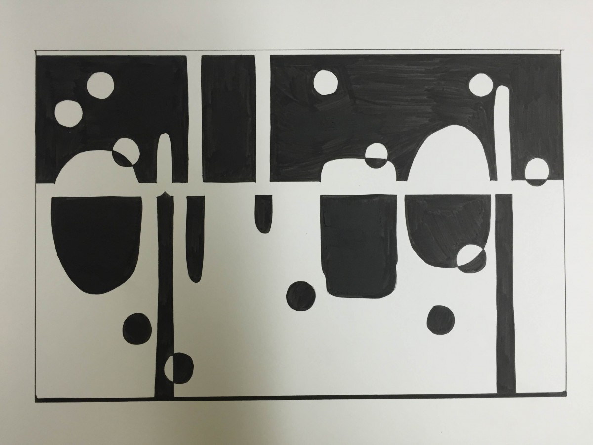
I’m not sure if this was your intention when creating this design, but in the ambiguous composition on top, I see a night scene with the figure/ground reversal, and when flipped upside down there’s a day scene. I think it was clever to only use a reversal on the top third of this composition, leaving the rest of your figures’ masses to fill up the bottom part, which balances everything out nicely. It could also be thought of as two stable compositions in a single ambiguous one, as I can see both “night” and “day” standing on their own if the other was covered up.
Exactly it is my intension to make it as day and night. Smart!! and thanks for your comment.
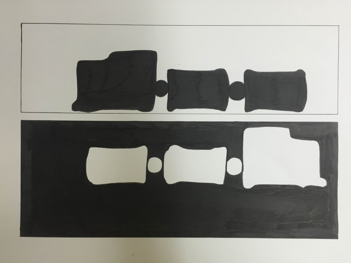
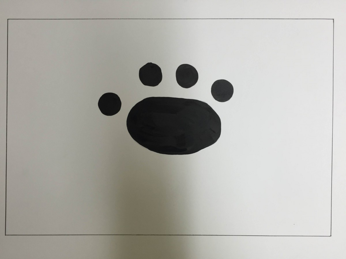
I completely agree with rmarcos, “I see a night scene with the figure/ground reversal, and when flipped upside down there’s a day scene.” It is a very unique design which I could not think of! I can see that you put a lot of effort in putting the ink for the third design, because there is a lot to cover. I also like how the last one is simple and obvious that its an foot print of an animal. You can’t really tell if it is a type of dog or cat, over all it is a adorable design.
Thanks Ayano and I do like your drawing too.
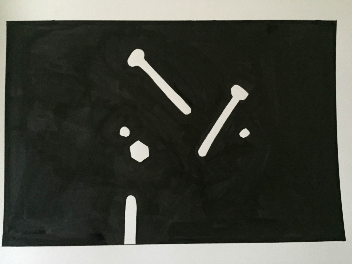
I love how you kept your drawings interesting by switching the background from white to black. In your first stable drawing I feel the intensity as the nails are falling because of how much the black background surrounds the figures. Your ambiguous drawings feels like I’m entering through a parallel universe as there’s both a black and white background. In the first ambiguous drawing the transitions of the circles and what appears to look like ooze give off a feeling of falling but floating at the same time. I really enjoyed looking at these drawings, it’s real pleasing to the eye and opens up my mind to think about what’s going on in the drawing.
Interesting comment Brandy. Glad you like it.
The perception of night and day in the first illustration is fascinating, and its a perfect image of ambigeouity.
Thanks Klever. Day and night is my favorite drawing of this project.