I found this project to be very enjoyable. I have worked with clipping before in terms of video but never really dug deep into it until this project. I got to work with layers of pictures and audio. In my project I tried to hit every single beat I heard accuratley. I would play the song over and over on the same part until the visuals matched the beats in the audio. What I could have done better is made my animation a few seconds longer because so the viewer can have more to process and analyze.
Category: COMD1100
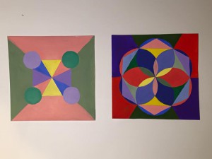
Color Interaction Parings: Phase 2
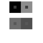
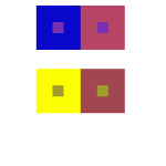
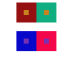
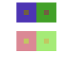
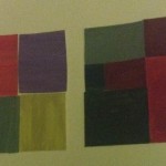
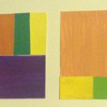
I learned how to manipulate a color using its surrounding. There are many ways to achieve different effects. Such examples are shown above, you can have a change in hue, value, or both. Color is associated with psychology just as much as it is to art. Our eyes see and brains perceive so I’ve learned how to really observe and see color. I am able to see the effect but also notice it is the same color at the same time. The time taken to complete this was about an hour.
Saturation Studies: Phase 4
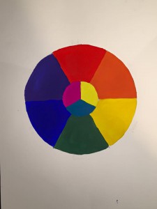
Phase 1: Color Wheel
First time how to use the simple color (RED, BLUE, GREEN, YELLOW, VIOLET) to understanding of saturation.
Phase 2 : Three Saturation
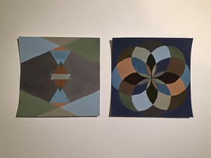
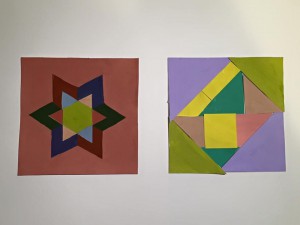
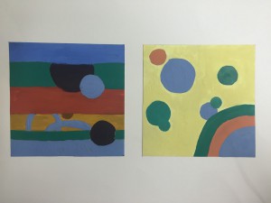
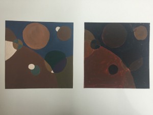
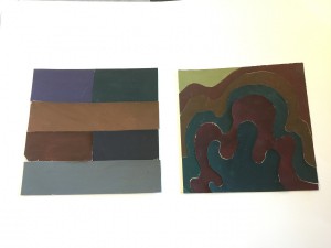
Chromatic Gray Studies – Exercise #1 & 2:
Took around one and half hours.
Muted Color Studies – Exercise #1 & 2:
Took around two hours to complete.
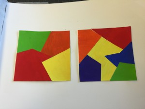
Prismatic Color Studies – Exercise #1 & 2:
Took around three hours.
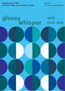
Phase 3: Swiss Style Band Poster
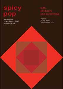
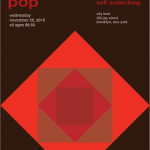
This project was fun for me, I worked with Brandy and Ashley, we had to make a poster of using the different saturation and values of the color red. At the beginning of the poster, we had to create a title that involves the senses of taste and sound. So we came up the “spicy” and “pop” for the title. Fortunately, we knew how to using the illustrator that we as fast as complete the poster .
saturation studies: phase 3
Saturation Studies: Phase 3
For this saturation study, I worked with Brandy and TK. In this project, we had to create a band poster using a name that is a cross-sensory word or phrase. We were given three cards; a color card, a composition card, and a concept card. For, color card, we were given was warm color. For the composition card, we chose to do taste and sound. We came up with the name “Spicy Pop” by making a list that were taste and sound. We played around with the words until we came up with Spicy Pop and were satisfied with it. Since we were given warm color, we chose to do red. We used prismatic, chromatic, and muted. Overall it took about 3 hours to complete this project.
Saturation Studies: Phase 4
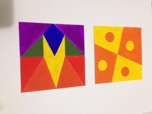
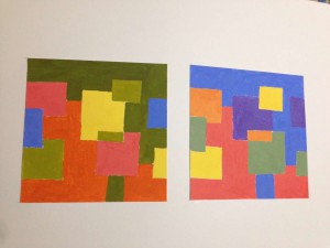
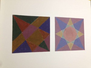
I think this project help me to improve my imagination and higher knowledge of mixing color. I think I did well of planning, material use and craft in this project. And I will use what ever I could in the next project, and I hope I can improve the technique I learned in the next project.
Saturation Studies: Phase 4
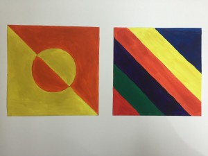
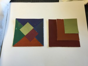
For this project, in the beginning I learned about the different triads of colors which are CYM (Cyan, Yellow, Magenta), RGB (Red, Green, Blue) and RYB (Red, Yellow, Blue). Also I learned about the different levels of saturation for color which are chromatic, muted and prismatic. Mainly the tasks were to make broad and narrow range collages using each level of saturation. At first getting the colors down was pretty difficult because you had to be careful with how much of the complement color you add in to change the saturation. I was very scared of the paint running out in this project. Another fear was making the exact shade of color when I ran out of it. I thought using paint in this project would be a bit easier because in the previous project we used paint. As a matter of fact it was harder because of mixing all the different colors. I find for this project I really need to improve my craftsmanship because the paint didn’t come out as smooth as I wanted it to. The next task was to make a swiss style poster which I found to be pretty simple because at that point I got a better grasp behind the concepts of the saturation levels. The next project I don’t really know what to expect which is pretty exciting because I’ll be learning something new. Hopefully I can use what I learned from this project and previous projects for the next one.
Saturation Studies: Phase 2
Through all phases of project #4 (chromatic Studies, muted Studies, and prismatic studies), I realized to understand them well you should know two things, they are value and saturation. My understanding to saturation is pure and intensity of the color, and value means lightness and darkness of the color. After memorized these two artistic vocabularies, they helped me better to understand the color mixing since I started painting. I think the most challenging step was when I had not enough color for my compositions, so I had to mix it more, but it is really hard to mix a color to be exactly the same like the color I mixed before. Each of them took me around 3 hours to finish. Since after the project #3, I’m glad to have another chance to work on painting physically, I can feel the improvement of my painting skills, and also the knowledge of color mixing.
