Color Interaction Parings: Phase 3

colorinteractionfreestudy_

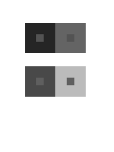
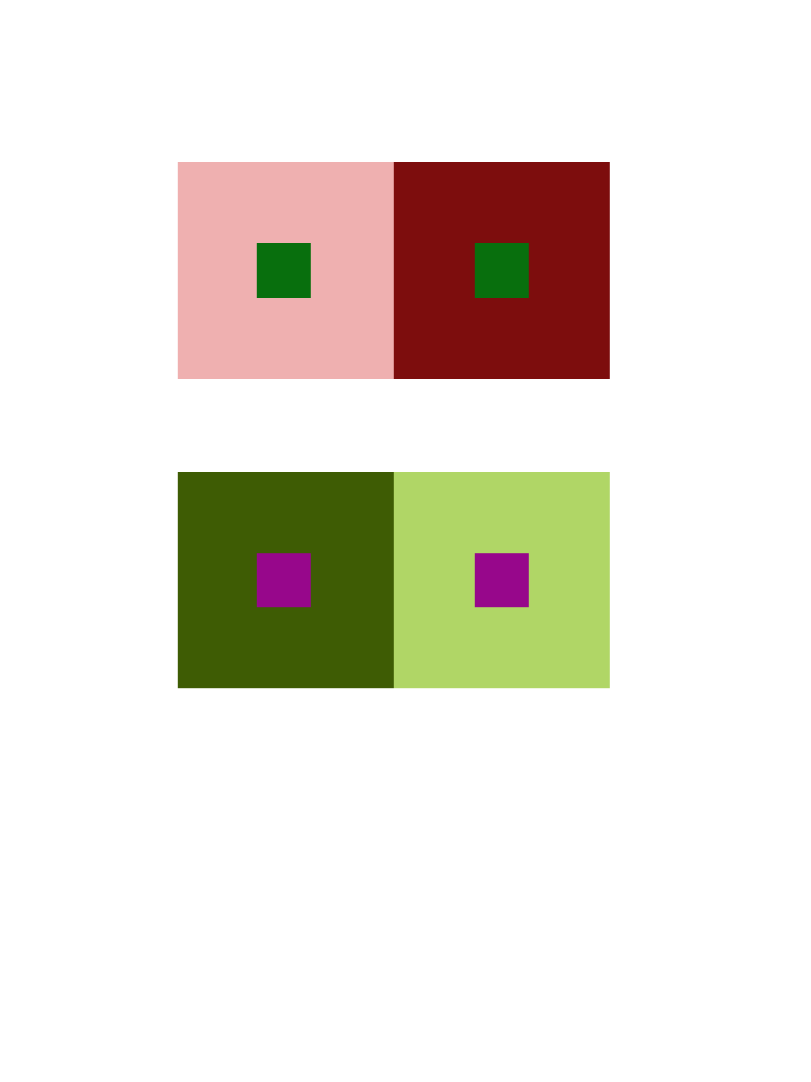
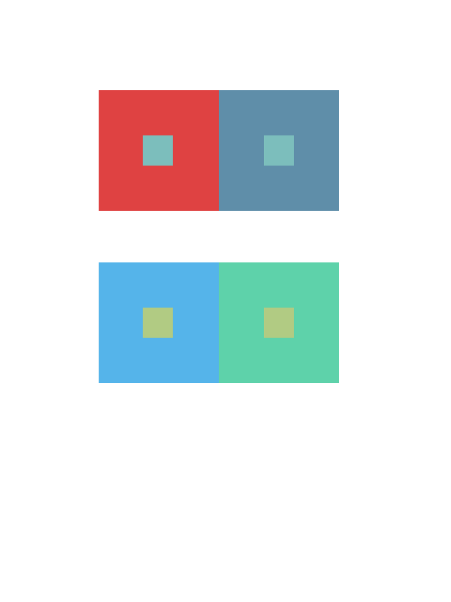
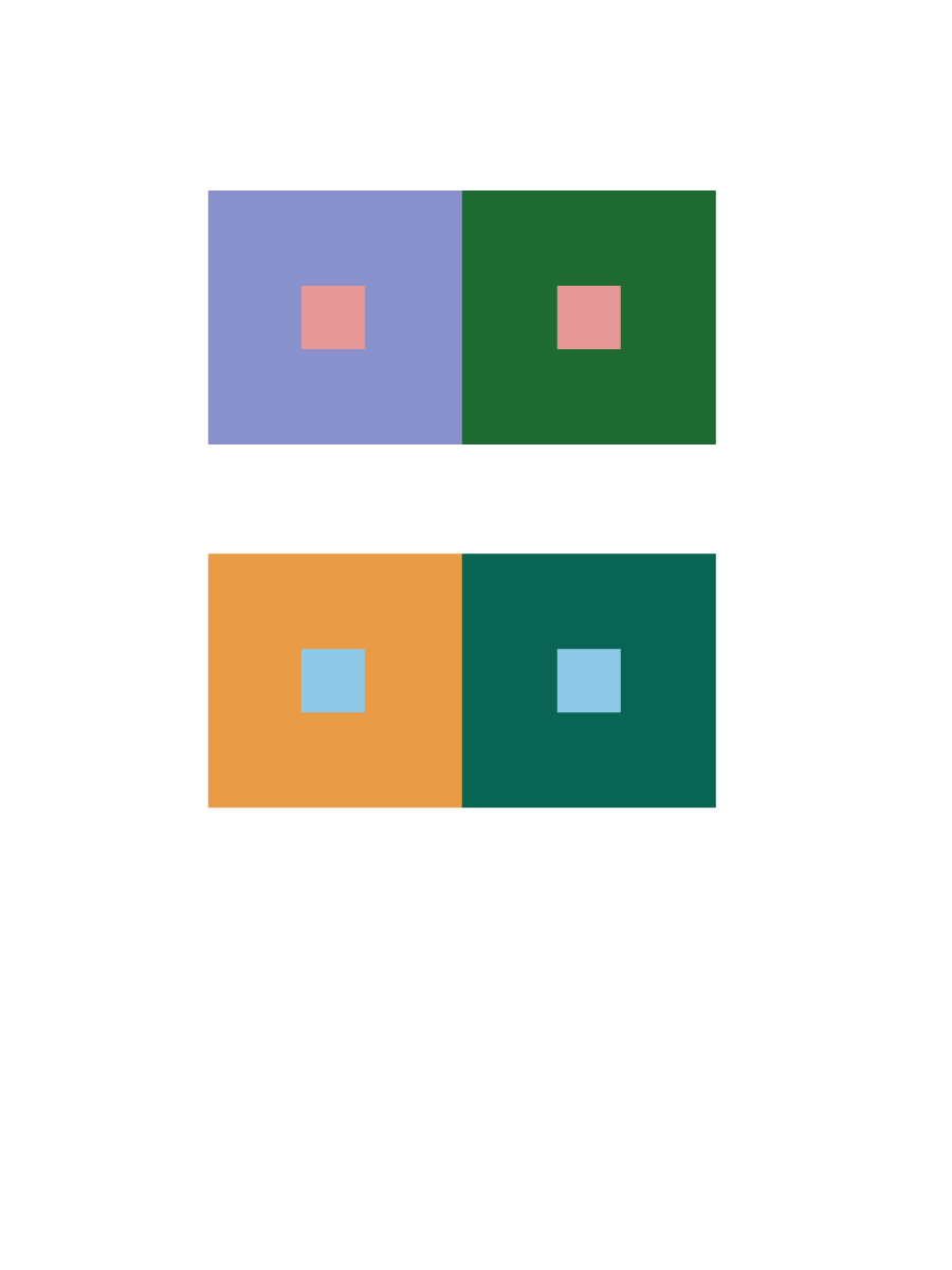
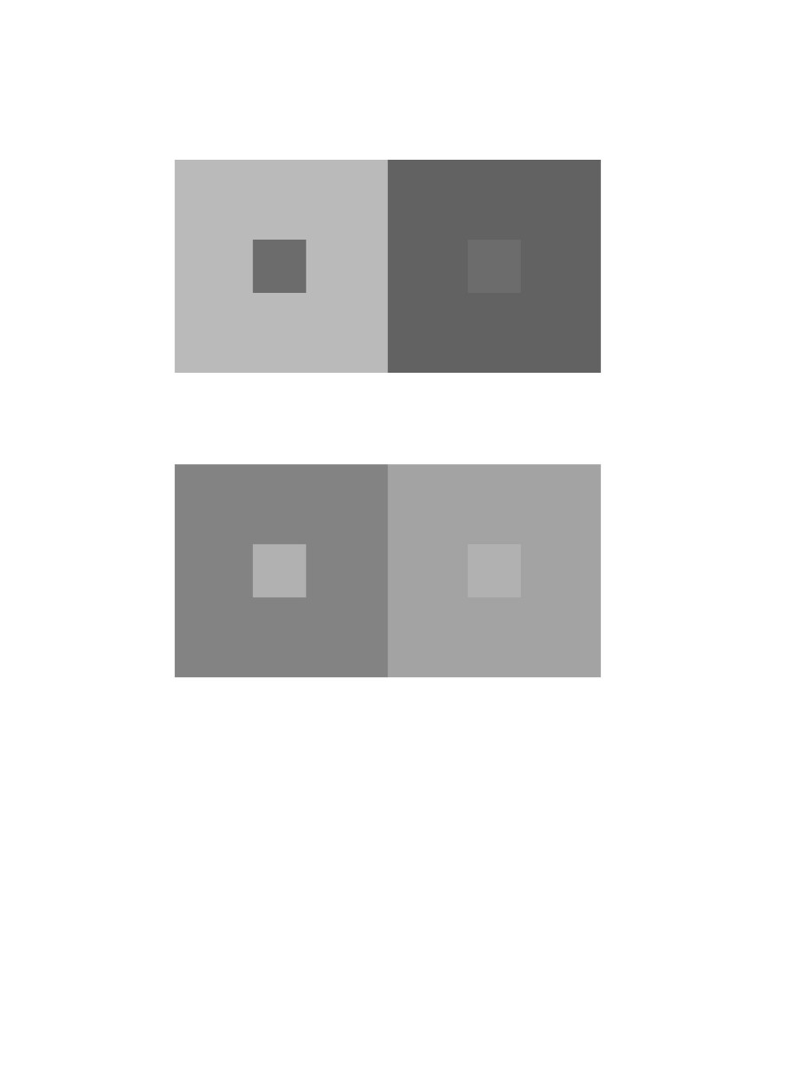
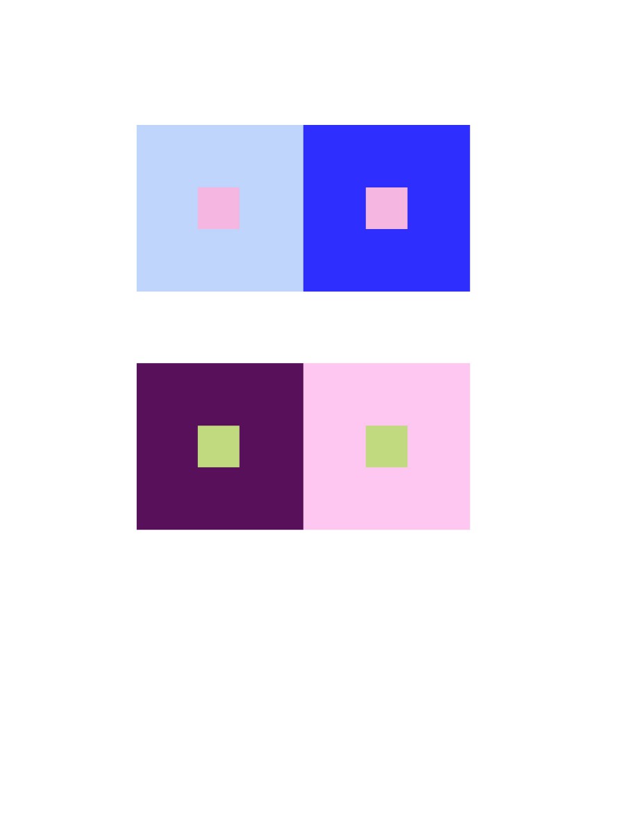
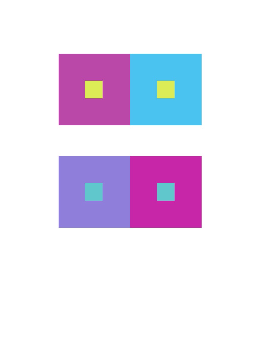
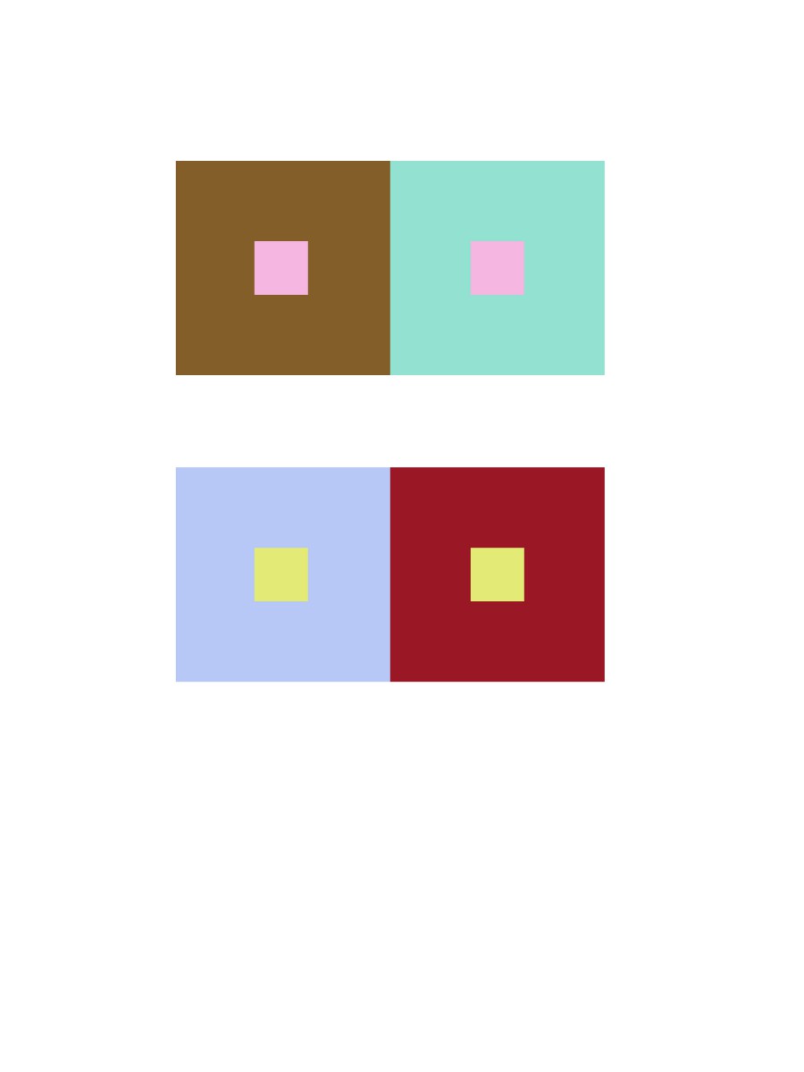
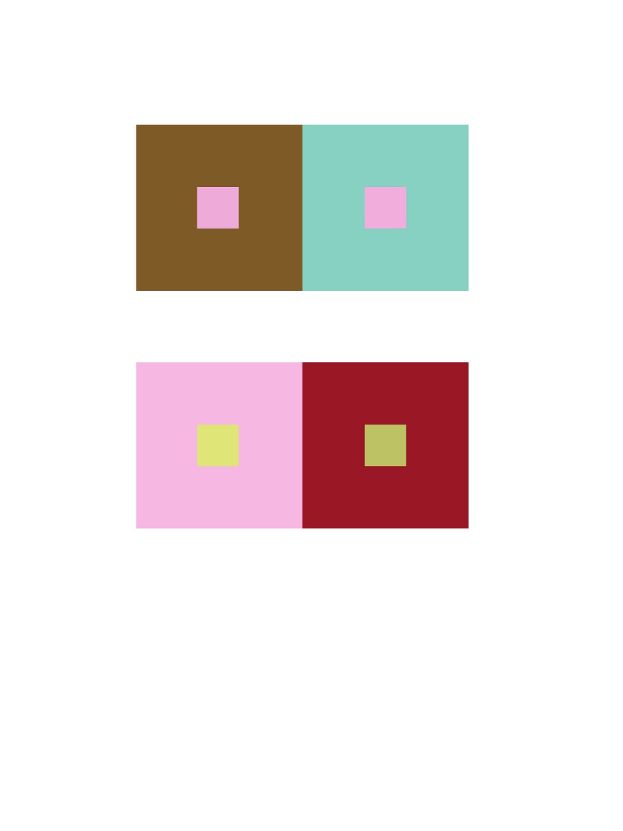
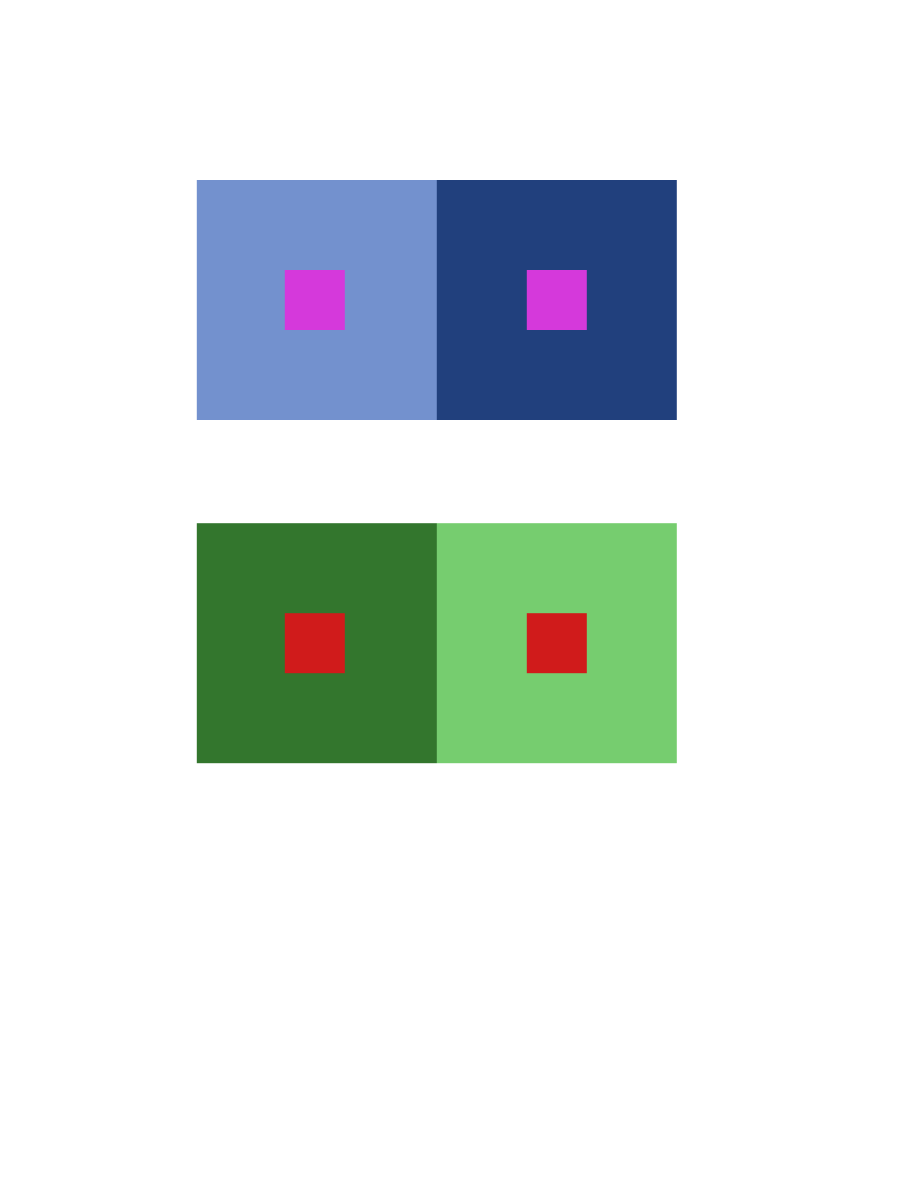
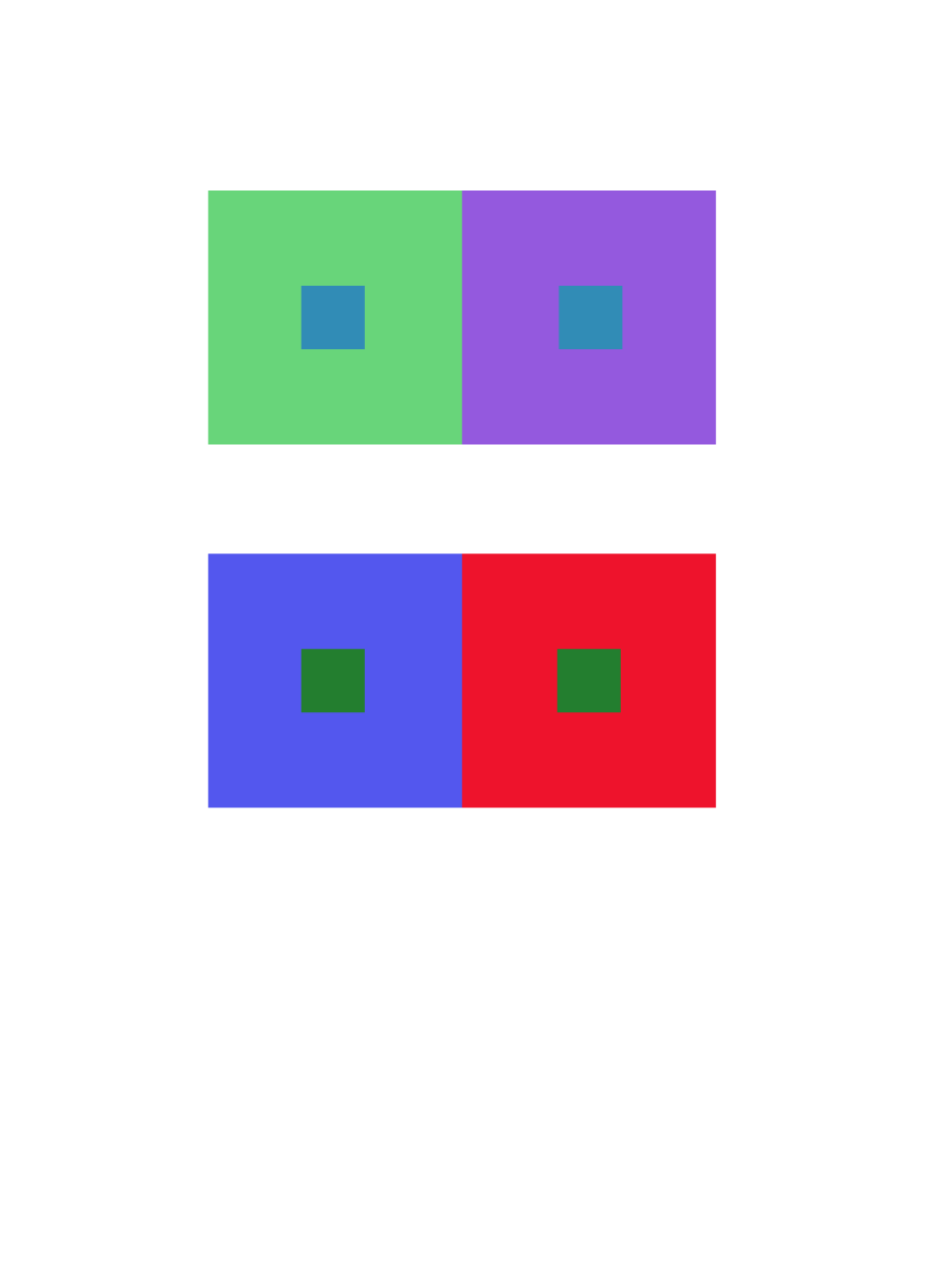
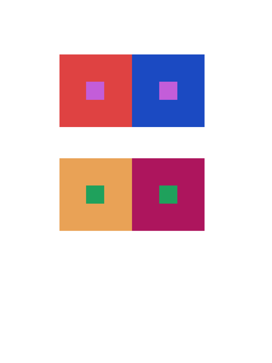
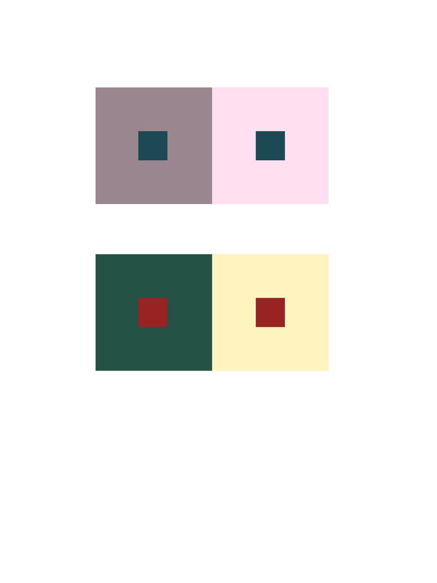
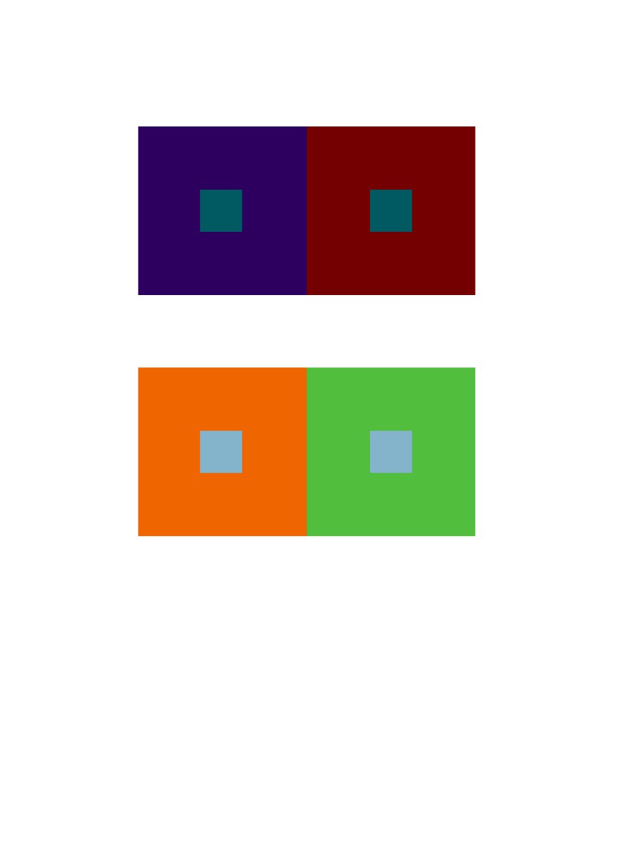
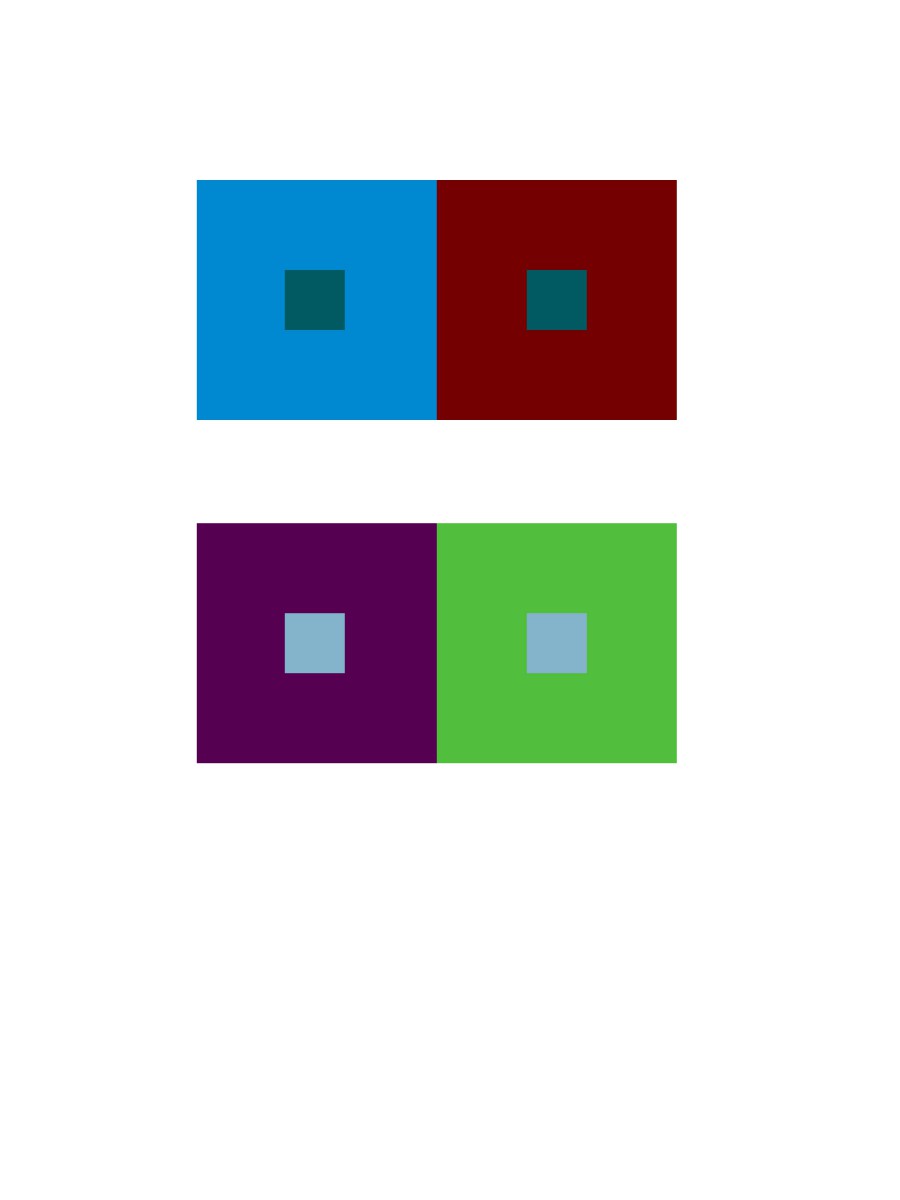
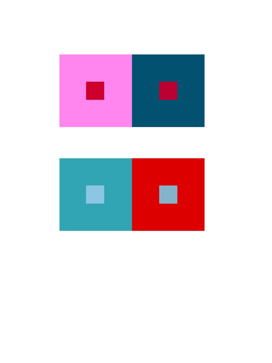
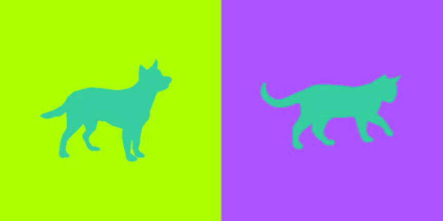
This project I found to be really fun and interesting. Not only was everyone able to work with a partner but we had the chance to get to know our partners in this activity. So with my partner Tyler, we had to pick a color for each other that best represents the other person’s personality. Then we had to pick a color that matches both of our personality traits. Next we had to come up with logos that represented each other but in a way that they are similar. With all of these elements we had to make sure our work showed simultaneous contrast. I chose yellow-green for Tyler because he’s mainly funny and outgoing(that represents the yellow) but at the same time he’s relaxed(that represents the green). Tyler chose to do a pink-blue color for me because although I’m cheerful and giggly(that represents the pink) I’m also intellectual, trustworthy and relaxed(that represents the blue). Our shared color is a blue-green to represent our relaxed traits. Tyler chose a cat logo for me since I’m cuddly but clever like a cat. I chose a dog for Tyler because dogs are outgoing and he really loves dogs. This part took about 4 hours and 30 minutes to complete.


Saturation studies: Phase 3

Click here to see band poster: Brightnoise

This poster is inspired by Swiss style posters and design aesthetics. Using Swissted’s nirvana poster, me and my colleague created a poster that was warm in color temperature. The original poster was black, red and light grey but for this project the use of all saturations were used (Muted, chromatic, and prismatic). The band name Bright Noise was thought of after me and my partner listed word associations for each of the 5 senses. Bright noise fit perfectly because the colors chosen, orange and yellow, are bright in luminosity. The term bright noise projects a powerful sense of sound and directs attention .

saturation studies: Phase 4

This project has been my favorite so far. I enjoyed learning how to really percieve color. I gained alot from this project and my perspective on life has changed alot. I no longer see hues and shades. Now blue can be turquoise and turquoise can be prismatic, muted or chromatic. Being able to be as specific and narrow with colors is important especially in the visual communications field. For the paintings prismatic was easiest and I found chromatic to be hardest. The reason i say this is because prismatic colors are the purest meaning using color straight from a tube would be perfect. Chromatic colors on the other hand have a dark, muddy appearance with a slight touch of color. For example, there are browns that lean more on the orange side and anothers that lean toward a green undertone. Regaurdless, chromatic should be more challenging because colors are mixed unlike prismatic which are straight from a tube. For my three compositions, I selected pieces that felt related and balanced to one another. This project overall was very beneficial and the skill of seeing was learned.

Simultaneous Contrast

Image one

Image two

}H06ZU(HRI]A34T7H[]4353    U5)90R$_@QEQO8}8D7007{O

In first image, its like a reflection of a image however the colors are different. On the left, it gives a feeling of cool, and on the right, its the opposite, it feels warm. In the second image, I see that the trees have same color, but the tree on left side, it appears more gray, and the tree on right side, it appears more green because of the surrounding color.

Project #5: Color Interaction Parings: Phase 2

Group 1 – Achromatic gray studies

colorinteractions_value

For group 1, I learned how to make the two achromatic gray small square that in same value look different by vary the value of the large square. It took me about 15 minutes to finish.

Group 2 – Shifting value (with color)

colorinteractions_value2

For group 2, I changed the value of the large square but keet its color. It alters the perceived value of the two small squares that in same color. It took me about 15 minutes to finish.

Group 3 – Shifting hue, but not value

colorinteractions_huenotvalue

For group 3,  I learned how to make different colors have the same value. I chose one hue as my two small squares’ color and make this one color appear as two by varying the color of my two large squares. It took me about 20 minutes to finish.

Group 4 – Shifting hue and value

colorinteractions_huenotvalue2

For group 4, I learned how to shift both hue and value of  my two large squares to make my two small squares that in same color appear as two. It took me about 15 minutes to finish.

Color Interaction Parings: Phase 2

Group 1 – Achromatic gray studies

group 1When I learned on this group, I thought this was easy to create studies, because it was gray color. I didn’t have to think a lot of the value or hue.

Took about 10 minutes.


Group 2 – Shifting value (with color)

group 2This group 2 was a little difficult than group 1 because of the value options. I had to try many times to make it perfectly.

Took about 15 minutes, because I had to double check the color.


Group 3 – Shifting hue, but not valuegroup3

Group 3 was easy to create. I learned how to using two color but had the same value, then saw a difference in the middle square, to create the misconception.

Took about 10 minutes


Group 4 – Shifting hue and value

group 4When I knew how to create the group 3, then group 4 will more easily. Just combine group 1-3 knowledge to create.

Took about 10 minutes.


Group 5 – Extra Credit

Extra CreditThis group was difficult because I had to make sure the color of the middle squares look the same one.

This took about 20 minutes

Color Interaction Parings: Phase 2

Achromatic gray studies

Group 1: For this study, I learned how to use different shades of grays to change the color of the middle square. The squares in the middle are the same color but the surrounding color makes it appear as though it’s a different color. It took 20 minutes to complete.

Shifting value with color

Group 2: For this study, I learned how to keep the color of the larger squares but change the value. The squares in the middle are the same color but with the change in value within the surrounding color it changes the appearance of the square in the middle. It took 20 minutes to complete.

Shifting hue, but not value

Group 3: For this study, I learned how to make different colors have the same value. The squares in the middle are the same color but the surrounding color make the little squares appear as if they have the same hue as the surrounding color. It took 35 minutes to complete.

Shifting hue and value

Group 4: For this study, I learned how to change the appearance of the middle squares with different hues and different values. It took 35 minutes to complete.


Color Interaction Pairings: Phase 2

Group 1: Shifting Value
Group 2: Shifting Value in Color
Group 3: Shifting Hue, Not Value
Group 4: Shifting Hue and Value
Extra Credit: Making Two Different Colors Look Alike

According to this project, I learned different compositions will give us different visual effect. Warm back layer gives an effect of pumping out the composition that over it. Cool back layer opposites that, it gives an effect of inward zooming, like a 3D tunnel. Also when you put the same color on both cool and warm back layers, you will see two colors that exactly same will became two different colors, which called simultaneous contrast, an interesting effect tricks your eyes. I think the most painful part is when you are up on group 4 and extra credit part, because you have already stared on compositions with simultaneous contrast for long time, so the illusion may caused headache and eyes damage. It decreased my concentrations a lot, therefore this part is the best part to challenge yourself as a designer.

I spend around 5-10 minutes on each pairs

saturation studies: Phase 1

Marcus Cerons color wheel

My color wheel was inspired by a series of events throughout my life. When younger, I had gone camping and fished. I loved the relaxation and nature all around me. Also, I love the ocean. It’s a whole other world that goes beyond our deepest imaginations. Two worlds side by side, ours and theirs.