Panel #1

Jaichan Kirty
Born 1996 in Guyana
Lives and studies in New York
_________________________________________
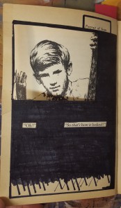
Oh! So that’s what it looks like, 2015
Sharpie on paper, 7.5″ x 5″
Kirty created this piece using an X-Acto knife to carefully cut this square out of the page, revealing the Portrait of Ivan that is on the previous page. Also, Kirty uses sharpie markers to cover up a huge amount of the pages leaving out a few words that create its own new story; Oh! So that’s what it looks like.
Panel #2

Jaichan Kirty
Born 1996 in Guyana
Lives and studies in New York
_________________________________________
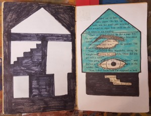
“Inside the House” 2015
Sharpie on paper, White computer paper, Highlighter, 7.5” x 10”
Kirty blocked out a huge amount of the pages and selected words and phrases to emphasize, “Opening her eyes” and “Photograph of the house when it’s winter”. Which he used to create images. Kirty uses paper to cut out the shape of a house. The cut out of the house was glued on the previous page.
Panel #3

Jaichan Kirty
Born 1996 in Guyana
Lives and studies in New York
_________________________________________
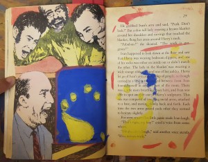
“Blueprint” 2015
Paint on paper, 7.5″ x 10″
“Blueprint” was created when Kirty painted over a picture with the saturated primary colors. Kirty painted a blue box, and inside that box is a print of a foot-step. After painting over the picture, Kirty then closed the book allowing the paint to print over on the other page creating a paint splatter effect.


All three panels are great, the first two meet the requirement of having at least 60 words while the last panel is just shy of 60 words. Maybe you could go a bit more in depth about the colors you’ve chosen. Or maybe you can also talk a bit about the techniques you used in your painting like for example you could use repetition.
For your second didactic, I like how you explained how the house was formed but I think you should also include the concept behind the house. Same thing goes for your third didactic. Also the second didactic is way too long. For the second didactic, try to explain the technically behind the piece in a concise way.
You are the only one colored your work for now, the color captured my attention a lot. Your second didactic panel is too long, I think its because of you explained to much on your creating steps, try your best to make it shorter.
Nice art work, but I think you missing the point of the assignments. This is not a didactic panel, because you are just explaining what you did to crate this art. You have to explain where you got your theme and from that explain why you made this art work. (Read others for example) There is some points I want to make, first there is a period after “when” I think you meant a comma. Also, don’t start the same sentence for different panel. (Sure, each panel is different, but change it a little) Lastly, I do not think this is 60 words, I think you went over that. (Make sure you read project #4 page)
*why you chose this theme
*create
Your classmates have given you some helpful comments. Here are a few more points to help you revise and meet the requirements of Project #4:
* The didactic panels should each be exactly 60 words–that’s the challenge to motivate careful word choice and revision.
* In the first panel, you haven’t quoted the text exactly–do you mean for the title and the highlighted line to be different?
* Be sure to proofread–I saw some small errors that you can catch if you reread looking to polish your language and punctuation.
* In the second panel, you might use a colon to set off the quoted material as an example of what you’re writing about, or commas to combine that sentence and the following one into one more complex sentence.
* Also in the second panel, it sounds like you used paper to cut the shape of the house, but you cut the paper to make the shape of the house. Do you see the difference?
* For the third panel, do you want to say anything about the relationship of the text to the images? Or how the work you did represents the theme you’re representing in your project? It seems all technique, which means you don’t address here the effect of the creative choices you have made.
If you have any questions, feel free to reply here.