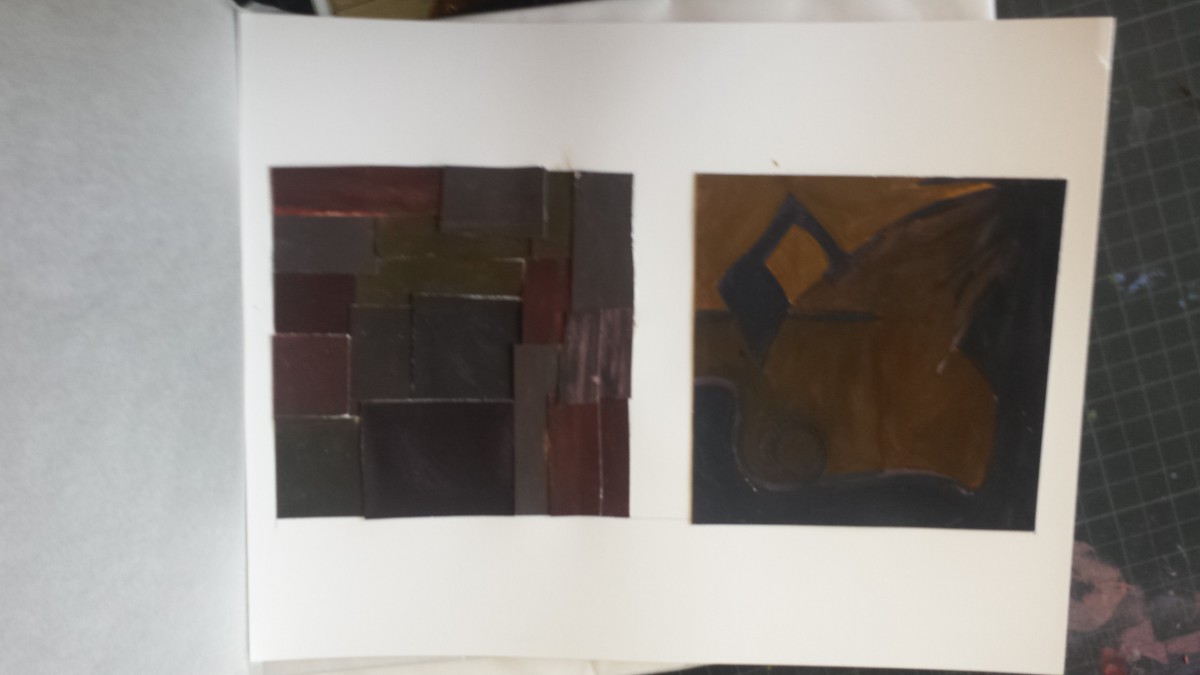
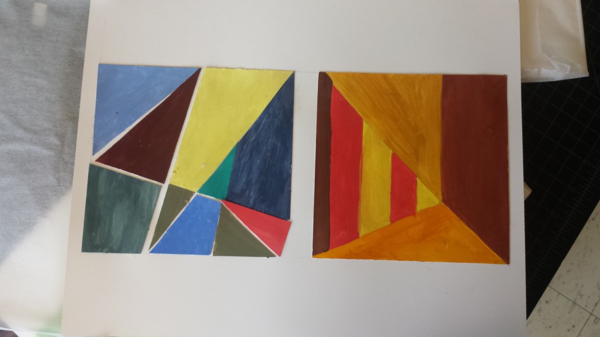
Color Interaction Parings: Phase 4

This project was fun. I like working on the computer more rather than cut paper. I learned about Achromatic gray, what I learned on this group is, it was easy to see a difference because I was only working with grays. There wasn’t a lot of options to choose. Also  Shifting value (with color), This group was a little tricky to create because of the value options. But with many tries, this is what I came up with. Also Shifting hue, but not value, This group was easy to create, I first chose a color and the chose another hue by sliding the hue bar up and down til I see a difference in the middle square. And Shifting hue and value, This group was also easy to create, I first chose a color and the chose another hue by sliding the hue bar up and down and then I changed the value until I see a difference in the middle square. Also we had to create a Free-Study – Paired Color Identities with Simultaneous Contrast. This Part of this project was fun to create. We had to chose a color that represents our partners personalities and then create an icon that would represent them while also creating Simulated contrast. I would not change anything about this project, I finished everything and handed them in on time.

Free-Study – Paired Color Identities with Simultaneous Contrast

Color interactions: phase 4

For this project, color and how its perceived was the main idea. I’ve learned that one color can appear differently according to its surrounding color because surrounding color subtracts itself from the influenced color. There can be differences in hue, saturation, value or all depending on color combinations. For this project, four color interactions were observed. An achromatic interaction with difference in hue and 3 color interactions with changes in hue, value and both. The change in value can be made by selecting three colors with different values. One hue light in value, one dark and another in between. As designers, colors are consistently used as a means to communicate to viewers so learning to manipulate the eye is significant.

color interactions: phase 3

Click on the link to view the color interaction pair-ups: lightningsun

Me and my colleague did not know nothing about each other. As an experiment we gave each other a color according to how we felt through our energy. My partner guessed violet and I green. Deeper research was then carried out to learn about color and psychology. Colors can often specify specific personalities, sounds, emotions, smells, and so on. That shows how the human mind links color to all the five senses and the power of color. We then learned different shades and tints of hues had more specific meanings which is how we chose the colors we did. Using knowledge we had on each other we chose the right shades for another and we used similar qualities for our influenced color. We’ve conjured the color yellow as our shared color. For our icons i chose a lightning bolt and he a sun. This  is because he loves electronics, nature and is a very straight forward person. Me because I love the summer, photography and traveling. Both icons relate because they both are found in nature and emit light. Time taken was around 90 minutes

Saturation Studies: Phase 2

Achromatic color saturation
Muted Saturation studies
Prismatic color studies

I learned that prismatic colors are the purest and chromatic colors are the least saturated. Muted colors lie in between. In order to obtain prismatic colors (pure R,O,Y,G,B,V) you use the primary colors (Red, yellow, blue). In order to make the other 3 prismatic colors (O,G,V) you mix red, yellow and blue accordingly. To create muted colors you can add either black, white, or it’s compliment. When adding black, you are shading and when adding white you are tinting. Using compliments can be tricky because using too much can lead to chromatic colors. Chromatic colors are essentially a muddy brown/grey and are created using a color and it’s compliment.

Exhibit Catalog

Emma is Still Alive”  is a piece created by aspiring artist Klever Javier Cobena. Drawing inspiration from Tom Phillips “A Humument”,  the artist conveys a dark, mystifying, and gruesome atmosphere, using the contrasting original work of Jane Austen’s “Emma”.  The concept behind both of these works is taking any medium of literature (i.e. a book) and turning it it into something completely new using different design aesthetics and artistic techniques. and  Originally a story of a young girl living in an upper class home in England, Cobena re-works that story with the the intention of driving it as far away from the original concept as possible. Using horror as a medium, Cobena decides to tell a tale of a a gruesome massacre, using only his design aesthetics and few highlighted words already within the pages of the book. Within the composition, a vast majority of the pieces are composed of either black ink, black paint, or black cut paper. Cobena, preferring black as a sort of “negative” color, utilizes materials such as Micron Ink Pens, Pigma Brushes, and Black Gouache Paints to re-work and block out certain words within the pages. With the given emphasis on certain select words that weren’t blocked out, Cobena re-tells the story through the artwork spread throughout the page. Certain examples within “Emma is Still Alive” include pages within like “Here Lies her Sins” and “Vision Of Shadow”, that use overlaps of two pages to create a single composition. Cobena uses nothing more than an exacto knife and a pen to create these overlaps, and express a single idea and theme with an overlap of two pages. Cobena also strongly integrates the concept of certain patterns of staccato nature, and legato nature. Using these concepts, Cobena creates certain moods and certain ideas using patterns differing between these two traits. On one page for example, one can view a sort of blood pattern running down on the words of a page, created using only a colored pencil and an HB sketch pencil. It has a  a flowing, smooth pattern, and gives the viewer that feel and imagery of a bloody mess. On another page, there are images of sharp, jagged edges blacked out with a pigma brush, giving the viewer a sense of danger.  Other design asthetics included with the piece also include ambigeouity, where Cobena utilizes the words on the page to create a layout that is very eye wandering and complex. There are also stable compositions, where he instead makes a focal point on the composition, drawing the viewers attention to a specific spot.